Recently I had the pleasure of meeting with ARRI’s senior color designer, and I asked him the question I like to ask all camera manufacturers: “Why?”
No two cameras look the same. Sensor hardware supplies the signals that eventually become color, but color itself is an incredibly complex mathematical construct. Someone not only has to do the math, but they must examine the results and determine what looks “right.” Every camera company has someone on staff who makes this decision, and I find it fascinating to learn how they came to make their signature look.
In many cases it’s impossible, or nearly impossible, to learn who these people are, let alone talk to them and ask pointed questions. There are only two companies where I have access to the individuals who design camera color, and one of these is ARRI.
My regular readers may have noticed that I’ve long been fascinated by ARRI’s color science. An early comparison to the Sony F55 (before Cine-EI mode) showed me that ARRI cameras saturate color up to the middle gray point but no further, unlike other cameras that increase color saturation right up to the clipping point. This mimics color print film, which is basically a filter that carves white light into shadows and hues. The more white light the film passes, the less effect one sees, so the most saturated hues always appear in the shadows, where the filtration is heaviest. Lighter hues don’t show much saturation at all because, by nature, they can’t: they consist of mostly white light.
When I asked my pointed color question of the man who designed ARRI’s color, he told me, “We wanted it to look like a film stock without looking like any single film stock.” That’s quite a trick, as every film stock—like every camera brand—has a distinct look. Kodak stocks, until recently, tended towards warmth, whereas Fujifilm stocks were neutral or cool by comparison. Agfa colors were muted and pastel. Some film stocks rendered shadows warmer or cooler than highlights. Instead of LUTs, cinematographers manipulated the look of their images through film stock choice (both brand and speed, as films of varying EIs had different color and contrast characteristics), processing and printing.
Given that kind of variety, it’s impressive that ARRI came up with a look that feels filmic without feeling like a specific film. The ARRI 709 look is its own thing, but it has become the gold standard because it looks universally pretty. One can take any ARRI camera out of the box, turn it on, and instantly enjoy ARRI’s intangible “film look.”
At the same time, the underlying data can be molded into just about any look desired. Colorists regularly tell me that ARRIRAW and LogC are the most malleable image formats they work with.
And now, with the ARRI Signature Primes, I think ARRI has done the same thing with glass.
As a trainer for The ARRI Academy, I’ve had a fair amount of time to play with the new Alexa LF and Signature Primes. In this article, I took a look at some of the key attributes of this new line of lenses.
SIGNATURE PRIME ATTRIBUTES
High macro contrast and low micro contrast. The more abruptly an edge transitions from light to dark, the sharper it appears. It’s possible to control how these transitions occur across details of different sizes.
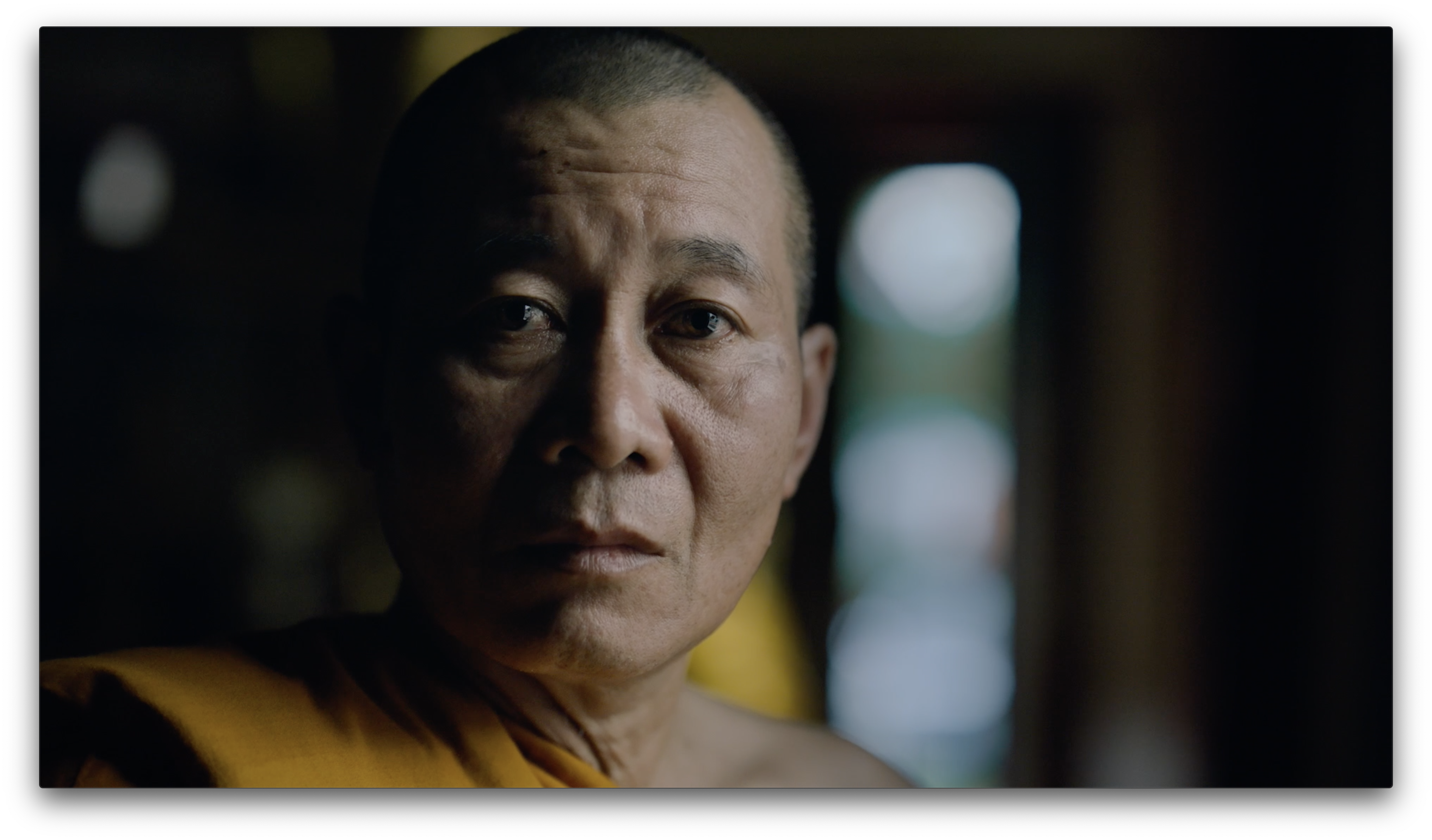
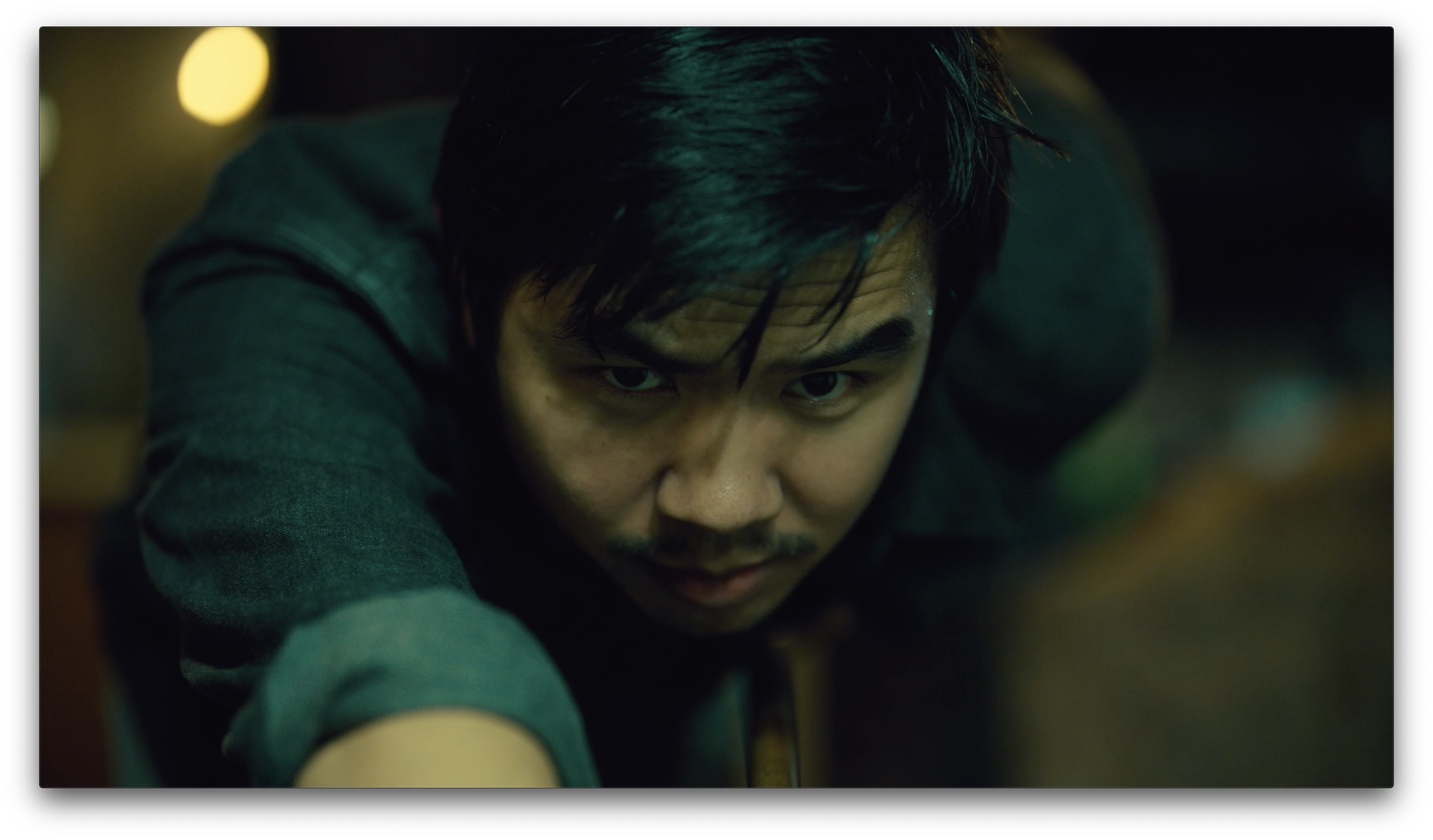
In the case of Signature Primes, imagine a closeup of a person wearing glasses. It appears very sharp overall because the glasses frames fall under the category of macro (large detail) contrast, which is very high in Signature Primes., Skin, though, looks smooth because wrinkles and pores fall under micro (small detail) contrast, which is very low. Skin detail is still present, it just doesn’t stand out as strongly as do larger textures and edges.
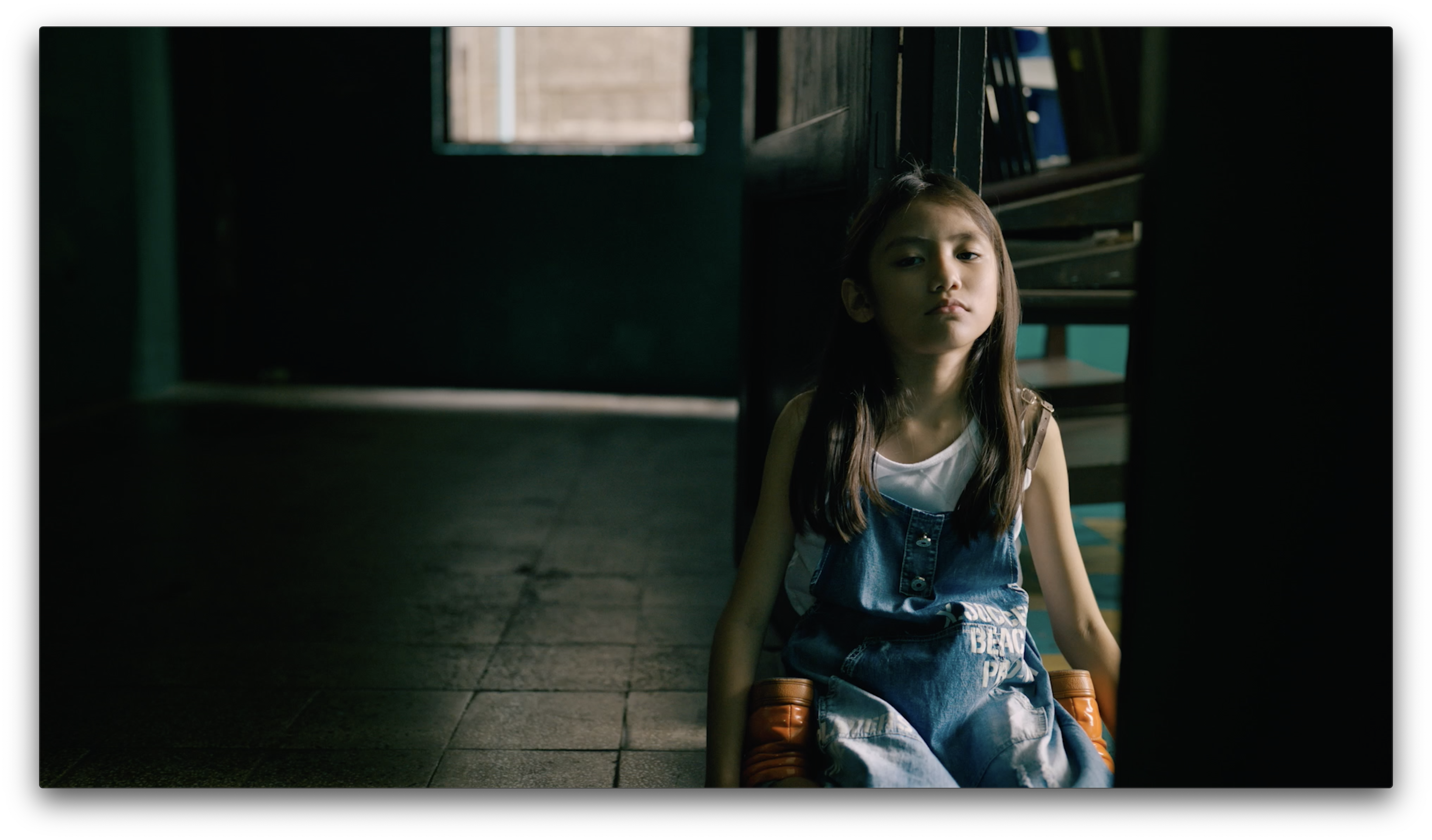
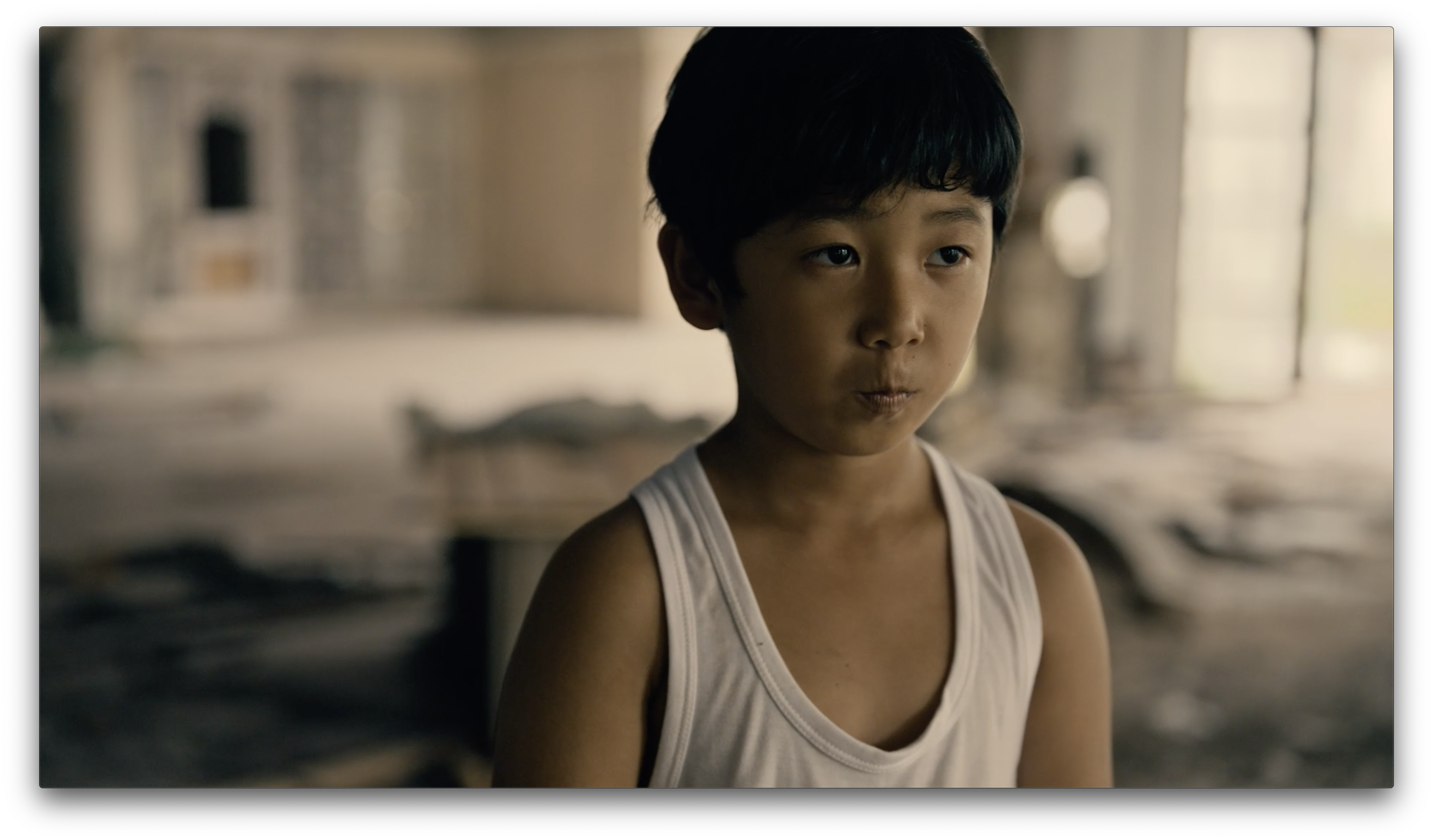
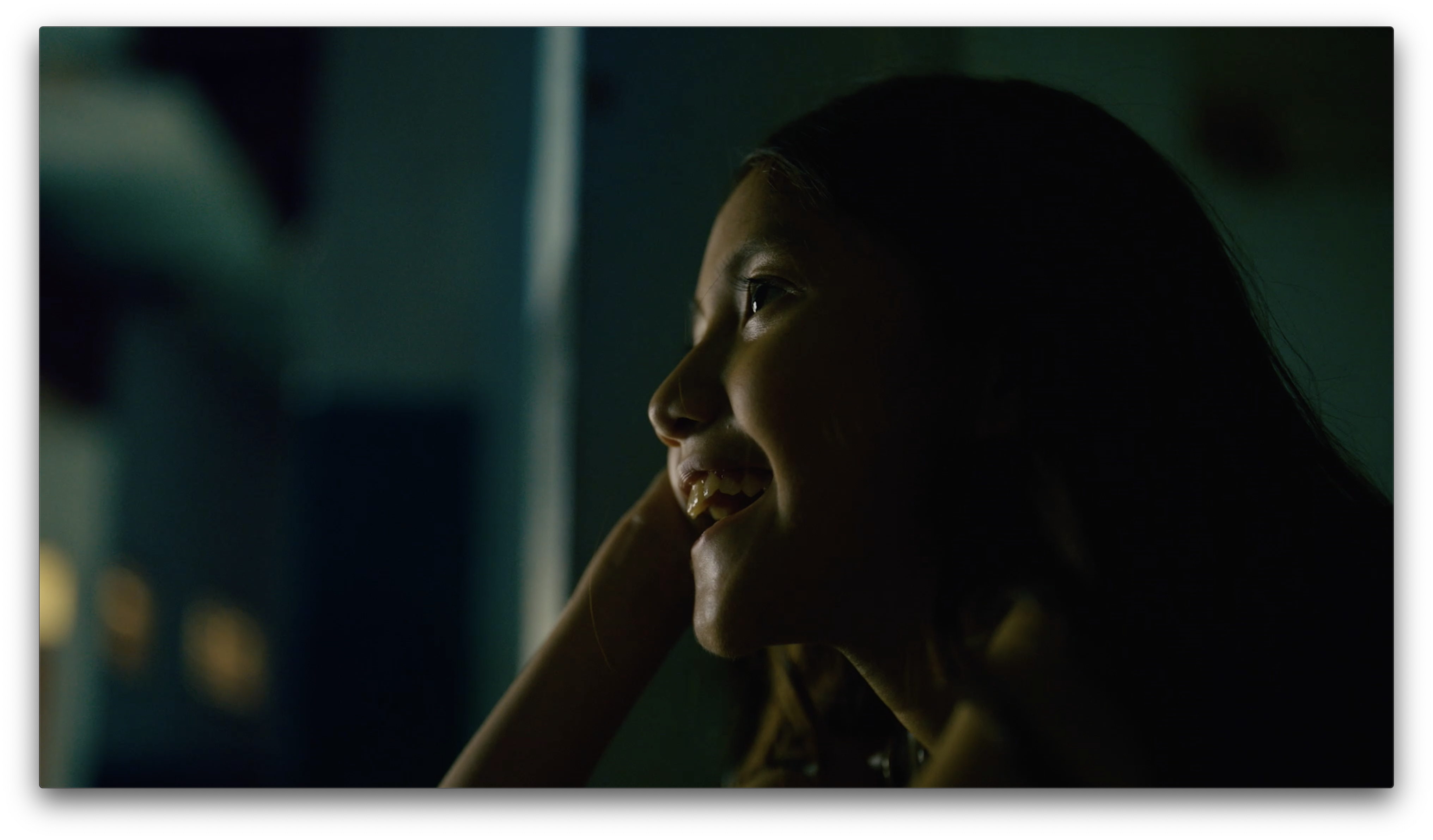
Skin tone color. Lenses have the ability to “pop” some colors and suppress others, as I showed in this article. Signature Primes, like the ARRI 709 look, do wonderful things to faces. Flesh tones stand out without appearing artificial… unless, of course, you change their color.
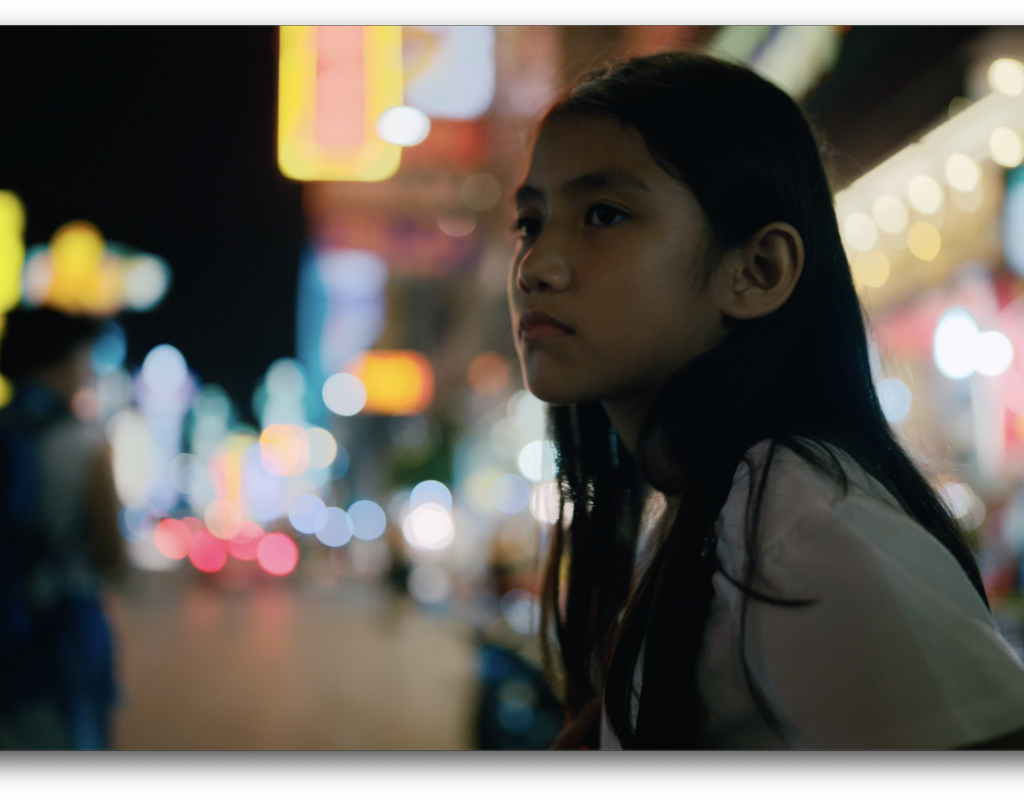
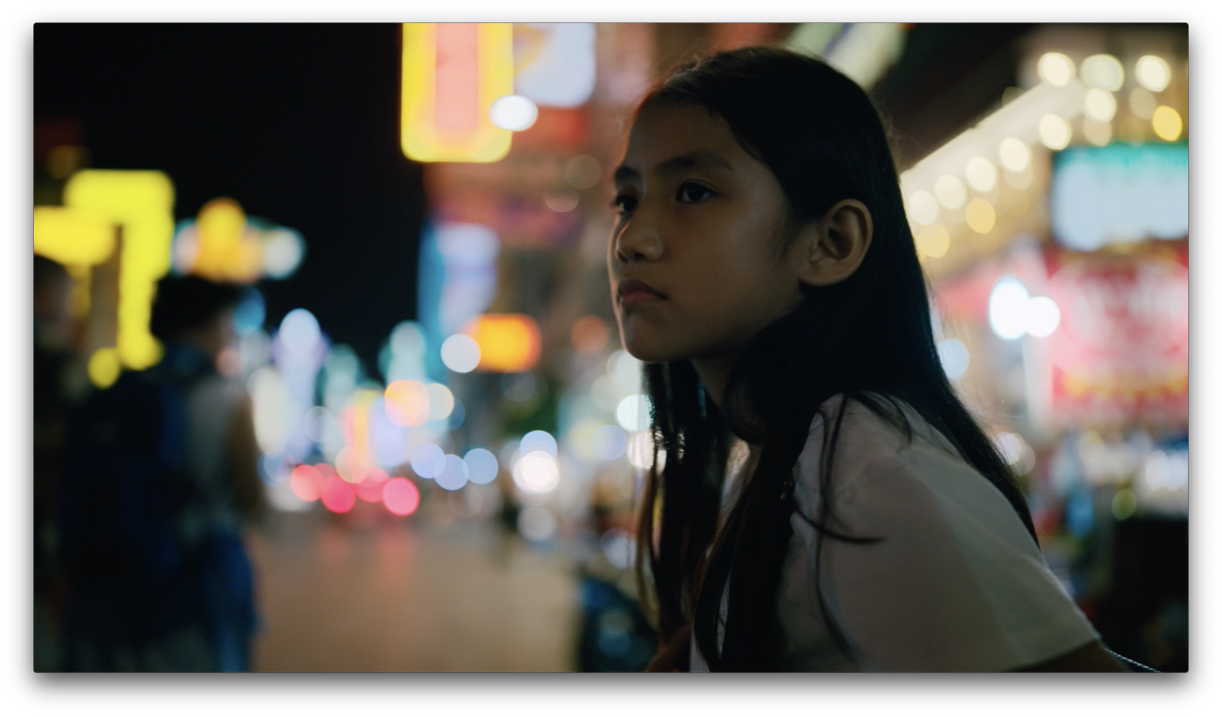
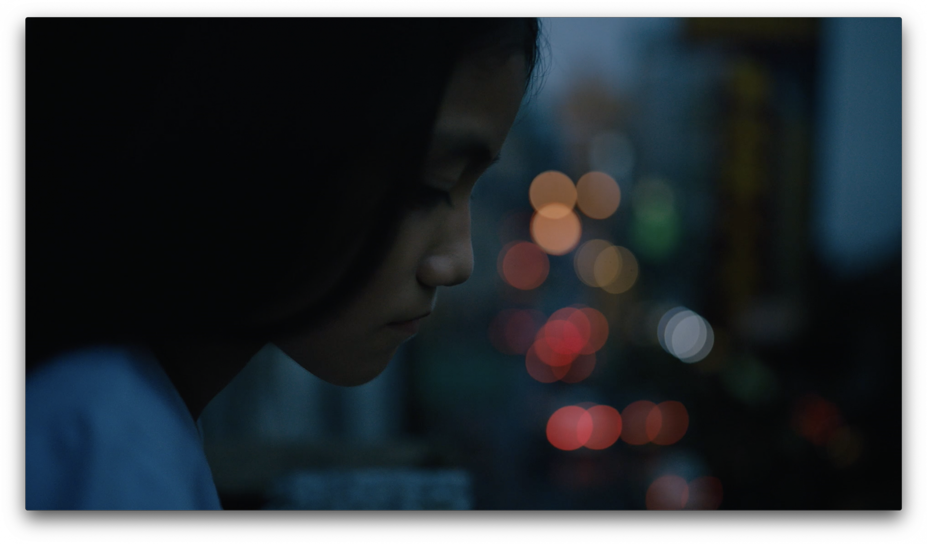
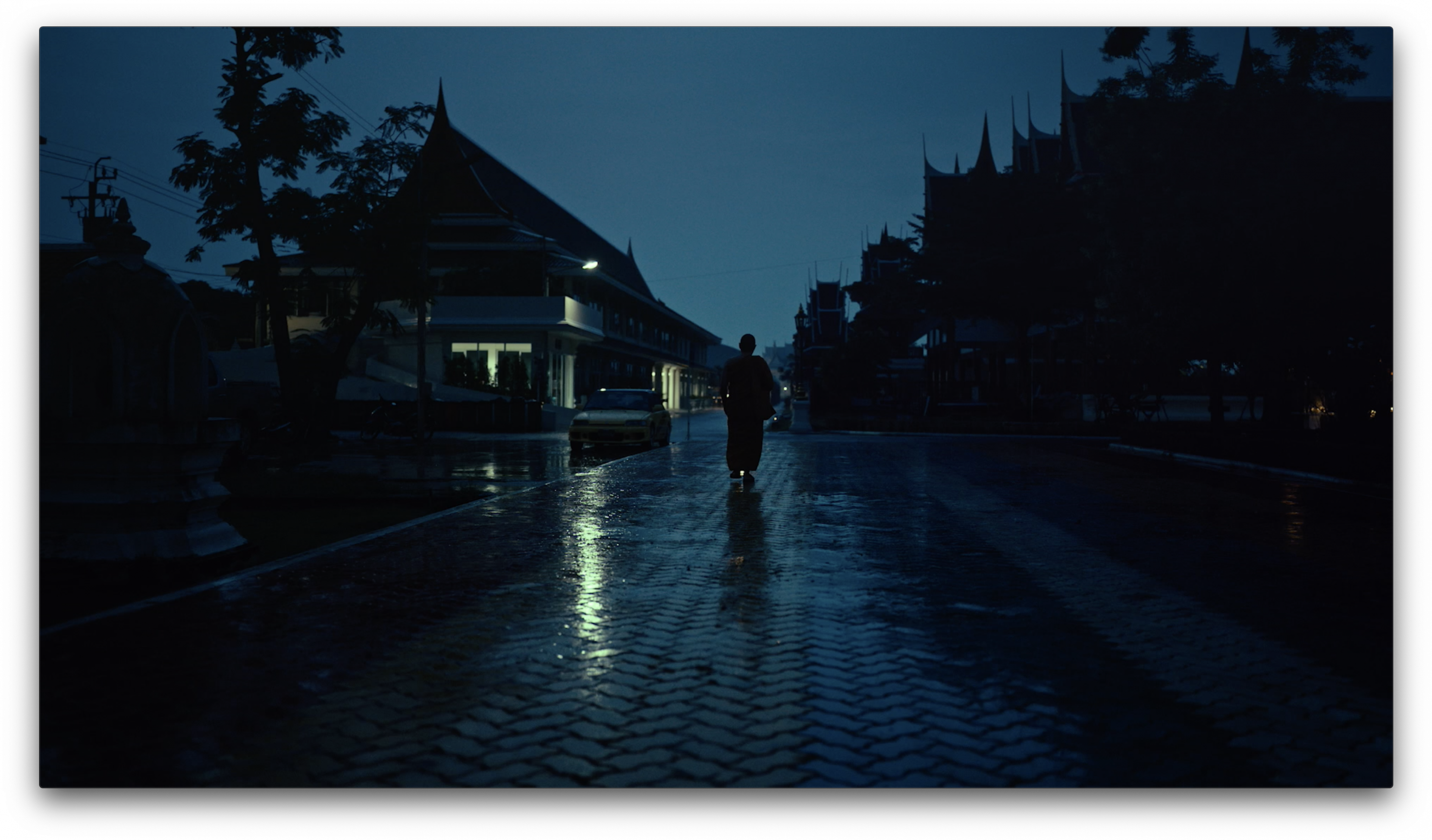
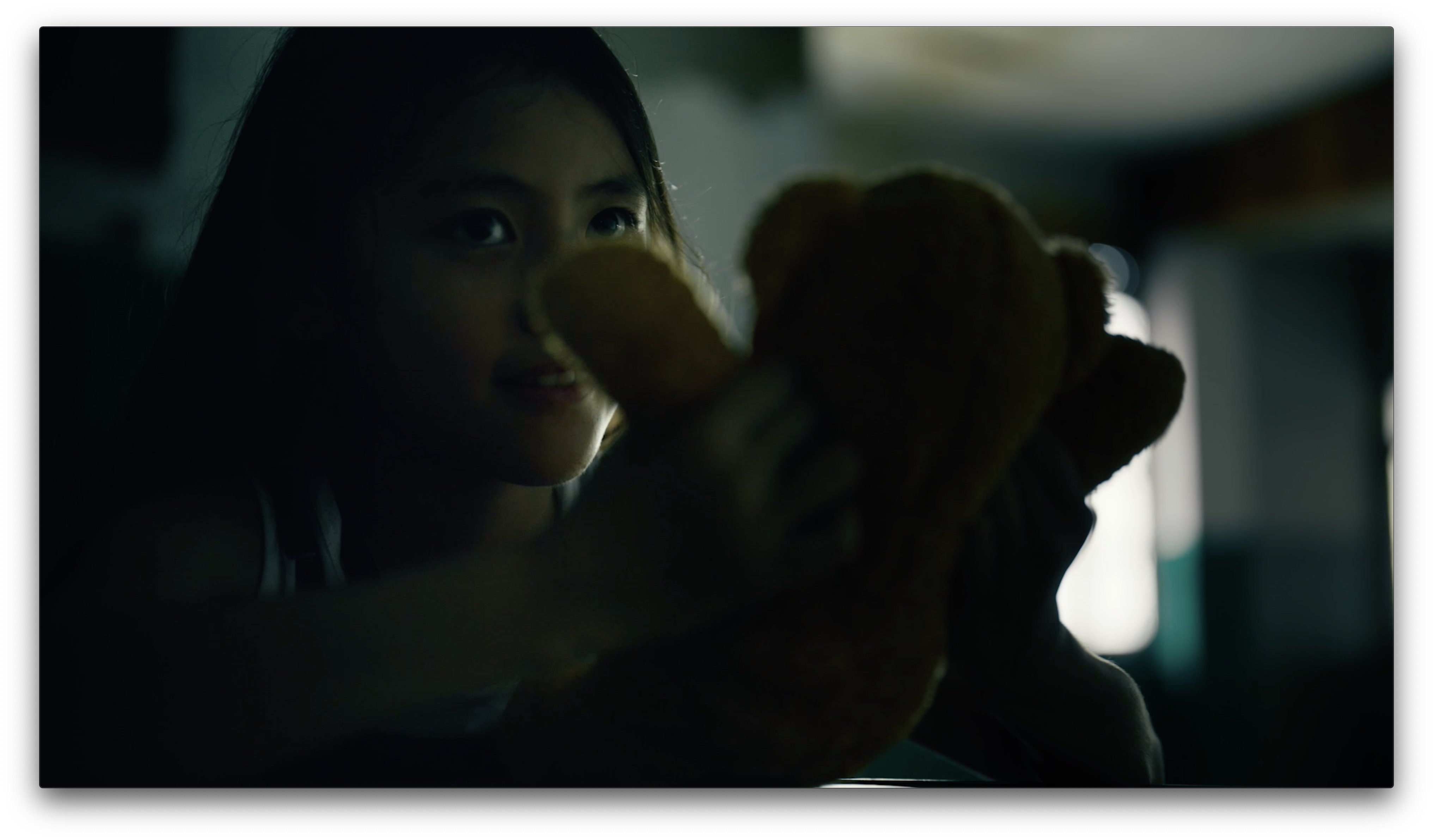
Smooth bokeh. One of the goals in designing these lenses was to give them a creative spin, rather than simply creating a sterile image capturing tool. The optical designers at ARRI paid as much attention to the out-of-focus areas of the image as they did to the plane of focus. This is unusual, as historically lens designers treated the point of focus as the sweet spot and the soft background as an afterthought.
When shot wide open, these lenses create swirling bokeh reminiscent of Petzval portrait lenses from the 19th century (and recently remanufactured by Lomography). This effect dissipates when the lens is stopped down, leaving the choice of bokeh to the DP. Unlike older lenses, such as Cooke Speed Panchros and Petzvals, this swirling bokeh doesn’t “squish” as it approaches the edges of the frame. The shape becomes more distinct, but it doesn’t flatten.
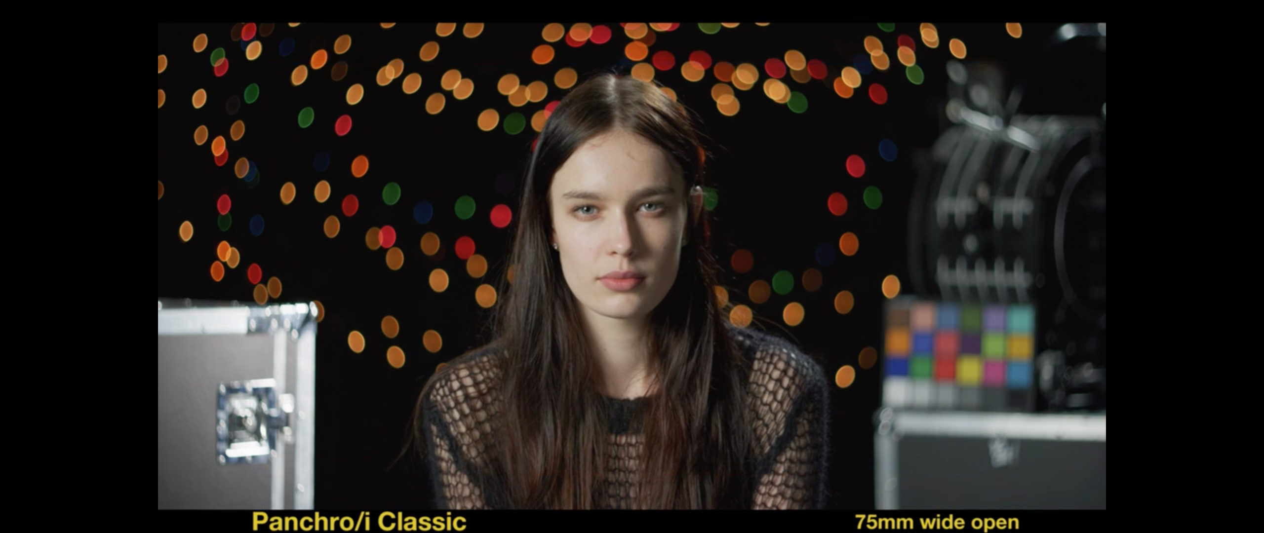
Also, the telecentric design of the Signature Primes eliminates chromatic aberration, which creates a colored edge around out-of-focus highlights and prevents blurred highlights from blending together unobtrusively.
Modern feel with retro touches. These lenses feel sharp and contrasty, both of which are important for UHD and HDR capture and display, but they roll off contrast in fine details, which is important for actor confidence. The Petzval-style bokeh imparts some old-school style to an otherwise modern lens.
A solid visual starting point. These lenses have a look, but it’s not overwhelming. It can be shaped easily with filtration, or we can leave them alone.
After thinking about these traits for a while, it dawned on me that these lenses are much like ARRI cameras, which have similar attributes.
ARRI CAMERA ATTRIBUTES
Sharp yet soft. The ARRI OLPF yields a “sharp yet soft” look, where detail is preserved but the image doesn’t look insanely sharp. When I zoom in on an image in post, I can still see fine detail, but it’s not harsh. This look is very kind to faces.
Skin tone looks amazing. ARRI cameras are the first that allowed me to overexpose faces without seeing awful clipping artifacts, but no matter the exposure level flesh tone just looks right. It “pops,” even when underexposed.
ARRI cameras feel filmlike, but they don’t obviously emulate a single film. The look is timeless: modern, but also familiar.
The images are incredibly malleable. The stock ARRI 709 look is great, but underneath that is a color space that allows colorists to push looks harder and further than most other file types.
The more I look through Signature Primes, the more they feel like an extension of the ARRI camera look: clean, kind, pretty, but flexible enough to become anything else. There are all sorts of technical reasons to use these new lenses, but we don’t choose lenses primarily based on weight or size or design. We choose them for how they look. These lenses feel very “Alexa-like.”
The best part is that they’ll work on any camera, and they’ll work better than most vintage lenses. The new LPL mount, with its reduced flange focal depth, makes it easy to design and manufacture telecentric lenses, where the light rays strike the sensor’s photosites as close to dead on as possible. Signature Primes are designed this way but traditional film lenses aren’t, and sometimes a film lens’s unique optical characteristics don’t mesh well with a particular sensor’s design or size. This becomes obvious in UHD and HDR, where lenses and sensors must be tested together to ensure they complement each other artistically. Rec 709 hides incompatibilities that spring to life in Rec 2020 and Rec 2100.
Lenses shape the audience’s view of the world at the most fundamental level. They are the one aspect of cinematography that can’t be easily removed or changed in post. I see a backlash in the arts against digital tools, and while this industry won’t return to shooting film predominantly any time soon, a lot of us want that analog look and feel. Shooting through old glass is one way to achieve this, but old glass isn’t the right choice for every project. It’s also not always the right choice for UHD/HDR, as lens flare, veiling flare and softness can be extremely distracting. Veiling flare destroys black levels, which are as important as highlights in HDR. Most of the increased color saturation in HDR occurs in highlights, and lens flares can be as distracting as ethereal Christmas tree lights strung across the shot. And while UHD can, at times, appear too sharp, it can also appear distractingly soft if a lens can’t resolve enough coarse detail.
Signature Primes seem designed for UHD and HDR. They’re clean and modern but with old-school bokeh, sharp in the broad strokes and soft in the details, and resistant to elements that destroy the HDR effect but that we can’t control quickly on set.
I’ve got another ARRI Academy coming up, at that means I’ll have my hands on an Alexa LF and some Signature Primes in the near future. I plan on spending as much time as possible shooting out windows at soft, multicolored highlights. Hopefully, I can collect some more footage to show you.
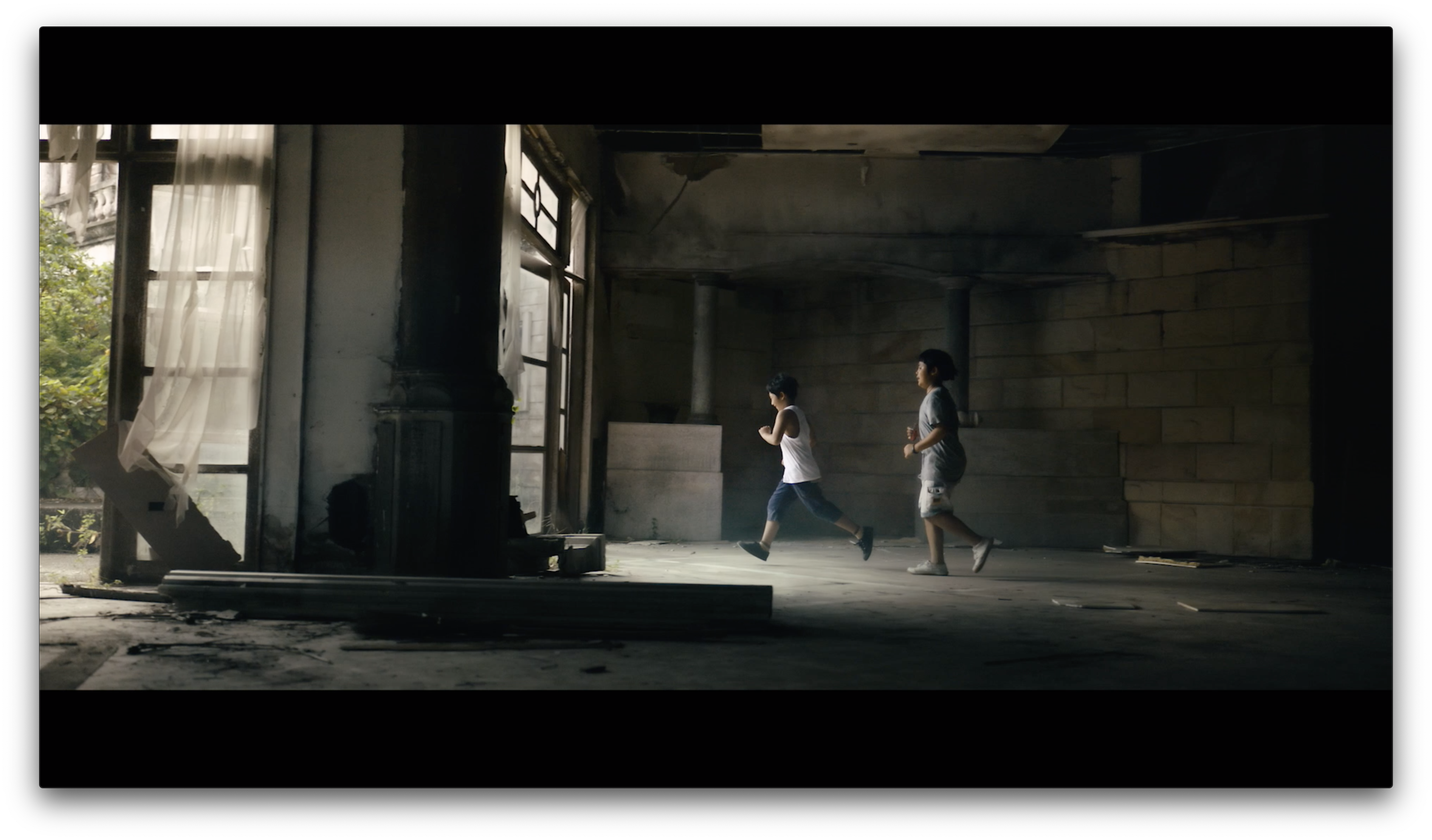
The Signature Prime reference frames shown in this article were pulled from this video:
https://www.youtube.com/watch?v=rMRJwcmlr54
Disclosure: I work as a paid trainer for the ARRI Academy, but they did not pay me to write this article.
The ARRI Academy is holding a “meet the trainer” event at ARRI Rentals in Brooklyn, NY on Tuesday, November 6th, 2018. Stop by and say hi. Please RSVP here. If the event page says it’s sold out, don’t let that keep you away. It’s very informal.
We’ll have an Alexa LF to play with, and ARRI Rentals may provide an Alexa 65 as well.
MORE OF MY LENS ARTICLES
Lenses: My Likes, Dislikes, and the Return of the Cooke Speed Panchro
The “large format” look: Sigma primes on a RED Monstro, in 8K
The large format look, continued: shallow focus and stressing old lenses
Filmtools
Filmmakers go-to destination for pre-production, production & post production equipment!
Shop Now