Accidents yield interesting truths. This is especially true in lens and camera tests, where it’s hard to know what to test for but there’s always something interesting to find if you look close enough. (And it’s nice when these accidents happen off the set instead of during production.)
Recently, while shooting some lens tests at a rental house, I happened to notice something out of the corner of my eye. My Alexa LF was parked in a prep bay next to a Sony Venice, and when I panned past it I noticed the quality of the Sony logo varied with the lens I was using. I’ve learned better than to ignore such things, so I took a closer look.
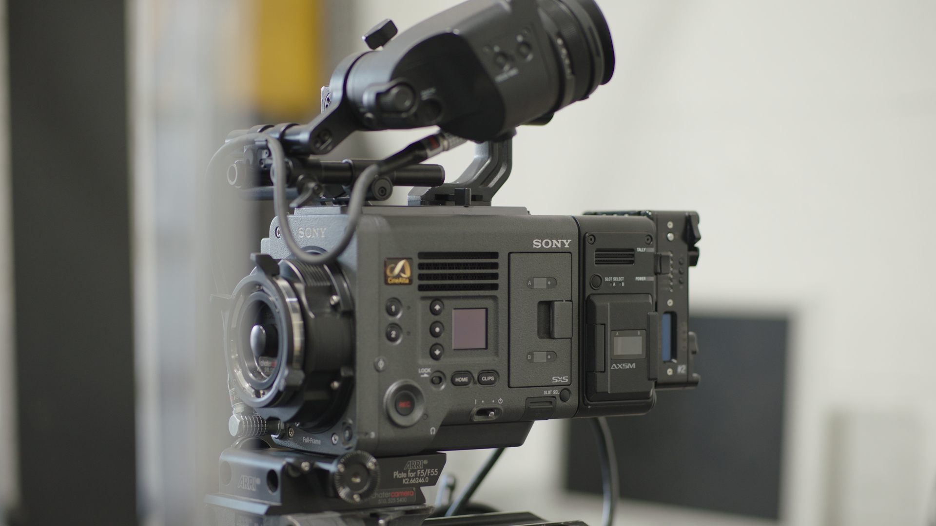
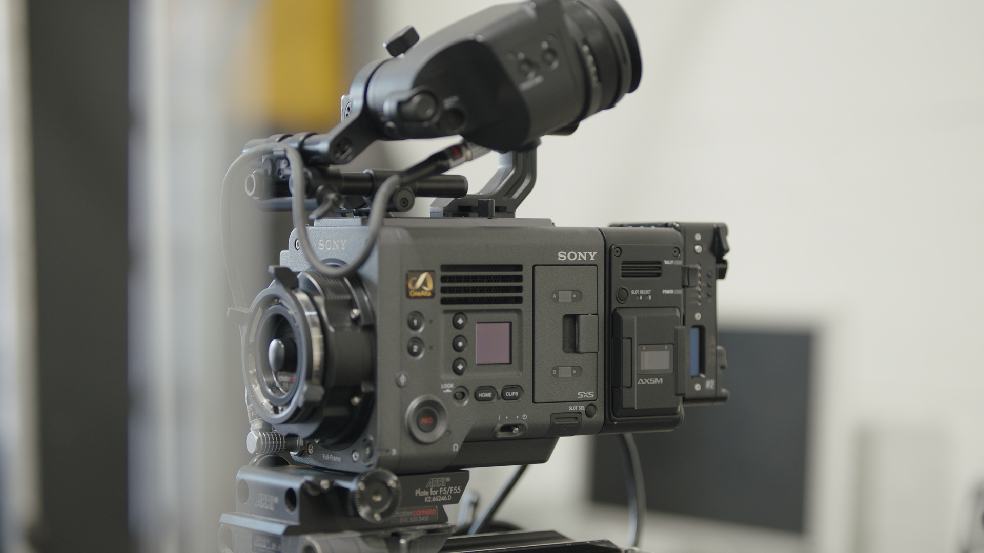
At the time I noticed this oddity, I had a Leica Summicron-C on the camera. I rolled a few frames, swapped out the Leica lens for an ARRI Signature Prime, and rolled a few more frames. The following images were pulled from Blackmagic DaVinci Resolve in HD resolution.


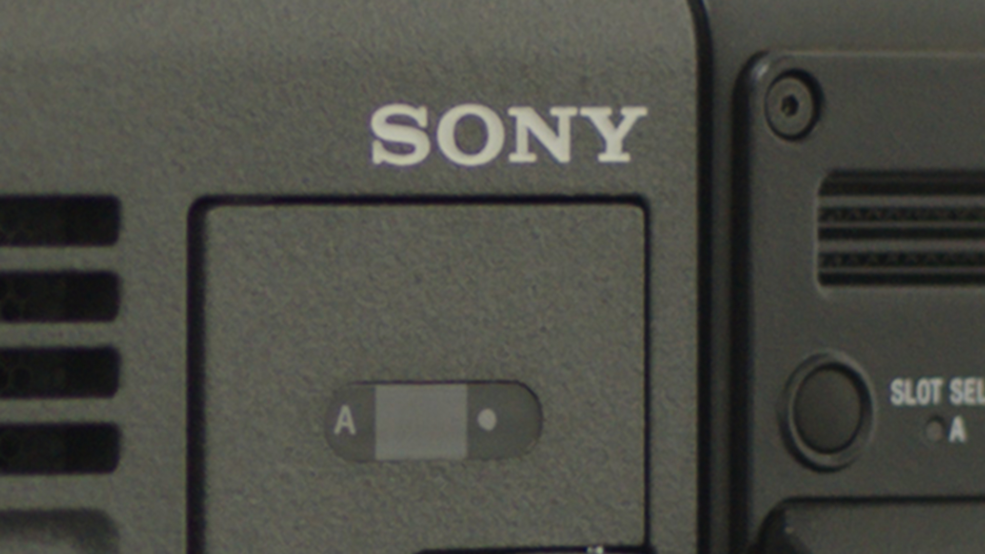
The are two things to see here. The first is that the Sony logo looks crisper on the Summicron than on the Signature Prime. The second is that the Signature Prime renders the gray Venice exterior as slightly warmer and brighter. I’ve already addressed the fact that Signature Primes possess a golden hue and boost mid-tones while preserving deep blacks (see articles here and here), but I wasn’t completely sure why the Leica lens looked sharper than the Signature Prime.
It turns out that the reason is chromatic aberration.

There’s a more dramatic example at the right side of the frame.
Old broadcast cameras had a “detail circuit” that drew a thin black line around areas of high contrast to make the transition appear sharper, increasing the image’s apparent sharpness. Indeed, all modern cameras employ this type of enhancement—although the level of enhancement is often much less than I saw in the standard definition era and the early years of HD. Even ARRI cameras add a tiny bit of detail enhancement, but only when recording to ProRes.
The chromatic aberration in the Summicron lens serves this same purpose. The purple fringe outlines the letters in the Sony name, making them appear sharper than they are. They almost appear embossed.
I’ve noticed that Signature Primes don’t feel sharp or soft, both of which are deviations from normal. (We only think in terms of sharp or soft if something appears different from how we expect it to appear in reality.) Signature Primes simply feel real, as if I’m looking through a clear glass window instead of a lens. Their lack of chromatic aberration and distortion mean they simply get out of the way.
These lenses were recently reviewed by Alfonso Parra, a Colombia-based DP who excels at camera and lens tests, and in his final report, he describes Signature Primes as “immersive.” I feel exactly the same thing, and in fact, that’s what caught my attention in the images above. The Leica looked much as I expected a film lens to look: sharp. The Signature Prime looked… real. I’m not used to seeing that in images. It shouldn’t be a big deal, but then HDR shouldn’t be a big deal either. It’s simply the way we see the world. But when we see it on a screen… wow.
I’ve not learned yet exactly why Signature Primes feel this way, but I suspect it has something to do with telecentricity. Signature Primes are engineered such that light rays exit the lens at as close to a right angle to the sensor as possible. Photo sites have depth, and light rays that strike them at an angle may not penetrate fully, resulting in vignetting. They are also covered by microlenses, which can create color fringing effects when struck at shallow angles. Large format PL-mount lenses must work harder to cover a large sensor as the rear of the lens is smaller than the sensor. That’s why the LPL mount has a much larger diameter: in order to evenly illuminate the sensor with telecentric rays, the rear of the lens must be at least as large as the sensor itself.
In this article, I compared the bokeh of several different types of lenses and discovered that telecentricity results in very soft and smooth bokeh. It appears telecentricity has much the same effect at the point of focus.
Another interesting feature is that the Signature Prime rolls out of focus more gently than does the Leica. The “T” in “Tally” and the “P” in “Power” look harder in the Summicron image, while the Signature Prime renders them with a softer blur that almost feels as if it is superimposed.
There’s another area of the image that’s informative: the lens mount.
Chromatic aberration tends to be strongest at the edges of the frame, especially when a lens is wide open—as both of these are. (The Leica was set to T2, while the Signature Prime was set to T1.8. I balanced both lenses by using the gain control in Resolve to match the brightness levels of the white wall in the background.)
The Signature Prime shows some chromatic aberration, but it feels softer and bluer than the Summicron, which feels harder and is magenta in hue. Chromatic aberration is typically green or magenta, depending on whether it falls in front or in back of the point of focus. What little chromatic aberration is visible in the Signature Prime is either golden yellow or blue. These are “natural” colors, as we tend to see golden and blue light in nature. We almost never see green and magenta light in nature.
All of these variables factor into visual storytelling. Lenses can feel hard even if they aren’t sharp. They can resolve high-resolution detail and yet feel smooth. Sometimes it’s enough to feel the differences, but other times we must understand why these differences occur so that we can control and choose them. If I want to tell a story with a “hard” lens, do I want it to feel that way due to color fringing, or high micro contrast, or both? If I want a “soft” lens, do I want a lens that also resolves fine detail or glosses over it? Do I want a lens that distances the audience from the emotion of a scene, or that immerses them in it? Does the color of the aberration help or hurt? All of these are choices for the modern cinematographer. All of these give a lens “character” or “personality.”
Telecentricity clearly has its benefits, and the design of the LPL mount makes telecentric large format lenses possible. Wooden Camera recently announced LPL mounts for the Sony Venice, RED DSMC2, and Sony E-mount cameras, so here’s hoping that large format telecentricity is coming to a camera near you.
Art Adams is Cinema Lens Specialist at ARRI, Inc. He was a freelance director of photography for over 26 years. You can reach him here.

