Why am I hawking camera test charts at NAB? Because they reveal the secrets hidden inside every single camera made.
Back when we used to shoot film, a gray card was often enough to ensure properly printed dailies. No one shoots gray cards anymore, but they’re more important than ever—even though they don’t work terribly well anymore.
When I started out in the industry I was told that DPs lived and died by dailies. The first day they didn’t look good was often a DP’s last day on the job. The issue was to find ways to make sure that the person timing the dailies understood the DP’s intent and didn’t try to do something unexpected or just plain wrong.
The simple gray card was the most foolproof way of doing this. As color science is baked into the chemistry of film it was often enough to “white balance” and set exposure to the gray card. The rest was up to the DP. (In reality I’ve been told by colorists and color timers that individual shots are always graded, otherwise there’d only be about three DPs working in Hollywood.)
HD is both similar and different. Raw and log offer so much flexibility that unless a DP makes their intent clearly known a colorist can take their footage in many different directions, none of which are conducive to making a director or DP happy. Beyond that, there are settings in HD cameras that allow one to change how they respond to color in fundamental ways without affecting the color of neutral hues like whites, grays and blacks. That means you can record some really crazy and screwy colors in the field that aren’t fixable by simply white balancing. To fix errors like those you need a roadmap that shows you a set of known hues and tells you where they should be. For dailies, that would be a simple chart such as the DSC Labs OneShot Plus.

But that’s only one small use for a color chart. Years ago I fell in with DSC Laboratories, manufacturers of the finest color and test charts in the world, when I found that I could decipher color issues in new cameras using one of their products. The RED ONE had just been released, and I was determined to learn everything I could about this crazy new camera that was unlike anything I’d ever seen. I knew that it rendered color better under daylight than under tungsten light, but I didn’t know why. By looking at a color chart (a DSC Labs Chroma Du Monde) under both kinds of light I was able to see that some colors contaminated others under tungsten light but not under daylight.

Naturally I wrote an article about my findings… and it turned out that I’d found a new use for the Chroma Du Monde that DSC Labs had never considered. They’d invented this chart as the perfect color reference for matching broadcast cameras, but it turned out to be a wonderful tool for discovering how various cameras rendered color in different ways. For example, Canon’s signature look pushes reds towards orange, but you’d normally never notice this unless you photographed a person holding a Coke can in front of their face. Using in-camera color only, the face would look great but the can would look orangish red. Without post secondary color correction you’d not be able to get both hues to be accurate at the same time. The Chroma du Monde reveals this characteristic instantly.
My sense is that Canon does this because most blemishes and skin imperfections are red, and by skewing them toward normal flesh tone they have a tendency to disappear. There’s no arguing that Canon makes skin look great—a little too great, as sometimes I think their cameras make skin look so good it tends to look a bit unreal—but without a color chart it’s hard to say why. And now you know.
For this reason I also know that Arri Alexa reds are slightly cool, and the Panasonic Varicam HS renders orange-reds as red whereas the Varicam 35 renders them their actual hue. Oh, and you’ll discover that a lot of matrix settings in Canon cameras will make greens appear cyan, which is good to know if you’re going to shoot green screen elements.
That’s what good test charts do: they split out elements of an image so you can examine them individually. It’s hard to critically examine color, for example, in an image where there are all sorts of colors mushed together and none of them are standardized. If you shoot a color chart and you know how that chart’s colors are meant to look—and, better yet, those colors are meant to fall into specific marked places on every waveform monitor and vectorscope ever made—then you can quickly see if your camera and recording system are capturing accurate hues or not. Better yet, if you don’t have time to fix color errors on location, just shoot a color chart and someone in post will have a very good chance of fixing them later.
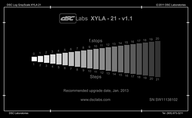
DSC Labs makes all kinds of charts: color charts, resolution charts, focus charts, 3D charts, wide gamut charts, dynamic range charts… if there’s something you want to know about a camera, they likely make a chart that will tell you exactly what you want to know.

For example: do you want to find the TRUE resolution of the image you’re recording? Resolution is affected by so many things—lens, lens aperture, color of light, sensor, sensor processing, video compression—that it’s impossible to know what the final resolution of your image is without looking at all of those things together. That’s when you learn startling things about cameras, especially 4K cameras that don’t actually capture 4K resolution images. (Bayer pattern sensors typically lose 20% of their resolution during the deBayering process, so with even the best lenses a 4K camera will only yield 3.2K—and that’s before video compression. True 4K requires at least a 5K sensor and a very good lens set at a decent f/stop.)

I’ve been doing chart training at the DSC Labs NAB booth for many years now, and it’s always a lot of fun to show people what’s possible. It’s also nice to show how DSC Labs products are consistently made to the highest quality standards. There are cheaper charts, but there aren’t any that are better. It’s insane how carefully these people make their products. Stop by booth C6043 for the tour. I’m there in the mornings, and PVC contributor Adam Wilt is there in the afternoons.
I’ve assembled some of my chart-related ProVideo Coalition articles below. Some are new, some are old, but all show how camera reference charts can be used to reveal the internal workings of any camera available. In a world where manufacturers cut a lot of corners to put out cameras that do amazing things for no money at all, these charts are the only way to find out where all the corners are—before they bite you on a shoot.
Disclosure: I’ve worked as a paid consultant to DSC Labs.
Art Adams | DP
Grading
CAMERAS: A New Chart for Film-Style Production–The DSC OneShot
CAMERAS: Rough Guide to Color Grading with the DSC Labs OneShot
Color
CAMERAS: More Thoughts on Canon’s Color Science, This Time with Pictures
CANON C300: Trimming White Balance, Plus a Look at Daylight vs. Tungsten Color
The Secrets of the Chroma Du Monde, Explained Live (on tape) at NAB!
Step into the Matrix: What I Learned from Examining RED’s Build 30 Color Science
Dynamic Range
How Cameras Really Work
TLCI and Camera Color: What a Difference a Prism Block Makes

Filmtools
Filmmakers go-to destination for pre-production, production & post production equipment!
Shop Now


