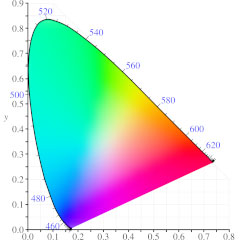
In Part 5 we started to look at the CIE 1931 Chromaticity diagram, the distinctive rainbow tongue that pops up anytime color management is involved. In this article / video, we pick up where we left off and look at how it was actually created. The most pressing question – why is it such a weird shape? – will be answered by looking at the research and work leading up to its design.
This was all originally one video, but it simply got too long – even after splitting it in half, this video is almost half an hour long. So the introduction for part 5 is just as applicable here:
Anyone who’s ever looked up color management – especially using Google – will have seen the funny, multi-colored tongue that is the CIE 1931 chromaticity diagram. But when I saw it for the first time I didn’t feel like I really understood it. It seemed to raise more questions than answer them – why is it such a weird shape? Where did it come from? What’s it for? Nothing about it seemed intuitive. The only thing that seemed really clear was that pretty much any discussion about color management was accompanied by the picture of the rainbow tongue.
Maybe it’s just me, but I always wanted to understand how that shape was made and why it was significant. You don’t end up with an image like that by accident, so presumably there’s some hidden logic behind its design.
There’s a lot of additional information about the CIE 1931 diagram that I’ve skipped over, because it’s possible to demonstrate where the horseshoe shape came from without diving into all of the mathematics involved. In the video, I’ve basically jumped from the Wright-Guild color matching experiments straight to the horseshoe shape, and skipped the bits that happened in the middle. For anyone who’s interested in the bits I left out, there’s a lot of information available online – some of the more valuable articles I’ve found are here:
So far, most of the videos in this series have focused on color, which would make sense for a series on color management. But for the average digital artist, the issues surrounding brightness are far more relevant and pressing. Now that we can look at the CIE 1931 chromaticity diagram and understand what we’re looking at, in the next article we’ll turn our attention to brightness.
If you’re new to this series and want to start from the beginning, then start with the introduction.
If you’ve found this interesting, then I’ve been writing for the ProVideo Coalition for over 12 years, so check out my other articles.

Filmtools
Filmmakers go-to destination for pre-production, production & post production equipment!
Shop Now


