The 5D is fast and portable, but it’s not a professional camera–so know going in that you’re going to have to color correct whatever you shoot.
That’s not a bad thing in itself. All footage should go through some sort of post processing. It’s much easier to finesse a look in post than it is on set, surrounded by crew who show all the enthusiasm of watching you and your DIT play a month-long game of checkers. Expensive checkers, too, if you count their spectating time. (You can be sure the producer is!)
Some cameras need to be painted on-set, and that’s fine as we go into a shoot knowing that. But when you shoot with the 5D you’re not using it because its footage will match the quality of a Sony F35, an Arri D21 or Panasonic Varicam 3700. You’re using it because:
(1) It’s cheap;
(2) It’s small;
(3) The picture quality is half-decent, with 35mm depth of field;
(4) It’s inexpensive; and
(5) It’s cheap.
I’m a big fan of color correcting high-end raw camera footage, but I’m even more fanatical about color correcting footage from small cameras. If there’s a cost-effective way to take your footage to the next level, why not do it?
This spot is a spec spot, which means no one is getting paid for anything, especially color correction. Since I’ve fooled around with low-end color correction tools for a while I volunteered to tweak my own footage. I’m nowhere near as good as a professional colorist would be, but I’m a lot cheaper.
In this case the client wanted big, bright colors that would appeal to children and reflect the colors in their logo, so instead of desaturating colors (as is the trend) I found myself saturating them. That reinforced a discovery I made a long time ago: desaturation solves a lot of problems, whereas saturation often causes them.
I’ve broken out each shot by color correction steps, and I’m going to go through each one and tell you what was going through my mind when I did what I did. All the steps but the final one were done in Magic Bullet Looks, adding and tweaking one module after another. (The module names are noted on the stills themselves, and they are cumulative.) The final touch to each image was the addition of a digital filter from Tiffen’s DFX 2 digital filter suite.
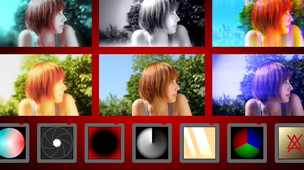
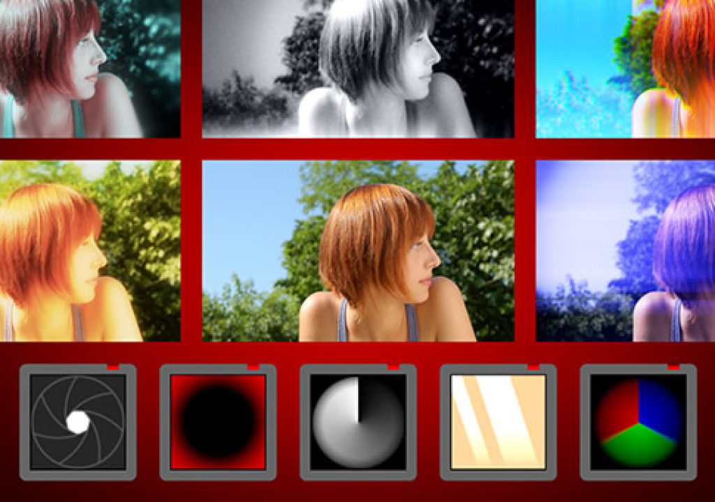
This image, helpfully stolen from the Magic Bullet web site, shows the modularity of the Looks system. The squares along the bottom row are effect modules, and they build on each other from left to right. The square with the red circle inside it, for example, is the Edge Softening module, used to blur portions of an image to direct attention elsewhere. (I once saw a magician use this live on stage.) The yellow square with streaks through it is the Grad module, and the module immediately to the right of it deals with Saturation. The other modules are classified.
Why use these two tools instead of a pro solution like Color? Other than Color being a bit buggy, it also takes me away from my timeline, making me work in another application that then renders the results back to a new timeline. I prefer to work on the timeline itself, viewing and reviewing clips and making minor adjustments in multiple passes. It’s not the way a professional colorist would do it, which is good as I’m not a professional colorist. It works fine for spec projects and experiments.
Also, Color has a steepish learning curve, so while I’m learning it I’m still able to make some progress by using these simpler, faster tools. There is next to no learning curve when using Magic Bullet Looks and Tiffen DFX 2. It was harder entering the product serial number during installation than doing anything else.
Turn the page for the first shot…
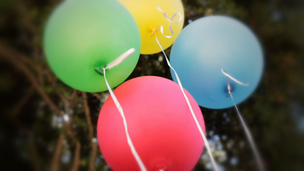
We had no idea, when we shot this, that it would be the opening shot of the spot. I believe we shot this second to last, just before shooting Cary’s final line. (Cary was the son of the director/editor, Simon Sommerfeld.)
This is a Leica 35mm still lens, with a Canon mount adapter, probably around F8 to hold all the balloons in focus.

This is the original shot as it popped up in Final Cut Pro. The trees look like they’re being hit by a reflector but I’m pretty sure that’s just ambient bounce light off of sand. You have no idea how hard it is to make balloons follow instructions. Worse than kids filled with helium, although the kids’ voices under helium are a lot funnier.
We used a 35mm Leica still lens on this shot. It looks like I stopped down a bit to hold focus on all the balloons. I’m probably at F8, and so is the lens.

Lift/Gamma/Gain is the name of a module in Magic Bullet Looks that allows the user to tweak lift (pedestal, or black level), gamma (mid-tones) and gain (highlights, or overall signal strength). These three controls will achieve a significant amount of what needs to be done to the overall image. They all interact, so adjusting one requires readjusting the others. For example, boosting gain brings up both the mid-tones and blacks, although not as much as it does the highlights.
Adjustments to the overall image are “primary” color correction. Adjustments to a portion of the image or a range of color are “secondary” color correction. Nearly everything I do here is primary color correction. (Tertiary correction is when the director calls and asks me to change something.)
In this case I probably left the lift and gain alone and opened up the gamma slightly, brightening the mid-tones.
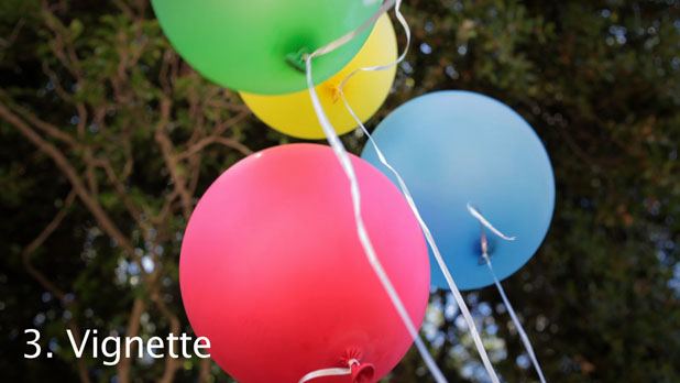
I’m a sucker for a good vignette. The Vignette module is like a circular grad, clear in the middle but darker at the edges. It’s a great tool for subtly directing the eye toward a specific place in the image by darkening everything around it. In this case it looks like I just darkened the corners a little.
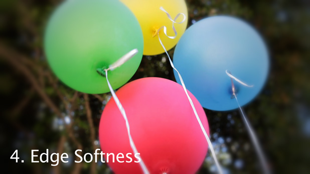
Another tool for directing attention is the Edge Softness module. I like the Lensbaby selective-focus look, especially when the corners of the frame are filled with gack like bright tree branches. Sometimes the best way to make an image interesting is to mess it up a bit. (Or at least that’s my excuse while shooting.)
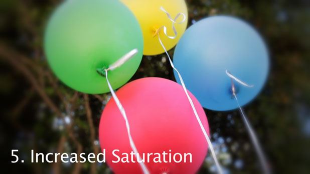
I boosted the saturation a bit here, although it’s hard to tell as I don’t think this JPEG can handle the increased color.
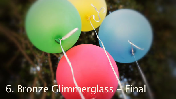
The last step in every shot in this piece is the addition of a Tiffen DFX 2 Bronze Glimmerglass filter. We wanted the look to be a touch soft and a little warm, and as most of the shots were either fairly neutral in white balance or were made neutral later, the Bronze Glimmerglass filter allowed me to add a precise and consistent amount of color to every shot.
We found that the full effect of the digital filter was too much, so I turned off the halation portion of the effect. Try doing that with a glass filter! (Actually I did, and I’m still paying it off. Quick tip: don’t use steel wool.)
———————————————————————
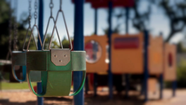
This is a Canon L-series 85mm autofocus lens set to manual focus. I originally set this shot up at F2.8 but only the hinge on the front swing was in focus. I decided to stop down to F8 to hold focus on the first swing, knowing that I could later blur the objects on the right side of frame.
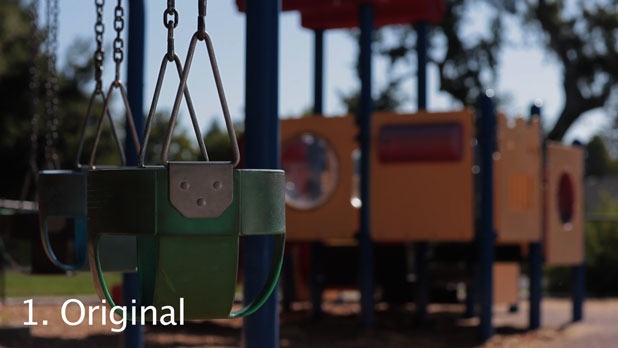
Here’s the raw H.264 file. It’s a bit dark as I’m trying to hold color in the sky and not blow it out. It looks a little muddy but all the shadow information is there, ready to be tortured from the image.
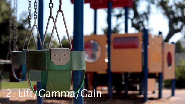
I boosted gain a lot to make the bright side of the front swing pop. It’s got a nice hot edge on it that I really like. I kept the gamma down, in order to keep the left side of the front swing a little dark, and maintained the level of the blacks as they look pretty good.
If this shot was a prisoner of war it would have given up everything as soon as it saw me cleaning my teeth with a toothpick. It was that easy to open up the mid-tones.
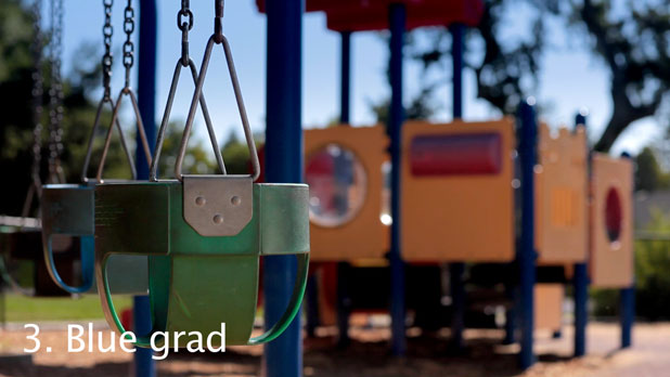
This spot was all about color, so I used the Color Grad module in Looks to bring some blue back to the sky. Actually, as I’ve discovered from playing around with skies in Photoshop, they are actually more cyan than blue.
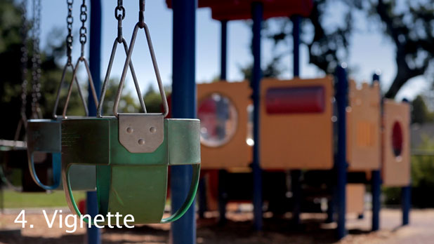
The Vignette module takes the corners down a little in brightness while keeping the front swing roughly the same. By now the swing is developing quite an ego.
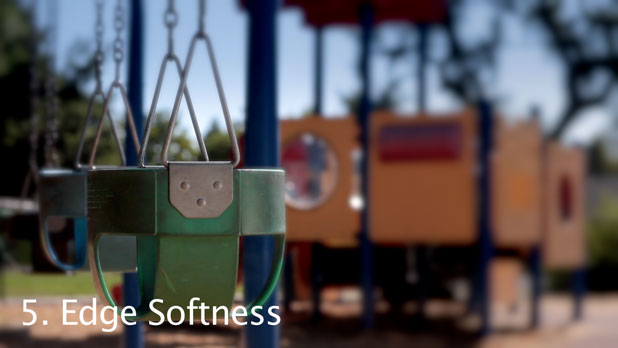
The Edge Softness module increases the feel of an out-of-focus background, further directing attention to the now swaggering swing.
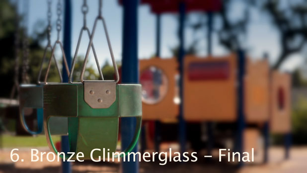
And a little yellow-orange Bronze Glimmerglass warms it all up like hot cocoa at the Russian Front.
Turn the page for more…
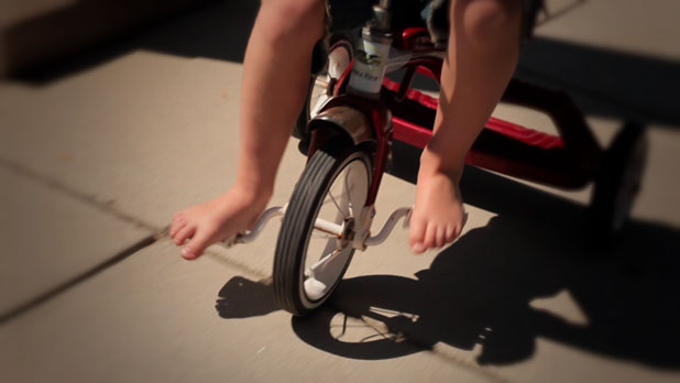
I’m being pulled backwards on a wheelchair, shooting handheld. I stopped way down on this one, probably to F8, just to make sure I didn’t run into focus issues as the distance between the wheelchair and tricycle changed. Not that the dolly grip wasn’t excellent. (It was the director. He did okay. Don’t tell him, he’ll get all proud.)
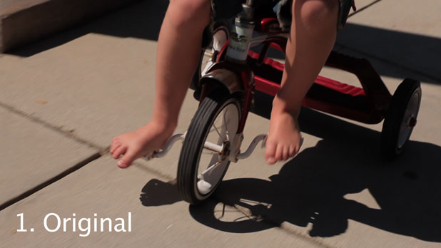
This shot is okay on its own, but it could be a little better. I think I underexposed a little bit to protect highlights that snuck in over the course of the shot. I found myself constantly coddling the highlights on this camera. Someday they’ll be all grown up and out on their own, and then what? I should have toughened them up a bit.
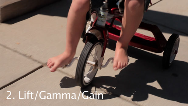
I boosted the highlights a little to make the sun on Cary’s legs “pop” a little more. Silly, spoiled highlights.
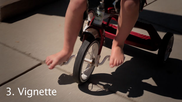
I do love a good vignette. In this case the Vignette module in Looks adds a little interest by reducing the evenness of the sunlit ground and bringing the eye to the center of the frame.
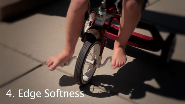
The Soft Edges module adds a little more interest. It’s not exactly the Lensbaby effect, but it has a nice rough feel to it.
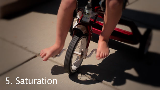
As this spot was all about color I enhanced the red of the tricycle and made it the same vector as Cary’s shirt. You haven’t seen his shirt yet, but you will in the next shot. It’s a nice rich Communist red, a nice tribute to the united workers of the world.
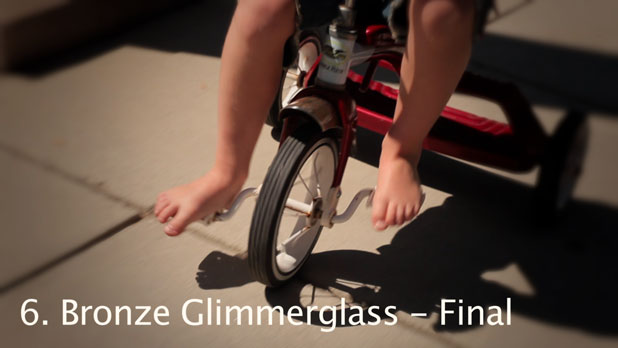
And the final touch, the Tiffen DFX Bronze Glimmerglass filter–a soft kiss of effervescent autumnal coloration added to an otherwise sultry summer day.
———————————————————————
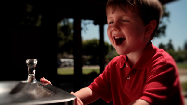
I love lighting simply, and this was about the simplest lighting setup ever. I just put a 4×4 bounce card on the far side of the water fountain, where it leaned against the wall and bounced sunlight back into Cary’s face. Fast and simple, which is the way you have to work around four-year-olds. Not that he was much trouble at all, and in fact he was so well-behaved for the most part that I swore the director must have been slipping him cough syrup between takes.
Cary’s shirt in this shot became a color reference for the rest of the spot. I made the red in his shirt as saturated as possible while still remaining broadcast “legal” and matched the vector his shirt created on the vectorscope in every other shot in the spot. I’m going to call it Cultural Revolution Red.
This is the Leica 35mm, around F4.
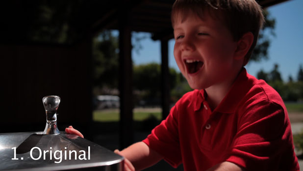
As you can see, the “bones” of the shot are there. I underexposed a little to hold the highlight on his shirt. The light on his face is very nice but I want to make the highlights a little brighter and the shadows a little darker. I’m always protecting the highlights, which is a problem as they’ll never grow up properly that way.
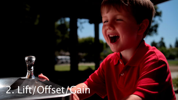
Lift/Offsett/Gain works differently from Lift/Gamma/Gain. When you adjust lift, gamma or gain, you’re adjusting either the blacks, the mid-tones or the highlights, but you’re doing so in a way that causes them all to interact. In this case I wanted to boost the gain and the gamma to make the highlights on Cary’s face a bit brighter, but without lifting the blacks–and I couldn’t make that happen with Lift/Gamma/Gain. I’d raise the gamma, which pulls the blacks up, and then lower the blacks back to where I wanted them, pulling the gamma back down.
I’d always wondered what Offset/Gamma/Gain was good for. It turns out that Offset simply adds or subtracts values from the entire range. If you lower or raise Offset, every level in the image raises or lowers equally. In this case I was able to increase gain and boost gamma fairly severely, stretching them both away from black without raising black as well.
If you compare this image to the one above it, you’ll see that the shadow side of Cary’s face is nearly the same but the highlights on his face are brighter and richer. That’s the look I was going for, and I couldn’t get it any other way.
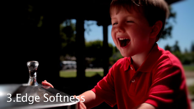
Our old friend Edge Softness blurs the sides of the frame and directs attention in toward the fountain and Cary’s face. It’s subtle, but it works.
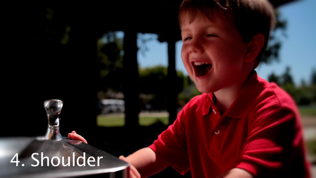
The Shoulder module is a dangerous tool to use when color correcting off an LCD monitor. I use two calibrated Apple Cinema Displays, and what I’ve learned is that these displays reproduce highlights vastly better than a Rec 709 monitor can. In the past I’ve boosted highlights to a level where they look good on my display, although the waveform says they’re off the chart, and when I burn those projects to DVD and watch them on a Rec 709 monitor the highlights are gone.
The Shoulder module is like a knee control. It puts a heavy slope on the exposure curve in the highlight range, bending out-of-control highlights back to within “legal” limits. I use this tool judiciously as it’s very easy to boost the highlights out of range and then bring them back with Shoulder in a fashion that looks fine on my LCD display but makes them unwatchably bright on a broadcast monitor.
In this case I used just a touch of Shoulder to reign in the overexposed shirt highlights. I brought them them down until they were just touching 100% on the waveform.
These particular highlights are obviously terribly spoiled. Over time they wanted to throw an impromptu party and there was nothing I could do but deal with them in post. Keep reading, you’ll see.

Cary’s shirt became the standard red reference that I used for every subsequent shot. I made note of what vector it fell on in the rotational axis of the vectorscope (which displays hue) and the lengthened the vector (increase saturation) until the red was just short of the red box on the vectorscope. I then took a little bit of saturation out of the highlights as the red shirt was starting to turn blue. (More on that later.)
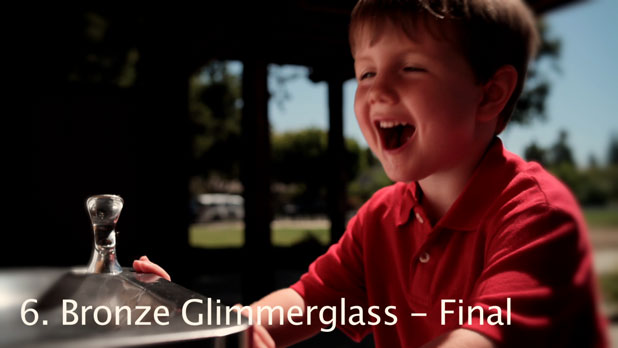
Last but not least, the Bronze Glimmerglass adds a snifter of happiness to the proceedings.
More about the ups and downs of coloring on the next page…
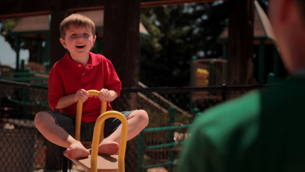
We lit this shot very quickly, as you do when working with young children, and most of the light is coming off either the sand below the frame or two 4×4 bounce cards to the right of camera.
This is the Canon L-series 85mm, probably at F4 or 5.6.
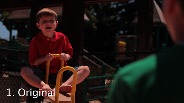
My original exposure was a bit dark to coddle the highlights. I was very aware that Cary’s bright red shirt wanted to clip the red channel, and I wanted to stay away from that “video” look if at all possible. It would have been incredibly bourgeois and an insult to the masses to do otherwise.
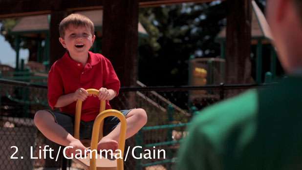
I used Lift/Gamma/Gain to bring the gamma up (open up the mid-tones). I brought up the gain just a touch as well, judging by the highlights in Cary’s hair.
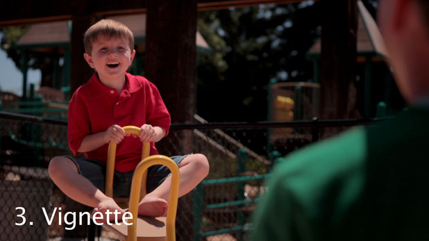
I used a subtle Vignette, centered on Cary, to make dad a bit less prominent. It’s a pretty subtle effect, and is in no way meant to denigrate the role of dads everywhere. (No phone calls from the Fathers Defensive and Benevolent League, please.)
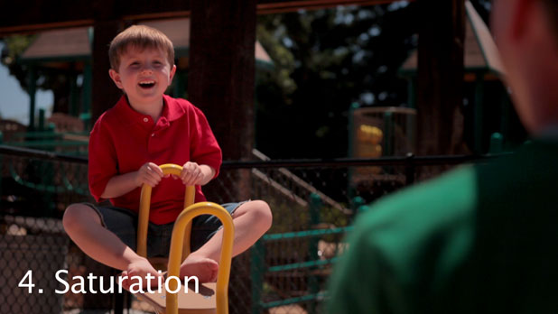
I manipulated the Saturation module to match the hue and saturation of Cary’s shirt to the previous shot, matching the rotation and length of the vector in a vain attempt to relive the glories of the former Soviet Union. (Did you know they were the first to send a dog into space? Sadly the government ran out of milk bones and was unable to lure it back. Also, it preferred endlessly circling the earth to the glories of the Soviet People’s Republic.)
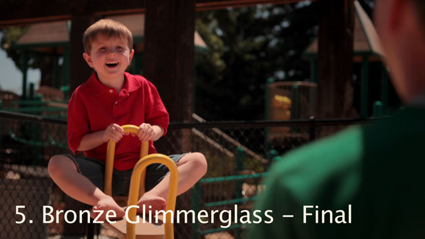
And our old friend, the Bronze Glimmerglass filter, brings an extra ray of sunlight to the shot.
———————————————————————
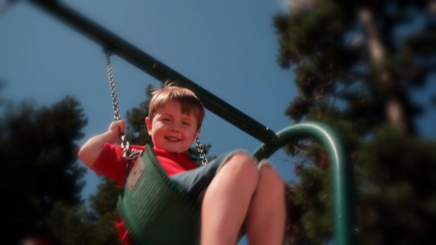
The swing shots were tough. I raced around handheld, trying to get enough coverage in the few minutes we could keep Cary happily swinging. In this shot I’m lying on the ground, on my back, trying to find a nice competition that didn’t include a lot of background gack. (I swear, “gack” is a perfectly legitimate word. I think it has Medieval origins. Very old and established.)
This is the Leica 35mm, probably around F4.
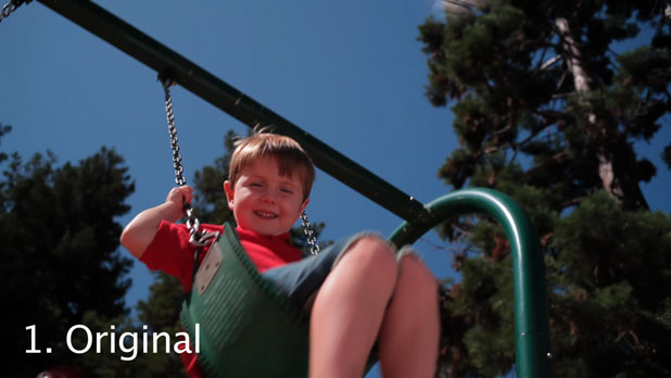
The shot, as I shot it. The shadows weren’t as deep as some of the other shots so I was able to expose “normally” without spoiling highlight detail. (This was a vain attempt to toughen up the highlights, who had been spoiled until now. They simply laughed at me.)
There was no fill except for the bounce off the sand just below frame. We could have filled more, but that would have taken precious “child in a good mood” time.
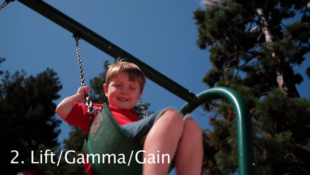
I didn’t do much here except to boost the mid-tones a touch. Under Communism each worker has their role, and the gain guy was out standing in line for three hours to buy a crust of bread for lunch.
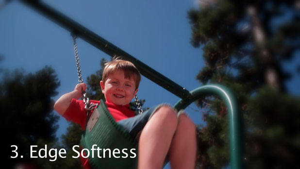
I do love me some Edge Softness. I thought it made the shot a little more interesting and made the stark and contrasty trees a little less ominous. More “High Sierras” and less “Black Forest.”
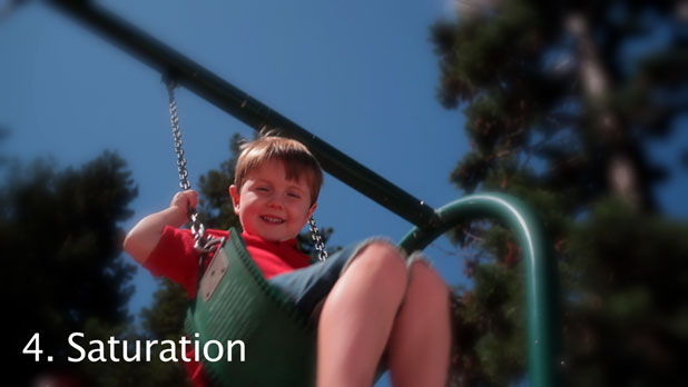
Once again, matching the shirt to previous shots according to the dictates of Mao’s Red Book.
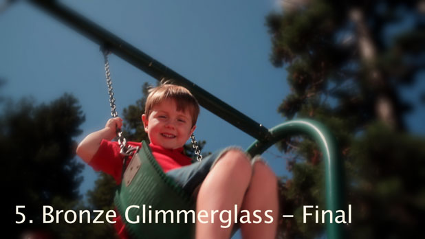
And a final whisper of warmth, sighing through the warm summer air. The Bronze Glimmerglass desaturates the sky somewhat, but I think that’s okay as it competes a little less with Cary’s crazy red shirt and complies with the director’s request to make Cary the most saturated thing in the frame. (Honestly, I think he was talking about the shirt, although he was holding a bottle of cough syrup at the time…)
More swinging to come on the next page…
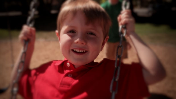
This shot and the water fountain shot are my two favorites. Once again this is me running about handheld, finding a frame, and letting it play for a bit before running around and finding another one. Each shot according to its needs…
I should note that I had to grab focus by eye while Cary was swinging, a feat that was made possible–in spite of the 5D’s very low resolution LCD display–by the Zacuto Z-Finder.
This is the Leica 35mm lens, probably around F4.
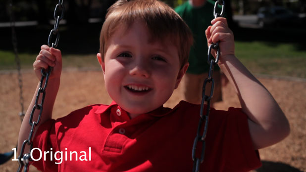
Here’s the original. From this angle I’m protecting shirt highlights again. I could have opened up a little more but without precise exposure telemetry, like a histogram or zebras, I opted to play it safe–much like Russia’s centrally-controlled economy.
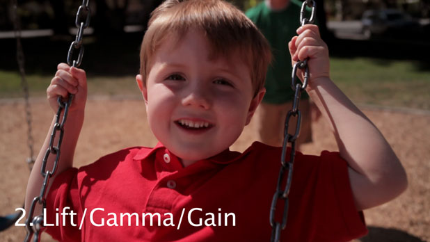
Gain and gamma are boosted to reduce the harsh shadow on Cary’s face. The shadow becomes softer, kinder, and gives generously to charity.

Darkening the corners makes the frame just a little more interesting and focused on Cary.
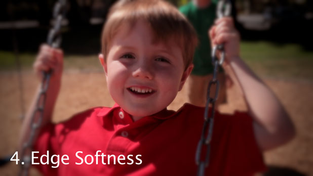
Edge softness focuses our attention even more, and creates the illusion of shallower depth of field than there really is.
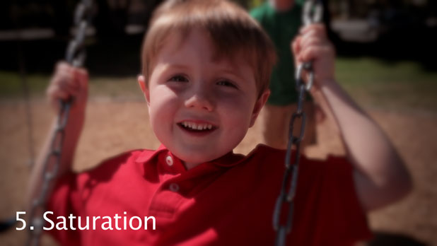
Once again, matching the shirt to previous shots. It looks like I used the Saturation module to bring Cary’s shirt back within “legal” broadcast limits and to conform with the color scheme of the 30th Annual Soviet Military March through Moscva.
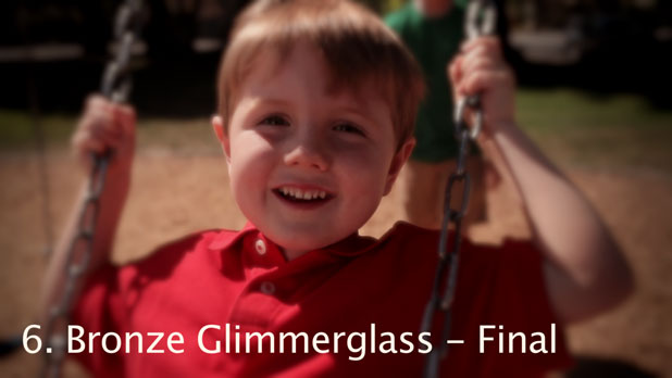
Lastly, the Bronze Glimmerglass filter garnishes the frame like a bit of golden yellow onion placed atop a raw herring.
———————————————————————
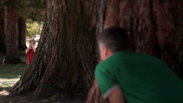
Believe it or not, this entire area was lit with two 4×4 bounce cards covered with Reflectix set about 15′ feet away from the close tree. By feathering them we were able to achieve even fill light across the entire area, which is a good thing when working with kids.
Cary had a little bit of a meltdown before this shot, and Simon used reverse psychology to bring him back. I was most impressed. I tried the same trick later on with my dogs. “No, I don’t want you to sit up. Nope, you can’t sit up for me right now. Don’t even think about it.” And they didn’t. Clearly dog psychology is more complex than kid psychology. Now I know why dog psychologists get the big bucks.
Leica 35mm, probably around F4.
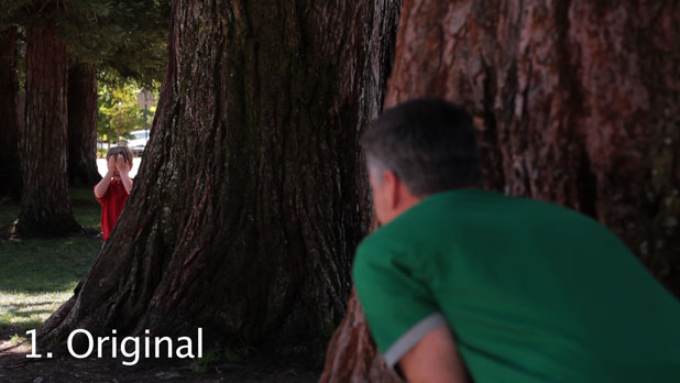
The original is a little bit down, but not much. I was very cognizant of the bright background highlights behind Cary’s head and I underexposed very slightly to hold detail in them. It was around this time that the highlights demanded their own trailer and a masseuse.
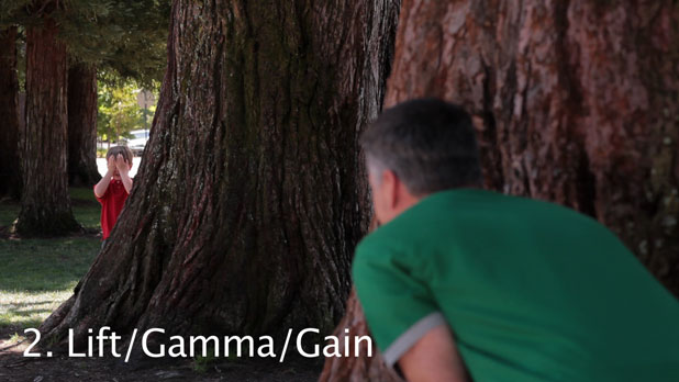
I boosted the gain to make the shot a touch brighter.
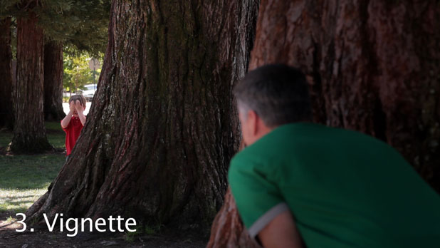
Centered on Cary, the Vignette module reduces the prominence of dad’s green shirt, leaving his face alone. (Yes, yes, I get that dads are important, but this wasn’t personal. It was simply an artistic choice.)
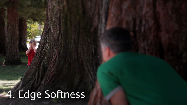
Edge Softness creates the illusion of less depth of field than there is. (If reality is an illusion, did this shoot really happen?)
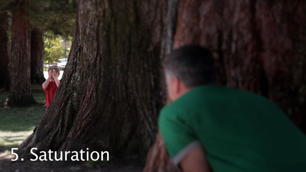
Even though Cary’s shirt is a very small portion of the frame I was able to see it very clearly on the vectorscope and match it to previous shots according to the dictates of the Bolshevik Revolution.
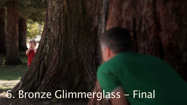
Ah, a hint of summer, because at 95 degrees it wasn’t already hot enough.
———————————————————————
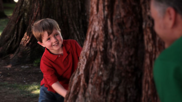
This was an easy close-up to shoot. We brought Cary forward to the close tree and pushed the camera in some. Here you can really see the modeling on the camera left side of his face from the two distant Reflectix boards. The edge on the right side is simply reflected skylight.
There are no highlights in this shot as they left, saying something about a three-martini lunch and a strip club by the airport.
Leica 35mm, F4.
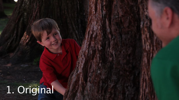
Not sure why this original turned out darker than the one above. Gremlins? (I think it was because the shot was originally framed higher, making the bright background more prominent, so I protected for the highlights. And then, as happens so often when working with kids, the shot changed.)
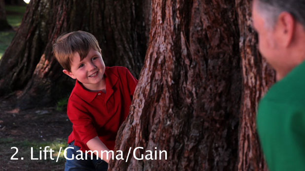
Brought up the gain to make the image brighter. This was no reflection on Cary, who was plenty bright on his own. Too bright, in fact. I had no idea that the “E” in the “E=mc^2” equation stood for “Emu.”

Once again, the vignette brings dad down in prominence. We know he’s there, but for the second or two that we’re watching this shot we should be focused entirely on Cary. Because, you know, if Cary was in danger dad would sacrifice himself to save him, and so we sacrificed dad here for the good of the spot. (Please, no more phone calls. Next time we’ll shoot a spot entirely about dads.)
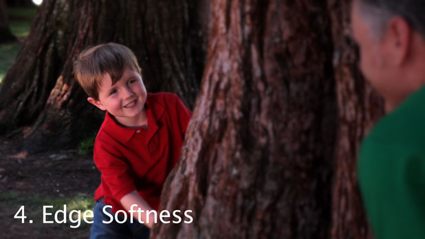
I blurred dad a little more, just to be malicious, because the phone calls have become really annoying.
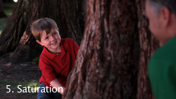
Matched Cary’s shirt to previous shots and previous eras of near world supremacy by several fallen socialist republics.
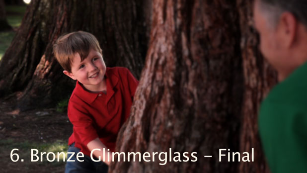
And finally, like a whisper of madagascar cinnamon sprinkled onto a vanilla bean latte, the Bronze Glimmerglass finishes everything off.
Brace yourself for the grand finale, on the next page…

Just your average shot of a dad and son describing the emptiness of life by inscribing zeros in the sand.
I’m fairly sure this shot was done on the Canon 85mm, probably at F4.
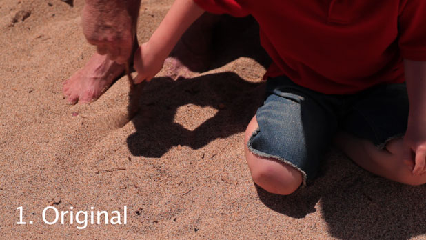
I exposed fairly normally on this shot. There’s nothing here that’s particularly extreme, although Cary’s shirt did wander through sunlight on occasion and get very bright indeed. The highlights were back, sozzled, and wanted to show off.
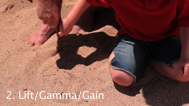
I brought everything up to a nice peppy level before I started knocking bits down again, just as happens in life.
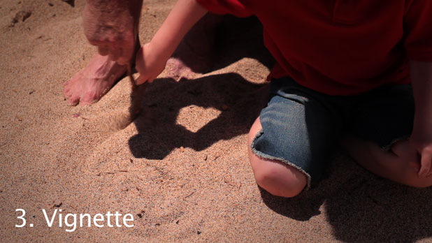
This time the Vignette module is centered on the circle, making it “pop” just a little bit more than the rest of the sand and emphasizing the pain and ennui of existence.
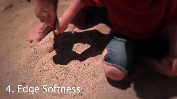
Edge Softness, because I could. Actually it helps create the illusion of an imperfect lens that’s hinting at the full frame but only clearly showing a part of it.

Matching the shirt, yada yada yada power to the people yada.
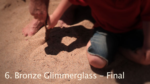
Like the dusting of ground cloves on the surface of a mincemeat pie… the Bronze Glimmerglass.
——————————————————————–
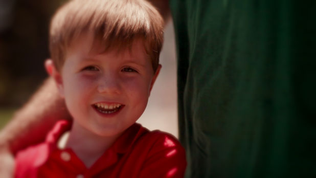
This was a tough shot. This is the Canon 85mm at F2.8, to keep the background kids too soft to recognize. I was very nervous about judging our limited depth of field on the Canon’s LCD display and we shot a safety take at F8 that looked not as good as the others. I’m glad Simon Sommerfeld (director/editor/”dad”) was able to use an earlier take.
Cary had melted down and been reconstituted by our director several times by this point. Each time he rallied back to his usual cheerful self but we knew we had limited time to get this shot. Revolution will not wait.
As we had an all volunteer crew (this being a spec spot) our key grip had to leave early, saying something about a protest march over the high cost of potatoes and the failure of central government cost controls. As a result I wasn’t able to add any fill light to this shot at all because I didn’t have time to run and get the bounce materials myself.
We waited for Cary and dad to step into the shot and immediately rolled.
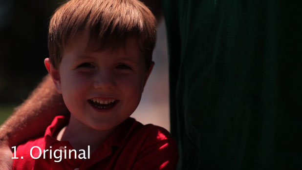
I’m protecting, without much success, a VERY hot highlight on Cary’s shoulder. The highlights are completely full of themselves now, swearing at the crew and stumbling about talking about wanting to be treated like highlights on a big budget action picture, where they can do anything they like.
I do like the hint of blue skylight you can see reflecting on Cary’s skin. It gives the shot an interesting warm/cool dynamic, a hint of capitalism in the Worker’s Paradise.
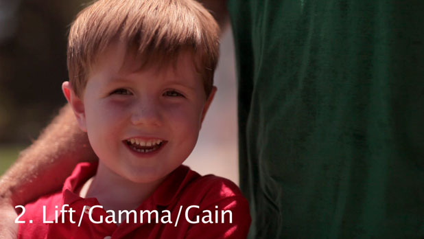
This shows how much detail there was in the shadows. This shot is a touch noisier than the rest because I had to boost the gamma so much, but for a rushed shot with a child actor who was about to dissolve into a puddle of emotions this turned out quite well.
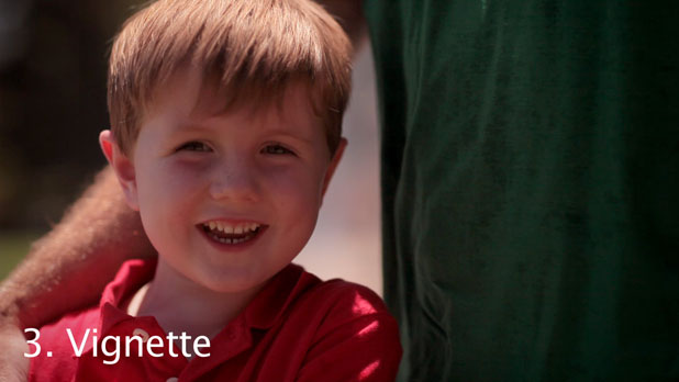
Once again, knocking dad down in stature. Cary will do this himself in his teen years.
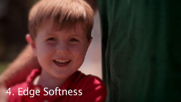
Edge Softness, primarily to make dad’s arm less obvious and eliminate some of the ghack (alternate spelling, look it up) on dad’s rumpled green shirt.

I matched the dark portions of Cary’s shirt to previous shots, but the highlights went a little blue. Adam Wilt tells me this is most likely because the red channel was completely clipped, allowing whatever blue was in the fabric to overexpose and become more noticeable. I think it’s a response to the poverty suffered by the masses in contrast to the wealth manifested by the Party bosses, but I could be wrong.
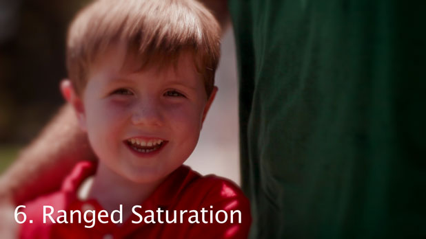
After trying to isolate this highlight in other ways, and failing miserably, I used the Ranged Saturation module to desaturate the highlights enough that the blueish tint to the red highlight wasn’t so obvious anymore. It also took a little color out of Cary’s hair, but I figured that would come back with the Bronze Glimmerglass. The Bronze Glimmerglass solves everything. I’m thinking of carrying one with me at all times just for that reason. Need a cab? Bronze Glimmerglass. Letter from the IRS? Bronze Glimmerglass. Untimely death of a loved one? Bronze Glimmerglass and a 1/2 White Promist.
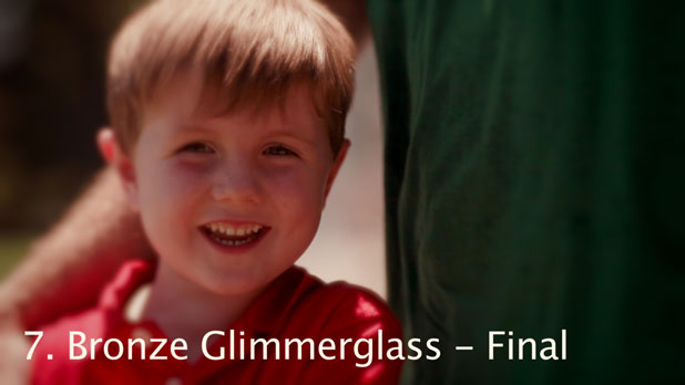
I was right, the Bronze Glimmerglass saved the day, like a lemming with a handgun at a barnyard pie fight. (No, I don’t get it either. It just sounds like something I’d like to see someday.)
And there it is. Nice footage, nice camera, made nicer by a few tweaks in post. Don’t skip this step. It makes everyone look good and the clients happier.
——————————————————————–
Art Adams is a DP who rarely colors within the lines. His web site is at www.artadams.net.

Filmtools
Filmmakers go-to destination for pre-production, production & post production equipment!
Shop Now