A slide show featuring winners is a must-have for every awards banquet. From the Oscars and Emmys on to specialized industry recognitions, all these events showcase the accomplishments of nominated individuals and organizations. The public loves exciting recaps of important civic contributions and stars, just as much as entities want to introduce or remind the audience of their messages. Oscar night budget aside however, most organizations have less-than-adequate image library assets to work with, and the results are usually dull and predictable.
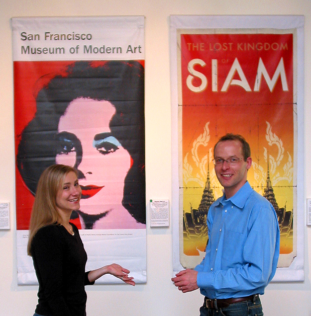
A happy and timely accident! One awardee’s business featured a Warhol exhibit banner of Elizabeth Taylor
Here’s how to take Oscar inspiration and run with a modest budget and minimal assets.
Our specific assignment for this project was a 30-minute film introducing 12 award finalists, with interviews of the principals. The lead in was the problem. Getting 800 corporate types to stop networking, take their seats and pay attention is always a difficulty. The initial 2-minute presentation had to have punch and compelling interest. Somehow all 12 finalists had to be featured along with stills of projects they accomplished.
We were given a meager library of promotional images and logos, submitted by the entities themselves. What a sorry collection it was! Some of the finalists were large corporations, yet their photography assets across the board were a joke. Many were only 40MB files! Out of focus, poor color, uninteresting snapshots. Only two firms knew what I wanted when I asked for vector file logos.
Like most NGO or civic entities, our client has no extra budget to make better images. I’ve faced this constraint often, and know I can count on the Animoto slide show utility to make a stunning presentation. That is if I do my advance job with image optimization and clever editing. For best results I fix color and density, crop for impact, add clarity or sharpening, along with up-rezing or standardization of files to 1080px high @ 100DPI. Pre-production effort is absolutely necessary when you’re going for giant screen presentation. I go through the same optimizations, whether images are professional or marginal quality.
That’s the tech part; the art part has three elements. Edit your images down to only the best ones that will show well in a fast slide show, and make further crops for up-close impact. Put the images in a believable sequence that tells a story. Pick just the right music for the crowd, venue, subject matter and intent. This is where you show your innovation; devote time and understanding of the client needs. Once I’ve taken care of these elements, Animoto has never disappointed me.
Once I’ve optimized, sequenced and scored, the Animoto software does the rest. My sizing formula (I’ve written it as an action) allows images to upload quickly. The interface makes it easy to correct an error in quantity, omission or sequence. Think carefully to highlight the most important images, telling the automation to give extra visibility to certain images. It’s fantastic to audition music and select from a genius collection of various copyright-free music genres. Did I mention it’s lightening fast? My Animota are ready for screening in about the time it takes to get a coffee. And if the first automated slide show doesn’t suit you exactly, remix it for an entirely different result. Mostly I’ve remixed when I wanted to add more images or change sequences or speed.
For the presentation shown here in full, there were four more elements needed over and above the Animoto itself. A graphic lead-in with part video and part stills, an announcer voice over, a way to highlight the 12 finalists by face and name, and an ending credit for us. The HD download drops right into Final Cut Pro, allowing Karl to combine a couple of my event logo backgrounds with his vision of moving light graphics. He pulled in crowd cheers and applause from wild sound, and laid in the voice over, which we recorded in our sound stage. He already has our standard end credit in the can, ready to drop in. He cut and pasted the music track to extend over the credits. It took several iterations to figure out how to feature the finalists. Business names alone did not work, nor did company logos or portraits. By making image collages in Photoshop of portraits grabbed from the Sony EX3 interview capture along with the business names and logos I was able to establish the 12 identities, both foreshadowing and reinforcing continuity with the video interview messages to come.
Example of Photoshop collage used to establish company identity and facial recognition of awardee
On the day of the event, the audience went silent and applauded – they loved it!
While you can’t control the actual transitions used in the Animoto slide show because it’s a computer generated automation, I’ve found that with pre-production I can come very close to a hand-made look. Full HD downloads happen quickly and play well on theatre size screens in big halls. The time you’ll spend is a fraction of what would be needed in a video editing program with a talented editor. Animoto makes an eye popping presentation relatively easy and completely affordable. Even a sophisticated audience who has seen it all will be captivated.
