In part one, we looked at how ARRI built a lens with a modern-yet-beautiful look for the future of digital cinematography. Now we’re going to tear it apart. Carefully.
If you haven’t read part one in this series, you might want to take a look before starting on this article. Get ready, I’m going to throw a lot of information your way!
What does it mean to create “a modern take on a vintage lens?” Because ARRI Signature lenses are so precisely tuned already, we can introduce some very specific aberrations by adding a single optical element to the back of the lens. These aberrations are “HDR friendly” in that they do not significantly impact the highlight or shadow reproduction of the lens or add unwanted color fringing.
We’re actually adding or enhancing optical aberrations, which is a much more complex look than can be achieved using diffusion alone.
THE NET HOLDER, AND SO MUCH MORE
Every ARRI Signature lens comes with a net holder. We’re a film company at heart, and we thought this would be a fun and useful addition.
As we also like to experiment, we ordered some simple diopters from an eyeglass lab and applied them to the back of a Signature lens using this net holder.

We learned several things from this experiment:
- Cinematographers liked the look but wanted it to have more character, as opposed to just being “sloppy.”
- Commercial and music video crews were okay focusing by eye, but feature and television crews demanded accurate focus marks.
Eventually we found a formula that worked by starting with a diopter “core” and building additional aberrations on top of that. This process resulted in the ARRI Impression V (“Vintage”) series of optical elements, the first in what we anticipate being a long line of creative tools for Signature lenses. We also found a way to make focus marks track properly!
Before we proceed, you should understand what the filter names mean.
Positive optic elements: based on a positive diopter, with some extra secret sauce. Strengths are:
-
- 070P (core is a +0.70 positive diopter)
- 140P (core is a +1.40 positive diopter)
- 230P (core is a +2.30 positive diopter)
- 330P (core is a +3.30 positive diopter)
Negative optical elements: based on a negative diopter, with some extra secret sauce. Strengths are:
-
- 050N (core is a -0.50 negative diopter)
- 100N (core is a -1.00 negative diopter)
- 200N (core is a -2.00 negative diopter)
- 290N (core is a -2.90 negative diopter)
The numbers don’t match between positive and negative due to the difference in glass thickness. For example, a stronger negative filter might impact the sensor coverglass. Glass hitting glass is never a good thing.
Most of the images that I will show compare the strongest positive filter to the strongest negative filter. Keep in mind there are three weaker strengths in each range, so if you find these looks too strong you can easily back off to a lighter strength.
THE THREE KEY ABERRATIONS
Impression V elements add an actual optical element to the rear of the lens. They introduce the following aberrations that are commonly found in vintage lenses:
Spherical aberration. Light rays passing through the center of the lens focus at a different point than light rays passing through the outside of the lens. For example, the light passing through the center of the lens might focus on the sensor, while light passing through the outer edges of the lens might focus behind the sensor. The effect looks much like a sharp image overlaid on a soft image. Highlights take on either a halo (hot center with dark outer edge) or donut (dark center with bright outer edge) shape.
Coma. Light rays passing through the outside of the lens focus closer or farther from the center of the frame, forcing highlights to take on a teardrop shape that point toward or away from the center of the frame.
Astigmatism. Detail focuses differently in one axis vs. another axis at 90 degrees. The simple way to think of this is to imagine a cross where one of the lines is soft and the other is not, where the ideal result is that both lines are equally sharp or soft.
These three aberrations (and a few more) exist in Signature lenses, because there’s no way to eliminate them completely. Our designers opted for a balanced approach, where these aberrations interact in ways that are artistically pleasing without drawing undue attention. Because these aberrations are so finely balanced, we can throw them significantly out of balance simply by adding an optical element to the rear of the lens, with fascinating results.
Everything that I will show you is something you may encounter in an actual vintage lens. It’s not normally possible to take the vintage look out of a lens and see the difference, so if nothing else, these optical elements should be helpful in learning how to identify aberrations in a vintage lens and anticipate their impacts on the image. For example, spherical aberration has a huge impact on depth of field. (More on that later.)
FACES
There are few things more important than making an actor look good. Impression V elements do this in two distinct ways.
The native look of a Signature lens is natural, and that’s what we see on the left. (Our senior colorist added a little grain to these images for a more filmic look.) The strongest positive filter creates a soft, dreamlike image that works on different parts of the image in different ways.
The positive filter softens faces in much the same fashion as an old portrait lens. The mechanism for both is the same: under corrected spherical aberration. Light rays passing through the center of the lens are focused, and light rays through the outside edges are not. This results in a pleasing softness along with a kind of glamorous glow. The filter in the image above is the strongest positive filter, and there are three lighter strengths starting with “barely visible.”
Cinematographer Ian Rigby was an early adopter of Impression V elements. For this music video, he put the 330P filter on at the beginning of the day and never took it off.
The negative filter softens faces in a different way. Here the effect is produced by over corrected spherical aberration, which is what we find in most vintage lenses. At the point of focus, the image is pleasingly soft, but there is no glow effect. The effect is visible but draws less attention to itself.
Both elements clean up faces nicely, but in very different ways. The positive optic draws more attention to itself, while the negative optic is quite subtle.
NOTE: the strongest optic in each range changes the focal length by about 8%, so the differences you are seeing above are +/-8%, or 16%. Under normal usage, you would not see this kind of image size change.
BOKEH IN THE CENTER: SPHERICAL ABERRATION
Earlier I mentioned that an Impression optic acts on different parts of the image in different ways. Over and under corrected spherical aberration deliver wildly different looks to out-of-focus backgrounds. This means we can use Impression V elements to create bokeh very similar to what you’d find in a vintage lens. The difference is that a vintage lens will offer only one option per focal length, while Impression V elements deliver two options, in four different strengths, in the same lens.
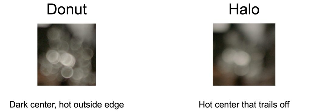
The native bokeh of a Signature lens is very soft and smooth on both sides of the point of focus. Adding a positive or negative optic, however, changes that significantly. The positive optic will produce halo bokeh in the background, while the negative optic will produce donut bokeh.
It’s important to note that the opposite type of bokeh will always appear in the foreground.
These different types of bokeh produce very different effects on backgrounds. For example:
The native Signature look is very soft and smooth. At T1.8 there’s a little bit of a swirling sensation due to some cat’s eye vignetting at the edge of the frame. (Signature cat’s eye bokeh is symmetrical at every focal length.) Despite the amount of detail in the background, the eye slips naturally back to the point of focus.
The positive Impression V optic makes the background softer with a stronger swirling effect that draws my eye inward. The image feels very dreamlike to me.
The negative Impression V optic retains a lot of background texture. The frame feels more energetic as there are a lot of hard edges that cause my eye to move around the frame. The swirling sensation is gone.
A closer look at the structure of the bokeh reveals significant differences. The native look is soft and smooth. The negative optic causes background edges to interact, creating lots of high contrast edges in the out-of-focus background. The positive optic’s look is very soft, but interactions between foreground and background objects still produce a small amount of residual detail.
These images, shot by cinematographer Jeff Berlin, show how the cat’s eye shape changes between the different elements.


Here’s an example of a negative Impression V filter in action.
Another project by DP Ian Rigby, this time showing the off several strengths of negative Impression V elements. Pay attention to the bokeh in the forest shots. Rigby calls his negative Impression V filters, “portable K35s.” He uses them on both Signature Primes and Signature Zooms.
You may have noticed some differences in the quality of highlights in above images. There’s more going on than just spherical aberration.
BOKEH AT THE EDGES: COMA
In the examples above, I mentioned coma. Coma occurs when light passing through the center of the lens focuses at a different distance from the center of the frame than light passing through the outer edges.
The bright point of the arrow shapes is where light passing through the center of the lens is focused. The wide end of the arrows is where out-of-focus light passing through the outside of the lens lands.
The arrowhead shape is also affected by astigmatism, which, under certain circumstances, can flatten and distort the arrowhead shapes considerably.
In the image on the left, light rays coming through the center of the lens focus farther away from the center of the frame than does light through the outside edge of the lens. The arrowhead shape creates a swirling sensation when there are enough point sources in the frame.
The inward pull of the negative optic’s coma, where light rays coming through the center of the lens focus closer to the center of the frame than do light rays coming through the outside edge, eliminates this swirling effect.
PUTTING IT ALL TOGETHER
We can see the differences in coma and spherical aberration combining to create interesting effects in the following images.
Without an optic, Signature Primes exhibit a very pleasing cat’s eye at T1.8. This creates a natural swirling effect in fine detail at the frame edges.
Adding the strongest positive optic introduces both under corrected spherical aberration and coma. Coma creates a hot spot on the outer edge of the highlight, which—combined with a little astigmatism—squashes the highlight into an arrowhead shape. When that arrowhead combines with others, the result is a swirling sensation that feels a little like a Petzval lens, although the mechanisms are different. (Petzval lenses show a lot of field curvature, which is not significant in Impression V filters.)
Adding the strongest negative optic eliminates the swirling effect and creates lots of hard edges in the out-of-focus background.
There’s something else going on here that’s very interesting. Did you spot it?
DEPTH OF FIELD
There’s a significant change in the distribution of depth of field. Look at the man’s hand holding the phone in the positive and negative images. Notice the difference?
The hard edges of the donut bokeh act like edge enhancement, and the soft edges of the halo bokeh make edges much less distinct. This affects apparent depth of field, skewing it significantly in one direction or another depending on the optic. In the top image, his hand is reasonably sharp. In the bottom image, it is very soft.
The phrase I use to remember which way it will shift is:
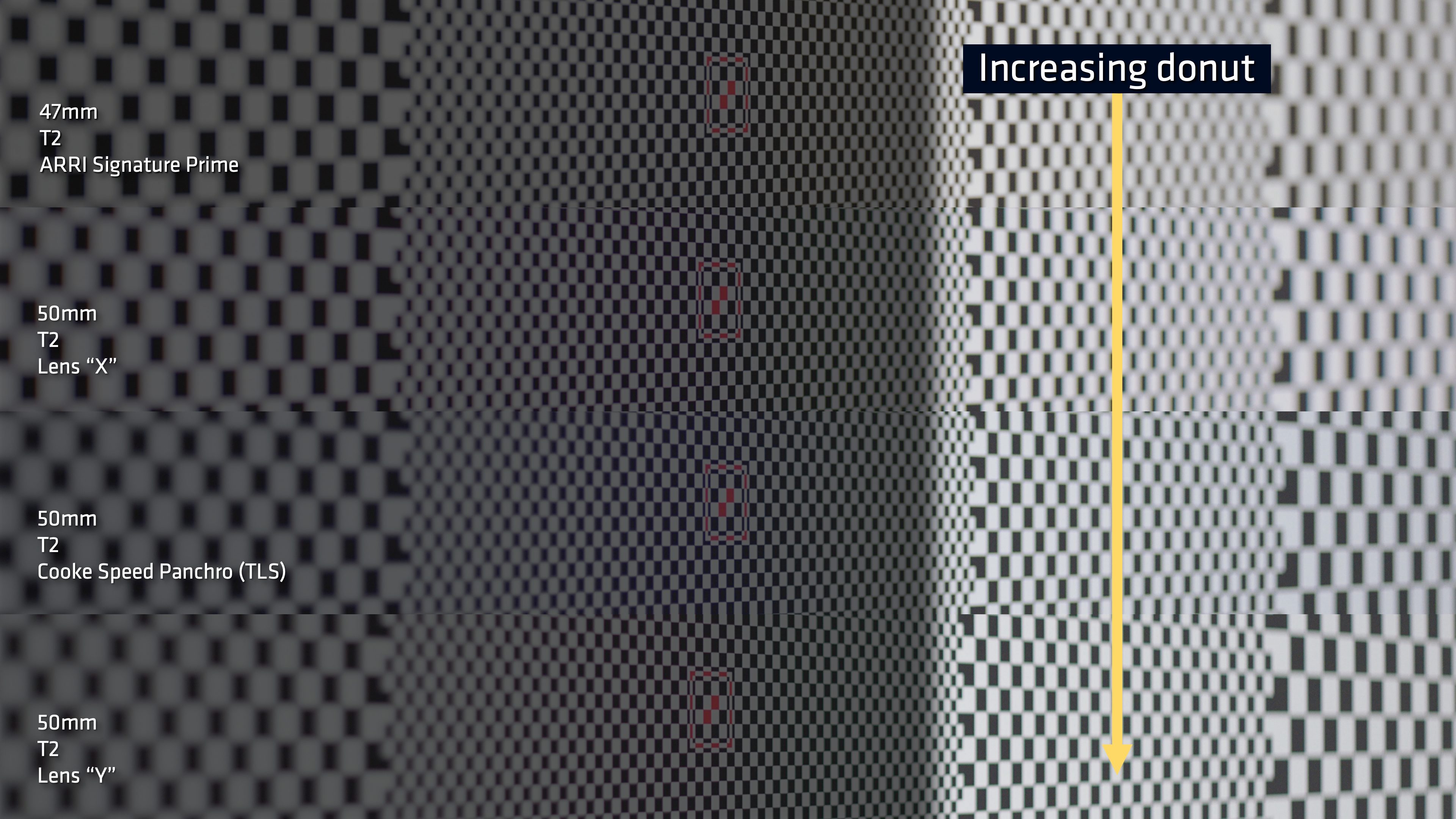
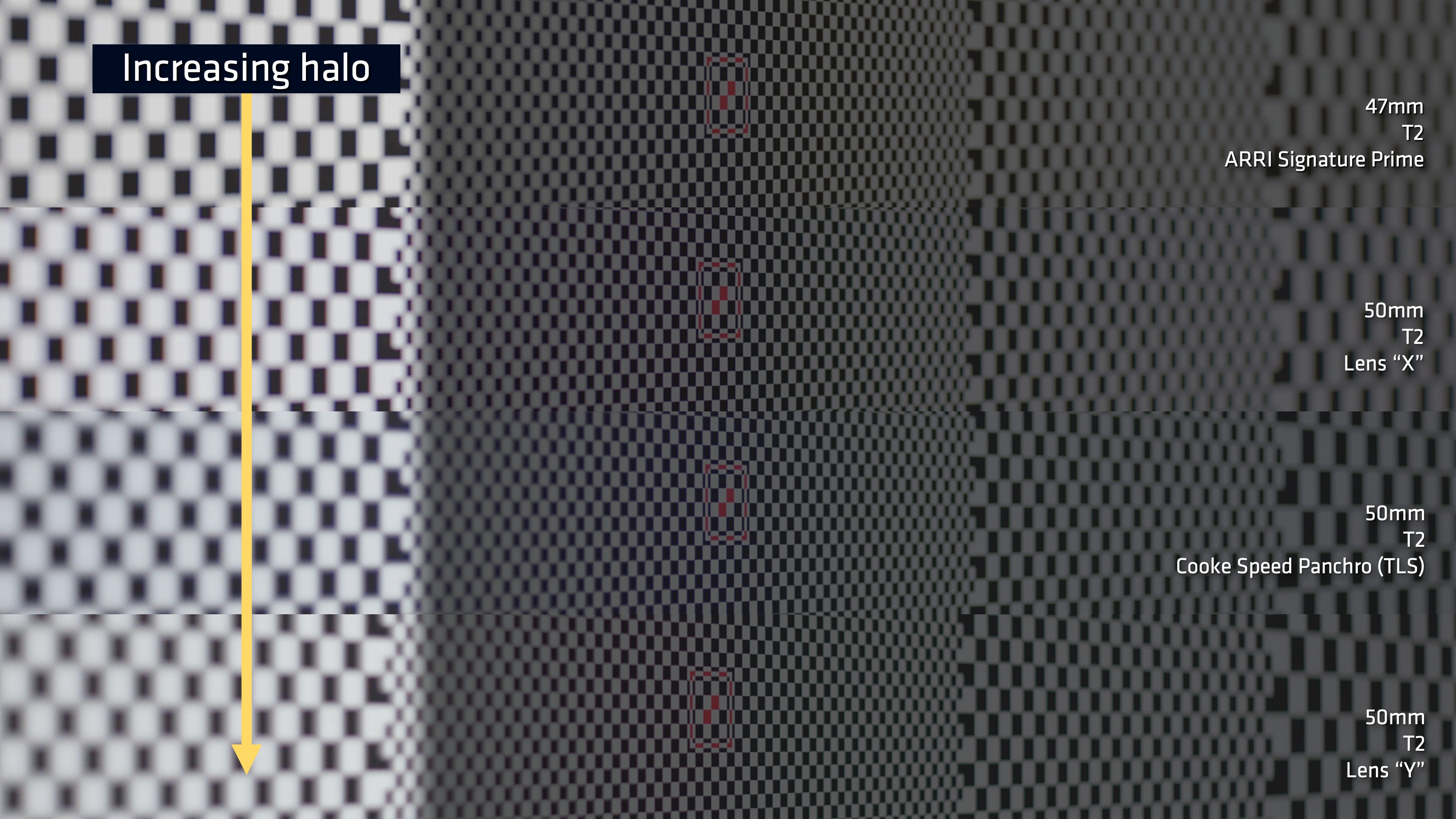
“Depth of field follows the donut.”
To better illustrate this effect, I shot a checkerboard distortion chart, commonly used in VFX to map distortions in lenses. Rather than shoot it flat on, though, I shot it at an angle.
This is how you’d normally shoot this chart.
This is how I shot it instead.
By focusing on the center of the chart, with the chart at an angle, I was able to see how various lenses rolled out of focus.
I’ve arranged these images in order of increasing donut bokeh, from top to bottom. Most vintage lenses show this kind of bokeh due to overcorrected spherical aberration. As we’ve seen, the negative elements look a little sharper at the point of focus than the positive elements, which have a little bit of glow to them. I suspect that designers of vintage lenses used overcorrected spherical aberration to make their lenses look a little sharper, as that was the best they could do with the technology of their time (prior to the invention of aspherical elements).
Let’s revisit the image with the Christmas lights in the background. If look at the man’s hand, we can clearly see the depth of field shift.
Here’s another example:
The difference between backgrounds is incredible, and we can also see that the depth of field is skewing wildly forward or back.
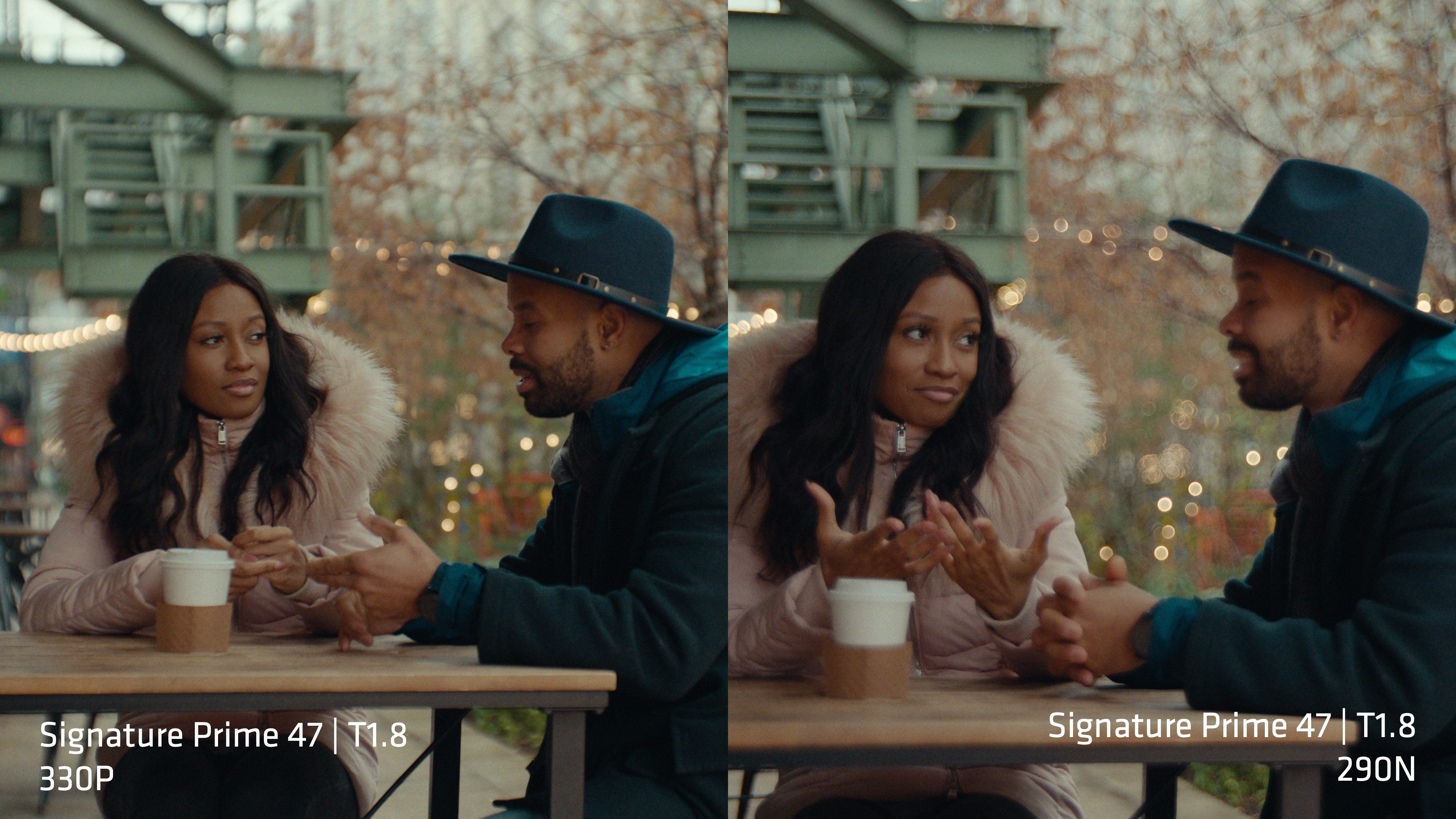
It’s interesting that the only difference between the left and right images is a single rear-mounted optic. Nothing else changed. (Once again, the image size change is due to the +/- 8% image size shift between the strongest positive and strongest negative elements.)
Let’s look at one more example of all these aberrations interacting.
Impression V elements have different effects on different focal length lenses at different distances. They are predictable, but it takes a little experience to anticipate what the effect will be. In this case, a long lens focused at 100 ft/30 m with either optic delivers dramatically different effects.
The positive optic delivers a familiar, dreamy look. The negative Impression V optic delivers a soft look that still feels slightly sharper than the positive optic.
Up until now, the effects we’ve seen were driven primarily by spherical aberration and coma. In these images, astigmatism is forcing the arrowhead shapes to flatten and become more pronounced.
We can clearly see how the different elements skew depth of field.
And here we can see how coma affects the image. The positive optic spreads light toward the center of the frame. The negative optic spreads light away from the center of the frame.
It’s fascinating that a simple… well, not so simple… piece of glass behind a delicately tuned high-performance lens can do so much.
HOW TO FOCUS
One day I was looking at Impression V elements on a lens projector in our service department. A lens tech from ARRI Rental came in, saw what I was looking at, and said, “That looks like one of mine.”
That drew us into a discussion about how to focus lenses that show a lot of spherical aberration. He told us that he tries to teach camera assistants to look at focus a little differently when working with de-tuned lenses. For example, rather than putting a focus chart at 6 ft/2 m, focusing the lens, and seeing if the lens markings indicate 6 ft/2 m, he instructs them to put the chart at 6 ft/2 m, set the lens focus to 6 ft/2 m, and see if the lens appears acceptably sharp.
This is because a properly focused lens (chart at 6’/2 m, lens focused at 6’/2 m) with spherical aberration may appear soft, and throwing it slightly out of focus may make it appear sharper. This is typical at wide T-stops, where focus may appear to drift even though edges are sharp at the point of focus.
This sounds a little crazy, but I can show you why this is the case using a lens projector.
I photographed this off the lens projection wall in our service department. This is a Signature lens with a 070P positive optic. I’ve mirrored the left side of the chart onto the right side of the image to compare what happens when we focus the lens in different ways. On the left, we’re going to focus for contrast: we’re looking for maximum black between the white bars. On the right, we’re going to focus so that the edges of those bars are sharp, without worrying how much black we see between them. We’re looking specifically at 20 line pairs per millimeter on the reticule, as that’s the resolution that tracks the focus scale on a Signature lens when paired with an Impression V optic.
When we focus for maximum black between the bars (left) and edge sharpness (right) the difference in focus between those two marks is 4 ft/ 1.21 m. The focus on the left appears correct, as contrast plays a significant role in our sense of sharpness.
Even though the edges are sharp on the right, the blur of spherical aberration eliminates contrast, which makes the lines feel milky and soft—especially from a distance.
By the time we get to the 230P optic, the difference is readily apparent, especially when we look at the wide shot.
There’s a series of lenses, introduced by another company in the early 1990s, that was famous for having two focus witness marks. One was meant for T2.8 and smaller apertures, and the other was meant for apertures wider than T2.8. This difference in witness marks was due to spherical aberration. By focusing differently at T2, sharp edges appeared slightly soft but increased contrast made the image appear much sharper.
As a camera assistant at the time, I often found myself working with DPs shooting between T2 and T2.8, which meant I had to guesstimate my own focus witness mark!
WRAPPING THINGS UP
Despite using ARRI Impression V elements to illustrate several points, the characteristics that I’ve illustrated apply to all vintage lenses in one way or another. The difference is that I can show you different effects on the same lens, rather than showing different effects across different lenses. That’s been the most interesting part of this process for me: comparing a lens with and without the excessive aberrations that give a lens vintage flavor.
An actual vintage lens will deliver more complex looks, as there are quite a lot of elements interacting with each other vs. adding a single element to a Signature lens. The difference is that Impression V elements are future friendly (for HDR) and the lenses will match better than a set of vintage lenses often do. And, if the look isn’t quite right, you can change the look on set, which can be quite useful.
In the end, they’re just another tool, and the tools themselves don’t make unique images. The cinematographer does.
To see more projects shot on Signature lenses, please visit the ARRI Signature Lens Showcase.
Art Adams is the product specialist for cinema lenses at ARRI Americas. He freelanced in the film industry for 32 years and for 27 of those years he was a cinematographer. He works out of the ARRI office in Burbank, California.

Filmtools
Filmmakers go-to destination for pre-production, production & post production equipment!
Shop Now


