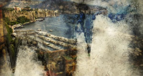
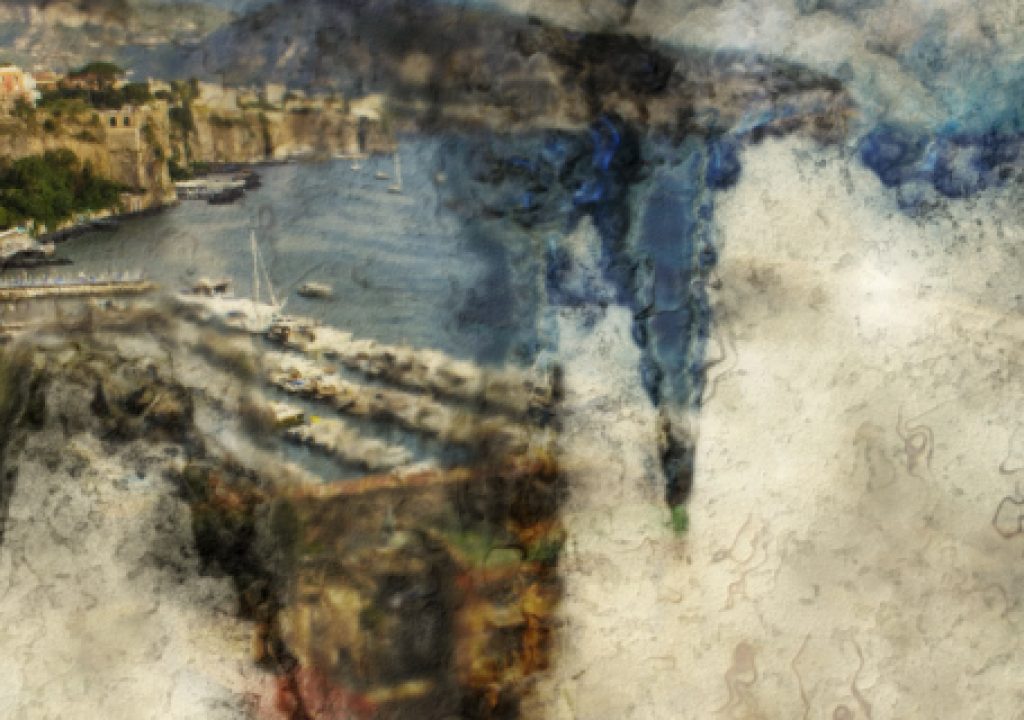
Over 3 years ago, in a rare moment when I had some spare time, I attempted to create an After Effects project that revealed an image as if it were a watercolour painting. I posted the result on my website and since then it has proved immensley popular, and I’ve always been meaning to clean up the original project and give it a bit of a facelift – and here it is.

After tweaking a few things I thought it would be interesting to deconstruct the whole project and look at how it all works. This took much longer than I expected, so the result is a two-part video presentation that analyses the workflow and logic behind the newly updated and completely overhauled watercolour wipe.
In part 1 I give some background and talk about the way the project is structured so that changes to the source image can be automatically updated in the final composition.
In part 2 I look at the layers in the “final” comp and talk about what they’re all doing.
(click the ‘full-screen’ icon for best results)
You can download the complete After Effects project with all files here.


