From Iron Man’s futuristic HUD to holographic maps in a galaxy far, far away, Jayse Hansen is the designer behind some of the most recognizable displays and interfaces in films today. Created with Adobe Creative Cloud apps, his iconic interfaces combine realism with futuristic flare. Hansen is best known for his work on live-action blockbusters, but in recent years, has also started to find a niche in animated films.
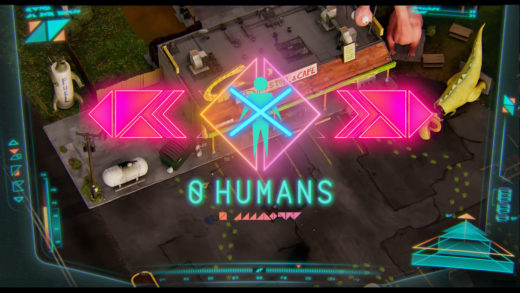
In the Netflix-exclusive animated film “The Mitchells vs. The Machines” – which received a 97% approval rating on Rotten Tomatoes as well as many honors as the best animated film of 2021 – Hansen led the design for the displays used by the titular machines. The movie is a heartwarming sci-fi comedy that follows the Mitchell family as they learn to work together to save the world when AI robots revolt. Hansen designed the HUDs and interfaces used by the robots, including the film’s unique triangular robot language and custom fonts.
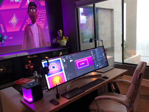
Hansen spoke with us about his journey from movie fan to a go-to designer for iconic graphics in Hollywood films and beyond.
For “The Mitchells vs. The Machines,” you designed a unique language that only the AI robots can read. Can you walk us through that creative process?
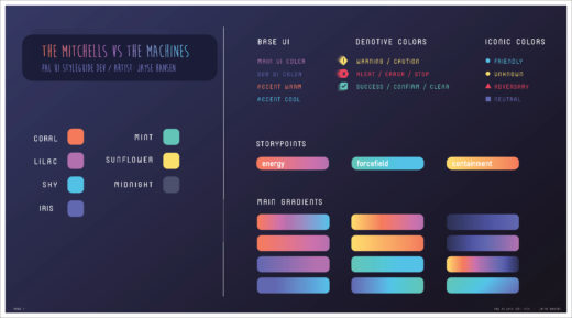
Hansen: The human world of the Mitchell family that is seen early in the film is very painterly, muted, and organic, so we wanted to contrast that with a robot world made up of efficient straight lines, vibrant colors, and ultra-minimalistic design. Led by the amazing team of Lindsey Olivares (Production Designer), Toby Wilson (Art Director), and Mike Rianda (Director), I began with simple shapes like squares and triangles. I tried different iterations where I softened the shapes, formed the triangles into complex hexagons, or just used very simple lines. Early versions were more complex, and some were even inspired by QR codes.
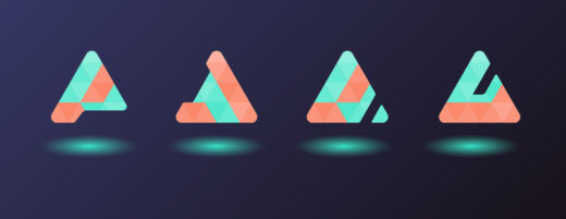
Because the language was going to be an important aspect of the film, Mike was especially excited about also using it as a coded way of planting hidden Easter eggs throughout the film. I designed about 30 different versions before the final decision. The challenge was making the font look simple, but at the same time highly advanced.
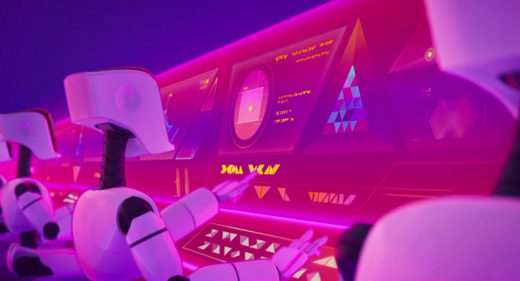
We ultimately circled back to the idea of basing the language on only triangles and adding gradients to give the shapes more definition. It was a big hit with fans. There are numerous Reddit pages where people have translated everything from toaster UIs to street signs after scouring the movie frame by frame.
You did all of the design work with Adobe Creative Cloud. Tell us about your workflow.
Hansen: I like to start by just scribbling something awful looking on paper. Then I’ll go back and forth between Adobe Illustrator and pen and paper. I like this process because each medium puts me in a different headspace, so I get new ideas when I hop back and forth. It can be hard to get inspiration staring at a blank page, so sometimes I’ll even make some shapes in Illustrator, print them out, and then sketch over them.
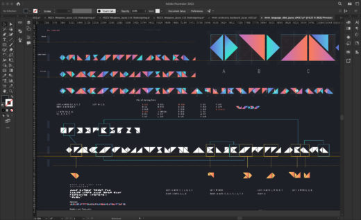
When we settled on a design direction, I created the final production-ready graphics in Illustrator and then pulled them into Adobe After Effects for styling. Some artists use Adobe Photoshop for this step, but I prefer After Effects. I can add more advanced types of glows or film grain etc., and it’s ready to animate when clients want to see it in motion. I’d usually do animated examples for key scenes and then hand those source files off to Michael Schroeder and the ultra-talented motion graphics team at Sony Pictures Animation to complete the final shots in the film.
What do you like about working with Adobe After Effects?
Hansen: First, I love the integration between all of the Adobe apps. It makes my life so much easier when I can bring complex Illustrator designs into After Effects as layers. Everything can be converted to shape layers, which adds another level to how I can animate my designs. I also make heavy use of scripts and expressions in After Effects. This allows me to customize my workflow perfectly to the project and how I like to work.
You’re an Adobe Creative Cloud veteran. Is there anything you’re looking forward to using more in the future?
Hansen: I’m working a lot more with Adobe XD for UI design, and I think it might replace Illustrator in my workflow. I’m excited about the new Multi-Frame Rendering capability in After Effects. It will make a big difference in terms of how fast I can preview and render comps.
I’m also really interested to find out what’s next for Frame.io now that it’s owned by Adobe. We used it recently on a feature film about AR contact lenses that I executive produced called “Sight: Extended”, and it was a life saver. But I am probably most excited about Adobe Substance 3D Modeler for VR. I currently concept my holographic UIs in VR using an Oculus Quest 2 and Varjo XR-3, so I’m really looking forward to seeing what Adobe brings to the VR space. Once you’ve designed in VR, it’s really hard to go back to a flat 2D screen.
How did you get started in the film industry?
Hansen: I actually remember the exact moment when I decided I wanted to work in film. I was around eight years old, and I loved making little models of “Star Wars” ships. I’d spend hours gluing and spray painting them to look ‘real’. Then one day, in a “Return of the Jedi Official Collectors Magazine” I saw a picture of the special effects team for “Star Wars” making the Tie-Fighter models used in the film. They were gluing them together and spray painting the wings. That’s when I realized that they were using small models to portray these huge ships. They were basically doing the same thing as me. In my 8-year-old mind, that meant that I too could make my own “Star Wars” movie!
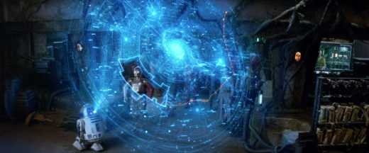
Years later, when the cast from “Return of the Jedi” reunited for “Star Wars Episode VII – The Force Awakens”, I returned to my eight-year-old self, only this time, I was working at JJ Abrams’ Bad Robot with Andrew Kramer recreating the iconic opening “Star Wars” logo in Illustrator. I was kerning each letter for the title crawl in After Effects. I was designing and animating all the various R2-D2 holograms and Tie-Fighter displays.
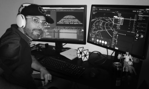
I was in heaven. I realized my childhood dream had finally come full circle when I walked into a grocery store and saw my work in several spreads of the new “Star Wars Episode VII Official Collectors’ Magazine”.
You’ve primarily done work on live-action films. How are animation projects different?
Hansen: I never thought I’d do animated films, but I did some work for Disney for the Marvel and Star Wars franchises. When “Big Hero 6” entered production, I was pulled into that, and I loved it. The biggest difference between live-action and animated films is that with animation I tend to get involved much, much earlier in the process.
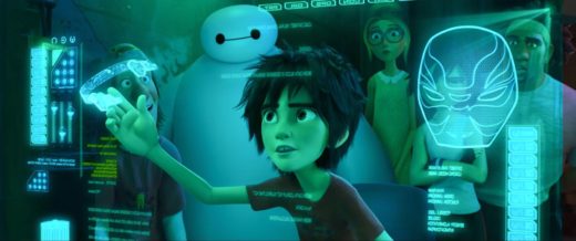
They’re building worlds from scratch, so there’s an important period where everyone is gathered around experimenting and deciding on the look and design of the animated world. Everyone, from the director down, is an artist or designer, so they really understand the creative process and how to iterate and throw ideas against the wall. That’s what I really like about being involved in animated films: that sense that everyone involved is a true designer at heart.
Have you considered working in real-world UI design?
Hansen: Film is always my first passion. But for the past few years I’ve also been designing spatial holographic real-world UIs for the aerospace and defense industries. These ongoing projects include work on the next-generation fighter jet cockpit and HUD displays, the next generation volumetric UIs for Tanks, and Spatial Triage / Sense-Making UIs for CIA Analysts. I’ve also designed highly transparent AR combat HUDs for multi-domain Special Forces operatives for SOCOM (US Special Operations Command). These are multi-mode HUDs for paratroopers in wingsuits, which then transition to water and ground base modes focusing on human-AI teaming with robot dogs and flying Overwatch drones. Sometimes my real-world UIs end up far more futuristic and detailed than my film UIs. But I love the challenge of using design to help the front-line people that are keeping us all safe every day.
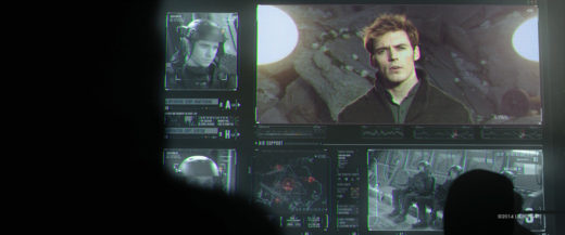
These real-world designs all tie directly back to my fictional work on films. For instance, in “The Hunger Games: Mockingjay,” I designed the hovercraft HUD display and main UI for the scene where the character Peeta is rescued based on a real-world Combat Search and Rescue (CSAR) dashboard I had previously designed for the Joint Task Force Space Command Center.
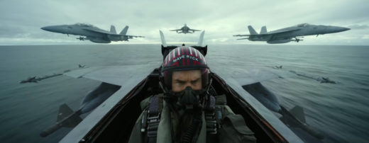
Similarly, for the upcoming “Top Gun: Maverick” movie (coming May 27, 2022), I teamed up with legendary designer-animators Gmunk, Dlew, Nick Lopardo, Toros Kose, and James Heredia. Because of my real-world fighter jet experience, I led the story-telling designs on the advanced fighter jet displays. I ended up working daily hand in hand with Lockheed Martin’s Skunkworks team to ensure the ultimate accuracy for every gauge, dial, and heat setting for critical moments in the film.
Check out more of Jayse Hansen’s work at jayse.tv.
Filmtools
Filmmakers go-to destination for pre-production, production & post production equipment!
Shop Now


