If you remember the early days of Premiere Pro you probably remember what a cluttered interface the application had. It was rather ugly and not very well thought out. Buttons, switches and dials were everywhere. The modern Adobe Premiere Pro CC is much cleaner but you can clean up the viewing monitors even more.
This is a simple tip of just going under the Settings wrench in both the Source and Program monitors and turning off options. When this cleaner interface came along I turned off as much as I could and have never looked back. I actually don’t remember what default options are turned on the first time you launch PPro.

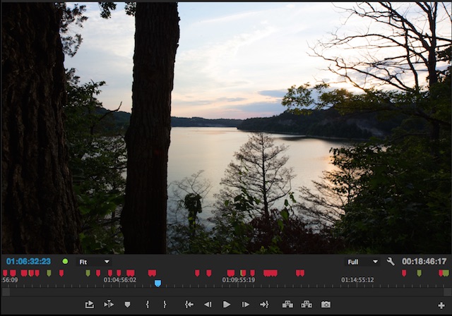
Here’s is the Program monitor with all the options turned on.

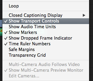
These are the settings you can uncheck under the settings wrench to get a much cleaner monitor.

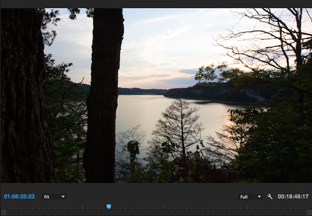
And here is that same Program monitor with the settings turned off.
Isn’t that much cleaner? You transport controls are on your keyboard. Timecode numbers and markers can be seen in the timeline. I guess the only thing I do leave on sometimes is the Dropped Frame Indicator which I might turn on if I’m seeing playback issues.
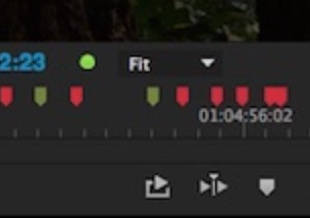
Now if only we could get of this annoying zoom slider:
I hate that thing under the Source and Program monitor.


