Adobe Premiere Pro has a lot of panels and windows that provides a lot of flexibility. With all of those panels often comes a lot of clutter and when working on a smaller screen like a laptop that screen real estate is at a premium. Here are a few tips that can help both free up and manage that screen real estate.
Use the Workspaces
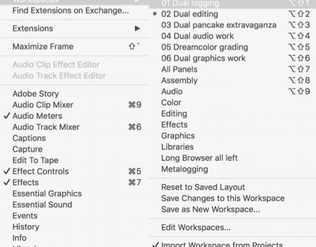
Besides the built-in workspaces that Adobe Premiere Pro ships with you can create your own. And you can create a lot of them. Don’t be afraid to create as many as you need for different panel arrangements. They can be easily created and saved and then deleted later if you don’t want them.
I like to number my workspaces so they correspond to the default keyboard shortcuts. Dual above refers to my dual monitor setup and how I like the workspaces arranged with two monitors.
That ALL PANELS workspace
If you’ve never taken time to thumb through the All Panels workspace that Adobe Premiere Pro has then do that now. It’s most everything that is in PPro panels wise. Take some time to go through it and use that as a jumping off point for making new panel setups of your own.
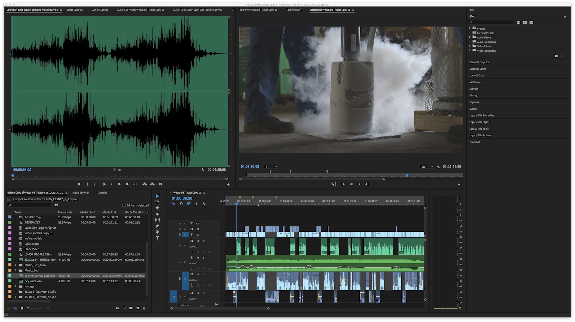 There’s some good discovery there if you’ve never been through the different PPro panels.
Stacked panels and solo panels
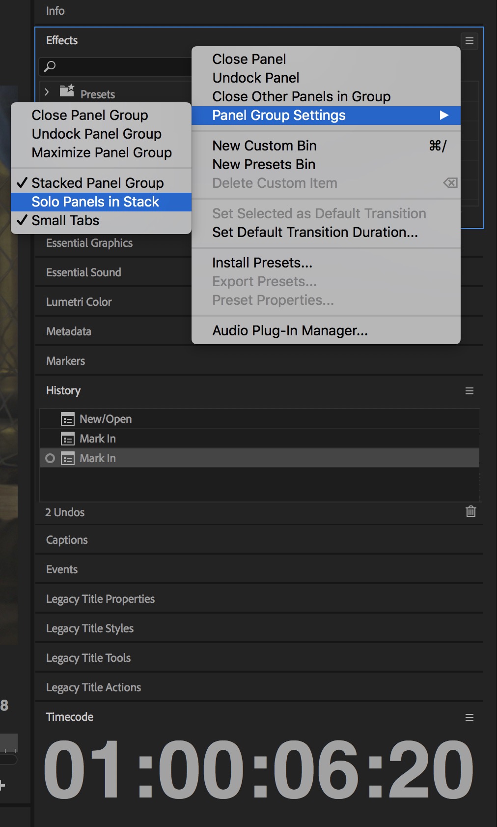
If you bring up the All Panels workspace you’ll see a layout that has all of the panels set up in a stacked layout on the right side of the screen. This is especially useful on a small screen if you’re working with a ton of panels that you have to jump between regularly.
The Stacked Panel Group option will stack the panels as seen above instead of putting them in tabs. This is really nice for cramped screens. Only one will open at a time unless you uncheck Solo Panels in Stack. Then you can have more than one open at once. Again, these are all worth experimenting if you haven’t used these layouts before.
Turn off the Workspaces panel
This tip might seem antithetical to this tip on workspaces but that thin little panel that might sit at the top of your layout that shows the different panels by name? Close that thing up as that’s taking up space much better used by the overall interface for things like timeline height. Right+click on the workspaces panel and choose Close Panel to get rid of that thing.
 If you think it’s convenient to click on those saved workspace layouts then imagine how much more convenient it is going to be to access them via keyboards shortcuts as they are shown in the first image of the post!
 Have your own editing and post-production related QuickTip for #28daysofQuickTips 2018 that you’d like to share? Know a killer Adobe Premiere Pro, Final Cut Pro X, Avid Media Composer or DaVinci Resolve tip that no one else knows? Want to possibly win a prize? Then click over to the post announcing this year’s #28daysofQuickTips and find out how you can send in your own QuickTip.

Filmtools
Filmmakers go-to destination for pre-production, production & post production equipment!
Shop Now