Panoramas are something that became second nature to me since digital arrived. The possibility to create, with digital stitching, something that would take hours in the darkroom opened new frontiers of exploration. But showing panoramas on the Web takes away, many times, the grandeur of the panorama created.
I’ve used panoramas in my photography since the very first digital camera I started to use on a regular basis. With my Canon EOS D30, a 3.3 millions of pixels professional model from 2000, sold in a package with an astounding 1 GB IBM Microdrive, with the same format as a Compact Flash memory card, but then much cheaper. Yes, then the MicroDrive, which was like a hard drive, but miniaturized, seemed to be the future. It was, until 2006, when CF became cheaper and able to hold more data.
Once I got my Canon EOS D30 I started to make panoramas, not so much for the panoramas themselves, but because I could easily stitch two or more images together to get a final file that would be huge in terms of the digital world. You see, we had just started with digital, and a 3,3 MP camera seemed too little for people used to scan 35mm transparencies to transform them in the 70MB size files we were told we needed for printed magazines and books.

I remember one of the first series of panoramas I created for publication: they were of airplanes at Airshows. Not the ones flying, but those on a static display. Suddenly, I had a solution for editors asking for enough pixels for a double page spread: panoramas. Everybody was happy and I believe we, the photographers, felt a bit like magicians, because we had the tools – and for many people the secrets – to create those fantastic images.
One thing I learned very early was that, contrary to all the rules told about the creation of panoramas – you need a tripod, you need special tools, etc. –, I could do many of my panoramas by hand, if I practiced a lot the movements and understood the technique. After all, on many occasions I did not have time or the possibility to use a tripod. So, I learned very quickly to do series of images that would align well when edited.
I’ve kept creating panoramas whenever I can, and I’ve been showing people at my workshops – and even away from them – how to make panoramas. With so much practice, I dare to be bold, meaning my panoramas, sometimes, are huge images that can fit a wall. Now, when it comes to show them to people, what I usually have as a wall is the Web, and that means that I am somehow limited in terms of how I show my huge detailed panoramas.
I know there are tools that allow you to share your images big size, but those are very specific and not something associated with a regular online publication, be it a professional website like Pro Video Coalition, one’s blog or a social network where people share photographs. I wrote here at PVC, previously, about panoramas, and felt, then, the need to publish some of the images on an external link, so readers could have an idea of the dimensions a panorama can reach. At ProVideo Coalition we’re limited to some 700 pixels wide on the pages, so we can hardly call anything published here a panorama. That’s where the Web shows its advantages: we can simply link from one site to another to better tell a story.
I’ve used that option to connect text and images at different places before, and I am doing it again, also because of panoramas. I am using because I faced the same dilemma of showing huge panoramas in little space, but now it took a new direction that I think is interesting to share with more people. That’s how this article started.
Preferred Image Sizes
So, for my previous article on panoramas, I used Maptia as the website to place images linked to the article at ProVideo Coalition. It works well, because my images can be shown in a bigger size there, so readers have an idea of the options available and results. In that article I showed the detail from one area of the whole panorama, so people would get the perception of the relative size of things. I felt it would work as intended.
This time I discovered that I need to do more. During a recent visit to an area along the Tagus river, in Lisbon, I took a series of photographs for one article published at Medium, Tourist… Just for One Day. Then I created some huge panoramas which I deemed to be quite interesting as they show the riverfront in Lisbon as seen from the other side of the river (see panoramas above), and wanted to share them with people. Images for many online spaces have limitations, what makes sense, so I usually prepare my photos within the dimensions indicated by the websites. On Medium I usually work with images around 2000 or 2500 pixels wide. With panoramas, which would just be a thin strip if I used the same width value, I use as reference a value of at least 750 pixels in height, mentioned at Medium (and Maptia, another space I also use) as a minimum.
When I created the images for my Medium article Tourist… Just for One Day I was faced with a problem: the detail on my panoramas was lost in the small photos published. As an example, one the images from the recent series of panoramas created has 25714 x 4772 pixels, so when reduced to a 4218 x 750 pixels image, most of the detail is lost. Looking at the originals at 100 per cent on a 30 inch screen and then looking at the images at Medium made the decision easy: Write this article.
Trying to use online one panorama with the original size also creates problems. In Photoshop, Save for Web will simply refuse to save images so wide. And saving as a normal file with a quality of 8 gives you a 6/7MB file which is too much to use online. When you try to upload such an image to a website like Medium you get this message: Uh oh! An error occurred while uploading the image, please try again.
Sharing panoramas online
Viewing a huge panorama, even on a modern 4K screen, will only show, in the case of an image 25000 pixels wide seen at 100 percent, about a fifth of the whole image, so we’re really talking about a big file. On a 30-inch monitor, like mine, one sees even less, as the resolution is 2560×1600. I am well aware that not many people use 30-inch screens – yet – so it makes sense to have smaller images on the web, that can be seen almost entirely on one screen. But when dealing with panoramas, a lot of information is lost, especially as we make them bigger as the technique refines and the tools available for stitching become better. So, my huge nice panoramas turned into a thin line of colour and not the immense vista that first attracted my eye.
That’s how this article came to be. With the tools available we’re creating huge images that when shared do not tell the whole story. I went back to my original panoramas and cut sections of them, close to the original scale, so as to give readers an idea of the real dimensions and detail of the original. The 4552 x 3168 images created, even if reduced online, will give you a better idea of the scope of the original. Two things contribute to reduce the detail, though: the compression (at 8) for the these images, and the fact that the panoramas were created on a hazy day, which in fact reduces the amount of detail. Still, I think they show what is being lost when the image is reduced for viewing online. All images were taken with the new Canon EF 100–400 f/4–5.6 L IS II USM and a battered old EOS 50D, handheld.
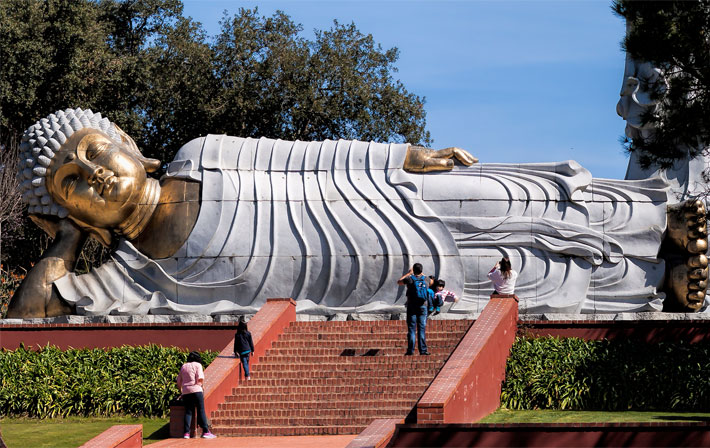
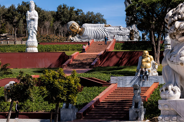
The Buddha Gardens panorama which is from a different day, was also shot with the same lens, although here the aim was to create a bigger photo of the stairway and not a wide panorama. The whole image is shown, and then a section measuring 2560×1600, as seen on my 30-inch screen, so you can compare the whole photo as shown in Medium, with 2500 width, and just a section with the detail the technique allows you to have within a single panorama.
With this article I hope to demonstrate that we need to rethink, sometimes, the way we make panoramas, or at least how we share them online. I, for one, will start to present them, especially in the case of the bigger ones, with some means of showing the viewers the dimensions of single elements within the frame. As done for this article, although using an external website. To check the bigger versions of the images created for this article visit my page at Medium, which connects directly to the article here.

