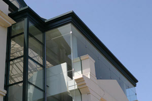
The journey from a clean photo of a modern building to a distressed, impressionistic print.
Although I have spent a fair amount of money to buy camera equipment and digital printers which can produce a more-perfect image, the truth is that my personal aesthetic is more along the lines of wabi-sabi: an appreciation for the aged, weathered, and decayed. So what happens when I take a clean photo of the San Diego Museum of Modern History, a fine modern architectural example of a glass, metal, and stone? I have to distress it. The irony is, the result won a prize – and few realized it was a digital print of a photograph. Here's one photograph's journey into the realm of accelerated aging:
The original image – shot handheld with a Canon 10D and its standard 24-70mm lens, f=8.0, ISO 400, exposure 1/750 – is shown below. Since the 10D does not have an excess of pixels for high-quality prints, I tend to try to get close to the final framing when I shoot, rather than excessively crop an image later.
To help give the impression that portions of an image have been worn away, I like to use a stock library of “grunge textures” called Surface Toolkit. My friend Alex Lindsay created these by taking photos of distressed surfaces in Alcatraz prison, removing any natural lighting gradations in Photoshop, converting the images to grayscale, and editing them to be seamless tiles. Their main purpose is to be used as texture maps in 3D modeling programs to add aging effects to surfaces, but I like using them to treat text, photos, and video as well. The image below on the left is the untreated texture from Surface Toolkit; the image on the right is after I inverted it and used Levels to enhance its contrast:
I do my photo compositing in Adobe After Effects; it's sort of a video version of Adobe Photoshop. I prefer to use After Effects because I have been using it since version 1, and it is completely non-destructive: I can change my mind at any time and get back to the original pixels.
In After Effects, the above grunge image was used as a “track matte” applied in Silhouette Luma mode. As a result, the lighter areas of the grunge image knocked holes in the underlying photo, and darker areas were left progressively untouched.
To further eat away at the outline of the building, I cut a mask (clipping path) along the roofline, and applied a plug-in effect called Roughen Edges to chew away parts of the roofline and sky. The result of the grunge matte and Roughen Edges are shown below:
All of this distressing actually destroyed too much of the structure of the building for my taste. To re-strengthen the outlines, I applied an effect called Smart Blur, which normally is used to keep outlines sharp while blurring the areas in between. Smart Blur has a diagnostic mode where it shows you just the edges it has detected and plans to keep sharp. The resulting outline is exactly what I needed to re-establish some structure to my photo:
These edges are normally white against black. I inverted the image, tinted the black lines a dark indigo, and applied the result on top of the weathered image using Linear Burn mode. I then removed some of the perspective distortion from the image using a Corner Pin effect applied to an Adjustment Layer above this stack (in newer versions of Photoshop, I'd use the Filter > Distort > Lens Correction instead). I also pumped up the saturation a touch. The final distressed image is show below:
To enhance the weathering effect, I chose to print this image on Hawk Mountain Kestrel Brite White, which has a nice mould-made texture. Indeed, the texture of this paper – one of my favorites – helped inform my choice of grunge imagery earlier in the process. The image was printed at 200dpi on an Epson 2200 with stock Epson UltraChrome archival pigmented inks, using a custom printer profile provided by Hawk Mountain.
To continue the elemental construction theme, I gathered together some washers, nails, window screen, and other bits of galvanized metal, cut them to fit the shapes present in the photo, and glued them directly to the print. I then floated the symbol overlay as well as strips of translucent Japanese unryu paper over the print by stacking up layers of mat board and adhering these elements between layers. The final result is shown below:
Deconstruction 1.1 – Chris Meyer, 2005
Around this time, my wife Trish had just joined the Collage Artists of America, and was planning to enter their Fall 2005 exhibit. I had just started playing around with these photo-based collages, and decided on a whim to also join – and enter my first two efforts (this piece being the second). To my surprise, both were juried into the show; to my shock, Deconstruction 1.1 was awarded second place! I don't necessarily credit this to any brilliant artistic breakthrough on my part; I feel that when people are presented with something new for which they have no context to judge, they assume the unknown must be good (smile).
Since this piece, most of my distressing efforts have moved outside of the computer, and into the realm of printing onto unusual papers to get a less-than-perfect print. I'll discuss those techniques in future posts.
Our photographs and artwork, as well as content contained in our books, videos, blogs, and articles for other sites are all copyright Crish Design, except where otherwise attributed. Other examples of my mixed media work may be found on my artist web site.
