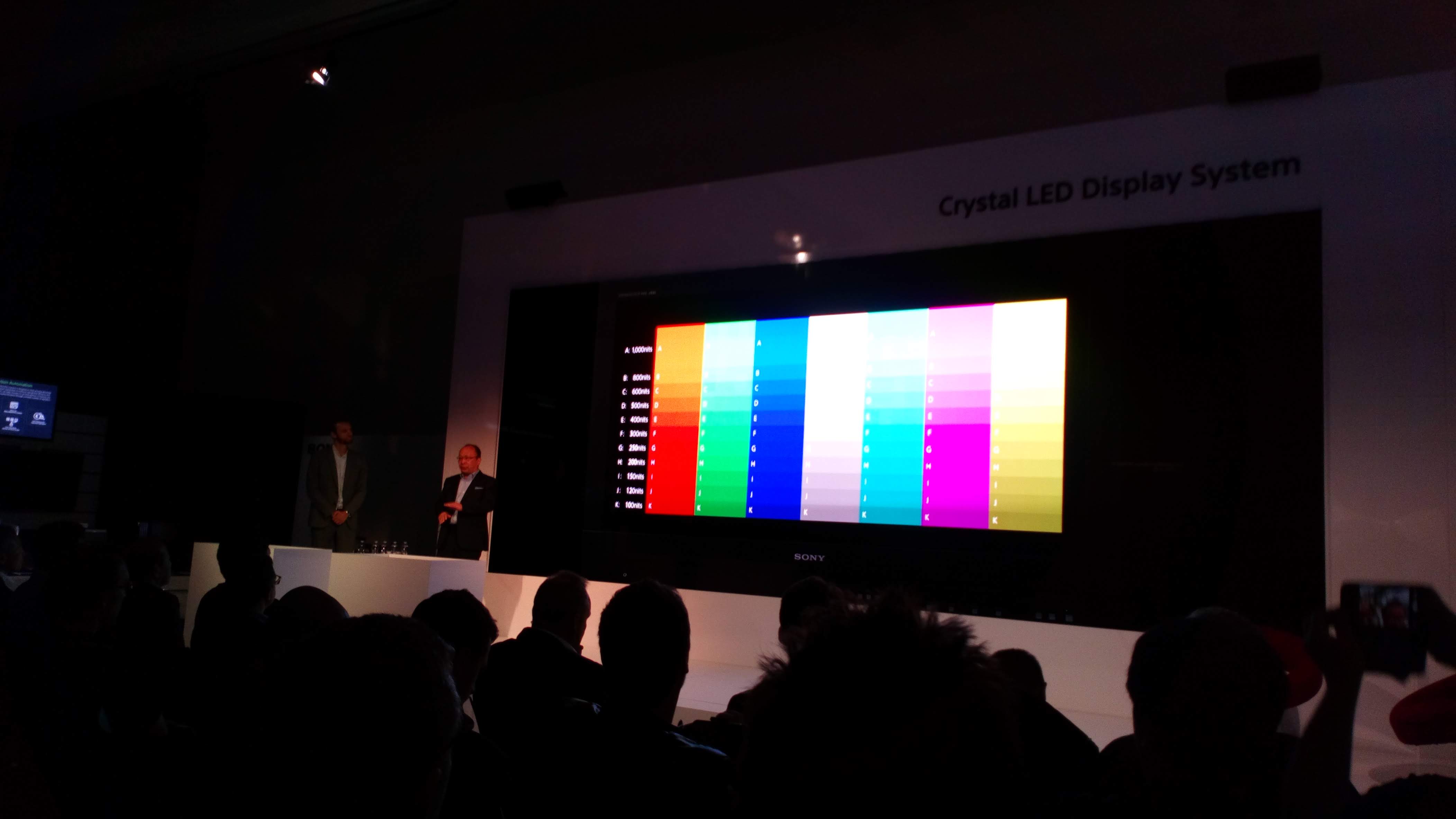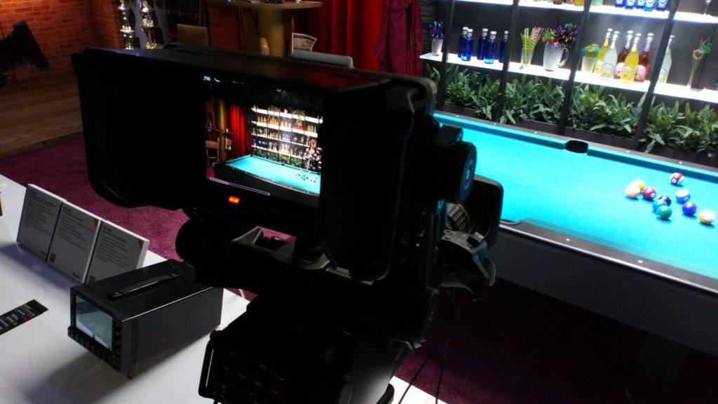
Back in the day, color was simpler. A show could change stocks and play around with printer lights, but overwhelmingly what looked right on an answer print was right. There was only ever one standard for projectors, and things only became slightly more complicated with the advent of electronic grading; for a long time a TV picture was a TV picture.
Things have improved – we have HDR displays now which massively outperform both TV and cinema of old – but things have also become much more complicated. How did we end up here, and why?
One way to show the why is to compare a video monitor to the real scene it represents. Notoriously, the vivid blue-green of tropical water over white sand is something that TV often can’t handle; the greens don’t get green enough. Similar things apply to brightness. Nobody’s putting on sunglasses whenever the sun appears in shot at the cinema. Compare sound; properly set up, modern sound gear can make it sound convincingly as if someone’s standing in the room talking, but video displays almost never look like a window into another real world. Film and TV pictures are compromises.
Why? Well, most people are aware that color images are made up of red, green and blue components. A simple RGB color system is easy to understand, because we’ve all played with the sliders in Photoshop. What’s less obvious is that we could choose lots of different reds, greens and blues with which to build images, and if we choose, say, a pale and desaturated green, that’s going to remove any chance of reproducing that tropical ocean well.

It’s not even as if the primaries we use were freely chosen. They were chosen because phosphors glowing in those colors were available to CRT manufacturers. We’re still simulating them now, in conventional HD displays (using the ITU’s Recommendation BT.709, the famous Rec. 709) and computer monitors, which share the same primary colors in the sRGB specification. The later Rec. 2020, often associated with HDR displays, is vastly more capable, with deeper, more saturated primary colors.
No display has ever been made (nor can be made, in theory) which completely achieves 2020, although practical examples can do that tropical sea far better than anything else.
Brightness has an even more complicated history. Gamma sounds complicated because it’s a Greek letter, though it’s probably better to call it “luminance encoding.” What we’re talking about is the relationship between the signal level, or the number in a digital file, compared to the amount of light coming out of a monitor. It’d have been easy to simply make the light output ramp up in a straight line as the signal does, but that’s not quite how the human eye works. It sees more differences between dark shades than bright ones, so as to handle the huge brightness range of the real world. If we’d used that simple straight-line relationship between signal and brightness, especially over a radio link, shadows would have looked noisy just because we’re more sensitive to the random changes.

As it happens, the original CRT displays helped out. They needed a lot of signal to get from black to dark grey, but then progressively less and less signal to get from mid-grey to white. That meant brightening the shadows electronically in the camera so that the CRT would then crush them back down again on viewing, reducing noise and achieving reasonable performance. That’s a coincidence that confuses video engineers to this day. If the CRT had not forced that electronic shadow-brightening process in camera, we’d have had to invent it anyway. Either way, that’s what originally defined the relationship between display brightness and signal level, and in terms of broadcasting that’s only changed with the advent of HDR.
The problem with gamma and colorspaces is that they’re completely fundamental, but differently fundamental for every manufacturer and even between cameras. If it seems like this could be standardised and automated, well yes, but there are politics afoot. Worse, many manufacturers’ standards are very similar, and it’s often possible to botch the setup and still have things look right enough to be wrong without being obviously wrong. Happily, David Hover’s piece from 2019 remains very relevant to setting up software like Resolve.
Color can still be simple enough. Some people might yearn for the simplicity of decades past to return, but with every modern camera manufacturer promoting its own way to describe color and brightness, don’t hold your breath. Done well, it doesn’t have to be a nightmare.
More about color correction in production:
On saturated light: making two lights emit the same colour
Exploring Colour Quality Systems in Production: Lamphouse efficiency, modifier efficiency and more
Exploring Colour Quality Systems in Production: LED colour issues and the colour rendering index

Filmtools
Filmmakers go-to destination for pre-production, production & post production equipment!
Shop Now


