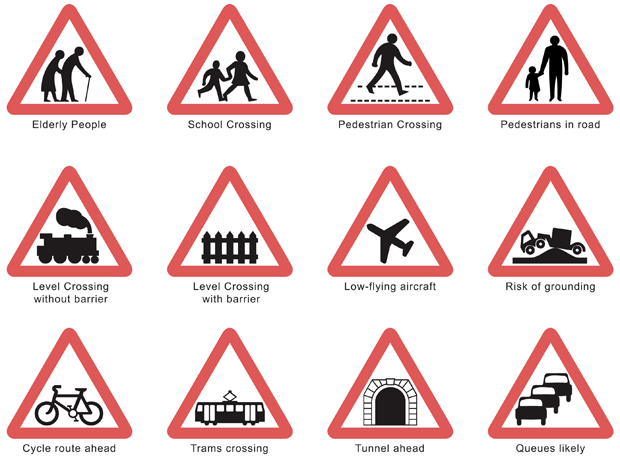
Sign recreations courtesy of iStockphoto, © track5, Image #214915
I am a huge fan of the BBC programme Top Gear. Aside from the fact that I’m a car nut, I enjoy the wry humor, the unusual set (standing literally in the middle of the audience), the crazy stunts, and the graphic design that goes into the vignettes on many of the cars (that would be a nice gig…). I’ve been catching up on episodes with BBC America, and stumbled across an interesting interview with Margaret Calvert: one of the people responsible for designing the motorway signs in England after WWII. With the introduction of high-speed motorways, the government realized that their standard signs didn’t work. As a result, a whole new font and set of icons were designed. Graphic designers interested in how to convey information quickly may enjoy some of her insights:

