 DataStoryteller is Digital Anarchy’s brand new tool for video editors to Final Cut Pro, Premiere Pro and After Effects. A beta version of the solution will be showcased at 2023 NAB Show.
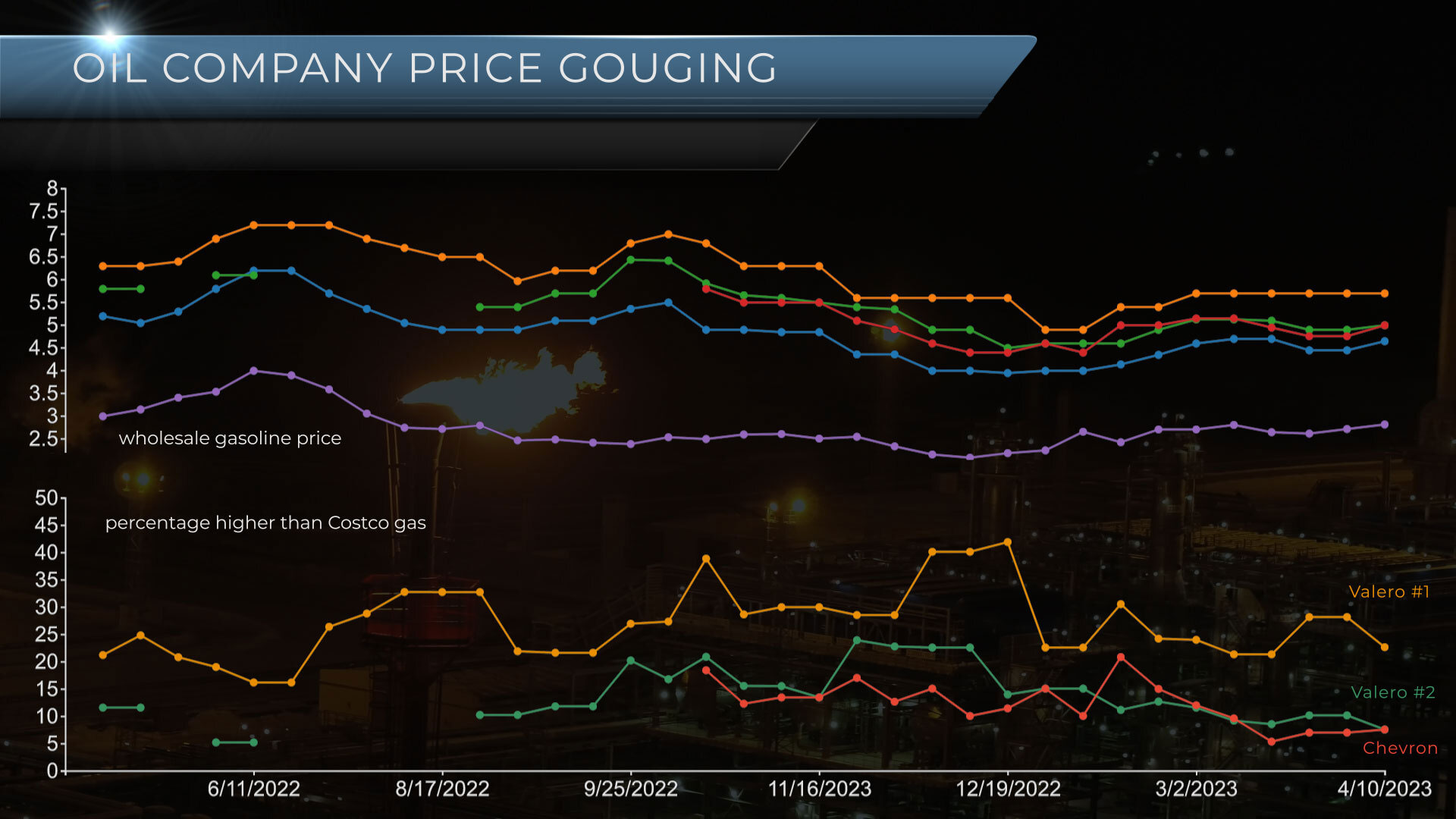
Digital Anarchy brings data-driven visualization tools for video editors to Final Cut Pro, Premiere Pro and After Effects at NAB 2023. The brand new tool enables video editors to upload Excel or CSV files, select a chart type, and animate one – or multiple – data sets with minimum effort. This makes it easier to create anything from simple animated charts to more complex data-driven visualizations. DataStoryteller is robust yet simple, allowing for chart customization without being a data scientist to create interesting and clear animations/visualizations.
“When data visualizations are needed in video production, they are either complicated to produce or basic PowerPoint charts,” said Jim Tierney, CEO of Digital Anarchy. “With the world awash in data, big and small, we wanted to give video editors an easier way of creating animated charts and data visualizations within the editing apps they’re familiar with.”
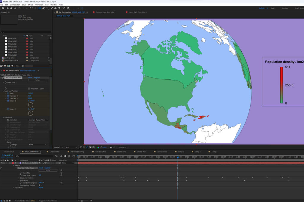
DataStoryteller charts and maps are initially configured and previewed in the users editing platform of choice – Final Cut Pro, Adobe Premiere Pro or After Effects – and behave like a plug-in within these applications. The integration with After Effects, Final Cut and Premiere Pro makes it easy to apply changes and show the animations in the video editing application, without the need to export/import files back and forth.
 DataStoryteller: how it works
Set up can be done a couple ways: from scratch or by using a template. Setting up a basic chart works much like creating graphics in Excel or Apple Numbers, with the advantage of all features being tightly integrated with the video editing platform. After uploading a file, users can choose what data to include in the animation, as well as set resolution, height/width, color, transition effects, position on screen and more. The templates are an easier way to create the visualization with styling, colors, and basic animation already set up. If the user finds one they like, they just need to upload their data and make some tweaks. They can also save their own templates if they’re creating similar charts regularly.
Key Features of DataStoryteller
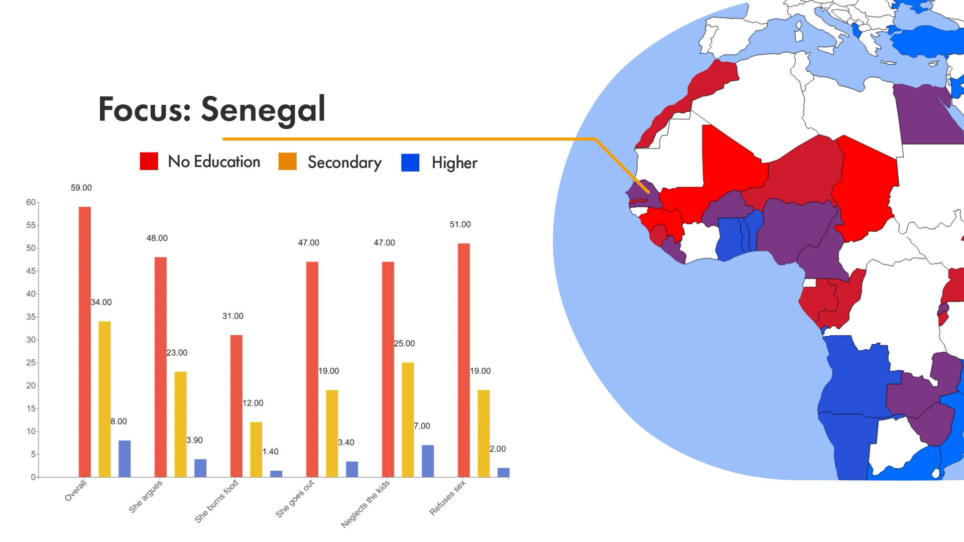
- World and US Maps: Visualize world data (countries) or US data (states and counties), and use names or FIPS data to link data to regions on the maps. The World Map offers different projections, including a 3D globe.
- Traditional Charts: 1.0 supports Bar, Line, and Scatter/Bubble charts. Because Data Storyteller is built on the robust charting library of D3.js, we will continually be adding other types of charts after the 1.0 release.
- Support for Simple or Complex Data: Imported CSV or Excel files can be simple spreadsheets or more complex, with multiple sheets or large data sets.
- Built-in Spreadsheet: A built-in spreadsheet allows users to see and select all of the data or select specific cells, rows, and columns that they wish to visualize.
- Multi-file Animation: One of the strengths of Data Storyteller is the ability to upload multiple data sets. For example, multiple years of census data can be uploaded and then animated year by year, creating complex visualizations that tell a story with much more depth than a simple bar chart.
- Range/Filter Animation: Editors can choose to slowly reveal or hide data by animating the spreadsheet selection or filtering values that are higher or lower than a user defined threshold. By using keyframes that determine when and where each new data point appears, it is possible to create animations that animate specific data for more impact.
- Multiple Dimensions: Another strength is support for data with many attributes. For example, in our Census data, for different cities you might want to show Age, Income, Crime level, and Cost of Housing. Any of these can be used to control X position, Y position and Size and Color of the resulting data point. All of which can be animated over time.
- Preset Templates: A wide variety of templates help users get started on creating beautiful data visualizations.
- Vector Charts: The charts are all vector based graphics, so can be rendered at any size, including HD, 4K, 8K, 12K or higher.
 DataStoryteller at NAB
If you want to see DataStoryteller in action, NAB is the ideal stage this April. At its booth #N1316 in the North Hall of the Las Vegas Convention Center, the team from Digital Anarchy will demonstrate a beta version of DataStoryteller – a set of two new plugins that substantially simplifies the creation of animated charts and map visualizations for video production.
Digital Anarchy DataStoryteller is currently in beta and will be released in the summer of 2023. The plugin will cost $199 and will initially be available for Adobe After Effects, Premiere Pro, and Apple Final Cut Pro.
Follow the link for more information, or to participate in the public beta of DataStoryteller.

Filmtools
Filmmakers go-to destination for pre-production, production & post production equipment!
Shop Now


