The film look is an elusive thing. Everyone has their favorite flavor, but there are two basic, yet opposite, techniques in vogue right now—and I think I’ve figured out why.
When the film-to-digital transition commenced in earnest, back in the early 2000s, the biggest complaint about digital was that it had a “video look.” Over time the general consensus was that it boiled down to two things: over sharpened detail, and very saturated and hue-distorted highlights. Early HD cameras (I’m looking at you, Sony F900) only gave us about two stops of overexposure latitude above middle gray. Highlights clipped in the most hideous manner, often showing hue shifts (cyan and pink were not uncommon). And the rule of thumb for those of us with film experience was to keep the detail way down when shooting for broadcast (-40 in SAU, or “Sony Arbitrary Units”) or off when shooting for a film print.
The original Panasonic Varicam was gorgeous. Its color was very delicate, accurate, and somehow filmic, and even though it only captured 720p it outpaced the F900 among owner/operators because cinematographers were drawn to this “non-Sony” look. It had several gamma curves that aggressively compressed highlights, and while they were meant to capture images for post grading we often used them for WYSIWYG imagery because they desaturated highlights and rolled them off in a more filmic manner.
As cameras got better and better, we gained more dynamic range but the image didn’t always look filmic. It wasn’t until the Arri Alexa Classic debuted in 2010 that DPs like myself, who started out in film, felt we had access to a true digital cinema camera. The amazing thing about this camera was that the entire dynamic range was usable: rather than having to protect highlights, or keep flesh tones below 60% on a waveform to prevent hue distortions, we could overexpose or underexpose and it all looked great. What had been technical considerations evolved into artistic choices.
I was fascinated by Alexa’s color, and I became determined to figure out what was going on. I set up a Sony F55 (pre Cine-EI mode) next to an Alexa, aimed them both at a color chart, and rolled through as much exposure range as I could, observing what happened to color saturation as exposure increased.
The Sony F55, in custom mode, saturated colors right up until luma hit 70%, at which point highlights showed dramatic color distortions and the diamond pattern on the vectorscope resembled a shrunken and very unhappy starfish. In Alexa’s case, the diamond pattern on the vectorscope grew until luma hit 35% or so, and then the pattern locked. As exposure increased, colors got brighter but they didn’t get more saturated.
That’s what film does. Unless you talk to a colorist.
A common colorist trick is to desaturate shadows for a film look, which seems backwards to someone like myself who has actually shot film and thinks Alexa does a great job of emulating the “film look.” I like this look, but I didn’t understand for the longest time why I focused on desaturated highlights and they focused on desaturated shadows.
When I realized what was going on, I felt like a bit of an idiot.
I’d been looking at highlight quality because I transitioned to digital at a time when that was its huge weakness. In film I could overexpose highlights, blow out windows, use practicals to light the shot, all because the highlights rolled off gently to a desaturated white. Digital held more shadow detail than film, by far, but it couldn’t handle highlights. Film held highlights, but shadows were often a bit crunchy.
Well… print stock shadows were crunchy. When I started out I worked mostly on features, so I focused on what the print looked like. Print stocks don’t have nearly as much shadow dynamic range as film negative does because it is trying to block as much light from the projector as possible to create rich blacks. Colorists transfer directly from the negative, so they have a very different experience.
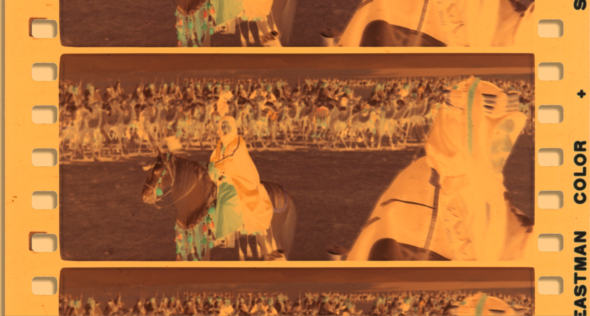
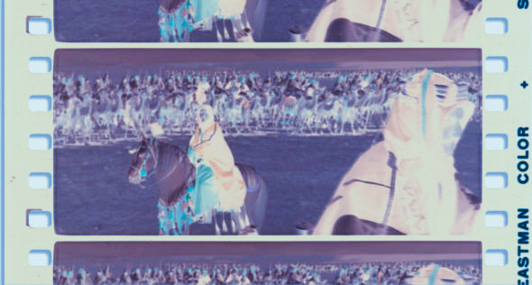
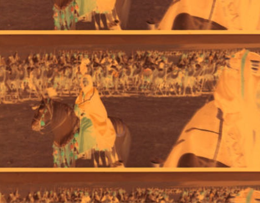
 I found this 65mm negative from Lawrence of Arabia at the Widescreen Museum. (This is a great website, and if you don’t know about it you owe yourself a long visit.) I brought it into Adobe Lightroom and played around with it a bit:
 In film negative, the dark areas are highlights and the bright areas are shadows. It’s interesting to note that most of the color information is in the mid-tones. It drops off pretty quickly in the shadows, because those drop off to transparency.
Transparency in a film print represents highlight information. Transparency in a film negative represents shadow information. In both cases, increasing transparency means decreasing color information.
As a film DP shooting for print, I knew that I had less dynamic range in the shadows because print stocks dropped off before they reached deep into the toe of the film curve. They had to, otherwise they couldn’t reproduce a deep black. Colorists don’t have that barrier: they create imagery directly from the negative, and they can shape the bottom of that curve to pull out more detail than I ever had access to in a print. In the same way that a digital camera captures more shadow detail than can be reproduced on a print stock, a telecine can pull more out of a film negative than a print stock can reproduce.
The upshot is this:
- If you’re used to grading from a film negative, and you’re trying to make a digital image look like what a telecine would see in the deepest shadows of a film negative, you’re going to desaturate digital shadows because color saturation decreases as the negative becomes transparent.
- If you’re used to viewing print film, you’ll be more interested in desaturating digital highlights, as color saturation decreases as the print stock becomes transparent.
I suspect most colorists use a combination of these tricks. Most cameras, though, focus on highlight desaturation over shadow desaturation. Alexa certainly does this, Panavision’s DXL2 with Light Iron color science does this, and modern REDs do this as well. It makes sense to emulate what a film print stock does because the only way to see a truly filmic look is to view projected film. As this has become somewhat uncommon with the advent of digital projection, it’s less important to emulate film than it is to differentiate between beautifully shot digital images and the traditional video look. From that perspective, either technique meets that need.
I have worked as a paid consultant to both Sony and Arri.
I’ll be teaching two Arri Academy classes in mid-March, 2018 in Brooklyn and Chicago, with another class in Vancouver, B.C. in April. If you’d like to learn the ins-and-outs of Arri cameras, accessories, color processing, LUTs, recording formats, etc., this is worth checking out. For more information about upcoming classes, or to request a class in your area, please contact the Arri Academy coordinator.
Art Adams
Director of Photography

Filmtools
Filmmakers go-to destination for pre-production, production & post production equipment!
Shop Now


