Building a new product always starts with the need to solve a problem. When we first conceived Frame.io, we were working video professionals in search of a way to streamline the creative process by making it more efficient, more accurate, and more collaborative—no matter where you were physically located.
When we officially released Frame.io in 2015, we were humbled by the creative communities’ embrace of the platform. In the nine years since, the vision has grown thanks in no small part to our dedicated users.
During those years, you pushed the boundaries of Frame.io in ways that, frankly, even we hadn’t originally considered. You went beyond video post-production, expanding into photography, design, social media, live events, sports, e-commerce, and more. It was our users’ passion for Frame that inspired us to restretch the canvas to build new solutions that support all creative workflows.
A new question
In January 2020, we took what we learned from our more than four million customers and posed a new question to ourselves:
What if we were to redesign Frame.io—from the ground up?
That’s precisely what we’ve done, and we couldn’t be more excited to reveal the results of our efforts. Welcome to Frame.io Version 4 beta, the creative management platform designed specifically for content creation teams who want the flexibility to work the way they love to work. Frame.io V4 beta is more than just an update; it signifies a complete transformation of the product, marking the beginning of a new chapter in how modern teams structure and manage their creative workflows.
More beautiful, more precise
We’ve redesigned and reworked every aspect of Frame.io to ensure excellence across the entire user experience on the web app, iPhone, and iPad. But mostly what we’ve done is to consider the myriad workflows that exist in our increasingly content-hungry world, and to make Frame.io the product that conforms to your unique workflow—not the other way around.
A redesigned Workspace
You’re a master multi-tasker balancing everything from viewing media, managing uploads, responding to feedback, and trying to get your creative work done. With our new panel system, you can orient your view to be the most efficient. Expand all panels for the ultimate multitasking experience or collapse them for distraction-free focus.
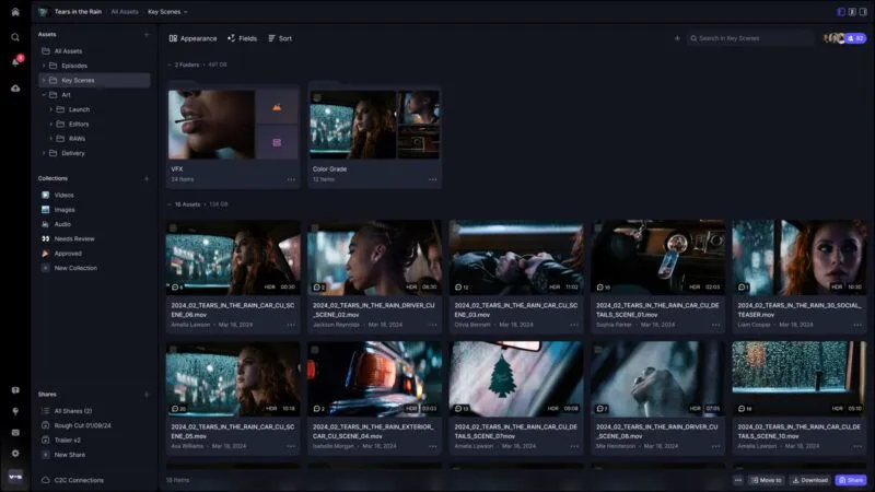
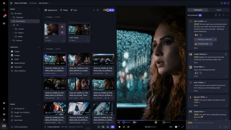
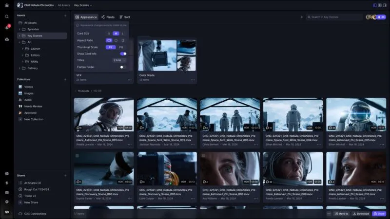
In Frame.io V4 beta, you can also customize nearly everything about the way your media appears in Frame.io—from adjusting aspect ratios to editing asset card ratios, deciding which metadata fields are most important to display, and more.
Performance plus
Our goal for V4 beta was to make a web app that feels fast and fluid. This meant reimagining our architecture for every layer of our stack to bring you the best experience possible.
We’ve completely rebuilt our asset grid to handle millions of files, folders, and version stacks without leaving you waiting for things to load. We’ve also moved our uploads to a Web Worker thread, letting you continue to work in parallel during bulk uploads.
The cloud file system
Frame.io Version 4 beta gives you greater flexibility and control over everything from managing your assets to customizing your workflow.
Metadata
Metadata is key to the new Frame.io V4 beta experience, transforming the way you interact with your assets. Instead of relying solely on a rigid folder structure, you can now organize and view your media based on how you and your team work in a single, unified platform.
Take status tracking, for example. Our current version of Frame.io has four preconfigured status labels, and customizing those options was one of our most requested features. We heard you, and in V4 beta you now have the ability to define and track your project in exactly the way you want to work. Add due dates or assign tasks to people. If you’re casting, you can add actor names, roles, ratings, and agent contacts. For social media posts, tag assets by platform. The possibilities are endless.
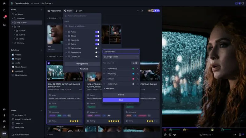
Collections
What this all leads up to is the introduction of Collections. Collections are a flexible, saved view of your assets that allow you to dynamically select, filter, group, and sort your media using the metadata you choose. Collections update in real time, reducing the time your team spends manually culling and organizing. They also allow you to organize (or reorganize) your files in unique combinations without needing to make duplicates of your assets, which conserves storage space.
Most importantly, they allow you to save a specific configuration of these metadata parameters. Collections is our answer to providing the kinds of flexible workflows that you’ve long asked for, without us dictating the approach, process, or template for how you work.
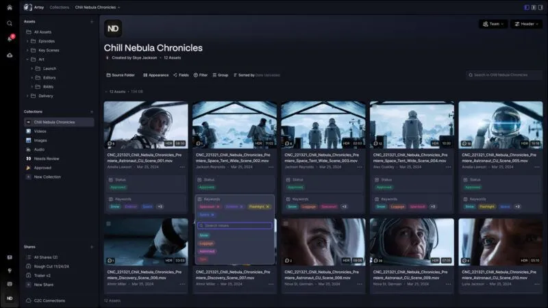
Some examples: Configure Collections to view all creative work slated for review and approval by the end of the week, neatly sorted by designer. Or categorize auditions by role, applying a filter for those rated four stars or above by the director, and share them in a beautifully designed layout with producers for their input and feedback. Marketing managers or ad operators can organize thousands of marketing deliverables by social media platform, grouping them by asset type, duration, and go-live date to ensure the right placement and release timing for each asset.
The easiest way to begin using the new metadata and Collections features is by exploring Project Templates, a library of starter projects that will help you discover the vast range of possibilities for V4 beta-enabled workflows. The library comes with 12 templates initially, and we’ll add to it as we learn more from seeing the workflows you’re creating.
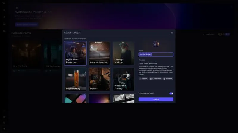
Feature refinements
When we say we did a total redesign, what we mean is that virtually nothing was left unexamined or untouched. The many core features you depend upon have all been refined and improved to further streamline your workflow.
Simplifying sharing
With V4 beta, we have rethought the entire flow to make sharing easy and customizable.
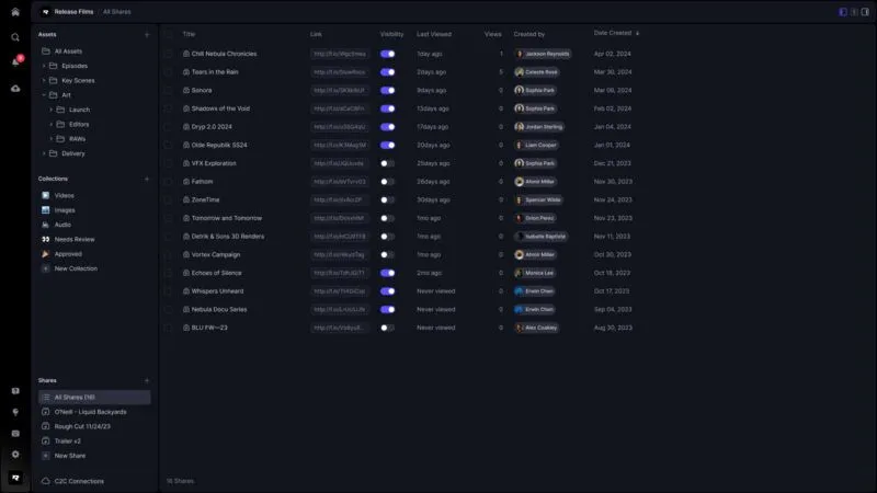
Our new Share builder lets you fine tune every element of your media to reflect the unique story you want to tell or to help elicit the kind of response you’re seeking—whether it’s creative feedback or final approval. Sharing work-in-progress, final cuts, Collections, assets—it’s all up to you. Select from reel or grid views and brand your Shares with a WYSIWYG editing panel that lets you choose your theme or custom colors, and the media information you want to display. And, if you need to add an item to an already existing share, just drag and drop it in.
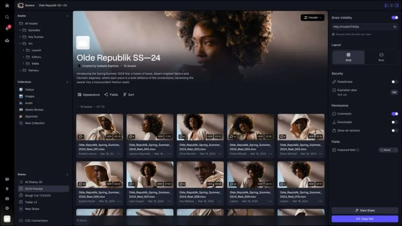
Accessing your Shares has also been simplified. Recent Shares are listed in the sidebar where you can quickly open a Share, see it in context, and make changes. Our new “All Shares” list gives you a more granular look at the complete list of shares on a project, showing you when a Share was last accessed and allowing you to easily adjust the visibility settings or to alter the security and permission settings.
A more precise player experience
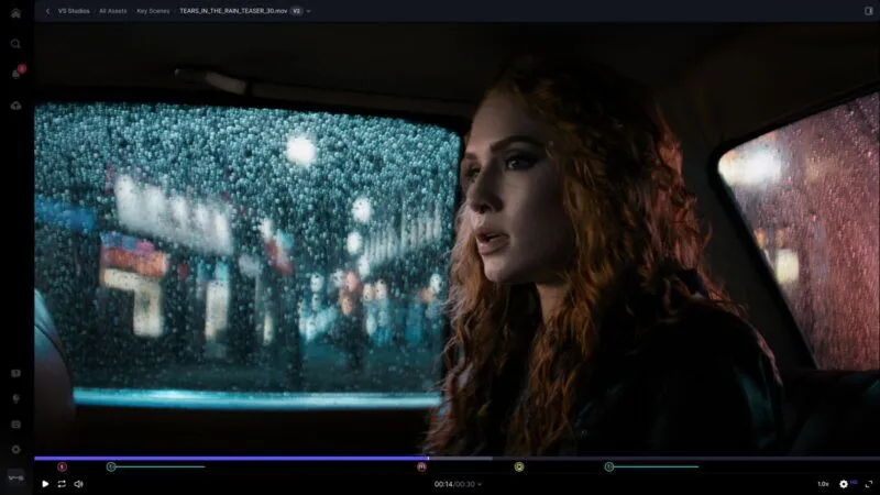
Our updated player offers a seamless, fluid experience when viewing media.
Regardless of file type, our unified player showcases every media asset with precision, detail, and elegance. We’ve introduced features like frame-accurate hover scrubbing, providing you with an accurate gateway into every part of a video, and high-resolution preview during scrubbing ensures that every frame is presented with impeccable clarity even as you move to your desired location. And our state-of-the-art custom HLS adaptive bitrate streaming player guarantees a superior playback experience with minimal buffering and interruptions.
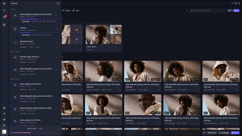
Frame.io has always been known for its super-fast uploads, and now even that’s gotten a boost. We’ve introduced a new global upload sheet, which allows you to monitor batch uploads across your account from one central place. We’ve also moved the actual file transfer code off the main thread, which means you’ll never experience a sluggish UI, even during the largest upload jobs.
Fine-tuning feedback
The ability to leave frame-accurate feedback is a core value of Frame.io. So obviously we couldn’t redesign our product without a big update to this critical feature set.
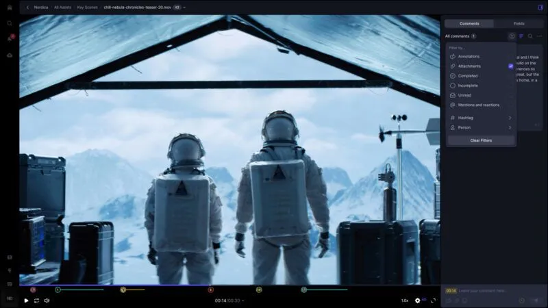
Now you can anchor your comments directly to any point or pixel in your video, image, or design-file frame. Simply tap anywhere on the frame and your comment will appear exactly where you need your collaborator to see it. Hashtags let you index comments, making them easier to track. And the new ability to add attachments to a comment helps illustrate your suggestions clearly and unambiguously with specific examples. You can also react to comments with emojis to respond to feedback quickly, with just a single symbol.
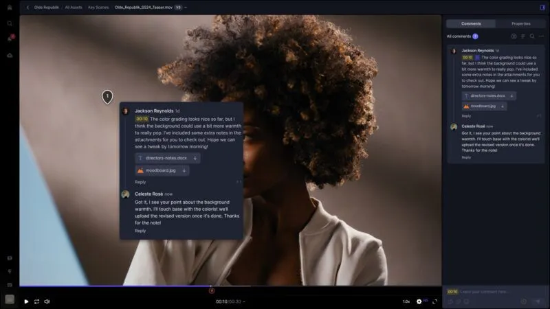
Finally, we’ve introduced comment filtering, which helps you prioritize how you see, and respond to, important conversations. There’s also a link to every comment that lets you direct someone to a specific conversation.
iPhone and iPad
Our award-winning mobile apps for iPhone and iPad have been a critical part of the Frame.io story, helping even the busiest executives and creatives stay in touch on projects no matter where they are. That’s why we used V4 beta as an opportunity to completely redesign them to be as powerful, performative, and intuitive as using Frame.io on your desktop.
First, we have a new Workspace page on iOS, with new project cards and a project page that gives you the same asset configuration controls. The full-fledged file management experience allows you to rename, move, copy, export, and delete files and folders. You also have the same new commenting features, like adding attachments for reference, and emoji reactions. And, of course, you’ll have the full power of Collections on both iPhone and iPad, as well as the complete sharing experience with all the configuration and branding controls.
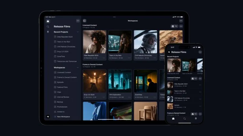
On iPhone, the new commenting drawer allows for adaptable workspace customization. Need extra space for commenting? Simply slide the drawer up. For a more focused view of your media, just pull it down.
On the iPad, we take advantage of the larger screen for a more immersive and efficient workspace. The commenting system has been upgraded with a refreshed, user-friendly interface, including a full-screen drawing and annotation feature for more detailed feedback.

hese mobile app advancements are more than mere upgrades; they embody our dedication to delivering a consistent, high-quality Frame.io experience, regardless of device.
Account management and pricing updates
Clearly, we’ve leaned heavily into our creative workflow features. But for users who are working with high value, pre-release content or are creating at scale, we’ve also expanded our account management features to give you more control and flexibility over your projects, your permissions, and your security.
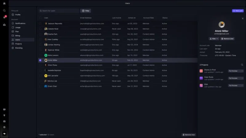
The new Users section in your Account Settings gives you a more holistic view of your account Members, as well as the ability to change their roles, manage their access, or remove them from your account—individually or in bulk. And, in the Projects section, you can see a searchable list of all your Projects, along with key details like when it was last updated, how much storage it’s using, and who has access to it. You can even invite and manage Members directly from this section.
And there’s even more that you can learn about here.
Getting started
Creating Frame.io V4 beta has been an ongoing labor of love over the past three years, and we’re excited to begin the rollout. Starting today, V4 beta is available to eligible Free and Pro plan customers across web, iPhone, and iPad. As a beta, some of the existing Frame.io features may not be initially available, but you can be certain that those features—along with NLE integrations and companion apps—are an element of our forward- looking roadmap. Additionally, V4 beta will launch for customers with Team and Enterprise accounts later this year with even more exciting functionality.
Our goal in creating Version 4 is to eliminate all obstacles to creative flow and to empower creatives to concentrate on what they do best. So it’s within that spirit that we’ve built a thoughtfully considered and carefully designed migration process—one that makes transitioning to V4 beta straightforward and smooth, allowing creative teams to quickly and effortlessly adopt and integrate all of Frame.io’s new enhancements into their workflow without missing a beat. We’ve created a new library of videos and tutorials designed to help step you through our new features. Our amazing Support team is, of course, also on hand to help you whenever you need them.
As always, we can’t thank you enough for your ongoing support throughout the development of our product, and for your loyalty. We’re incredibly excited about the new Frame.io Version 4 beta, and we can’t wait to hear about the projects you’re using it for and how it enables you to produce your best work yet.
Original Source: Frame.io Insider – posted 4/9/24

Filmtools
Filmmakers go-to destination for pre-production, production & post production equipment!
Shop Now
