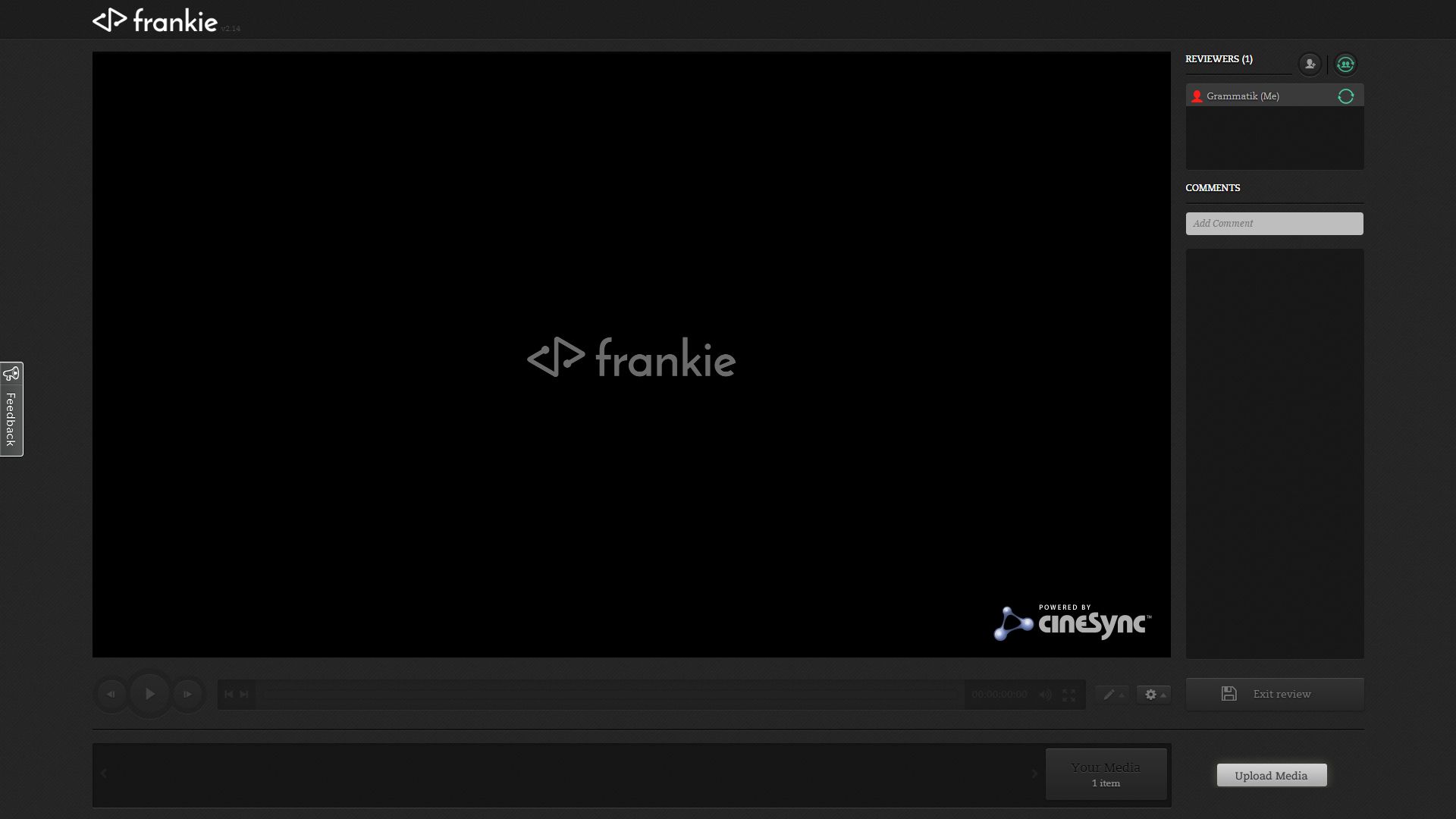
So – what’s the hardest thing to manage in any digital project? It’s not the shot list, or the asset databases, or the ever-encroaching deadlines – it’s the people involved!
From artist to producers to clients, getting everyone on the same page (or frame) can take as much time as getting the actual production work completed. This is something that I’ve become all-too familiar with as a one-man CGI facility, so I’m always keen to find ways to make the review and meeting process as painless as possible.
If everyone’s working in the same city it’s a simple enough process – but with the increasingly global nature of today’s working practices in digital content production, from film to television, traditional physical meetings might not even take place for many projects.
In response to this a wealth of tools have stepped up to fill the gap in the market, offering everything from group conversations in software such as Skype, to screen sharing in tools like TeamViewer. However, most of these are business focused – my attempts to find tools that lend themselves to creative workflows haven’t been totally fruitful. In the past I have had some success with Cage and Trello, but as the internet evolves the tools that we use to collaborate must change as well.
With regards to content sharing and client review – specifically in linear content such as movies and TV – new collaborative tools such as cineSync have emerged, and they’re far more artist-friendly. They allow multiple artists, producers and directors to collaborate on review sessions from all over the globe, using interactive tools to annotate, comment on and discuss shots, enabling everyone to clearly see the next steps that are required for the project.
cineSync has found great success in Hollywood and beyond, and has become almost a new verb, replacing ‘review session’ in much the same way ‘Googling’ something has replaced ‘searching’. But the depth and advanced features of cineSync might be too complex for smaller studios that are looking for something smaller, easier and more flexible. It was this line of thinking that led cineSync developer Cospective to create Frankie.
Frankie is, in many ways, the little brother to cineSync. It takes the video review tools and functionality from cineSync, and distils them into a cloud- and web-based format. That means reviews can be carried out from any location on virtually any device. Want to do a quick approval session while one party is using an iPad in Japan and the other is at a desktop in Sweden? If you can work out the time difference, then a real-time, synchronised review session is possible.
Frankie transports the power of cineSync – with a few of the features removed or scaled back – to a straightforward interface, which anyone from client to artist can easily jump into and use.
It keeps some of the annotation tools from its big brother, but Frankie’s workflow is really based around simplicity, and ensuring everyone can view the content in a straightforward manner and without confusion.
I’ve personally been road-testing Frankie a number of projects, the first being on a motion graphics project. It was a great introduction to the Frankie workflow, and everything worked very smoothly. I was able to receive useful, clear feedback from the client, which helped bring the project to completion with little trouble. But it was when I used Frankie to review a meeting on another job that I discovered it to be a potentially invaluable resource.
I had been asked by Audio Visual director James Norton to create an animated ‘move’ for an introduction screen loop through Turner’s iconic Battle of Trafalgar painting. The painting was being moved to its own dedicated space in the National Maritime Museum in Greenwich, with written interpretation and objects from the period, along with an immersive soundscape.
The brief was a very specific move across and into the painting, which would use techniques like depth of field to help pinpoint key aspects that Turner had placed into the imagery – aspects that would help to explain why the work was as much propaganda as it was a true depiction of the events that had taken place.
James was based in Cambridge, and I myself am based just outside of Brighton, so while meeting in London was feasible, using a tool like Frankie had a raft of potential benefits for both of us. This being the first time James has used a tool like Frankie for review, I was eager to see how we would get on.
Setting up a meeting in Frankie is straightforward. You head to your account on a browser (Frankie requires no installation and is built around HTML5, so will work across various browsers and operating systems) then log in, create a new project and upload your media. Frankie impressively accepts pretty much any format of animated file. You just wait for Frankie to transcode it into a high-quality file for streaming over the internet – which is quick and painless – and then send out invitations to your attendees. Only one of you needs a license to start the session – the amount of people that can join in depends on the Frankie license that you are using.
I knew that Cospective had created a successful tool when it took James longer to set up Skype for the audio discussion than it did for him to log in to Frankie and start the review session.
Once started we were both able to discuss key points and annotate frames with notes and movement arrows (ideally it’s best to work with a Wacom tablet during these review sessions, as you can quickly and easily point out the elements you are discussing with no room for misunderstanding). It’s worth noting that Frankie really does deliver on its promise of real-time synchronisation: everyone in the session is seeing the same thing at the same time, and that’s key when discussing updates or alterations to a shot.
One of the truly great features of Frankie’s workflow is saved to the end. Frankie automatically makes an annotated PDF of the notes taken during the meeting, which could then be shared with James as a record of the change requests. It’s just another way of clarifying exactly what has been said and what needs to be done next – not to mention being a useful reference point for others in the team who weren’t able to attend the Frankie session.
Sometimes having a simple tool that does one thing exceptionally well is a better investment than a more complicated one-stop shop. Frankie is a sterling example of this. It cuts out the need for bulky email attachments or complicate file transfers and keeps everything organised. Thanks to this Frankie’s clear and effective toolset really can help any production – large or small – to stay on track across all disciplines. It’s effective, simple and easy – a great combination when it comes to working with multiple people on complex digital projects.
About the Author
Through design agencies and as a freelance he has worked on projects for the BBC, the Natural History Museum, BP, The National Trust, the Science Museum, Castrol, Volvo, JC Decaux, Invensys, the British Library, Dynamic Earth, The Royal Museum of Scotland, the National Maritime Musuem, UAE Expo 2010 and a wide range of other clients in Europe, the US, the Middle East and beyond.

