Ever composite a number of clips, only to have the result like an explosion in a paint factory? This month we’ll search out a variety of plug-in effects for adjusting color and applying tints to video clips. I’m using Adobe After Effects, but many of the same effects are available in other programs.
Exploring the Color Wheel
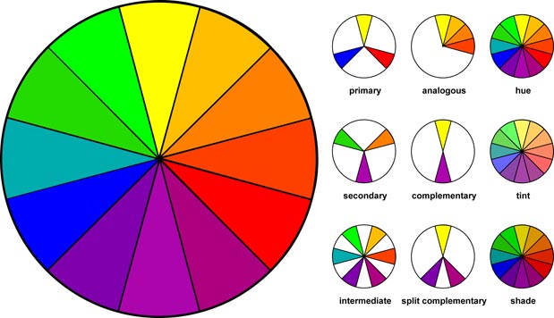
Coming from a print background of CMYK color, I was at first bewildered by video’s RGB color space – I even recited the “yellow and blue make green” mantra to no avail. It didn’t take long, however, to discover that the Hue/Saturation/Lightness color picker was far more intuitive, as I could quite easily pick the base color (Hue) and adjust its intensity (Saturation) by moving from the center to the outside of the wheel.
A few traditional acrylic painting classes gave me renewed appreciation for the ease of the digital color wheel, and also uncovered useful color relationship rules. For instance, “Complementary” colors are opposite colors on the color wheel (i.e., blue and orange), “Analogous” colors are adjacent to each other (i.e., a quarter slice of the wheel as in yellow/orange/red); “Triadic” color relationships, as the name implies, are three colors which form an equilateral triangle on the wheel. All in all, adding a little method to the madness of picking colors can’t be a bad thing, and there are lots of good books on color relationships at your local art store.
Leveling the Playing Field
Although the color controls in After Effects are set in RGB color space, it goes without saying that if you’re designing for NTSC video you need to check colors on an NTSC monitor. To ensure that color choices you make stay within NTSC legal colors, you can apply the Broadcast Colors effect to your master comp by nesting it in a new top comp. I dislike the rendering hit and compromises in image quality that this entails, however, and prefer to choose colors more carefully, avoiding totally saturated colors. If I’m unsure, I’ll create a “Test Comp”, nest the master comp and apply Broadcast Colors. By setting the method to “Key Out Safe”, legal colors are now transparent so I can assume that any remaining pixels are “unsafe”. I then reduce the saturation on the offending layer(s) until the master comp is entirely transparent (safe). I keep the Test Comp around for further checks, but render the master comp as is.
Before you start tweaking colors, you may want to apply the Levels effect to adjust the contrast of the clip. The effect looks a bit unwieldy, but to increase the contrast you only need to use the Input Black, Input White, and Gamma sliders while referring to the useful histogram. (If you’re like me, you’ll rarely use the other 22 sliders.) Alternate plug-ins such as the old KPT Sharpen Intensity Photoshop plug-in (from Kai’s Power Tools v2.1) works well on low contrast video, though you may want to blend it at less than 100%.
If you need to cool off pure white for video output, you can adjust the Levels Output White point to 245 or so, though this will flatten the entire image. To compensate, try adjusting the Input White point by a similar amount so that only the highlights are darkened.


Upper Left: The original four movies in all their colorful glory. Above: A simple 2-color Tint effect applied to each movie, using one base color per movie. For each movie, Black is mapped to a dark tint, while White is mapped to a lighter version, with both tints at 100% saturation. Left: A 3-color Tritone effect using the same tint color per movie. Black is mapped to black, Midtone is mapped to an 85% saturated tint color, and White is mapped to white. The image’s contrast and saturation is easier to maintain using a tritone effect compared to the simpler two-tone Tint.
next page: more creative tinting effects
Hue and Cry
The Color Balance effect allows you to balance the Red, Green and Blue components of a clip. If you like that sort of thing, the Boris FX Color Balance has different Color Balance Modes (Photo Positive, Photo Negative, and Linear) for more creative choices. Additionally, Boris FX recreates many After Effects Image Control effects with the addition of a Mix with Original slider, and a feature called “Pixel Chooser”. Pixel Chooser allows you to select pixels to be effected based on either their location in the image (for simple “selections”) or their color value, with a Blend slider softening the transition.
The Color Balance (HLS) effect allows you to edit the Hue (base color), Lightness (add black or white), and Saturation (intensity of the color). The Hue control is your best friend. Imagine rendering a background of animated blue lights in 3D, then creating different color variations for each bumper by simply changing the Hue in After Effects. Tip: Hold down the Option key as you turn the angle control for a real-time update. Also, for fine-tuning, drag your mouse away from the dial to make smaller changes to the value. Also, Key Correct Pro Zone HLS offers separate HLS controls for the Shadow, Midtone, and Highlights.
Rose Tinted Effects
While it’s possible to reduce Saturation in the Color Balance (HLS) filter to create a black and white movie, you might try using a Tint effect. The default settings (“Map Black to: Black” and “Map White to: White”) create an image with more contrast than simple desaturation. I also find Tint useful for applying color to black Illustrator text: Select “Map Black to” and pick a color using the swatch or with the eyedropper.
Although you can animate the two Tint color parameters over time, you’ll find that the colors often go to gray during the animation. This is because Tint follows a straight line across the color wheel between keyframes (try animating from blue to red and you’ll see what I mean). If you want to animate the colors and maintain saturation values, set the starting color using Tint, then apply the Color Balance (HLS) effect and animate the Hue angle.
While Tint is useful for creating simple two-tone effects, it has a tendency to make video clips look a bit “flat” as the dark blacks and bright whites are lost. For day-to-day color tinting we prefer a Toner-style effect, which allows for mapping the Highlights, Midtones and Shadows to three different colors. Set the Midtones to the tint color of your choice, but leave the Shadows at black and the Highlights at white or off-white – the result is a tinted movie with lots of contrast.
Boris FX Tritone has the same controls and result as the stock CCToner or After Effects Tritone effect with an added slider for adjusting the Midpoint plus their usual Pixel Chooser controls. Along similar lines, the Key Correct Pro Color Matcher has “Target Colors” for White, Mid and Black Points, but instead of “replacing” colors it “transforms” your colors by moving the image towards the target colors, while maintaining the relationship in colorspace of their Original colors. For compositors, this allows for easy color matching between different RGB images.
Throwing a Curve
For the ultimate in color correction you need the equivalent of Photoshop’s Curves. The closest we got back in After Effects back in 1998 was the old DigiEffects’ Cinelook effect. While its claim to fame was that it “makes video look like film”, it was also a powerful color corrector. Select the Normal preset (i.e., no grain), and use its custom “Curves” interface to adjust color using a 7-step curve for RGB or for each of the individual Red, Green, and Blue channels. You could also adjust HSL, or use the Chroma Match option that is akin to Photoshop’s Variations. There are other effects today that come close, such as Boris AE Multitone Mix, or (if you have the patience to master it) Colorama.

After the Tint effect reduces the comp to grayscale, the old DigiEffects Cinelook is used to apply a “quadtone” effect using the curves feature: black is still black, blue is pumped in the shadows, green emerges from the midtones, and red is prominent in the highlights.
Another useful After Effects filter is Change Color. Next time you have a character in a lime green dress, you can eyedropper the green color and change its hue or saturation without affecting the rest of the image. I have better luck with the Match Colors set to “Using Hue” rather than “Using RGB”, and Matching Softness helps smooth out hard edges.
Less useful but fun to explore is the Leave Color effect. Select a color to keep, and then “decolor” (or desaturate) all other colors. This would allow you to, say, keep the red in the Ferrari while turning the background to black and white.
Finally, don’t overlook the incredibly useful Blending Modes for blending colors together (at the bottom of the Time Layout window, change Switches to Transfer Controls and select from the Mode popup). For instance, selecting Luminosity for a video clip will retain its luminance but pick up the color from the underlying background. Be warned, Blending Modes are additive…
The content contained in our books, videos, blogs, and articles for other sites are all copyright Crish Design, except where otherwise attributed.

Filmtools
Filmmakers go-to destination for pre-production, production & post production equipment!
Shop Now


