There’s a brand new iPad app that we’ve been following for some time that has finally made its way onto the app store. TouchEdit is a $50 app that comes from ACE editor Dan Lebental who is no stranger to editing as he cut a tiny feature film called Iron Man (among others). As soon as you read the description “Go Retro, Go Pro” off of TouchEdit’s website you might think you’re in for something a bit different. When you launch TouchEdit you immediately see that’s the case.
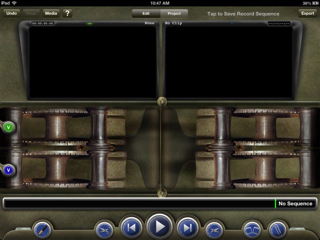
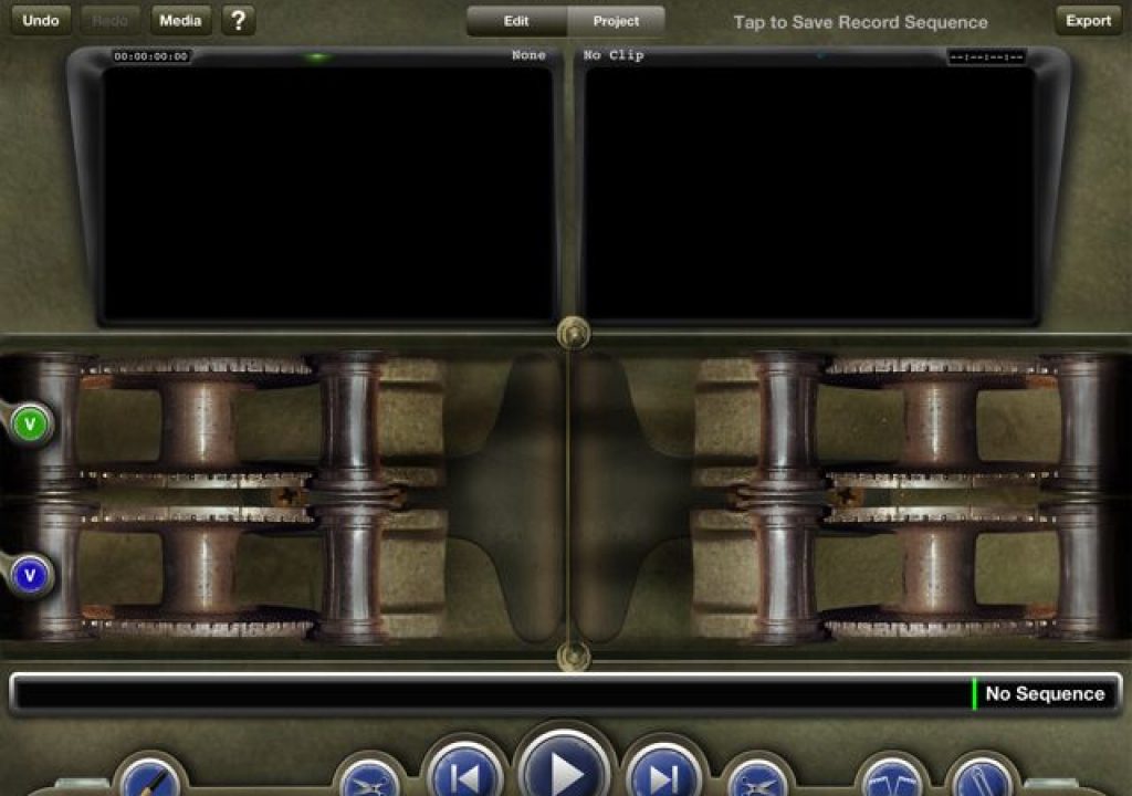
When TouchEdit says it is going retro, it certainly means it. What your eye will probably be drawn to are the mechanical looking things at the bottom of the screen. These are film rollers as TouchEdit is designed to resemble an old school flatbed film editor. This design decision will be immediately lost on many as the age of digital editing has rendered true film editing obsolete and even film students today might actually shoot real film but never physically cut it. The design of the app will be front and center of most discussions about TouchEdit as it's that design that dictates a lot of the function. Many will dig the skeuomorphic design of the app (it’s something that Steve Jobs might have loved) while others will find the design as its biggest fault.
What does TouchEdit creator Dan Lebental have to say about the design? I posed a number of questions to him while working on this article and he was kind enough to provide some answers.
As I’m sure you’ve read on Twitter, one of the more controversial aspects of TouchEdit is the retro design. Why was the choice made to emulate an old film editing system in a digital world?
That design became immediately apparent to me the first time hit the play button after loading up some footage. Like many other iPad editing apps (I’m looking at iMovie and Pinnacle Studio) the editing playhead remains stationary while the editing timeline scrolls behind it. But unlike other iPad editing apps the footage moves from left to right instead of the more NLE-conventional right to left. While this is correct from a flatbed film-design standpoint as the film on a film editing system would move that way it’s opposite of what you expect when coming from a digital non-linear editing tool. It does take some getting used to.
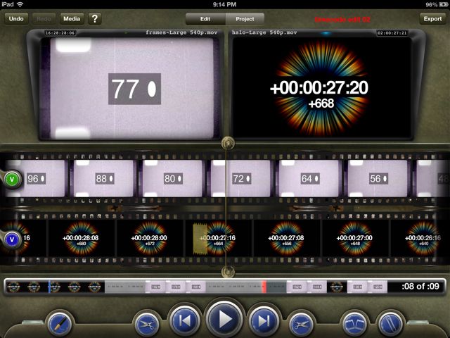
This is what TouchEdit looks like with an edit loaded in the Record monitor and footage in the Source.
When the developers say it’s a retro design they aren’t kidding as once footage is loaded up and you’ve got an edit in the timeline you’ll see the digital representation of actual film scrolling across the interface complete with sprocket holes. It’s quite the sight to behold. It’s not just the film that is skeuomorphic as there’s other interface elements that are retro too like a paper clip to make notes, tape to represent edits, scissors to trim and a grease pencil to mark IN and OUT points.
I’m not going to go into great detail on exactly how TouchEdit works as there’s plenty of videos that detail the functions of the app. Rather I’ll comment on some of that functionality and my experiences using the app over the weekend.
Using TouchEdit
Loading media comes from a variety of places including support for Dropbox. While the app can load media directly from the iPad’s camera roll if you’re planning to use TouchEdit for anything other than home movies your best bet will probably come from loading right through iTunes. Once TouchEdit is connected just check the Apps tab to load media.

I found the most reliable way to load media was directly through iTunes with an iPad connected. Those MVI files above are H.264 clips straight out of a Canon 7D. TouchEdit edited them just fine.
The video above goes into detail at the end as to how to use Dropbox to load media. Be sure and give it a look as I couldn’t figure it out at first. The easiest things to do is just link Dropbox from within TouchEdit and it’ll automatically create the folder structure you need.
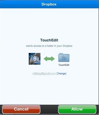
Link to Dropbox and the Dropbox app will open to link your account.
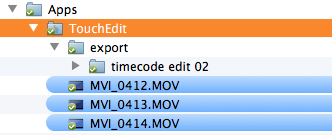
This Dropbox folder will be where movies need to be placed for import and where things exported to Dropbox will be stored as well.
When it comes to editing the first thing most users will need to get used to is that left to right movement of the media.
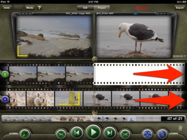
Since TouchEdit emulates old film editing machines media playback moves the media from the left side of the screen to the right, just like film would move in a flatbed. The line down the middle is the playhead.
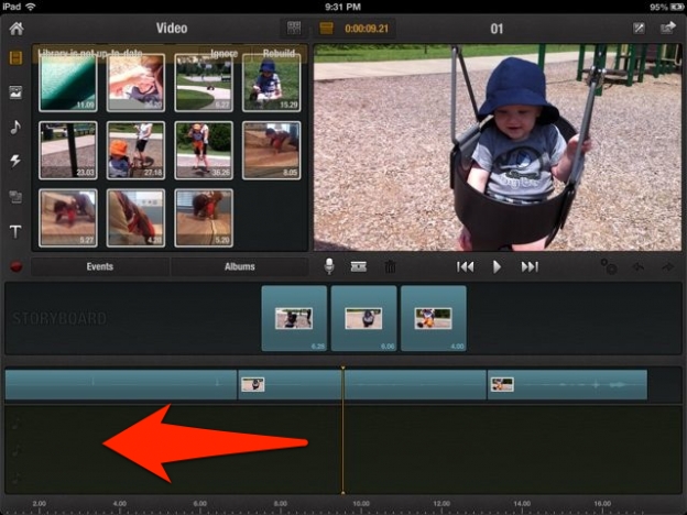
Compare that to the scrolling timeline of Pinnacle Studio as it moves the media from the right side of the screen to the left just like a conventional desktop NLE. Imagine the playhead actually moving and Pinnacle (as well as iMovie) has a normal NLE timeline.
This isn’t a deal breaker for TouchEdit but it will take some getting used to if you’re used to a desktop (or other iPad) NLE. This rather new scrolling direction also comes into play when it comes time to edit. I asked Dan about this as well.
With the TouchEdit design it operates somewhat the opposite “direction” of most NLEs, including some iPad editors (from playback to marking IN points). Is there any concern this will be too confusing for editors who are accustomed to NLEs working in a more ‘left to right’ kind of way?
Retro design meets modern NLE functions
There’s a real clashing of worlds when it comes to TouchEdit. While the app uses a lot of old-time real world things for the interface there’s modern NLE functionality all over the place as well.
Take the actual editorial tools and functionality in the app:
If that Source / Record, two-monitor interface looks familiar then you’re familiar with Avid Media Composer, Adobe Premiere or Final Cut Pro 7. Of course the two-monitor design came before computer-based NLEs but that’s what it’s most closely associated with today and it works very well.
With TouchEdit the Source side media is what is played back in the top filmstrip. The Record side, or the edit timeline, is what is played back in the bottom filmstrip. Performing edits is as easy as a drag from the top filmstrip to the bottom as seen in the video above.
But that old school film editing paradigm meets the modern NLE when it comes to the vertical mode mode that TouchEdit supports. There you’ll find things that are very familiar to those users of desktop NLEs. Once again it’s all summed up in a TouchEdit video.
To me the vertical or portrait mode is far more usable than landscape mode. That’s probably the desktop NLE editor in me talking but as you can see in the video above that’s where you get things like a more conventional NLE timeline, track patching, the ability to trim and even an audio mixer. The ability to actually zoom the timeline in and out will help when trying to trim. Just don’t try to tap and drag on a clip in the timeline as you can’t manually move them around.
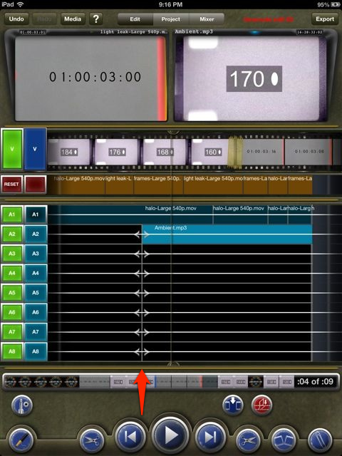
In the portrait mode you can actually see the edits in a more conventional looking timeline, though it still moves from left to right. See the arrow pointing to the line next to the playhead? That’s for trimming. The iPad is crunching a lot of numbers when using TouchEdit and it really feels like it is working hard when playing back in portrait mode. My iPad got quite warm after awhile.
With all of those advanced features coupled with the retro interface I posed this question to Dan:
There’s a lot of powerful features in TouchEdit, including many that that a seasoned editor will understand, but the design feels more like it’s geared toward a regular consumer. Who is the target market for TouchEdit?
Amen to digital photography sending way more footage into the edit. This is a universal problem in post-production and is certainly not unique to feature films. Anything that can help with that will be appreciated.
Moving from TouchEdit to other NLEs
That idea of creating an NLE on the iPad not for finishing of an edit but rather to supplement the desktop was the exact subject of a post I wrote in September 2012 called An NLE companion app is what I really wanted out of Avid Studio for iPad. That didn’t happen as Avid sold their app but Dan promises something similar from TouchEdit.
The 1.1 version of TouchEdit does support the new Final Cut Pro X XML as an export.
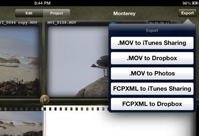
FCPXML export is a start and we should see more workflows in the future including Avid AAF.
I tried my dream workflow. That included exporting small 960×540 H.264 .movs from a batch of 1920×1080 ProRes clips. I then loaded those into TouchEdit and could see timecode stayed intact. After an edit I exported an FCPXML and tried to reconform that back in FCPX but no luck when I tried to relink.
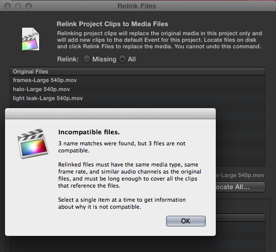
I had never seen that FCPX error message before. I’m not sure if the problem was going from the H.264 offline in TouchEdit to the ProRes master clips in FCPX or what but I couldn’t get them to relink.
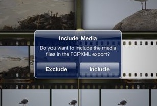
TouchEdit also gives the option to actually include the media used in the edit when you export the FCPXML. This option actually produced an FCPXML with media files that was able to conform in FCPX. But that doesn’t help when trying for an offline to online type workflow.
Next up: Random observations, what's next for TouchEdit and a few more words from Dan
Random observations from using TouchEdit
This article isn’t meant to be a how to on how to use TouchEdit as the tutorial videos are great for that. It’s not really a review of the app either so I thought that it might be useful just to list some random thoughts and observations that I had while working with the app over the weekend.
• TouchEdit isn’t completely stable as I had several crashes over the weekend of working with it. Of course both iMovie for iPad and Pinnacle Studio seem to crash more often than they should as well.
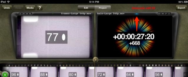
Keep an eye on the little toggle lights at the top of the Source and Record monitors as they tell you which side of the edit you’re working on. I think they should be more prominent as that little blue dot is what tells me I'm working in the Record monitor / timeline.
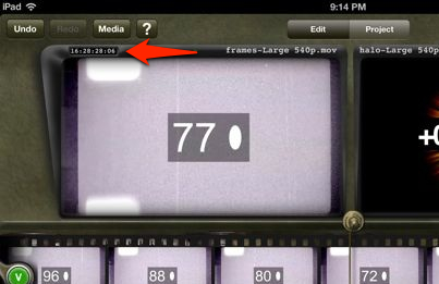
.mov files will carry timecode metadata and that’s what the arrow above is pointing to. I assigned code to all of these test clips that I was using such as the 16 hour code above.
• I was able to load both an AIFF and an MP3 into the TouchEdit iTunes sharing but only the MP3 showed up for importing.
• You’ll most likely need to really study the tutorial videos as there’s a number of places where you’ll use long taps or double taps or two finger taps to achieve a certain task. I had to rewatch some of them several times. Hopefully we’ll get some kind of written manual or a gesture cheat sheet to leave up while learning the app.
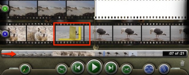
That mini-timeline at the bottom will be your best friend for a longer edit as it’s much faster to navigate there as opposed to scrolling the filmstrip. Also in the image above you can see both a piece of splice tape that represents an edit as well as the yellow OUT mark.
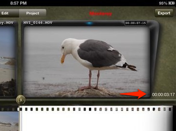
If you’re in grease pencil mode a double-tap on a shot will give you an IN to OUT duration next to the monitor.
• There’s an Undo button but it seems to sometimes become confused and either not work or it takes a couple of taps for it to actually happen.
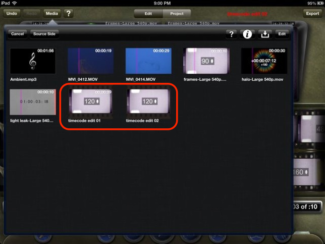
You can save different edit sequences and they are represented in the Media bin with a filmstrip around their icon. I found it best just to name them with ‘edit’ in the name as they can be hard to identify.
What’s next for TouchEdit?
That’s exactly what I asked Dan.
Any future plans for TouchEdit you can share with us?
That’s a very ambitious development schedule so it really looks like they’ve got big plans for TouchEdit. I sure hope Apple is able to get the updates approved quickly. Many will think that the $50 price tag is too high considering the cost of iMovie but TouchEdit is aimed at a much different market. While if feels like FCPX is the target desktop NLE companion for TouchEdit I suspect that was by far the easiest thing to support for interchange. Dan probably isn’t going to be cutting his next feature or television show in FCPX. Expect some videos to come online on the TouchEdit website with details on how to encode for the app with Compressor, CatDV and Resolve Lite. I look forward to those.
Dan also said this, which I think is a good final thought:
I think that sums TouchEdit up pretty well at this early stage in its life. It’s not perfect and has a few bugs but for professional editors there’s nothing quite like it on the iPad. If it continues down its ambitious development road it could add something to the editor’s toolbox that we’ve never had before.
Filmtools
Filmmakers go-to destination for pre-production, production & post production equipment!
Shop Now