Why would someone brave mid-100 degree temperatures and high humidity to visit Austin Texas in the summer? To get a dose of creative inspiration, of course. But rather than being devoted solely to graphic design eye candy, we were surprised to find that the 2009 HOW Conference was also heavily slanted toward the topics of product design and marketing – as well as numerous talks on how to keep your own creativity fresh while dealing with both clients and management.
The highly respected HOW Magazine – the parent of the HOW Design Conference – is primarily devoted to graphic design and business concerns in the print industry, with some crossover to web and motion. We were invited to give an introductory talk on After Effects for those looking to expand beyond print. Trish made the move from print to video years ago, but after attending this conference, we can tell you that print is certainly not dead yet. Out of 50+ sessions, we were the only one on video or motion graphics; there was only one pre-conference session on Flash, and just a handful of others that gave a peripheral nod to new media beyond websites (i.e. podcasts, video games, iPhone apps, etc.). Plus most of the parties and special events were sponsored by custom paper manufacturers and stock photography houses.
Despite the old-school focus, there was still a lot of thought-provoking information conveyed. Here is a summary of the talks that particularly stuck with us:
Progress vs. Novelty: What Will You Think of Next?
 Wednesday evening’s keynote was given by Rob Walker, the author of the Consumed column for the New York Times Magazine as well as his own Murketing blog. He looks at design both from functional and communication points of view, studying issues as both a marketer and an anthropologist. He sees design, image, and marketing as not just being about building a better mousetrap (and letting people know about it), but having a “dialog” with the consumer.
It’s one thing to have a blog or forum on your website; it’s another to actually respond to what your customer is saying – not just answering their questions, but understanding what it is they really want. Sometimes they want something comfortable and familiar. Sometimes they want something that is “venturesome.”
A great example he gave concerned the topic of “counterfunctionality” – creating products that didn’t actually do their job better, but instead were a quirky way for the owner to express their individual identity. Take, for example, watches that look cool, but which are actually hard to read (of which Chris owns several) – no focus group is going to tell you to make such a product, but hanging out with your users just might. Same goes for pants that hang well below the waist.
Our takeaway as designers? Go beyond the obvious solution, and instead look for the essence of what your target audience is actually interested in. It may not be all about the logo or a list of features; it may be about the lifestyle, or the way the user wants to feel.
Leading a Creatively Curious Life
This talk by Von Glitschka was one of several given by designers on how to seek out creative inspiration in your daily life. For some, this may seem like an obvious pursuit. But for many others caught up in the daily grind of meeting deadlines, keeping clients happy, and maintaining a personal life, it’s all too easy to find you’ve been walking around with your head down, nose to the grindstone. The basic message here is: Lift your head up and look around! And if you see something interesting when you do, don’t just go “that was interesting…” – use it. Indeed, Von’s manifesto for being creatively curious is:
- Act On It
- Share It
- Enjoy It
For example, Von had a printer that was horribly malfunctioning: All that came out were a series of streaks. Rather than boot the printer across the room (which we’re sure came later), he kept the printouts and scanned them, so that he would have a grunge texture for future reference. Not only that, he’s made those scans available for others to download. This general idea of seeing cool textures in his work and travels and capturing them for use in his own projects – plus making them available to others – has expanded into a line of books and downloads Von now sells.
(Takeaway: Always carry a camera with you. And use it.)
Or, if someone sings “all by myself” and you instead hear “Obama’s elf” – and if you also happen to be an illustrator – well, what are you waiting for? Don’t just chuckle to yourself; act on it, share it, and enjoy it, as Felix Sputnik has below:
 In another example, Von belongs to a group that regularly gets together and sketches based on a theme. One of these sketches evolved into an entire new line of work designing tattoos (including an education in intellectual property law, as his design was appropriated by a Chinese company who sold it as part of a rub-on set of tattoos distributed in the US…Von won, and was paid royalties).
Perhaps the best idea to come out of Von’s talk was to “replace fear with curiosity.” How many times have you been fearful to take on a new job, learn a new piece of software, or even try a new food because you’re afraid it will turn out badly? Instead of recoiling, leap at these situations as opportunities to expand your horizons.
(And if you don’t find yourself encountering enough opportunities to expand your creativity on your own, Von recommends the book Caffeine for the Creative Mind: 250 Exercises to Wake Up Your Brain.)
next page: Good vs. Great Design; 10 Things You Didn’t Know Fonts Could Do
Good vs. Great Design
 There were a few talks that the HOW conference organizers knew from the start would be popular – so they scheduled them twice. In this case, the original running of Cameron Moll‘s Good vs. Great Design was scheduled across from Von Glitschka’s Living the Creative Life, so we saw Cameron’s rerun on Friday. If you were ever interested in designing a product, a print or web page, a user interface, or anything else where the user has to interact with something you created, then Cameron’s talk was for you.
Cameron’s concern is that too many designs are solutions in search of problems (how often have we seen a piece of technology converted into a product, without thinking through exactly whether or not it was wanted or needed?). Beware of introducing a solution before knowing the problem! And sometimes, the problem is not entirely obvious: Users may not realize they have a problem; they may think that whatever they’re tripping over is just the way things are. This is where you have to be a bit of a detective or even an anthropologist: “Design is problem finding; not just problem solving” noted Moll.
Echoing themes brought up during Rob Walker’s keynote, Cameron dusted off the time-honored maxim “Design is fundamentally communication.” However, he’s come to find that’s not enough. Some estimates indicate that we are bombarded by 3000 advertising messages a day. To rise above this noise, infuse your communication with meaning: “Great design yields meaningful communication.”
 From there, Cameron imparted several important bits of wisdom and overarching themes to consider. For example, one of his maxims is “good typography begets knowledge.” Cameron quoted Jan V. White (author of Graphic Design for the Electronic Age
): “Typography is not an esoteric art form; it is a tool to be used to make information accessible. Information is neutral material. Only when it is transformed into knowledge does it have value.”
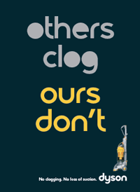
To reinforce this concept, Cameron presented the Dyson ad here as an example of this: note how the typography helps convey the message beyond mere words, but does not get in the way of reading the words.
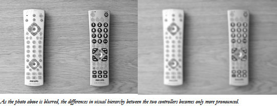
Another one of Cameron’s maxims is “Visual hierarchy yields importance and correlation.” In other words, if it’s more important, it should be bigger, and in a color (or more importantly, luminance value) that provides contrast to its surroundings. To check for this, he often converts an image or screen capture to grayscale, and then blurs it slightly: Can you still tell the hierarchy of what’s important and what’s not? If not, your user may get lost. The images below of two universal remotes is from Moll’s talk:
Another Moll maxim is that “Hierarchy and scanning are inseparable.” Cameron feels a designer should take “physical, biological, and cultural” considerations into account when designing a user interface. For example, Westerners typically read by starting in the upper left and ending in the lower right; make your ads or text layouts flow that way. The upper right is not in that flow, but still a good place to locate something important; the lower left is considered a “weak fallow” area: In other words, don’t put anything there that the user must read to successfully navigate your ad or user interface.
Anyway, it’s not our purpose here to transcribe his entire talk. HOW has generously made the handouts from the conference – including Cameron’s – available here (MP3s of many sessions will be available for sale later). Cameron also spoke highly of Bryan Lawson’s book How Designers Think.
10 Things About Fonts You May Not Know
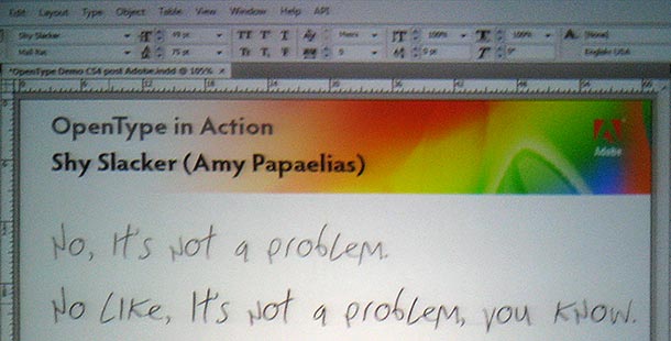
Thomas Phinney‘s talk turned out to be more interesting than expected. It included an overview of font characteristics, legibility concerns, and advanced typographic effects available in OpenType font, but then veered off into more lively topics. He showed a number of examples of cutting-edge fonts that can emulate realistic handwriting or translate languages. After recruiting a member of the audience, he pulled up a phrase on the computer that the assistant had to retype. As he did, the font would then translate the words on the fly into another language or variation. Our favorite was the humerous Shy Slacker font (see image below), by TypeTalk, the brainchild and thesis project of Amy Papaelias:
The most interesting part of the session was how Thomas helps to solve crimes with his font knowledge! While no fonts were involved in any serious murder mystery, Thomas has been called upon as a “type detective” (someone who can weed out possible forged documents, fake degrees, fake mail, and so on).
The most infamous case he’s been involved in was during the 2004 US Presidential campaign. You may remember how Dan Rather on CBS’s 60 Minutes produced four memos relating to George W. Bush’s service in the Texas National Guard. The memos were quickly shown to be fakes. Thomas was one of the typography experts hired to check their validity, and he proved that they could not have been produced by any typewriter of that era. His conclusion was that the memos were typeset on a computer using Times New Roman. (His basic premise is that if you have enough text to compare the relative line endings of paragraphs of text, each font will have its own “fingerprint” due to the number of different possible widths that could be assigned to each character. For instance, an IBM Composer font could only have 9 different widths, while Times New Romans has 18 different widths.)
next page: Designing for More than Three Screens; Color Management; more…
Designing for More than Three Screens
 For those not up on their hip-speak, the first screen is considered to be film; the second screen, television; the third screen, the computer (and the web); the fourth screen, mobile video.
John Crouse (not pictured at left) – who’s resume includes Wired, MOCA, the interactive unit at Digital Kitchen, etc.) – sees the fourth screen as also including everything “from video games to electronic billboards.” Slowing this adoption is fear of the unknown: As John pointed out, for many the prospect of Change = Fear, and the Future = Change.
The current default workflow is to come up with a story, create it into a script, convert the script into a video, and then repurpose that video (or outtakes or additional scenes from it) for other media. In many cases, these other media are used primarily as marketing tools for the original broadcast video. John feels that in the future, the more appropriate workflow will be to take the original story and then come up with separate scripts that are each appropriate for the media types chosen for distribution. Indeed, there are commercial reasons to view the TV version as the marketing device to drive people to the interactive outlets.
Our concern is that saying this is one thing; getting the networks to buy off on it is another. We’ve already seen how networks only wanted to have one master tape to deal with when broadcasting in 4:3 and 16:9 formats (and those who create content for the BBC have to worry about their 14:9 compromise); thus we ended up with “center cut” and the poor artistic compromises it required (click here for more on centercut and letterboxing issues). Getting them to agree to produce more than one version of the same program is really going to require a change in their mindset.
Given that you can get the networks on board with this new world order, how do you design for these varying media and experiences? John thinks in terms of each program as having a central “myth” – its storyline, its backstory, its world, its mood, etc. Given that, his guiding principle is to make sure you design for the myth. To do that:
- Strive to understand how the myth can best be expressed in each medium (in other words, don’t just bolt on interactivity to what is essentially a TV version of the program).
- Work with the writers. The writers know the myth. Get them on board early so that they can start thinking about how to express the myth properly in different formats.
- If it makes you uncomfortable, you should do it. (Does this sound like an echo of Von Glitschka’s “replace fear with curiosity”?)
Color Management Solutions Using Adobe Creative Suite
Although about Adobe products, and sponsored by Epson, this session was given by independent consultant Eric Magnusson of Left Dakota. Indeed, according to Eric, different Adobe applications inside Creative Suite 2, 3, and possibly 4 will print the same document differently. (So if you ever feel bad about not mastering color management yet yourself, take heart; even one of its biggest advocates has issues as well.) The workaround is to create a separate color profile per application per printer (ugh).
There was some interesting discussion about what color space to use to author media in. The conventional wisdom is to use a wide color space (such as Adobe ProPhoto), so that you have the best master in your archives to repurpose to other media later – just make sure you do a display proof of your target color space to see what’s going to happen with your current media. An interesting dissenting opinion was given by a designer in the audience who believes in working in the narrowest color space anticipated in the production chain (such as CMYK for printed t-shirts), so that all of your media – print, web page, PDF, and final product (t-shirt) will match. The biggest reason for returns of t-shirts is that the color of the physical product did not match the color in the ad; if you’re going down from ProPhoto in Photoshop to sRGB on a website to CMYK for the shirt, you are virtually guaranteed that they’re not going to match.
Although the differences are not as severe, this discussion still has implications inside the video world, as standard definition video and the web have different color profiles (the display profile for HD video is sRGB, which is the same as the web). The question to ask the client is: Do you want it to look (as close as possible to) the same across all media, even if it means compromising the image slightly in some formats? If so, set your project working space to match the video format, and convert to sRGB for the web on output. Or do you want it to look the best it can in each media, even if there may be some slight variations from media type to media type? If so, set your working space to a wider profile such as ProPhoto.
 Another big takeaway is how ambient lighting can change the perception of color. Some inkjet printer inks react to fluorescent lighting by appearing much more magenta than they would be in natural night (or when printed in mass production). This is less of an issue when staring at a computer or video monitor that is emitting light – assuming that your computer monitor has been calibrated, and that you’re using an actual broadcast video monitor.
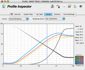
For those who wish to understand color management better, Eric recommended CHROMiX’s ColorThink (pictured here) as a diagnostic tool. We’ve also written a video color management article for Artbeats, with a follow up on scene- versus display-referenced color profiles here on PVC. (Also see Chapter 25 of our book Creating Motion Graphics.)
BBQ Pot Pourri
Aside from those talks, there were other useful nuggets of information that fell out of other sessions as well. We’ve already briefly mentioned the Color Marketing Group; this lead came out of John Bredenfoerder’s talk Color Strategy. John both reviewed the fundamentals of how we talk about color, demonstrated that the same color can have a different meaning in different contexts (so don’t get wrapped in color clich©s such as “red is hot”), discussed how fads evolve into trends and then into cycles, and discussed some of the currently popular colors (such as white being popular for business, as it represents “economic cleansing”). His handouts are among those that HOW has made available to the public.
Jeff Fisher (who wore a clown nose for most of his talk on marketing yourself) made the brilliantly obvious-once-someone-says-it comment that, from a marketing perspective, you shouldn’t spend your time networking on sites with your peers; go to sites where your (potential) clients hang out. Some of his favorites are sites dedicated to new businesses such as Biznik and StartupNation – who needs marketing and identity services more than a startup? He also likes Peter Shankman’s HARO (Help a Reporter Out) – a free service dedicated to helping connect reporters looking for anything from background to a quote to an entire article with professionals with knowledge on those subjects. There’s no better marketing than being recognized as a quoted “expert” in a field!
Also hugely entertaining was Marc English’s Discovery: Frontiers Are Where You Find Them session, where Marc posed for photos, played harmonica, harassed people entering or leaving after the talk had started, and in general wove a seemingly random path around his subject of “learn(ing) how to embrace experiences and discoveries you weren’t expecting, how to share what you discovered, and how to define your frontiers, whether they are in your own backyard or across time and space.” In short, he too makes a habit of getting out, photographing anything that strikes him as interesting such as a handlettered sign on an Indian reservation, and then later draws upon these inspirations in his own work for clients (see: Von Glitschka’s Living a Creative Life session mentioned earlier).
Coda
 Aside from the high-quality talks, we should note that the HOW Conference itself was very well run, with great parties (the ice cream sundae bar was an especially nice touch given the weather), a good bookstore, and even a chance for attendees to sell their own handmade wares such as t-shirts, iPhone cases, and jewelry. Plus Austin itself is a great town, with lots of fun restaurants and bars – just too bad about the weather.
Next year, the HOW Design Conference will be in Denver from June 6-10, where it will be considerably cooler (by the way, southern Colorado is lush and beautiful that time of year; see if you can swing a few extra days off to relax and recharge).
In the meantime, if you’re looking for a way to inject a little creativity into your job, we suggest you view Belief Design’s classic Pollinate 2005: The Common Desk for both entertainment and inspiration.
The content contained in our books, videos, blogs, and articles for other sites are all copyright Crish Design, except where otherwise attributed.
Filmtools
Filmmakers go-to destination for pre-production, production & post production equipment!
Shop Now
