This was the first project shot for California’s No on Prop 8 campaign. In an attempt to reach out to young voters I recruited my cousin Catherine, and her best friend Austin, to record an appeal for youth to get up and vote down Prop 8. They’re both politically active and immediately said “yes” to the project.
As we were unable to secure a free stage for the project we turned Catherine’s mom’s living room into a green screen studio. DP Simon Sommerfeld volunteered his services as gaffer and offered the use of his lighting and camera equipment, and Neil Tanner volunteered his teleprompting services. Phil Turner, newly arrived sound recordist from the UK, also volunteered and did a great job of recording usable sound around traffic noise.
We used Simon’s HPX-500 camera, which did a great job on flesh tones but wasn’t the best camera in the world for green screen. The chip is not native HD and uprez’s the image considerably. Normally this is a process without noticeable artifacts but we discovered some flaws during the green screen composite that forced us into a look that we hadn’t anticipated… but it turned out pretty darned good.
First, let’s talk about lighting on the next page…
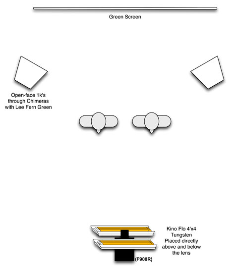
We shot this spot in a living room, and I had to plan my lighting accordingly. I’ve discovered that spilling foreground white light onto a green screen usually isn’t a big deal as long as there are no noticeable shadows so I created a pseudo “ring light” out of Kino Flos for a glamorous look:

A ring light is a round light source that wraps around the radius of the lens. Light coming from very close to the lens axis smoothes skin imperfections because those imperfections are often only made visible by the shadows they cast–and light directly from the lens axis doesn’t cast shadows, at least not on the face itself.
One benefit of a ring light is that the shadows it does cast fall around the outside edge of the object it’s lighting. In the case of lighting a face, all the light from the ring light hits the center of the face but falls off toward the sides because the sides don’t see the entire source. The face appears to glow from within.
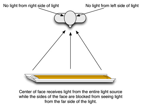
I duplicated this effect somewhat with two 4’x4 Kino Flos. Here’s the geometry of what’s going on:

The center of the face sees all the light from the entire 4′ length of the Kino Flo. The sides of the face are shadowed from the far half of the Kino Flo, so they are a stop or more dimmer than the center of the face. This is a nice way of creating a glamorous look without simply lighting flatly.
You can see this effect below. It’s mostly apparent on the sides of Austin’s face, although Catherine is seeing some benefit on her cheekbones:
I raised the top Kino Flo a bit above the lens because I wanted to create more defined chin shadows. Downward-cast shadows are less distracting in a shot like this than upward-cast shadows, so while the top Kino Flo was raised above the lens axis for chin shadow modeling the bottom Kino Flo was kept right below the lens to minimize shadowing.
Both units had Lee 216 White Diffusion on them to create a larger, softer source. The top unit had 4 bulbs on while the bottom unit only had one bulb on for fill.
I didn’t use a backlight because I didn’t have room for one, and I don’t use backlights that often anyway. It seems that a lot of DP’s resist artificial backlights as they age and I seem to have reached that point in my career where lack of a backlight doesn’t bother me.
The lights illuminating the green screen itself had Lee Fern Green on them. The key to making an object’s color pop is to light it with light of the same color, so by lighting the green screen with green light it becomes a much more saturated green–resulting in a much better key as the screen’s chromaticity is vastly different from that of the next closest colored object. (Thanks to DP Geoff Boyle for the Fern Green tip he gave me years ago.)
On the next page I’ll walk you through the post steps required to create the spots special “look”…
I worked with my friend Craig Thomas, a 3D animator and editor, to finish the project in After Effects. Craig is a wizard at compositing with Keylight, After Effect’s built-in keyer, but we ran into some issues with the HPX-500’s uprez’ing. The HPX-500 chip is not native DVCProHD size (720×960) so it uprez’s the chip’s image to HD sizes. In the process it has to make up information to fill in the gaps created by adding new pixels, and we discovered that the best way to expose this flaw was to try to create a green screen matte.
Here’s an example of what we saw:
As you can see, Austin’s ears are going to be a compositing problem. We also had a lot of trouble with Catherine’s hair.
There’s a technique I’ve played with in Photoshop that mirrors a rumor I heard about years ago in LA: word had it that when director David Fincher did a music video he sat in on the telecine session and had two passes transferred, one in focus and one out of focus. He then laid the sharp image on top of the soft one and made it partially transparent. The combination of sharp and soft can be a bit magical, and I’ve played with this trick a number of times on still images in Photoshop. I wondered if it might help me out in this case as I desperately needed to smooth over some harsh matte edges.
Here’s what I did in After Effects, with Craig’s help:
And here’s what it looked like, step by step. This is the “raw” green screen image:
For the bottom layer we created the key (shown here with white; I’m not going to try to reproduce Craig’s beautiful color grad) and blurred the image slightly using the Gaussian Blur filter:
Then I worked on the second layer, first by desaturating it:
And then clipping the flesh tones using Curves:
Here’s what the Curves window looked like when I reproduced this look in Photoshop:
And the final comp, with the blown-out black-and-white image placed over the blurred color image with 50% opacity, looks like this:
There’s something very pretty and delicate about desaturating colors this way. For me, half-saturated colors impart the feeling of a watercolor painting or a 30-year-old color transparency. On a practical level it blurred the key enough that blocky edges weren’t as noticeable in the NTSC version of this spot.
We mixed the audio using a music loop from Garage Band (I told you this was a no-budget spot!) and off it went. (We didn’t compress it for the web. That was handled elsewhere.)
I’ve got some RED spots that I hope to write about shortly; meanwhile, thanks for reading the article and please, if you live in California, vote NO on Prop 8!


