One of the first things we discover at NAB 2024 is that it’s tough being a waveform monitor in a world full of HDR. In fact, it’s probably hard being more or less any piece of test equipment, doomed to be bolted into a rack and scowled at by a succession of engineers. Still, it’s not the hardware’s fault. In that unwelcome moment of having a piece of technology tell us that things are not as they should be, it’s easy to forget that the very definition of how things should be was at some point dreamt up by a group of humans.
The presence of SMPTE at shows like NAB is ostensibly to report on the process of standards development, although there’s inevitably debate about what those standards should be. Whether or not there’s any real chance of influencing the process at this stage is unclear, but it’s always been easy to goad dedicated propellerheads into a sort of technological title fight over, for instance, how bright is bright enough to be called HDR, and what color red really is. And whether we’re talking about lights, cameras, displays or post, we spend quite a lot of time round here discussing what color things are, so it’s often worth sitting through the powerpoints at this sort of seminar.
The SMPTE conference track at NAB 2024 began, after an intro from Society leadership, with input from Joachim Zell, SMPTE’s Hollywood section manager, vice chair of the Academy’s ACES project and chair of the engineering excellence awards committee at the Hollywood Professional Association (now that is a LinkedIn). In the audience, meanwhile, was someone much more used to presenting seminars than attending them – Bill Feightner, currently of Colorfront, and someone Zell himself referred to as “my mentor” when Feightner piped up during the post-presentation Q&A session.
A good group, then, in a nondescript conference room.

Lasers
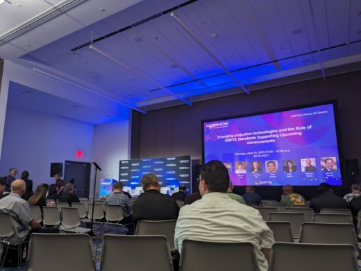
For the sake of full disclosure, Pro Video Coalition likes writers to submit photos with writing like this, but most of the readership have probably already seen rows of plastic chairs in front of a projection screen that’s being washed out by the cyanotic glow of the overhead room lights. It’s an ugly place to discuss beauty. Happily, projector manufacturers Barco, which had supplied one of its most capable models for demonstration purposes, had persuaded the conference center to switch off those lights when the critical projection demonstrations were in progress. Attendees were thus treated to a rare opportunity: conventional and wide color gamut images side by side on a high-end projection display.
The purpose here was partly to demonstrate Barco’s laser projection technology. The company hasn’t made conventional, Xenon-driven projectors in two years. Lasers have advantages of both efficiency and engineering convenience, given the red, green and blue are generated separately as opposed to being split from white light. The demo material was chosen quite carefully to demonstrate things that Rec. 2020 will do that things like P3 won’t, particularly cyan hues, which suffer due to a lack of deep green. Reds, too, are noticeably better, reaching more toward the ruby.
It’s one of those situations where the conventional material doesn’t look wrong until the improved material is introduced; it’s not something that’s easy to describe (or something we can feasibly demonstrate on the display you’re probably looking at) but it’s hard to dislike. It’s also newer to cinema, which has been a P3 world since the digital cinema initiative was spawned, than it is in TV, where Rec. 2020 OLEDs have been on the shelves for years.
Cinema is dim
The comparison to television is even more interesting in the context of brightness, or, more to the point, lack thereof. We’ve said this before, but cinema is dim: barely 48 nits, or half the standard hundred-ish that video displays conventionally achieve. It’s even less in comparison to the brightness that home TVs, actually achieve, often in the 200-300 nit range for viewability in a lounge rather than the black box of a grading suite. There are – with grim inevitability – at least three potential standards for cinema HDR, although the number mentioned most often at today’s event was 300 nits.Which is to say, cinema HDR might end up being about as bright as mediocre home TV.
Feightner’s contribution was to suggest that there’s no reason to specify 300 as an absolute maximum in a situation where the peak can be controlled by metadata, which makes sense (and to some extent is indirectly embodied in systems like Dolby Vision). Still, it does highlight the complexities underlying any imaging system which might potentially provoke the human eye to modulate its iris in response. At this point the discussion starts to become almost medical, something Zell referred to frequently in his speech.
It’s not something Philo Farnsworth was too worried about, although it’s worth bearing in mind that the famous test shots of his wife show the poor woman with her eyes closed, presumably against the dazzling barrage of light required to make Philo’s early designs work. These days, it’s the audience squinting.

