Equipment doesn’t make the image; people do. I proved this on a music video recently where we had more people than equipment.
It’s been a while since I last posted, for which I apologize. I’ve been working on taking my showreel to the next level by shooting a couple of spec projects.
One you’ve probably already seen: the Nintendo Wii spec spot I shot on the RED. The director I pulled in for that, Jono Schaferkotter, came to me shortly after that shoot and asked if I’d help him with a music video promo he wanted to do for a singer by the name of Rachel Williams. As I consider Jono to be a very talented up-and-coming director who lets me shoot cool stuff, I instantly said yes.
We shot said project on June 7th and 8th, on location in Santa Cruz. It was a down-and-dirty production, shot over the course of two ten hour days, with a very small crew and very little equipment. Having said that, let me also say that it’s some of the finest work on my reel.
Here’s the finished spot:
This was shot on a Panasonic HVX-200 and color graded using Magic Bullet Looks. Here’s what the cut looks like without the color grading, as I shot it (except for the composite scene where Rachel appears twice in the same shot, which is graded):
As you can see, I did quite a bit of post tweaking–and I shot with that tweaking in mind.
We shot 60p, recorded to a Firestore, because Jono wanted maximum flexibility in post. One of Jono’s heroes is director Mark Romanek, who frequently used slow motion for dramatic effect. After some experimenting Jono discovered that slowing the 60p footage, on a 60p timeline, to 33% in Final Cut Pro (and turning off frame blending) gave him the look he was going for.
The cuts above are about 85% Jono’s edit and 15% mine. He’s cutting an actual promo for the artist whereas I’m cutting something for my reel, so I opted to use some different shots in different places. I’ll go through that shortly as I want to talk a little bit about how we executed every shot in the video. We did this totally on the cheap: my lighting/grip package consisted of an Arri kit (2x300w lights and 2x650w lights), two extra light stands, two homemade shiny boards made using Reflectix, two white cards, two black cards, some grid cloth and a Cinesaddle. I never used more than two lights at a time.
Here’s what Reflectix looks like in action:
Available from your nearest Orchard Supply Hardware store. Look in the water heater section. It’s insulation material.
How to color grade your footage at home on page 2…
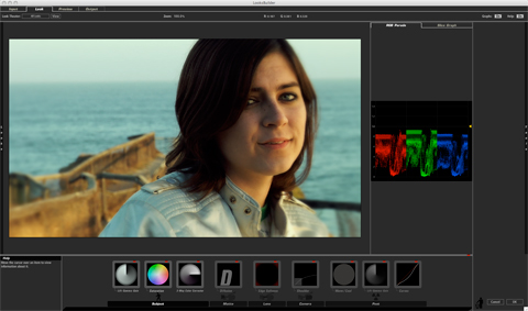
Before the shoot I went on a location scout with Jono and his producer, Laura Green. All the locations were in Santa Cruz: a bluff overlooking the beach, the city pier and the Boardwalk; the Boys and Girls Club of Santa Cruz; the roof of a friend’s house; the artist’s home; and Jono’s apartment. I took stills at all the locations except for Jono’s place and the roof, brought them into Final Cut Pro, and then played around with some looks using Magic Bullet Looks. I discovered that, while the presets in Looks are okay to start with, I preferred to use them as jumping off points to create my own looks. Each Look is created with modules (such as Curves, Diffusion, Vignette, Saturation, etc.), and it’s quite easy to turn an individual module on and off to see what it is doing. By selecting a preset Look that was close to what I envisioned, and then tweaking the component modules individually, I found it very easy to quickly achieve the image that was in my head.
Here’s what the Looks window looked like when I created my outdoor “minus blue” look:
Here’s detail of just the modules from the “post” section of the chain:
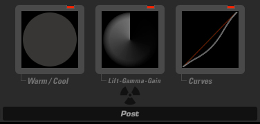
Looks has five “rooms”: Subject, Matte, Camera, Lens and Post. Each room allows you to add and tweak different modular effects, and the result can be seen in real time. The only drawback is that you can’t play the clip while in the Looks environment–you have to exit LooksBuilder and render the clip on the timeline in order to see what you’ve done in motion–but otherwise it’s a very powerful tool for amateur colorists like myself to take their shots to the next level.
This is the test video clip that I created from location stills shot with my Nikon D70:
Jono loved the green look at the pool so I did a lighter version of that for my final version. Originally I thought I was going to do an exaggerated warm/cool for the exterior shots at sunset but in the end I subtracted a lot of blue for a warm flesh/desaturated ocean look. The final interiors look nothing like this test as I opted to go with a color reversal look that I didn’t test here. (Jono is the guy with the beard; Laura is the woman in most of shots; and one shot shows the artist and her boyfriend having dinner while we blocked a VFX shot.)
I’m going to go through the video shot by shot and tell you a little bit about how each shot was executed:
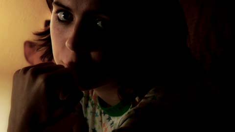
This is the shot that Jono used near the beginning of his edit as he felt it was a very vulnerable moment. I agree–it’s a brilliant moment, and I used it as the opening shot of my edit. This was shot in Jono’s apartment using two lights: a table lamp sitting on the floor off to the left of the shot (you’ll see a wider version of this later) and a 4×4 bounce card covered with Reflectix in the kitchen off to the left. I’m using the kitchen doorway to cut the Reflectix source off the back wall.
(all production stills courtesy of Katie Hodges)
Reflectix is a fun material. It looks like silvered bubble wrap. It’s extremely reflective, to the point where you could easily blind someone just by bouncing a bit of sunlight at them, but if used in the right way it has an interesting softness to it. Not only can it be very soft but it is also very directional, which helps if you don’t have a lot of C-stands and flags and crew around. I’m not sure how much heat it can take but it held up fine under the tiny lights we were using. In this case I believe it is bouncing a 650w tungsten open-face Arri light from about 8-10 feet away.
I was the oldest person on a crew of 20-somethings, and occasionally they did things that made me feel very old indeed–for example, when we needed to raise the table lamp off the floor for a shot, the handiest object around was a Corona six-pack.
_________________________________________________________
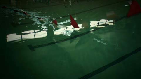
Our first location for Day One was the pool at the local Boys and Girls Club. We had the whole place to ourselves. There was some natural light from a row of windows high atop two walls that ran the length of the building, and we added some side light by opening a couple of roll-up doors. Before the extras arrived we grabbed a few inserts to tell a little bit of the song’s story, which boils down to a girl leaving a relationship because her boyfriend’s swimming career was more important than she was.
The flags dropping into the pool became the inspiration for a trick shot we did later in the piece…
_________________________________________________________
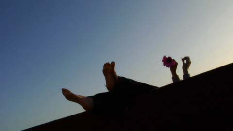
We shot this on a bluff overlooking the ocean, the Santa Cruz pier and the boardwalk. The quality of light was spectacular that evening–very soft, very low in contrast and just skimming the ground. The fill on Rachel’s feet was provided by a 4×4 Reflectix card held by Dan Allen, the brother of a film student I’m working with. He came out to assist me on Day Two (this was our second to last location), which gave me a lighting/grip crew of two, including myself. He was a huge help, especially as there’d only been one person on the lighting/grip crew the day before.
What a beautiful location. When we finished there we went to
_________________________________________________________
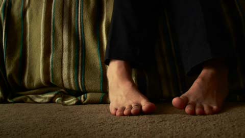
Jono’s place. Remember the first shot in the video? Same place. We had Rachel do some hand gestures and feet moves, and this move really caught Jono’s eye. I think it’s a great little moment. Lit entirely by a 4×4 Reflectix bounce off to the left.
_________________________________________________________
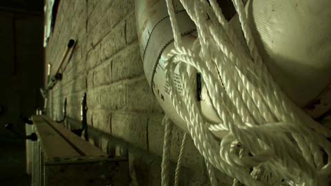
This was a cool shot. Here’s a still from later in the shoot but from approximately the same camera position as the shot above:
The bright glow is a 4×4 Reflectix bounce card leaning against a picnic table. It lit up the entire back wall of the pool area. When Jono came over to look at my shot he cast a wonderful shadow on the back wall. I pointed it out to him and he loved it, so we rolled the camera and then had the entire production team walk along the back of the pool, pretending to be a swim team. It worked out quite well. I love the quality of the shadows: they feel very natural, not artificial at all.
On the left side of the picture you can see me holding a shiny 2×3 something. That’s my 2×3 Reflectix bounce that I used later to light the other end of the pool. That story shortly. Keep reading…
_________________________________________________________
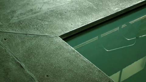
This is a transitional “grab” shot that we knew we’d use, although we didn’t know where. Note that this shot, and the life preserver shot above, are graded with the “green” look I created for all shots related to the pool.
_________________________________________________________
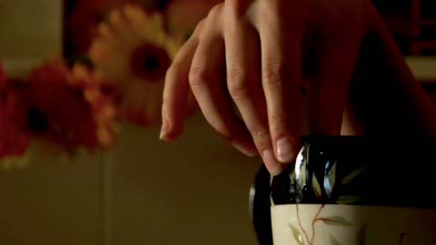
This is an interior shot at Rachel’s house. It’s a lead up to our little trick shot which follows–
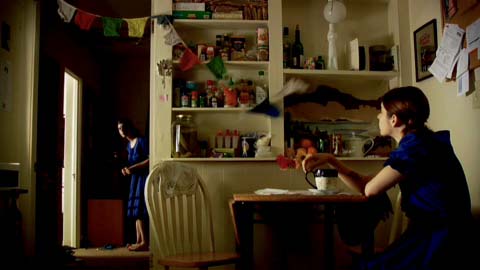
You may notice that Rachel is in two places at once as the flags fall from the top of frame. We knew we were going to do this effect shot in advance, but Jono added the falling flags to the mix on the day of the shoot and the reaction of both Rachels to the same action completely sells the shot. Here’s how we did it:
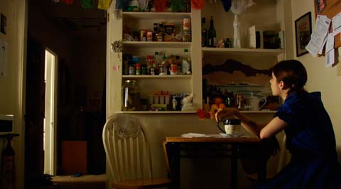
This is Rachel reacting to the flags falling, even though they aren’t, followed by
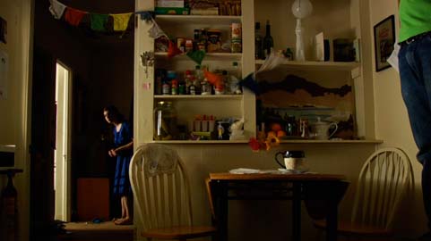
Rachel in the background reacting to the actual falling of the flags. The gentleman on the right of frame is Jono’s friend Jay, who triggered the flag falling using a piece of black thread attached to a pin. We did an 8-point matte in Final Cut Pro to put the two images together. If you look closely at the final composite you can see a faint line in the top right of frame as the flags fall; I think that’s due to a difference in the amount of ambient light hitting the wall with Jay standing in position. It’s barely noticeable.
We lit this with two Reflectix boards and two 650w Arri lights. One light is sitting to the left of the frame on top of a stove, where it’s bouncing into a piece of Reflectix attached to a 2×3 foam core. By angling the card in just the right way I was able to light Rachel at the table while keeping a fair amount of light off the wall without using a flag. The quality of the light is very soft but directional enough to pop Rachel without lighting up everything in the room.
The second light is a 650w fresnel bouncing into a 4×4 Reflectix card rigged on a light stand in the bathroom in the background. By getting the right angle on the Reflectix card I was able to light Rachel with soft pretty side light without spilling it onto the ceiling and bringing up the overall level in the room.
More details on page 4…
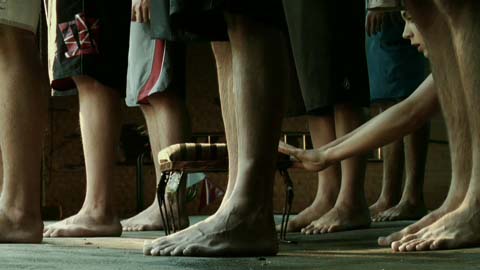
It wouldn’t be a music video without some symbolism. Here Rachel tries to raise herself to the level of the swim team, although 30 seconds into the song we already know she will fail. The stool wasn’t popping at all so I brought out a 650w open-face Arri light and lit it and her with uncorrected tungsten light mixed with daylight. I knew that I would be desaturating and skewing the color later so I wasn’t overly concerned about how the two white balances would mix. To my surprise, though, they both held very well–a tribute to Panasonic’s colorimetry.
The background is lit with a 650w fresnel raking across the wall.
_________________________________________________________
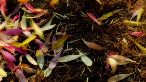
Lit with natural light at the beach location. The camera original footage was a little flat so I added some punch by bringing the gamma down and making the colors a little more vibrant. I think I used the “telecine net” module, which is one of my favorite effects: back in the 80s and early 90s it was popular to put some diffusion in the light path of the telecine, and as the telecine was scanning a negative image and making it into a positive one the diffusion affected the blacks instead of the highlights. The shadows bleed a little bit into the light areas, an effect I just love.
_________________________________________________________
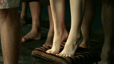
Once again with the stool. This is one of those little shots where Jono’s edit just blew me away. He uses just enough of the shot to tell the story and absolutely no more. The slow motion really works here.
I lit Rachel’s legs to the point of just clipping, wanting her to be the brightest object in the shot.
_________________________________________________________
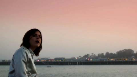
This shot was pretty cool when we shot it, but the composition needed a little something extra that I knew I could add in post. The grad was done in Looks and adds quite a bit to the shot. I’m not sure why I chose salmon as originally I thought I would go blue but the reddish color just felt right.
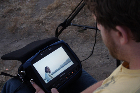
Jono supervises me closely so I don’t do something COMPLETELY insane:
_________________________________________________________
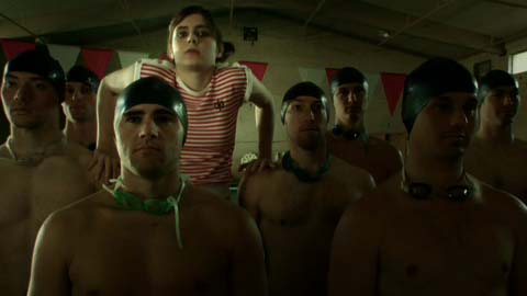
Rachel rises above the swim team. Jono’s cut only uses the top of her head rising above the swimmers’ shoulders; it’s very subtle and very beautiful. Unfortunately I found that several people didn’t see her without knowing where to look so I used a moment later in the shot where she struggled to lift herself above the swimmers.
I had to light this using a double bounce:
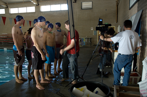
The Reflectix card is precariously balanced on a light stand that’s been tilted forward to get the right angle on the swimmers. The primary bounce is a 2×3 Reflectix card placed out in the sunlight, about 40′ away. I had just enough light to shoot this shot, although I had to bump the gain up to 3db to do this. The swimmers on frame left got more light than the ones on frame right, but I knew I could vignette the shot in post and put the focus back on Rachel–which is exactly what you see in the frame above. Rachel is at the center of the vignette, with the rest of the team dropping off in exposure.
The edge light hitting Rachel from the left of frame is from the primary bounce outside. Everyone is getting little scratches on both sides from the high windows that line both sides of the building.
_________________________________________________________
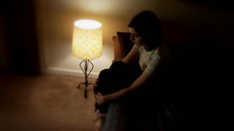
Remember the shot that opened this piece? Here’s the wide version. The table lamp on the floor is dimmed down to the point where the inside is clipping (which is fine, because it’s featureless anyway) and the shade is just on the edge of clipping. The light on Rachel’s face is, for the most part, coming from a 650w Reflectix bounce in the next room. I used the edge of the other room’s doorway to keep the bounce off the back wall. I wanted this to feel claustrophobic so I used the “soft edges” module in Looks to fuzz out the edges of the frame.
_________________________________________________________
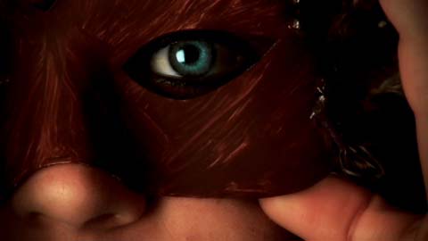
We shot a wide shot of Rachel putting on this mask and I asked Jono for a closeup, having a feeling I might want to use it in the cut I did for my reel. I enhanced her eye color in Looks in order to create a stunning contrast with the darkness and warmth of the mask. This shot is lit entirely by one light bouncing into a 4×4 white bounce card at face level. (That’s one of the fun things about this video: I was forced to work so simply that we moved REALLY fast. 🙂 )
_________________________________________________________
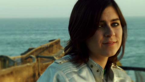
We did a number of beach shots that I loved, but for some reason this one struck me as being right for this cut. I’ll show you Jono’s choice later, and while I think it’s brilliant I think it works better for his cut than for mine.
Here’s the lighting setup for this shot:
For about ten years I’ve had 6×6 full grid and light grid in my small bag of tricks. They’ve saved me in a number of low-budget situations where I wanted to build a nice big source, or where I needed a soft source with a lot of punch (as I could line up every light I had behind them). If you have a grip truck on location then you don’t need these, but if you bounce between low budget and high budget jobs, as I do, it’s nice to bring some of the more cost effective high budget tricks onto the low budget shoots.
Using Looks I added some diffusion and warmth while subtracting some blue to make the ocean a bit more desaturated and cyan.
_________________________________________________________

The last shot of the video. I didn’t like all the little chachkis in the background so I added a heavy vignette in post, and then used the “swing/tilt” focus emulator in Looks to focus attention just on her lit eye. The shot feels very vulnerable and sad, especially with the blink at the end. And that’s the end of the :30 promo.
But… there were a lot of shots we didn’t use. Read on….
Please note that the images that follow are completely ungraded, as I never used them in my cut.
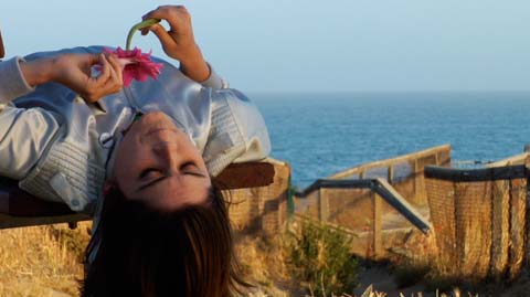
This was one of the many other cool shots we did at the beach location. Once again she’s lit only by sunlight being filtered through a 6×6 light grid held a couple of feet from her face.
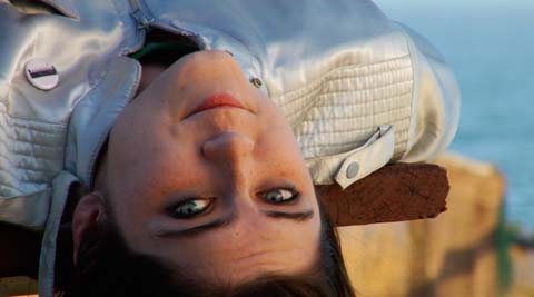
This shot was extraordinarily cool too, but the amazing part was when Jono turned the monitor upside down and said, “Hey Art, look at this…”
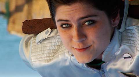
Wow. For some reason I think this is very cool–probably because it’s beautiful but there’s something about it that’s slightly off. I thought I would use this shot in my edit but I didn’t; partially because, for some strange reason, she didn’t look like she was the one singing the song, but also because I thought that using this without setting it up earlier in the edit would be a bit confusing.
If I’d been able to show Rachel laying on the bench earlier in the edit then I would have felt better using this shot, but since I didn’t… I felt I couldn’t. I needed to give the audience a clue as to where she was in order to give them an “aha!” moment, but without that establishing shot I felt the audience wouldn’t grasp what has happening.
I still think it’s marvelous, though.
_________________________________________________________
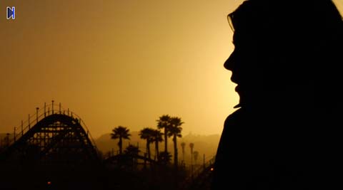
At one point I took the camera handheld and rolled on Rachel as she sang against a beautiful sunset. Sadly, it’s beautiful because of the many forest fires we’ve had around here lately, but still… why not take advantage of what’s there?
I moved around a bit, letting the sun peak out from around her face very once in a while. While neither of us used this shot in our edits I’m using it as the cover and menu page background for my new showreel DVD. I think it’s a very beautiful and subtle composition.
_________________________________________________________
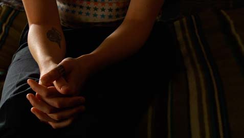
Jono used a tighter version of this shot in his edit, to great effect. Lit only by a 4×4 Reflectix card in the kitchen to the left, filled with a bounce card on the right.
_________________________________________________________
Remember how I mentioned a roof shot? Well, here it is:
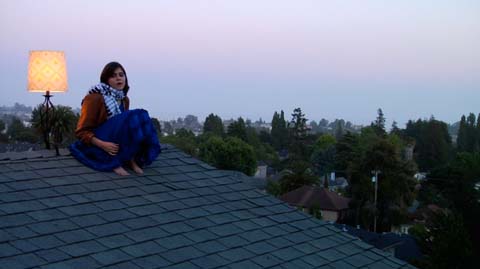
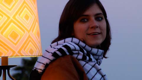
Both Jono and I were hoping this would turn out, but I had a sneaking suspicion it wouldn’t. The sun set directly over the camera, and I knew that would make the shot a bit too flat. Without a lot of practical lighting in the background I knew this shot would probably die. I tried to enhance it a bit using Looks but it just wasn’t there. Still, it was fun to shoot.
_________________________________________________________
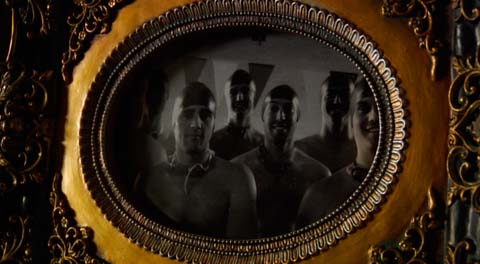
This was the last shot of the shoot, and I grabbed it quickly knowing I could lighten the center later. I didn’t mention it earlier but I was sick as a dog during this shoot, and by 11pm Sunday night I was ready to go home and collapse. I don’t think Jono used this shot in his edit; I tried it as an opening shot and then replaced it with his choice as his was much better. (That’s why he’s the director…!)
_________________________________________________________
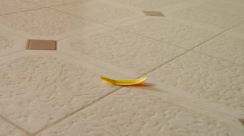
Jono’s cut started out with a single flower petal falling to the floor, followed by a vase of flowers in slow motion. I didn’t use it for my cut as I didn’t think it was as visually dynamic as I needed it to be for my reel, but Jono uses it in his edit as it tells his story better.
Here’s the footage, shot at 60fps–shown first at 60p real-time and then slowed down to 33%:
That was the first take. We never got a better one. Jono said his kitchen floor never looked so good.
The shot is lit from behind with a 650w open-face light bounced into a 4×4 Reflectix, and filled with another 650w bounced into a white card next to camera.
_________________________________________________________
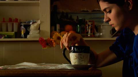
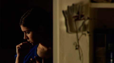
These are some close-ups we grabbed while doing our visual effects shot in Rachel’s house. I’m big on grabbing whatever coverage happens to be available to us without changing the lighting, so I talked Jono into grabbing these two inserts. We didn’t use them, but they took about three minutes to shoot and they’re there if we want them.
_________________________________________________________
That’s me behind the camera, Jono behind the monitor, and Laura the producer backing us both up. Other than being really sick during this shoot, I had a great time. I worked with a director who appreciates good work and encourages it, and as a result I was able to create some really nice images out of virtually nothing. And quickly, too! That was the best part: doing great work quickly and efficiently. Jono’s got some more spec projects in mind, and I plan to be there for every one of them. How can I turn down an offer to work with someone who encourages me to do my best work? I think it’s the beginning of a beautiful relationship.

Filmtools
Filmmakers go-to destination for pre-production, production & post production equipment!
Shop Now