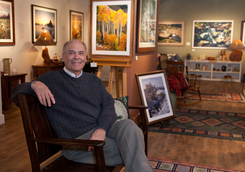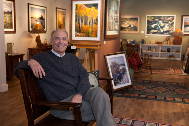
A beautiful presentation awaits the visitor at Larry Johnson’s gallery. Landscape photographers may be a dime a dozen, but the moment I walked in, I recognized quality work displayed with all the panache of a Tiffany’s window.
You probably know that I’m hot for photojournalistic and abstract work; nature and landscapes are not often part of my personal or professional image vernacular. I’m more of a Robert Adams, not Ansel Adams kind of girl. I was nevertheless enticed by the ambience of Larry’s gallery and found myself both charmed and drawn in to browse slowly and intimately among his striking scenes.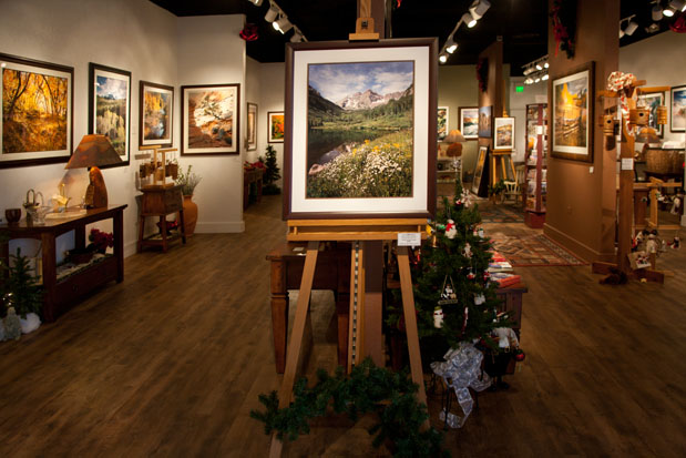
What was it that immediately captivated my attention? Two facets, one technical and describable; the other artistic and harder to explain. The straightforward, technical magic is that Larry’s photographs look real – well, better than real in a particular way. I find the prevalent gimmicks such as supersaturation and overdriven sharpness and contrast are a major turn off. I was so pleased that my first glance revealed Larry’s style shows no artificial over-dramatization. His photography is subtle and full of impact, introspective, yet speaking with visual music, vibrant with an impression of three dimensions.
He calls his method “chasing the light to honestly picture the greatness nature can give us”.
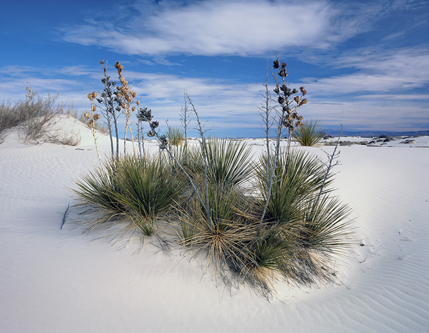
Greatness indeed. Captured by the patience to wait for just the right light – a process that may take hours to days to years of return visits. Patience is also the word that leads me to try to explain that certain something that makes a piece of art stand out, telegraphs immediate communication and encapsulates a memorable perspective. Shooting landscapes is a very personal vision. I can only explain the phenomenon of the art of landscapes with an analogy. We’ve all been to the Grand Canyon, been overcome with the scene and snapped a photo which inevitably turned out to be disappointing. Knowing our effort has fallen short, we email the image to a friend with the embarrassed text, “You should have been here to really see the colors.”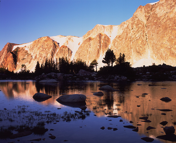
This is exactly where Larry’s art succeeds. When you look at his pictures, you actually do feel his awe, see with his eyes, and faintly hear the rustle of fall leaves or the crisp purl of a spring brook. He has somehow managed to let you step on his path and become filled with the emotions that only direct experience with the beauty of nature can bring.
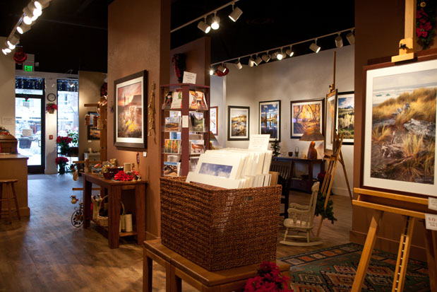
I really got involved. Talking shop and getting to know this delightful man, my planned brief interview stretched to more than two hours. What I learned is how Larry has put right and left brains together to make a business of his art. He set about designing a store that is instantly comfortable. He does not show other photographer’s work or other two dimensional work. However, by juxtaposing his wall pieces with handmade crafts and gift items – wood, ceramics, lamps, metal, stone, music – he has created an atmosphere that grabs and holds the visitor. The typical viewing pace slows down; no one makes a quick circuit and exit of the gallery. Somehow you just want to linger and invest time, not just because there is so much to look at.
What Larry has done with boutique presentation makes it possible for people to enjoy and understand how they can use art in their homes – art that happens to be photography.

He also let me in on two more of his secrets. The gallery ceiling is literally bristling with light fixtures, yet there is no general lighting whatever. Each time he hangs a new work, he feathers the spot lights to emphasize specific areas of the image, sometimes even creating a vignette. Yes, that’s the same feathering of light technique used in the portrait studio to light a face. Where did his inspiration come from? His years of work in the theatre, both as performer and production designer.
Larry’s second secret stems from his experience of how juxtaposing elements captivate and retain viewer interest. He hangs very dissimilar images next to each other. The differences are many: soft tones vs. vibrant, color vs. monochrome, highly detailed subject vs. simple geometric shapes, winter vs. summer, horizontal vs. vertical. In comparison with the last museum photography exhibit we visited, I realized Larry has a valid point. At the museum I totally passed by series of very similar pieces where a superficial glance at the subject did not interest me. I probably missed some good ones, but visually my mind did not want to explore them simply because of the repetitive grouping. I only lingered where I saw contrast and juxtaposition.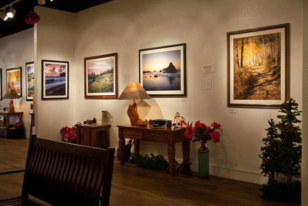
Scale matters
This jewel box gallery did not come easily or cheaply. Inventory must be pristine and abundant. Decorator art (which is in this case real art) must be shown large. 20×24 is a low end size. Think 40×60. Landscapes are a window on the world; it’s a disservice to clients to allow them to purchase pieces too small to afford full enjoyment of their investment. There must be enough gallery space to view pieces from middle to farther distances, with a background of subdued but interesting wall colors and lighting that puts a highlight on every image. Space build-out in a shopping center can easily top six figures, before you even consider monthly lease, expenses and inventory.
Location, location
Picking a shopping center, gallery row or alternative arts district is critical to appeal to the desired client. After trying several locations, and researching other photo galleries, Larry chose a brand new “main street” style shopping center that has an artistic town feel with fountains, green space, lots of destination and specialty businesses, yet is also anchored on the outer fringes by several national department stores and chains. Definitely non-mall. Nor is it in a row of galleries showing painting and sculpture against which photography might be seen as a poor cousin. And definitely not the funky physical appearance of reclaimed spaces that are typical of alternative arts venues. His location and business style are upscale, but never intimidating; tailored but never severe. Everything he does bespeaks value by implying years of enjoyment of what is unquestionably an emotional, non-essential purchase.
To Larry Johnson, photographic art is nourishment both for himself and his client. No junk food allowed.

Filmtools
Filmmakers go-to destination for pre-production, production & post production equipment!
Shop Now