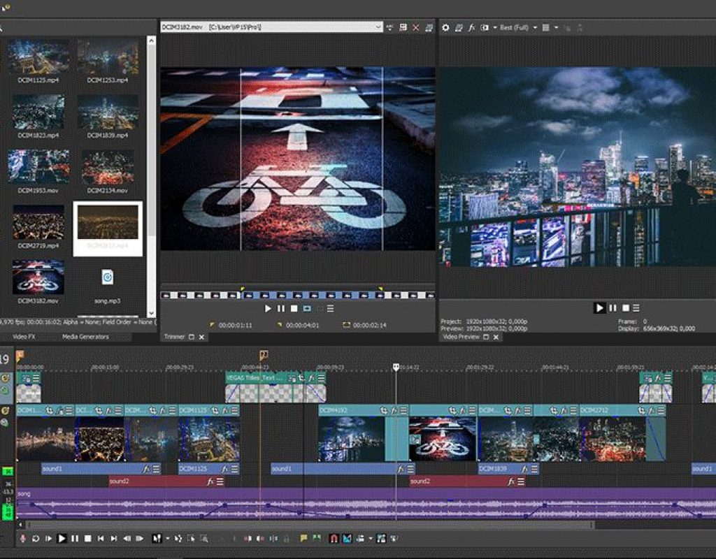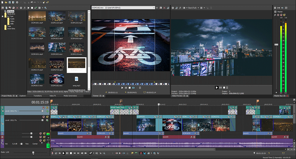
We’ve talked about what makes VEGAS Pro distinct in terms of being able to offer editors options that no other platform can match. It’s an important thing to note, as many of those features are set to be taken to another level with the release of VEGAS Pro 15.
In many ways, this version of VEGAS Pro is the culmination of a working style that is entirely dedicated to allowing professionals to customize their experience, all in the name of working more efficiently. VEGAS Pro users have always been able to customize their workspace to make it work most efficiently, but VEGAS Pro 15 takes that concept much further. It makes it possible to set up the UI just as someone wants rather than be forced into the configuration.
Major user interface improvements, hardware acceleration improvements, a picture-in-picture OFX plug-in with real-time controls on the video preview window and selective paste attributes are just a few of the top features in VEGAS Pro 15. These improvements are all distinct, but one thing they have in common is that they’re all designed to give users the kind of options they’ve literally been asking to see developed.
The Impetus for Change
As part of MAGIX, VEGAS Pro is in the hands of a company that is dedicated to the software and the community in a powerful way. It’s something that Gary Rebholz, Global Brand Manager for VEGAS Pro, has seen and experienced firsthand with the passionate and vocal users.
“One of the first things I did after everything was settled with the ownership situation was reach out to the community to ask what they would like us to do next,” said Rebholz. “The response was stunningly overwhelming. We received literally hundreds of replies. VEGAS Pro 15 ticks a number of highly demanded tasks off the list those users have given us. Our customers have given us an incredible roadmap.”
That roadmap allowed the team to identify a number of patterns, many of which were related to the look and feel of the software. VEGAS Pro was built upon the Windows platform and conventions, but as such, after a few years many felt it didn’t look like a modern tool. The community began to ask about updating the look, but from that sprung separate arguments about things like whether a dark color is best or a light color is best? Should the buttons be monochromatic or have color? What tools should users be able to adjust and move as they’d like? This was the kind of feedback that formed the roadmap Rebholz mentioned.
Different people wanted different things, so it became imperative to provide those users with options. VEGAS Pro 15 is set to strike a balance in terms of giving people the options to adjust and customize their interface, but not have those options come at the expense of functionality.
Numerous paradigms are being broken with VEGAS Pro 15, but all of them are in the name of improvements that users have asked to see. Users and even editors who only have a passing familiarity with the software will be able to see obvious and subtle changes.
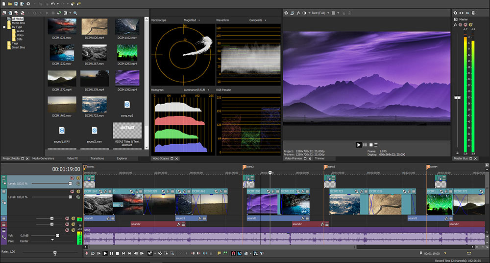
UI and Hardware Improvements
One of those obvious changes has to do with the modern approach to utilizing the tabs for window docking options. VEGAS Pro 15 provides users with a comfortable and much more logical approach that will be striking to both long-time and new users. However, the new “hamburger” menus will likely be the change that most people are talking about.
“Basically what we’ve done is drastically cut down on the number of buttons and controls you see by default in the interface by loading them into these “hamburger” menus,” Rebholz continued. “This dramatically reduces UI clutter. Any button or control that’s no longer shown by default can be easily accessed through the hamburger menu. But it doesn’t end there. Because we know we can’t pick the perfect button set for each individual customer, the “hamburger” menu is completely customizable. If, for example, you don’t like the fact that we’ve hidden the Invert Phase button by default on audio track headers, it’s a simple matter for you to change your personal defaults so that it is always visible.”
These kinds of changes are not just about aesthetics though. They’re designed to bring really functional improvements and innovation to the software, which goes back to the feedback the team received from their community. Users said they wanted to be able to make the UI look exactly like what they want it to look like. VEGAS Pro 15 gives users that flexibility in several aspects.
The modern UI enables customers to fully customize their workspace so that they can work faster and more efficiently. The UI can also be changed to better suit the lighting conditions of the room or the specific task the user is performing. The changes enable the user to cut video fast.
Beyond the UI innovations, hardware acceleration has been taken very seriously and will get even better in the near future. The company started with a focus on rendering speed, but there are also improvements on the decode side as well. Users who have modern nVIDIA cards or Intel QSV technology will see the most acceleration benefits in the initial release. Future updates will help AMD card owners.
Complete Flexibility
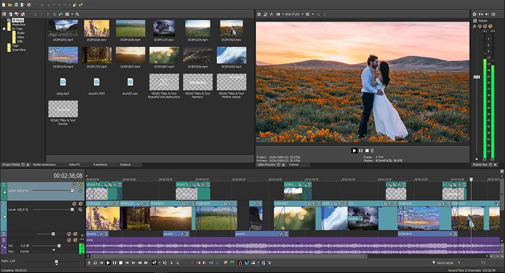
VEGAS Pro 15 also features a flexible, modular way for the user to create picture-in-picture and other size and position effects. This enables the user to create composite effects at any of the four video effects levels, including the clip event level, instead of only at the track level. These adjustments can be easily and intuitively made directly to the video on the video preview window. It’s a more intuitive way to work, and ties back into the flexibility that the software has become known for.
“This plug-in gives the user complete flexibility to create a picture-in-picture and other output effects wherever they need it,” Rebholz said. “You can apply this to an entire track or selected events. You can easily resize the output, zoom in on the video/still image, and pan across something you’ve zoomed in on. This approach is far more flexible than the tools available in earlier versions for accomplishing these tasks, although those tools have not been removed, so the user has the choice to use the new plug-in, or the tools they are comfortable with.”
Additionally, the new LUT OFX plug-in is also associated with helping editors work that much faster, since it allows the user to apply a single LUT to achieve a look instead of wrestling with various FX plug-ins to achieve that look. If you have a LUT that provides the look you’re after, it’s nearly an instant way to achieve the look.
Logical, modern docking window behaviors and controls as well as newly designed timeline clip events for more organized timeline work are a few additional improvements, and there are plenty other specific improvements that you can see for yourself. There’s a lot to say about these improvements, and those are the details we’ll look to fully explore in a review. What’s important to remember with all of them is that they’re all designed to make your workspace fit your unique needs. If that’s not something you think is happening, the VEGAS Pro team are more than happy to get your feedback.
With VEGAS Pro 14, the development team wanted to bring the focus directly back to the user, and VEGAS Pro 15 is designed to carry that concept even further. Several UI changes have been made that should make the software even easier to learn and use, while also making editors more efficient. VEGAS Pro has placed renewed importance on leveraging hardware technologies for faster decoding and rendering, and they’re set to continue to make improvements in the hardware acceleration area.
In short, if you’ve ever found yourself wondering whether or not you’re editing as efficiently as possible, VEGAS Pro 15 might be the tool you check out to confirm that suspicion.
Filmtools
Filmmakers go-to destination for pre-production, production & post production equipment!
Shop Now