I’ve used quite a few NLE’s over the years. From D-Vision to Media 100 to Media Composer, Premiere, Final Cut (7&X) and then onto Resolve. I’ll be honest, they’re all more or less the same beast, where each company adds new features each year to try to one-up the competition. Which one do you use? At the end of the day, it doesn’t really matter, as they all serve the same purpose. Well, what if one of them didn’t? What if one of them was designed for the sole task of Dailies and Finishing? That’s where Assimilate’s Scratch comes into play. A NLE with two very different strengths, that are both done exceptionally well, but with an interface that appears daunting, but once you start working with it, you’ll wonder how you ever lived without it.
I’ve started producing tutorials for Assimilate on working with Scratch, which I’ll be posting here on PVC. If you’re someone new to the industry, who’s looking to get up to speed on a DIT (Digital Imaging Technician) workflow, to break through into that field, learning Scratch is almost essential, as DIT’s will use Scratch in the field to create dailies to send to post houses as productions are being shot. Some things you’ll notice right off the bat with Scratch are:
- The app is fast. Really fast! You’ll get a little sample of this when you see how quickly it launches!
- The Scratch development team is a small team that listens to you, the user, to get the features in you want, and the bugs fixed that you need fixed, lightning fast.
- The support is awesome. The developers are part of the Scratch Google Group as well as the Assimilate Scratch group on Facebook, and respond to users all throughout the day.
- Scratch is all about Metadata, and it manages it probably better than any application I’ve ever seen. I call it a “Metadata Machine”, and you’ll hear that throughout the episodes.
- The interface is very different from any one you’ve used before, and that’s a good thing.
- Scratch supports the newest codecs, in most cases, before anyone else does (ProRes RAW)
- It forces you to think about your footage a different way and that, once again, is a good thing.
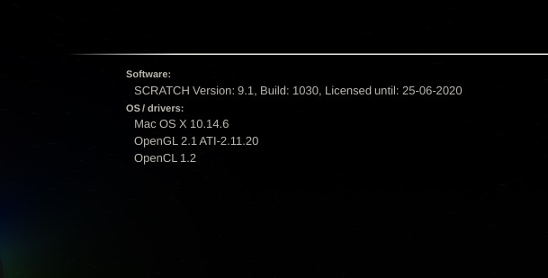
For the first lesson I posted on Learning Scratch, we’re talking about project creation. Now, you might be thinking that Project Creation should be pretty simple and it is, but there are a few bells and whistles to point out about the project selection window before you create the actual project. Before I talk about that, I want to circle back a little and talk about my first point. How fast the application is. It’s fast. You’ll get a brief sample of that when you launch it, and are greeted by the splash screen in about 4 seconds. I’m not kidding. That fact alone speaks wonders about what Scratch has going on under the hood.
Once you’re at the main project selection window, you can always click on the splash screen to get more information about your system, and the version of Scratch you are running.
Now, when we go to create a new project, the first thing to keep in mind is that this is only a starting point, and you can change the resolution of your timelines at any time in your workflow. This is a common thing in Scratch. Everything is just a starting point, and everything can be changed as you move along.
Once you’ve launched the application, you’re brought to the construct window. If you look at the bottom of the interface, you’ll notice that Scratch is divided up into four main modules. Construct, Edit, Color and Render. You will also notice, however, you only have access to two of those modules, Construct and Render, when you create your first project. All your importing will be done from the Construct Module and any adjustments you might need to make to your sequence settings, will be done from the Render Module. In the workflow that we’ll be looking at over the next few lessons, we’re not even going to talk about editing functionality of Scratch, as Dailies workflows will require little (almost none) to no editing at all.
The other thing that’s essential for me to mention, before we get too far into the weeds here, is that you can’t look at the “Media Browser” that you find in the Construct module, as a media browser, much like you’ll find in other NLE’s. The Media Browser in Scratch is designed to manage the media, once you have it inside of Scratch, not to actually import it. Alright, let’s not talk about the nitty gritty aspects of importing your footage for a Dailies workflow.
There’s really only two things that, for me, are essential to teach almost right away, when I’m teaching people about a new application, specifically an NLE and that is how to import, and how to export. Everyone can get in and play around with an application but if you can’t get footage in, or get it out, the application is really useless. That’s why the second thing I always teach is how to import (you’ll see that’s how to export is coming up shortly). When we’re importing inside of Scratch, you’ll need to consider, first of all, what you’re importing for. Dailies or Conform. In this lesson, we’re talking Dailies. I think it’s important to cover this first, as Scratch is really a Dailies application first, and a conform application second (in my opinion). I love the fact that in Scratch, the “Import Clips…” button is right dead in the middle of the application. Why is it there? Well, take a look around the Scratch interface. More specifically at the top. You’ll notice that there is no drop down menus, or really menus of any kind at the top of the application. Everything you need is located at the bottom and sides of the interface, and even the side bars can be shown or hidden whenever you need them. Alright, once you hit “Import Clips…”, you will now be in the import window, and it looks a little daunting, but it doesn’t need to be.
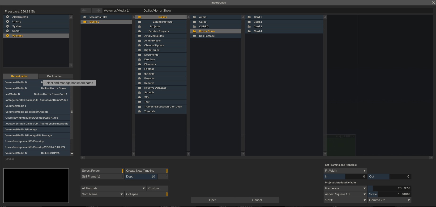
What we’re basically looking at is a complete breakdown of our system, with all the drives, and paths laid out for us in a pretty simple to follow manner. There are a couple of things that we need to decide here. First, how do we want to bring out footage in, and do we need to take any scaling issues into account.
First, when working in a Dailies workflow, you might have 1, 2, 5, 10, or even hundreds of cards that you’re going to need to process. Ideally, whether you’re working on set or not, you should have all your media in one location, simply in a folder called “Media” or something like that. This way all your media can be easily backed up just in case of drive failures, etc. Now that you’ve done that, Scratch gives you the ability to select the top most folder, and create new timelines based on the sub folders (i.e. – your camera card folders), and import everything nice and easy (and quickly, I might add), directly into your project.
Now, with that being said, Scratch works in a very interesting way, as opposed to other NLE’s. Normally, other NLE’s will take whatever footage you’re importing, and if you’re bringing that footage (we’ll assume larger than HD, or at least larger than the frame size you’re working in) into your timeline, the application will scale down the footage to fit the raster dimension. Scratch doesn’t do that. Scratch will drop the footage into your timeline, and you might not even notice that it’s done it, unless you’re paying very close attention. This is where the scale feature inside of the import window comes into play. You can make scaling adjustments (normally it’s a width scale, so that your footage, no matter the size, will fit properly width wise, and will either be cropped at the top of the screen, or letterboxed in the case of Scope footage being dropped into an HD timeline) as your footage is imported, so it’s immediately “correct” in your timeline, and any necessary scaling adjustments (shot by shot), can be made when you jump into the edit module.
Once you have media in your project (we’ll talk about it’s organization in a little bit), the Media Browser is where you’re going next. As I mentioned earlier, the Media Browser is designed to work with Media that is already in your project. Simply click on the “Media Browser” button at the lower right side of the screen, and it will display itself immediately.
The Media Browser is divided into six tabs, each focusing on a specific aspect of the shot. The first tab you’re greeted with is the “Base” tab. This is where you’ll get all the basic information about your clips from the slot they sit in in your timeline, to frame rate, raster dimension, length, and so much more. It’s more or less the basic information page of the Media Browser. Now, here’s where things get interesting. Looking at the “Grade” tab, not only do you get some basic information about the Color Space and EOTF of your footage, but you also have the ability to add Source and Grading LUT’s here as well.
You’re going to notice a bit of a trend happening here, moving from tab to tab. The “Files” tab gives you the opportunity to verify media, replace or relink footage and even perform tasks like to Calculate MD5 Checksums on your footage. The “Audio” tab lets you sync up external audio to your footage, assuming your timecode matches up. Don’t worry if it doesn’t, though, you can always do a manual sync at any step of the way, which we’ll talk about in later lessons. For right now, the Node tab doesn’t do very much (but we’ll come back to it later), and the Metadata tab will let you begin to add custom metadata to shots in your project.
At this point, I want to talk about an interesting topic inside of Scratch, and that is Search/Match masks, or as they are also called #-Codes. It’s a very interesting concept that I really like how it’s been implemented into Scratch. Let’s say, for example, you were creating Burn in for a review copy of your edit. You wanted to add in Source T/C, Source Path, and Resolution. In most cases this information would need to be entered manually. Well, not with Match Masks (MM). In the case of creating the Burn in, all we would add in the burn in field would be #stc, #spath, #res. That’s it. There are actually forty-four different MM’s that you can use, and they can be used across a wide range of tasks such as metadata information, burn-in information and even folder naming, when exporting your final master. It’s actually a very clever way of creating simple short cuts for us to use when doing very common tasks, inside of Scratch.
Now that we’ve had an introductory look at the Media Browser, I want to circle back to the scaling discussion we had before when we were talking about importing our footage, as there are going to be situations where you’ve imported your media already, and the last thing you want to end up doing is to delete all the footage you have in your timeline(s) just to re-import everything and adjust it’s scaling. Remember, as I said before, everything you set in Scratch is a starting point, that you can adjust at any time in your workflow (and you’ll hear me say this a lot throughout the training) and scaling is no different.
Once all your footage is in a (or multiple) timeline(s), you’ll notice that your “Edit” module has now become available to you, and when you click on it, the currently selected timeline will be what is active, and it’s clips will be laid out back to back based on the clips order in the slots of the Construct Module. The first thing we’re going to need to figure out is, are our clips actually larger than the frame, and we’re going to need some guides to help us figure this out.
In the Edit Module, we’re going to head to the “Settings” button, and then to the “Guides” button. What’s important to keep in mind inside of Scratch is that, by default, the screen size reference window is turned off, and the only way to tell the sizing of the current raster, is to look for the darker area of the image, which represents what’s outside the viewable frame.
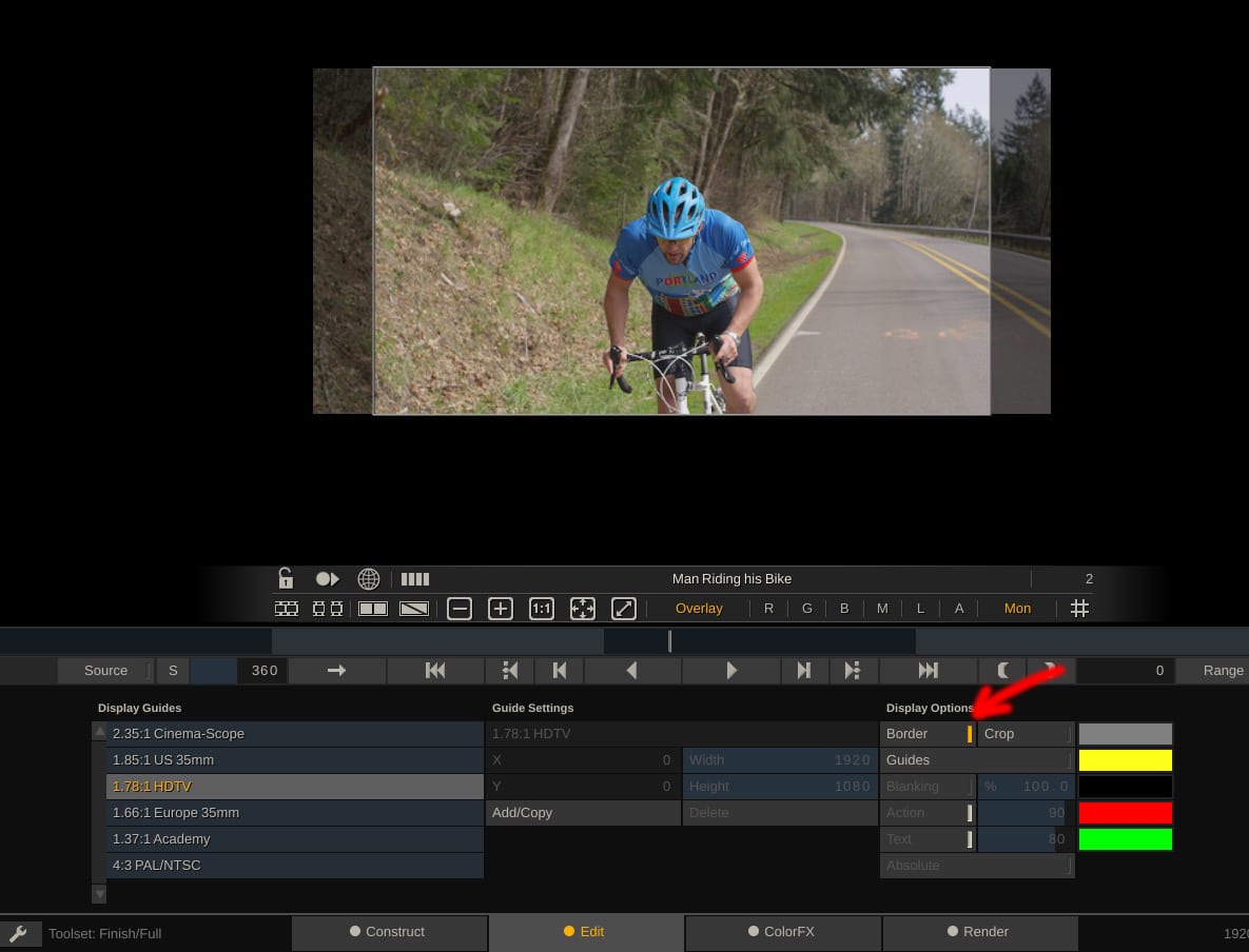
I have to say that this was one of the things that threw me with Scratch right from the beginning, as there are a couple of things here that, if you’re not paying attention, can handcuff you pretty quickly. Inside the “Guides” parameters, we have a few different things that we can do. First, we can have Scratch show us the boundaries of the current Timeline we have set up.
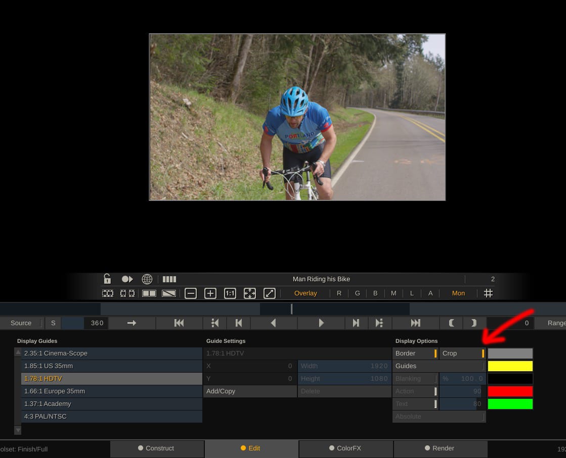
Now, to take this one step further, we can now crop off the parts of the image that are outside of the current frame (assuming there is any).
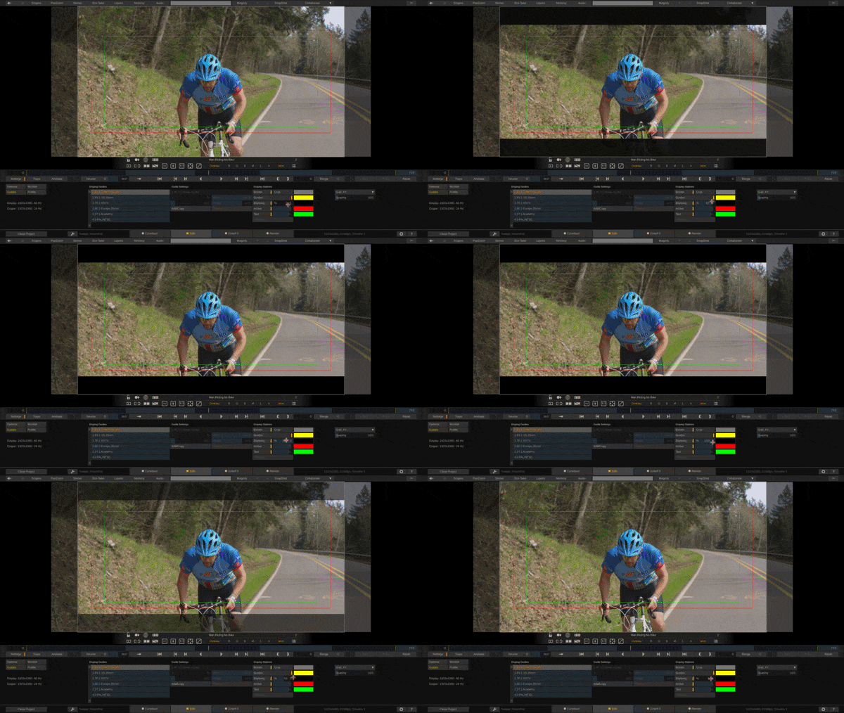
I don’t want to jump out of this page without talking about a few other important parameters that will really help you when getting rolling with Scratch. First, as you’ve probably noticed, we’re in the Guides section, so there is where you can either set and turn on your title safes by simply hitting the “Guides” button, and selecting the Guide setup you want. I should also point out that you can easily create your own Guides layout by simply hitting the “Add/Copy” button to either copy one of the standard layouts, or to simply create your own from scratch, but more importantly, there’s something else you can do in here that will be really important, especially if you’re dealing with multiple frame sizes with different aspects and different letterboxes. Scratch knows, obviously, where the edge of the frame will be, and by utilizing the “Blanking” feature, you can have Scratch “blank” out the part of the image outside the frame, to make your life so much easier when trying to get all your multi-aspect shots to look the same in your time. No effects needed. What you do here is overlayed over your timeline, and you can turn it on and off as necessary.
With all that being said, there’s another great workflow feature that I want to mention inside of Scratch, and it has to do with how you are going to “dial in” values into any parameter inside of Scratch. Normally, how things work in applications like Resolve is when you want to adjust a parameter, and you don’t want to punch in the absolute value, you would click on the value and drag the mouse left or right to adjust the parameter as much as needed. However, what happens in situations where you need to adjust the parameter by dragging past the edge of the screen? Well, it becomes an annoying process of doing multiple clicks and drags to get the value where you need it. Well, not in Scratch. In Scratch, you simply do what I call “The Twirlies”, and what I mean by that is that you can simply click on a value, and instead of dragging left and right, simply move the mouse in a circle clockwise to raise the value, and counter clockwise to lower the value. It’s actually a very simple, quick and effective way to precisely change your parameter values to whatever you need them to be.
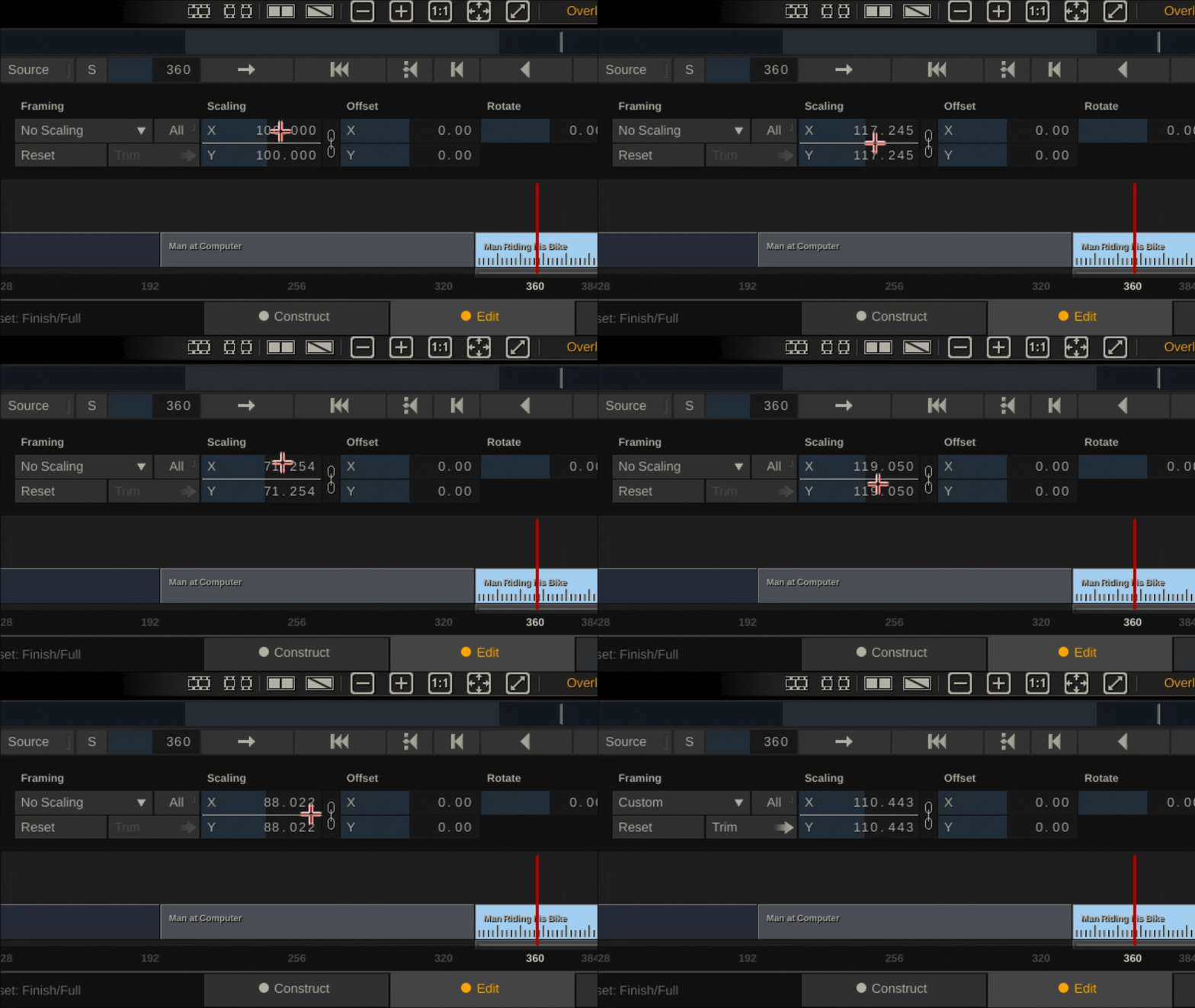
Another important shortcut I want to point out here is that you can pan around the Canvas by simply holding the space bar down, and dragging wherever you want it to go, and to zoom, simply hold Opt/Alt down, and you can mouse wheel in and out to adjust the zoom!
Alright, I want to wrap this article up by talking about adjusting scaling after you’ve already imported all your footage into your project, and it’s sitting in your timeline(s). In the main “Edit” Module, you’ll notice a parameter for “Framing” on the lower left side of the interface. Once you click on it, you’ll notice parameters much like you had when you were importing your footage. From this window not only can you adjust your Scaling, but also your image offset (position in X&Y), rotation, opacity, transfer mode, etc. Since we’re talking about scaling, let’s look at that. Obviously you can manually adjust the scaling to be whatever you want it to be, but if you want it to conform to the current width of your timeline, much like you would set when importing your footage, you can simply change the “No Scaling” parameter to be “Fit Width” or “Fit Height”, depending on what, exactly, you need it to match.
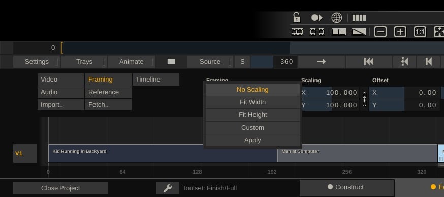
Now, that’s great and all, but this is making the adjustment to a single clip. Chances are that we’re going to want to have the scaling change happen to multiple clips in the timeline (all the ones we imported). In this case, all we have to do before we set the scaling, is to make sure that the “all” button is pressed, and when we set the scaling, it will be applied to all the clips in the timeline. That’s it. It’s pretty much that simple!
With the move to digital acquisition pretty much becoming the standard, DIT jobs are becoming more and more needed, but learning the software they use to do their jobs is pretty much non-existant. On set experience is a must, but what I’m hoping is that these tutorials will give you foundations you need to know about the most used application out there for digital dailies, so that when you get out in the field on your first job, whether it’s on a student film, Indy feature, or as an assistant DIT, you’ll already have the foundation to get yourself up and running in your new role as quickly and as easily as possible! If you want to download a free trail of Scratch to see what it’s all about, you can head over the the link included here!
Filmtools
Filmmakers go-to destination for pre-production, production & post production equipment!
Shop Now