“LED Light Shootout” sounds so dramatic, as if a collection of motley illuminants met in a dusty western town to settle their differences with bullets instead of marketing. It’s actually tedious, mind numbing work… and a real eyeopener.
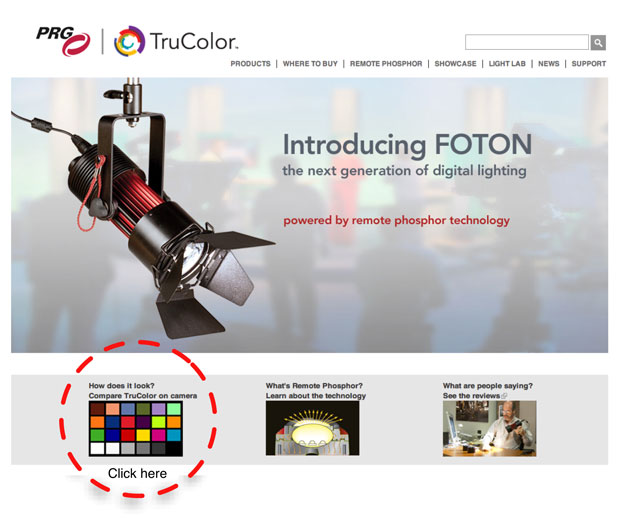
Before I go into detail as to how we pulled this off, you should probably look at the test results. Click on this link and then click on “How does it look? Compare TruColor on camera” at the bottom left of the page. This is what you should expect to see:
Once you land on this page click on “How does it look? Compare TruColor on camera” at the bottom left.
A few years back I consulted with Element Labs on the creation of the first broad spectrum LED light for the motion picture industry, the Kelvin Tile. That experience led to this one: an LED light comparison test that lets the chips fall where they may.
Rich Pierceall was director of marketing at Element Labs when I helped him and his team design and market the Kelvin Tile. Now he’s director of Digital Lighting Sales at PRG, and PRG has a new light to show off: the TruColor Foton.
When Rich approached me he was very honest: sure, PRG wanted to show that the Foton is a great LED light source, but he also wanted an honest evaluation of how it stacked up against the competition. That worked for me as I test to learn objectively, not to market. (I can market, and I’ve consulted on marketing before, but I keep those two areas strictly separate and make it clear when I’m doing one or the other.) Rich said that he had a lot of confidence in the Foton and that he specifically wanted me to conduct an objective test in which every light would succeed, or fail, on its color alone.
That was an offer I couldn’t refuse.
Technical tests like this are extremely hard to do. There are so many things to test that it’s easy to get bogged down in the details and find yourself stuck for days trying to quantify every last little variable. Comparison tests are even more stressful as they must, Must, MUST be accurate and balanced. Defining how that will happen is the most important part of the process.
Grip/PA Matt Mayotte assists PRG’s Rich Pierceall with light assembly.
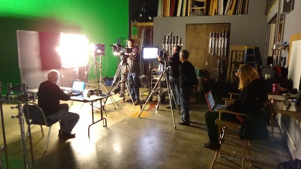
There were a lot of parameters to control in this test. The first was defining a standard tungsten light source against which to compare all the others. In this case we used two Mole Inkies, without scrims, as our reference. We didn’t necessarily want a 3200K reference–while that’s technically correct it’s not real world correct, as most tungsten instruments average 3000K–so I chose two lights that are known quantities, in common use, and of average age: not brand new, but not 30 years old.
Shooting the reference plate with “Princess Alexa.”
We chose to shoot the test on Arri’s Alexa. Not only is it the best camera out there (my opinion) but it’s a commonly used camera that is known for beautiful and accurate color. It’s also a single sensor camera, and experience has shown me that single sensor cameras tend to be less forgiving of color issues than prism-based cameras. Prism cameras use dichroic filters that can be very finely tuned to pass only very specific ranges of colored light, while single sensor cameras must use dyes that adhere to each individual photo site and are much less specific in the wavelengths of light they pass. A light source with a non-contiguous spectrum will more easily cause an odd color shift in a single sensor camera than a prism camera due to the single sensor camera’s more complicated color science.
PRG opted to use a MacBeth chart, as film professionals tend to be more familiar with those than the DSC Labs Chroma Du Monde series. The Chroma Du Monde is vastly better suited for Rec 709 digital image testing but as the test results were going to be displayed in a visual matrix, and not on vectorscopes and waveform monitors, the MacBeth chart seemed like a reasonable choice.
Framing the MacBeth chart.
We controlled for color in two ways: we white balanced the camera on the gray chips on the MacBeth chart (many cameras prefer to see a shade of gray for white balancing instead of white) and then our art director did an additional white balance in post, pinning the tungsten-lit MacBeth chart’s white and black values to their designated values. (Each patch on the MacBeth chart has a corresponding 8-bit RGB value.) He then applied that exact offset to every other image. The Alexa’s white balance turned out to be a touch cool (it came up at 2900K CC-1, which is technically correct but according to the RGB numbers was a little cool) so matching the MacBeth chart’s white and black chips to its known RGB values made the tungsten reference perfectly neutral. I also figured that erring on the cool side would help as I didn’t want us to be accused of neutralizing the tungsten-lit MacBeth reference using a color offset that was cool or green, as those are the directions that a lot of poorly-performing LED lights tend to skew. Adding a little red to create the neutral reference seemed like a better option.
I hate taking notes. It’s much easier to put all the relevant data in the frame and shoot it, but in this case there was just too much. We’d had have to shoot multiple passes of Post-Its for each light.
I shot this in Rec 709 “WYSIWYG” mode as the budget did not include a professional grade, and getting the image as close as possible in camera meant we could capture TIFF images as well as Quicktimes. TIFFs can be more easily manipulated in Photostop so those became the primary capture medium, with ProRes4444 Quicktimes as backup.
I set the ISO at 200 to remove any hint of noise from the tests. We didn’t need exceptional highlight latitude as printing technology doesn’t allow for the creation of a white that is brighter than 2 to 2.5 stops above 18% gray. (Glossy charts manage a higher contrast range but the MacBeth chart has a matte finish and is fairly low contrast by modern standards.)
I decided to mount the MacBeth chart against a piece of white foam core. There are a couple of reasons for this, but white balance wasn’t one of them: foam core is not a known white reference so I didn’t use it as a color reference at all. Instead it became a flat field reference: by photographing the chart surrounded by white borders we could easily assess whether the chart was evenly illuminated from top to bottom and left to right. As long as the foam core waveform levels at the sides, top and bottom of the chart were equal we were assured the flattest field of light possible.
Production manager Emily Pierceall managed to get all of these lights in one place.
Flat fields of light require some cooperation from the light sources themselves, and they didn’t always come through. Some of the lights had very strange beam shapes and angles, and we had to adjust for that as we were focusing on color only and not the beam angle. If a color on the MacBeth chart was not present in the sprectrum of the light being tested that patch would go dark, but that looks very much like what happens if the beam of the light isn’t perfect and a chip isn’t lit properly. We had to negate that effect if the test had any chance of being valid.
The solution was to provide the art director with a flat field reference. Gaffer Luke Seerveld mounted the MacBeth chart on a spud, and then poked a spud receiver through the middle of the foam core. After rolling footage on the MacBeth chart for a given instrument we then pulled the chart and shot the foam core alone. The art director could then examine brightness values on the foam core and add an offset matte in Photoshop to make the field perfectly even. Not only did this compensate for variations in beam angle but it also controlled for lens vignetting. (We used a 50mm Arri/Zeiss Ultra Prime.)
I still have flashbacks about this…
I could have added diffusion to the lights to soften and spread their beams but I ruled that out early on. When light passes through a diffusion material, whether it is plastic, paper or even particulate matter in the air, the longer wavelengths punch through nicely but the shorter wavelengths scatter. This results in warmer light as red punches right through the diffusion while some green and a lot of blue are lost. (This effect, by the way, is what gives us beautiful red sunsets when the air is polluted with exhaust, ash or dust.) And diffusion materials themselves are rarely perfectly neutral in color.
Avoiding diffusion meant that we were measuring what the light was doing, not measuring the effect of diffusion on the light.
The actual color patches in the final matrix are not the actual images captured in camera. The MacBeth chart patches were sampled in Photoshop and laid into a virtual matrix in order to make the presentation pretty and consistent. If we’d tried to align those charts perfectly during the shoot we’d still be there, and there’d be less opportunity to correct for beam angle variations.
Last but definitely not least, I shot every single MacBeth chart at the same T-stop: T4. Changing the T-stop affects the lens optically in a number of ways, and that could negate the reliability of the test.
I adjust exposure using the Alexa’s shutter as DIT Jay Farrington watches the waveform and guides me.
“We did that right, didn’t we? DIDN’T WE?” Jay and I obsess over exposure.
Aiming for a flat field. A flat, straight line across the waveform showed that the white foam core was lit evenly left to right. A thick line showed we were uneven top to bottom, as opposed to a thin line which indicates evenness.
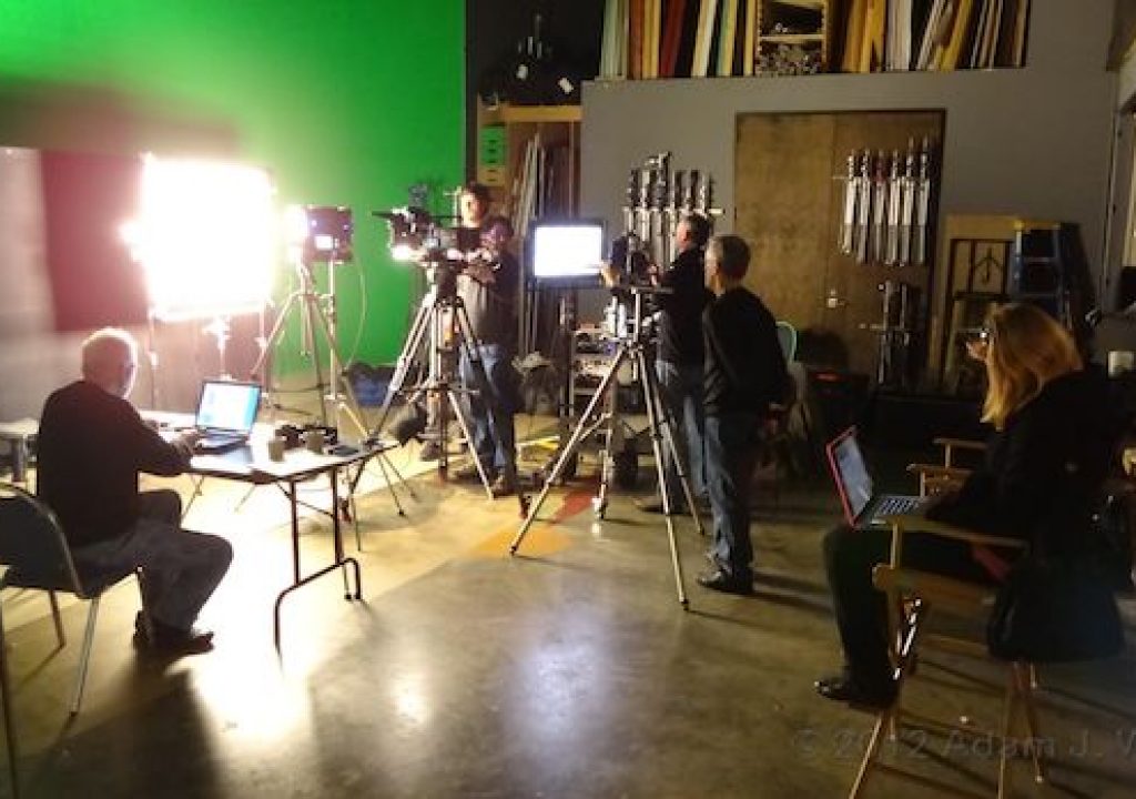
Rich used a spectrometer to gather spectral data while my team worked to capture the chart on the Alexa. We also recorded color meter values for each light using both a Minolta Color Meter 2 and Sekonic C-500. They almost never agreed with each other so I’m not sure that collecting their data had any value other than providing a few moments of laughter.
Rich Pierceall lines up the spectrometer.
What the spectrometer saw.
At one point Rich had to run away to pick up a light that hadn’t arrived in time so we changed setups to sneak in a flesh tone reference test. Adam Wilt, who graciously provided behind-the-scenes photos for this article, was very vocal about the need to shoot actual human skin as a cardboard chart doesn’t exhibit the same characteristics, such as subsurface scatter, that human skin does. That round of tests will be the subject of an article I plan to post on Monday, April 9th.
Having done some rudimentary color science work on the Kelvin Tile I can safely say that color itself is a form of witchcraft, and getting it right in an LED lamp is extraordinarily difficult. It can really only be judged in reference to something else as our brains quickly neutralize color shifts. Also, while any of these lights might be adequate on its own the game changes completely when a wonky light source is mixed with anothers. That’s when the color differences really stand out, if not by eye then on camera.
LED lights are very handy to have on a set, but they are also a new variable that may not work in all circumstances. The last place you want to judge an LED light’s quality is in dailies, so when in doubt–test.
Crew:
Production Company: PRG LA
Producer/Account Exec. for PRG: Rich Pierceall
Production Manager: Emily Pierceall
Art Director: Bob Ross
DP: Art Adams
DIT: Jay Farrington
Gaffer: Luke Seerveld
Grip/PA: Matt Mayotte*
Behind-the-Scenes photos and additional consultant: Adam Wilt
Arri Alexa: Chater Camera
Lighting/Grip: Seerveld Lighting
Stage: Purebred Studios
All photos used are ©2012 Adam Wilt and used by permission… and with many thanks.
NOTE: The TruColor HS was not part of the original test. I did not participate in the data collection for that unit.
Disclosure: I was paid to perform this test by PRG.
*”Grip/PA” is local nomenclature for a grip in training. Not quite a grip, but more than a PA.
Art Adams is a DP who is fairly bright but still has some gaps in his spectral response. His website is at www.artadamsdp.com.


