Sensors and lenses don’t always get along. In the HDR and UHD world, it’s important to test, test, test.
Recently I shot a diffraction test meant to determine whether there was any advantage to some sensors having larger photosites than others. There should be some benefit, as it’s known that sensors with smaller photosites fall prey to diffraction at wide f/stops. When I compared an ARRI Mini at 3.4K to an 8K RED Weapon Monstro and a 6K Sony Venice—both of which have smaller photosites than the Mini—I saw no benefit when the larger Monstro and Venice images were scaled to match the Mini. There were some noticeable hue shifts with diffraction, but there didn’t seem to be a difference in sharpness.
What’s interesting, though, is I saw some severe vignetting in one of the cameras. That surprised me.
Here’s what I did:
- Photographed a resolution chart with three different cameras: ARRI Mini, RED Weapon Monstro, and Sony Venice. I attempted to match the chart height in each shot.
- Each camera was set to open gate mode.
- The ARRI Mini recorded ARRIRAW at 3.4K. The RED Monstro recorded RED Raw at 5:1 compression. The Sony Venice recorded SONY OCN ST Raw.
- The lens used was a 75mm ARRI/Zeiss Master Prime. I shot each frame at T2.8 and T22 and utilizing each camera’s “native” EI (ARRI @ 800, RED @ 800, Sony @ 500).
- I used default settings in Resolve 15 where possible. The only significant color correction was white balancing and black balancing each camera, so they looked roughly the same. There is no post vignetting or shaping.
Here are the results:
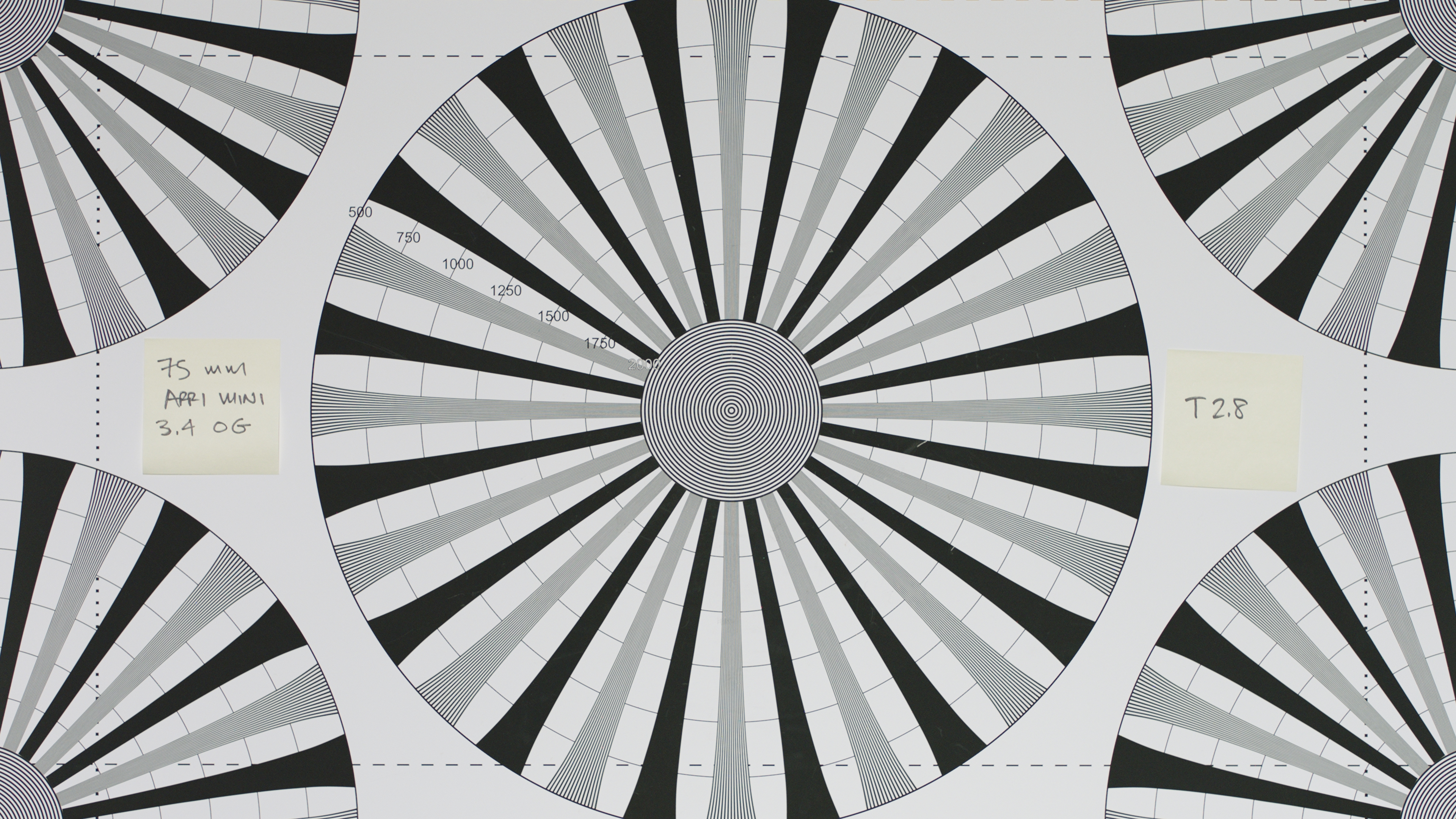
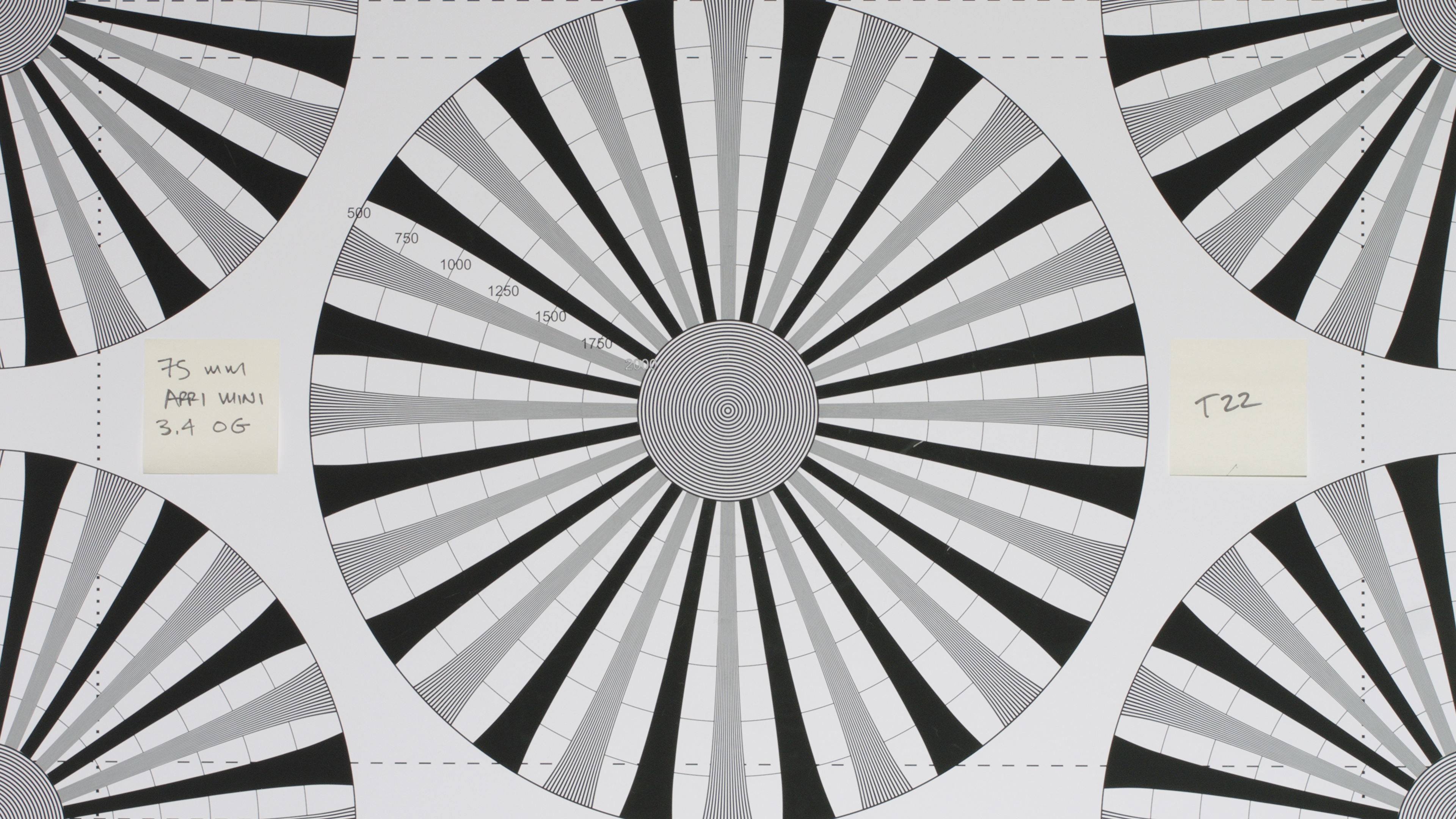
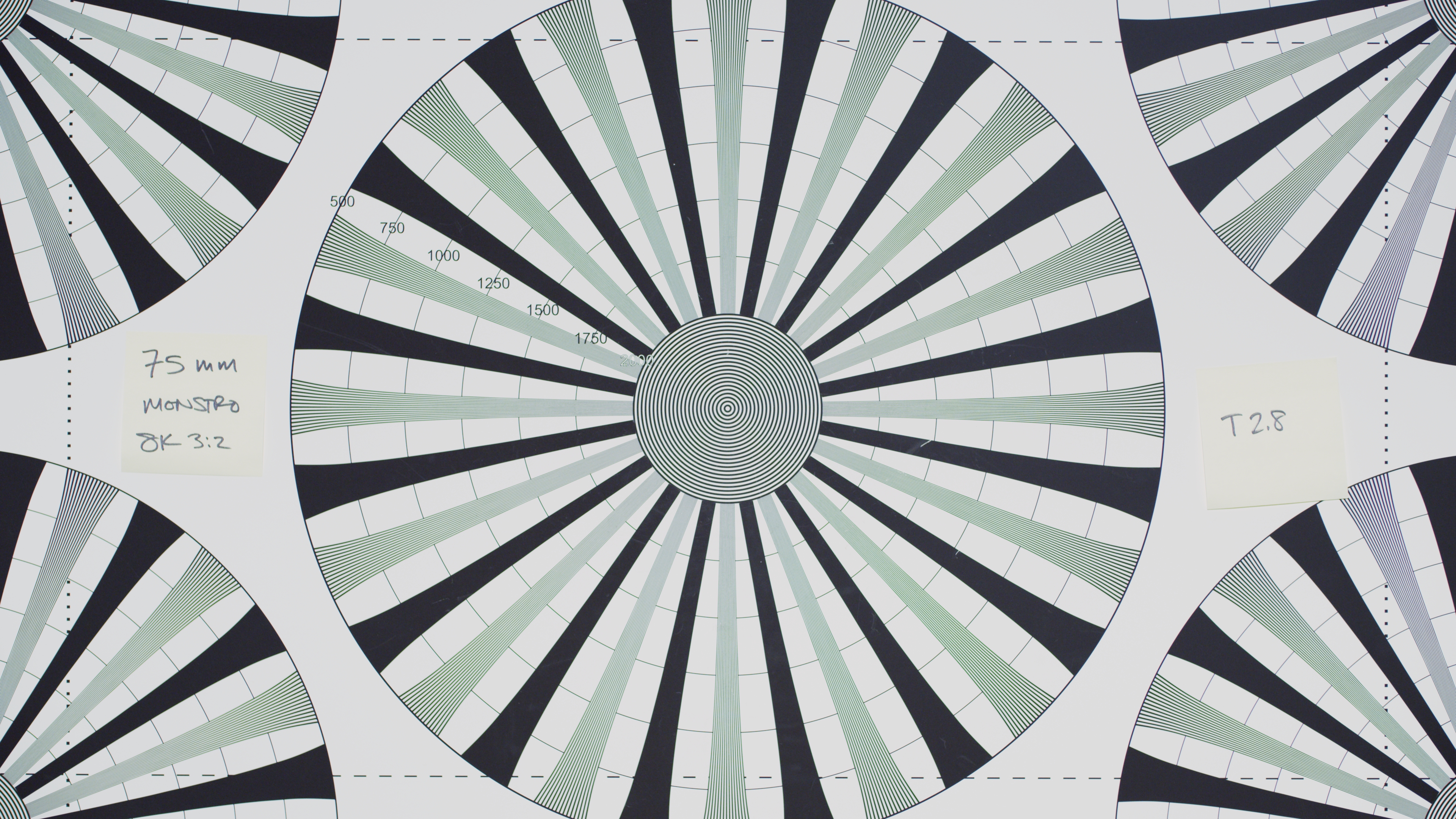
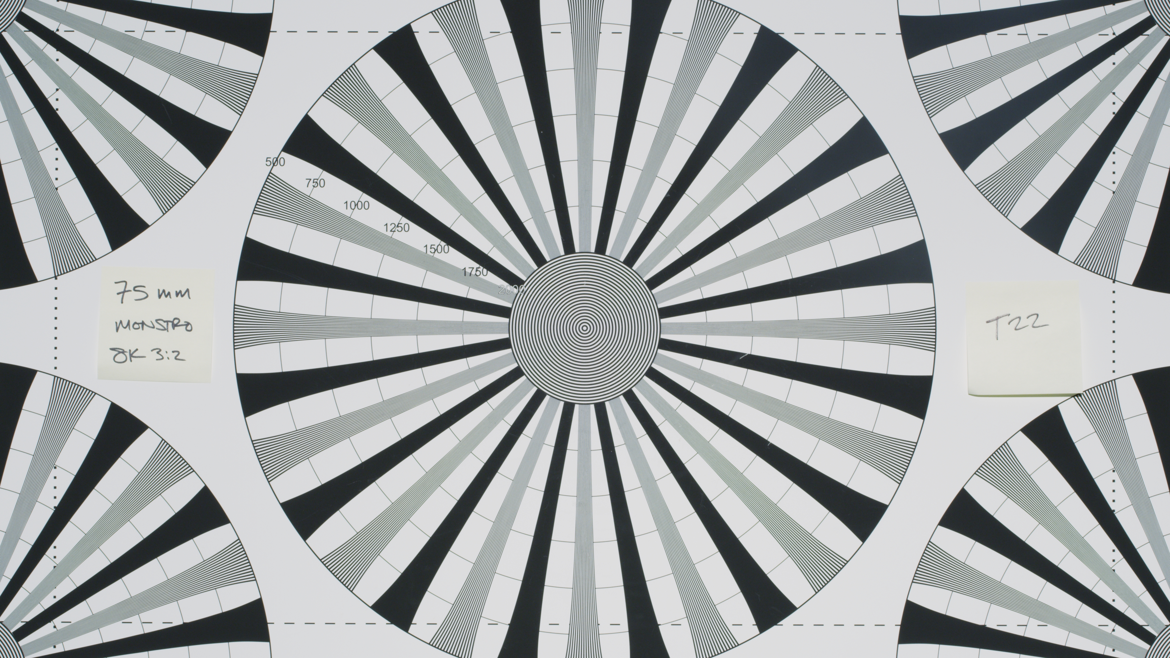
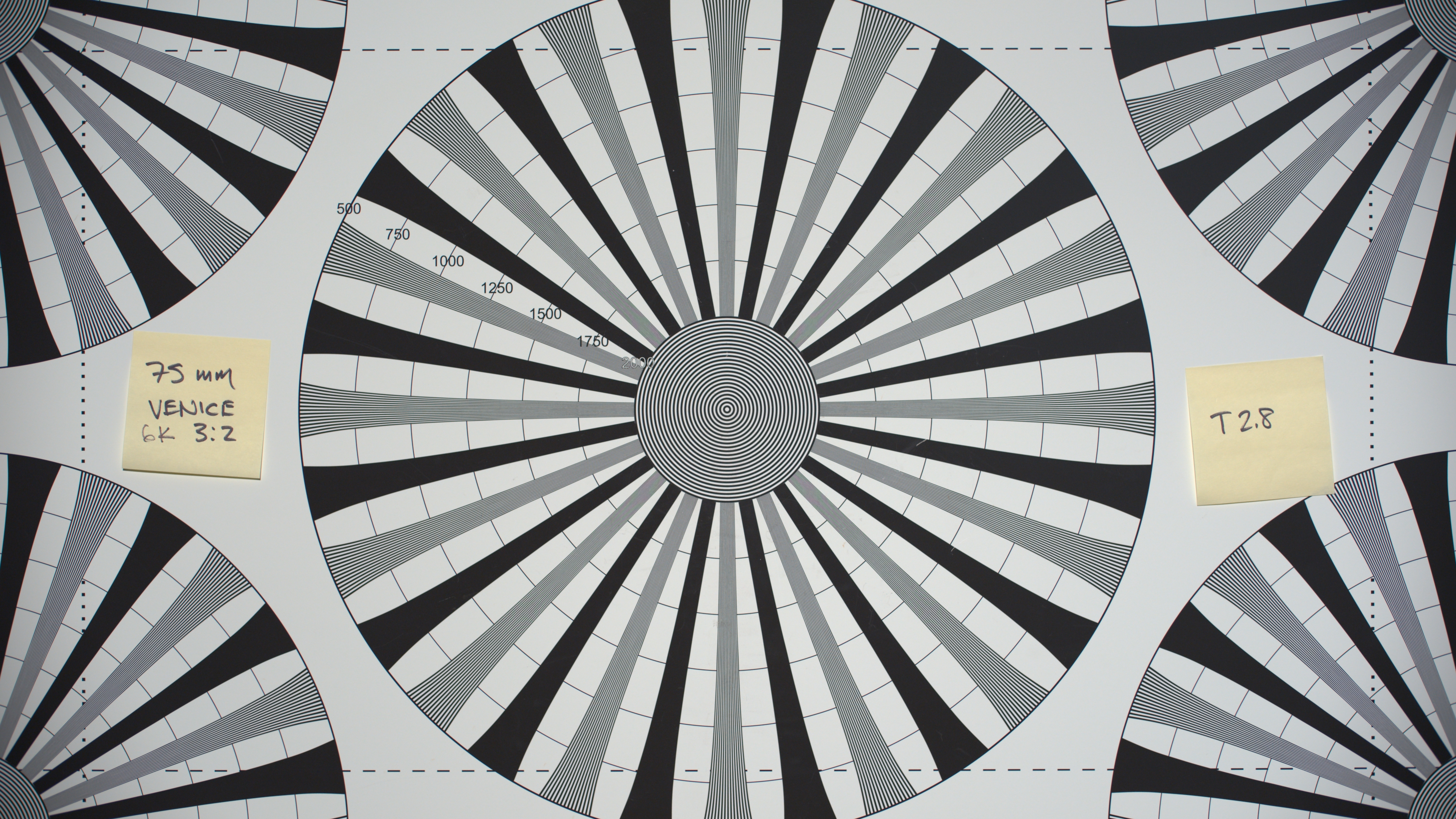
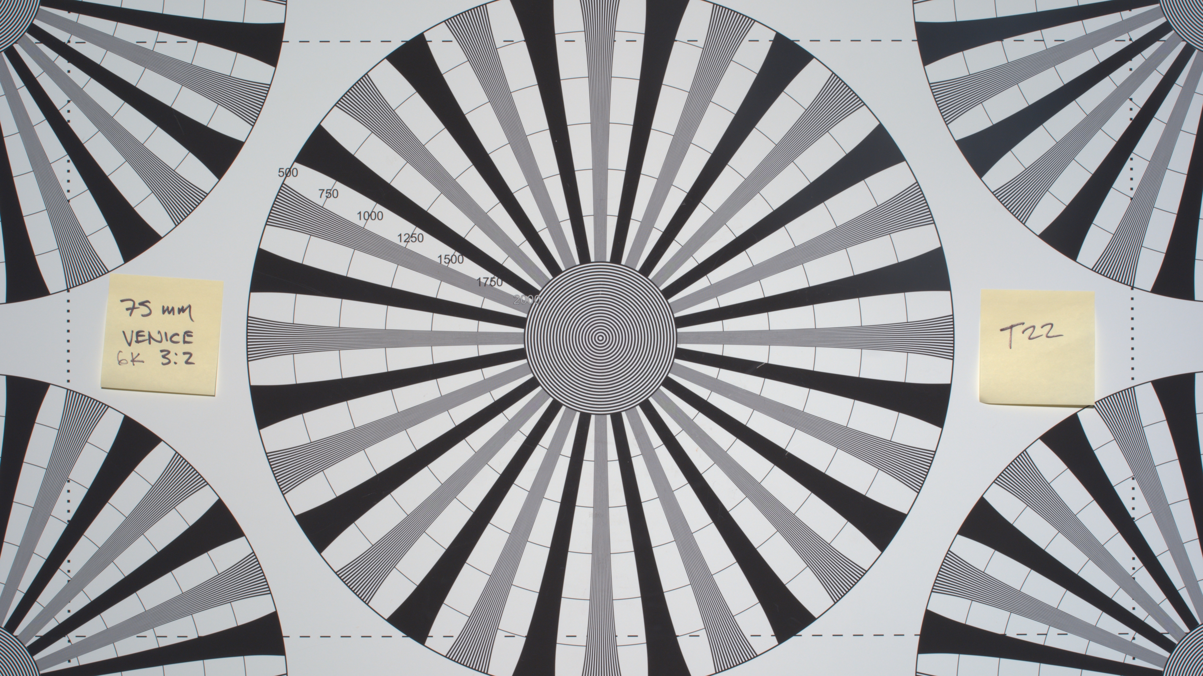
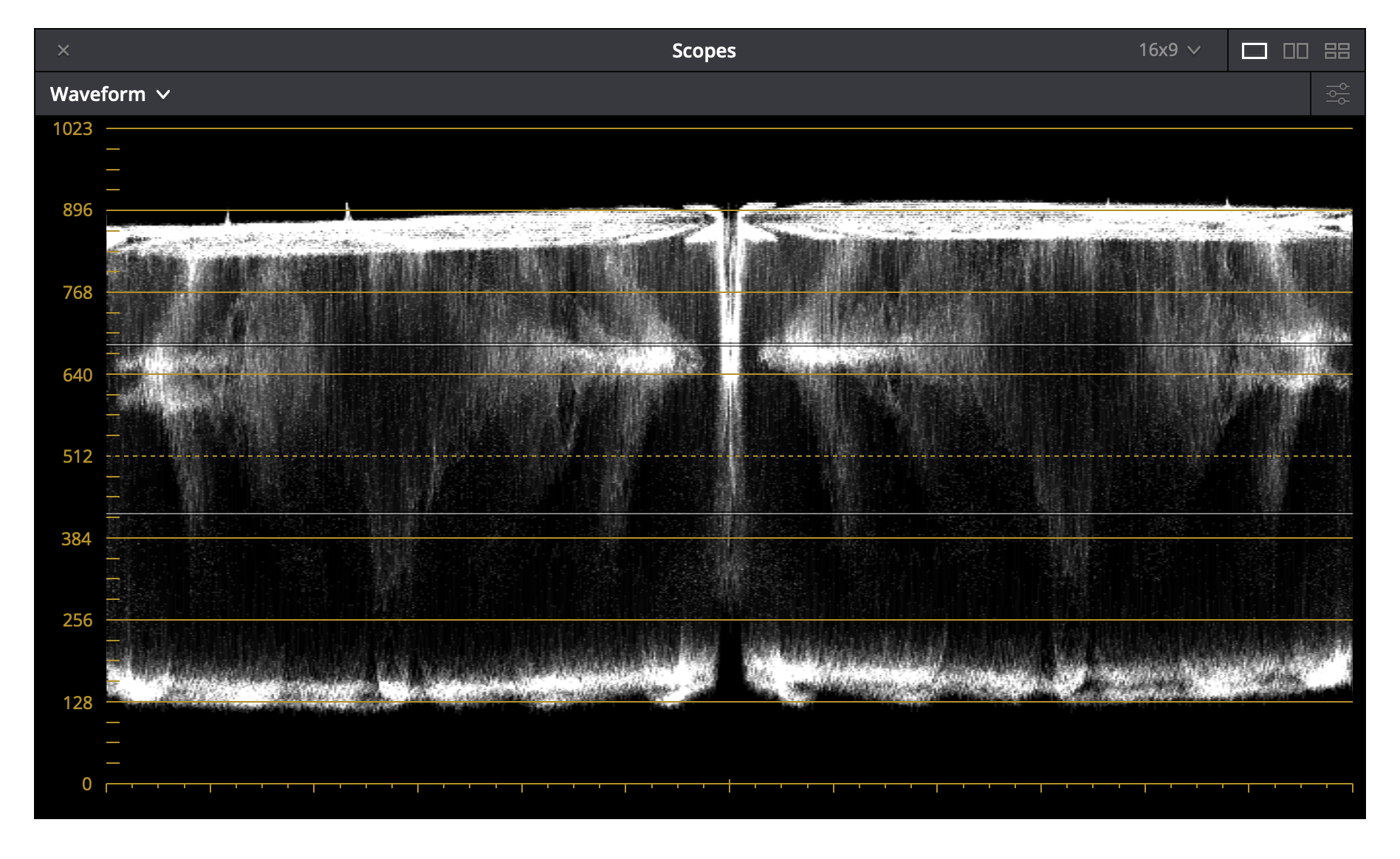
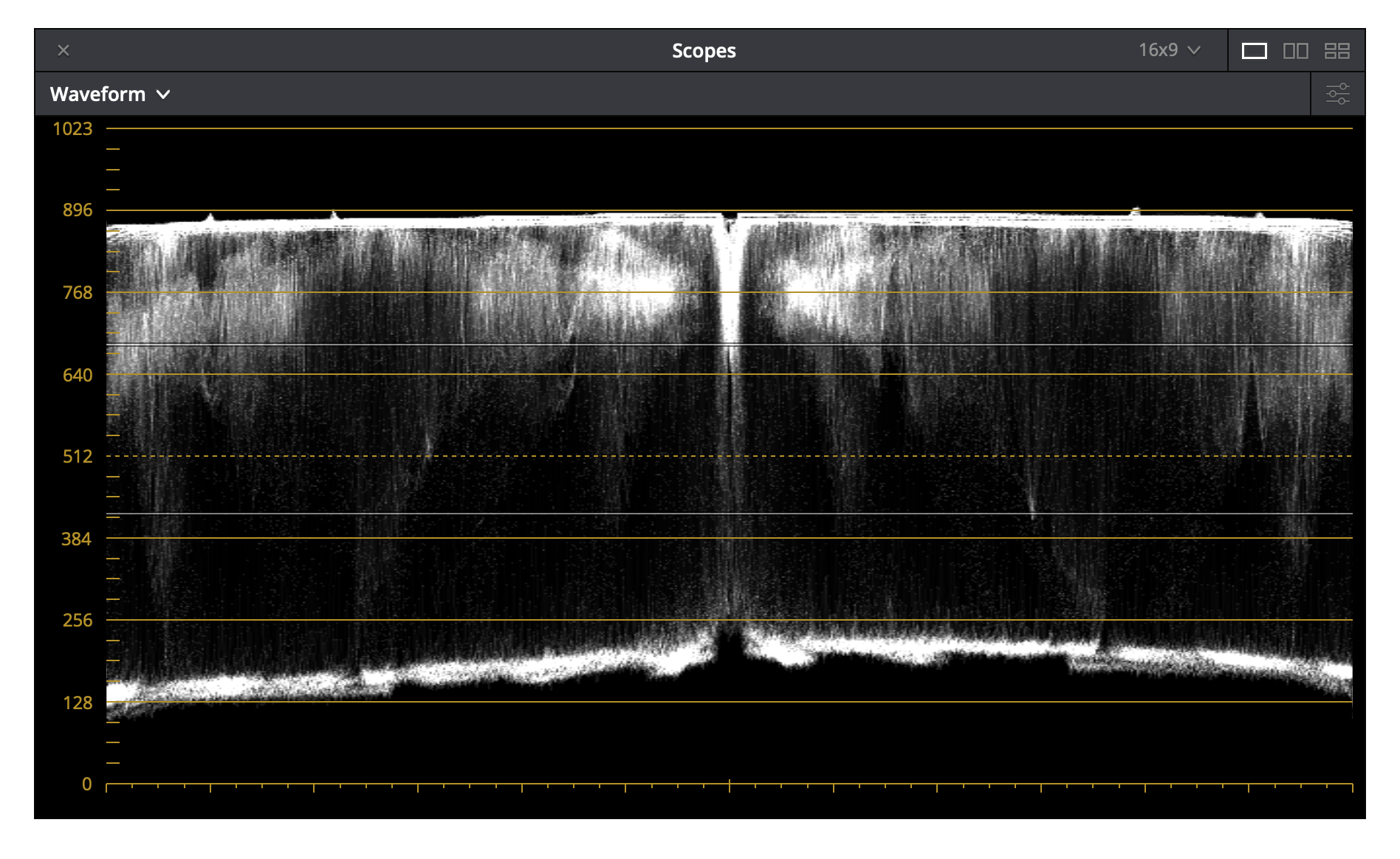

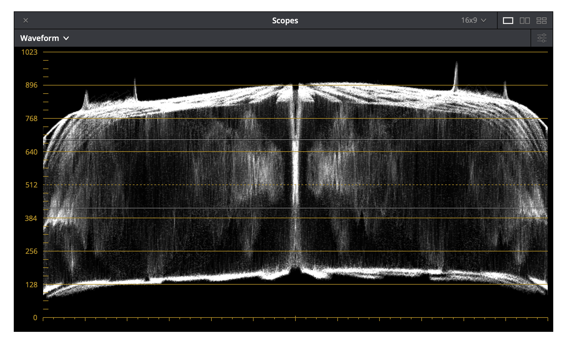
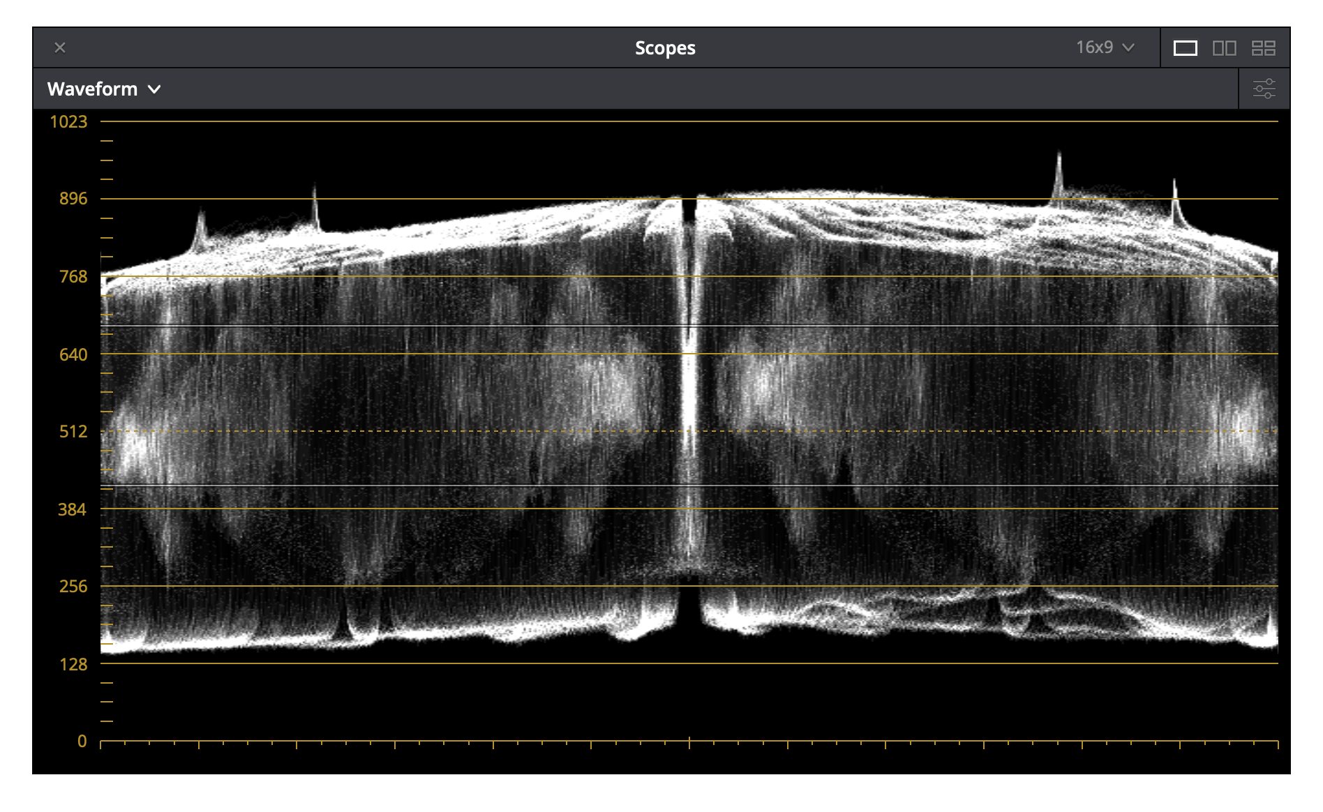
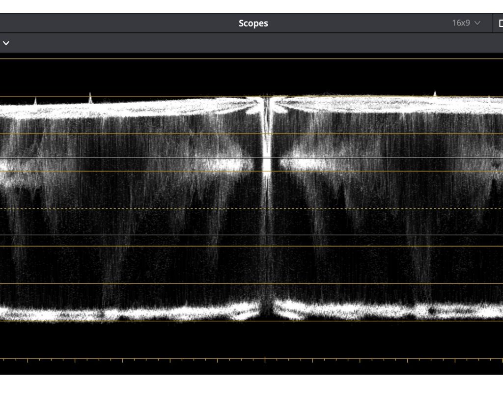
The Venice appears to show strong vignetting. There could be a couple of things causing this.
The Venice, in open gate mode, is using more sensor area than any of the others. The drop off on the sides is likely due to the sensor seeing the edges of this lens’s illumination circle. I know that the 75mm Master Prime covers the Alexa LF frame in UHD mode, but the Venice frame is broader than that. This mode is also wider than the Monstro 3:2 frame because that sensor isn’t as tall as the Venice.
The Mini shows no vignetting, but it’s the only S35 sensor in the mix.
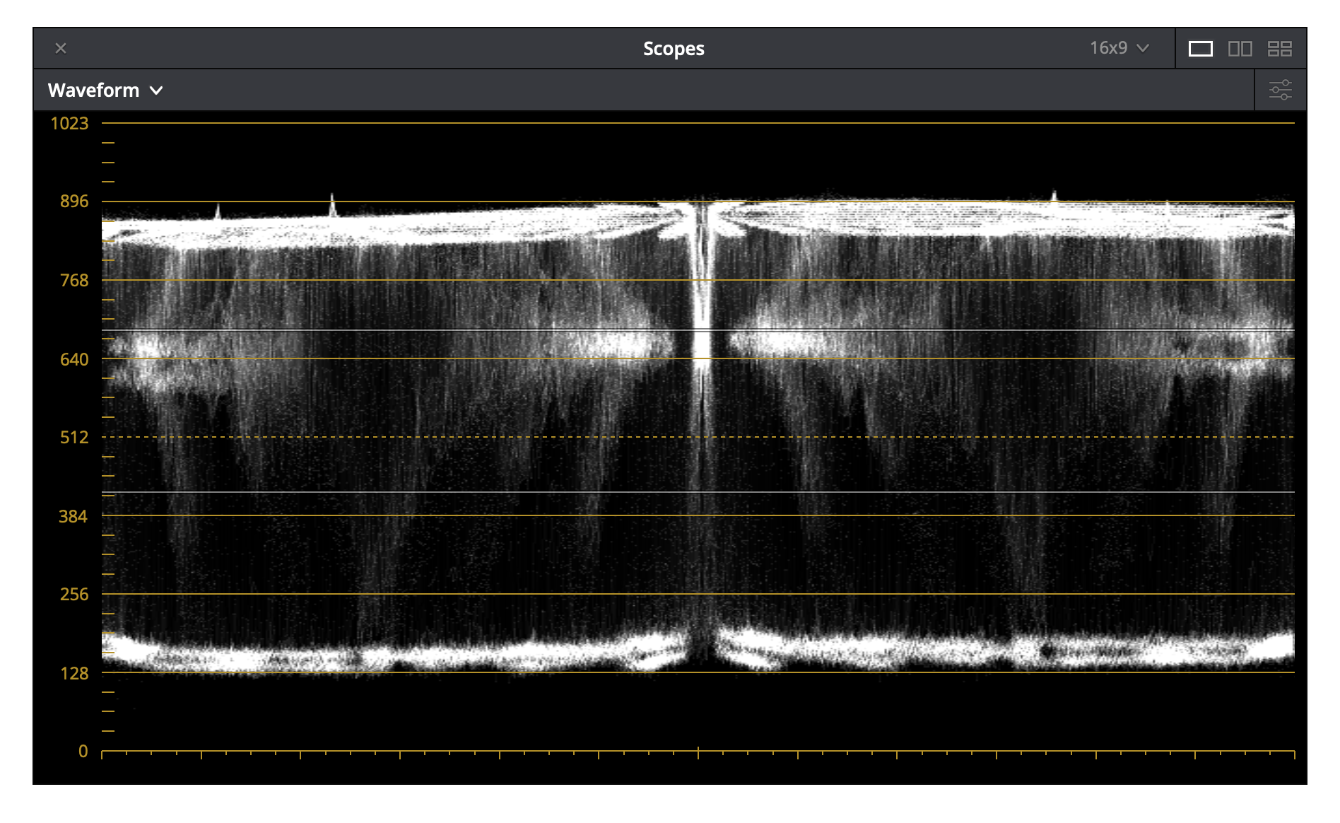
What’s curious is that Venice sees the chart as rolling off in illumination very quickly, more so than the other cameras. The dramatic fall off at the sides of the waveform at T2.8 seems due to the sensor seeing the blurred edges of the illumination circle. They’re still present, but less steep, at T22. This doesn’t explain why illumination rolls off so quickly to either side of the image center.
The chart isn’t perfectly illuminated. It’s a little dimmer on the left than on the right. I can still see illumination fall off to either side of center.
The only explanation I can think of to explain this relates to microlenses. These are tiny lenses that sit over each photosite to better direct light inside, increasing the efficiency of the sensor. They also fill in the gaps between photosites, where photons strike but aren’t “read” as image data. Microlenses are particular about the direction of the light that hits them. Film lenses tend to project light perpendicular to the sensor in the center of the illumination circle only. As the distance increases from the center of this circle, the light rays strike the sensor at increasingly steep angles. This results in a loss of efficiency at the edges of the illumination circle, which causes vignetting. (In some cases it can cause chromatic aberration as well.)
My guess is that some microlens designs are more forgiving than others.
I can’t come up with another reasonable explanation for why this vignetting occurs. There’s a slim chance that a change of focus might have caused this effect, as I had to move the chart a little closer when photographing it with the taller Venice sensor, but that would have been six inches at most. I experimented with tone mapping and highlight roll-off settings in Resolve to try to replicate this effect in the RED footage but couldn’t do it.
Spherical Master Primes are optimized for film, and film doesn’t care from what direction light rays strike it. Sensors do care, and very few lenses are designed to deliver light rays at shallow angles across the surface of a modern sensor. Signature Primes do this as they are designed to be largely telecentric, and I read an article recently that claims anamorphic Master Primes are partially telecentric as well. I haven’t confirmed this myself. An easy test is to look in the back of a lens and observe the position of the iris within the lens. If it’s toward the front of the lens, then it’s a telecentric design, as opposed to the rear of the lens, which is indicative of classic film design. I suspect that the spherical Master Primes are not telecentric, and while the ARRI Mini and RED Weapon Monstro don’t care so much about this, the Venice sensor is pickier.
The more I work with large format cameras, and the more I view HDR and UHD footage, the more I recognize that cameras and lenses have to be matched. Not every lens works well with every sensor. Not every lens creates desirable artifacts when viewed on a high-resolution monitor in a large color gamut. Recently I saw some SDR footage that looked great but showed significant highlight and flare artifacts in HDR that were suppressed by the Rec 709 display. As we get closer to HDR being a standard delivery format, we’re going to have to look very carefully at our lens choices. Every time I watch a TV show where lens flares or old lenses play a prominent role in the look, I wonder how much more I’m going to see when I watch that same show in HDR—and I wonder whether I’ll still like the look. UHD and HDR tend to amplify lens distortions and flares, and aesthetic choices made for one medium may not work for another.
After shooting my diffraction tests, I decided to take a quick look at Venice’s dual gain modes. I aimed the camera across the rental house floor and rolled a few frames at both EI 500 and EI 2500.
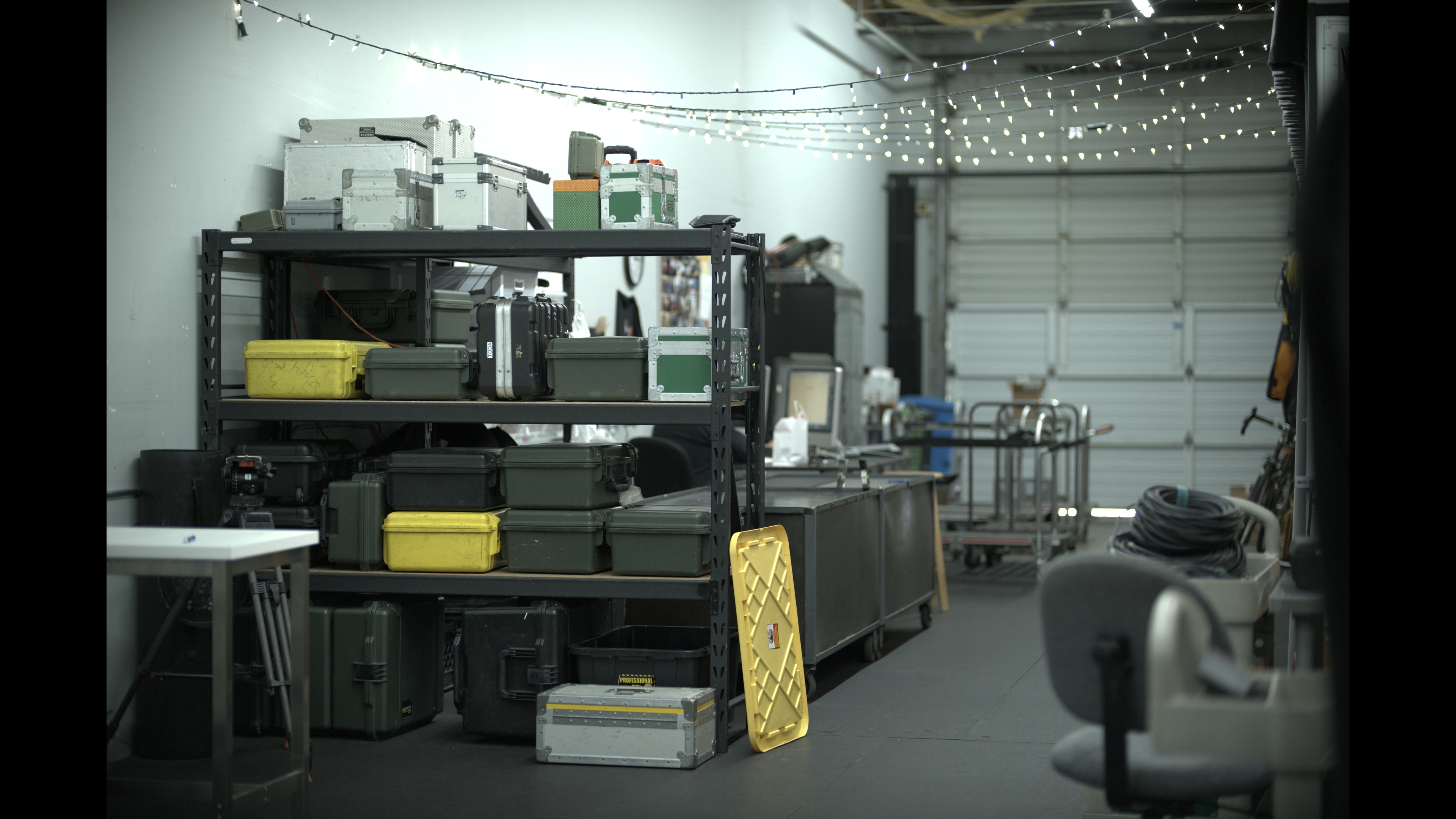
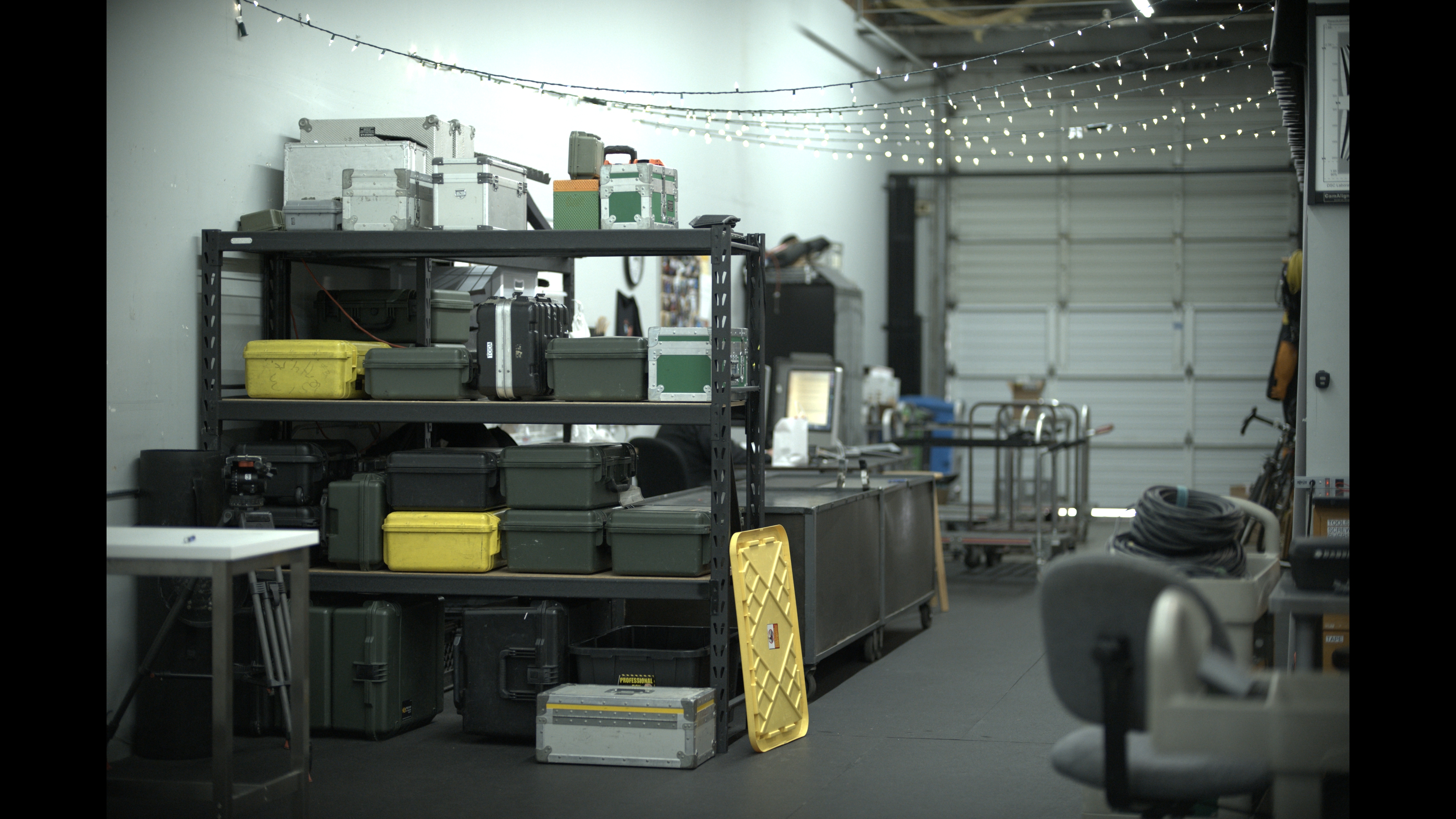

There’s some vignetting at the edges of the frame due to the sensor “seeing” the edges of the lens’s illumination circle. It’s a cool look, but I’m curious as to why that fall off in exposure starts so close to the center of the frame (as seen in the waveform images above). If this was a lens issue, the other cameras should see it too—and they don’t. This seems to indicate a sensor characteristic over a lens characteristic.
Side note: I don’t think it’s proper to say that 500 and 2500 are “ISO” settings. A camera should have only one ISO number, as that number is the result of standardized testing based on the noise floor or highlight clipping. It’s more accurate to say that these are EI (“exposure index”) settings, which are numbers to plug into your light meter to ensure predictable exposure results based on how the camera is configured.
Disclosure: I have worked as a paid consultant to ARRI, Inc. I was not paid by any manufacturer to write this article.
Art Adams
Director of Photography

Filmtools
Filmmakers go-to destination for pre-production, production & post production equipment!
Shop Now