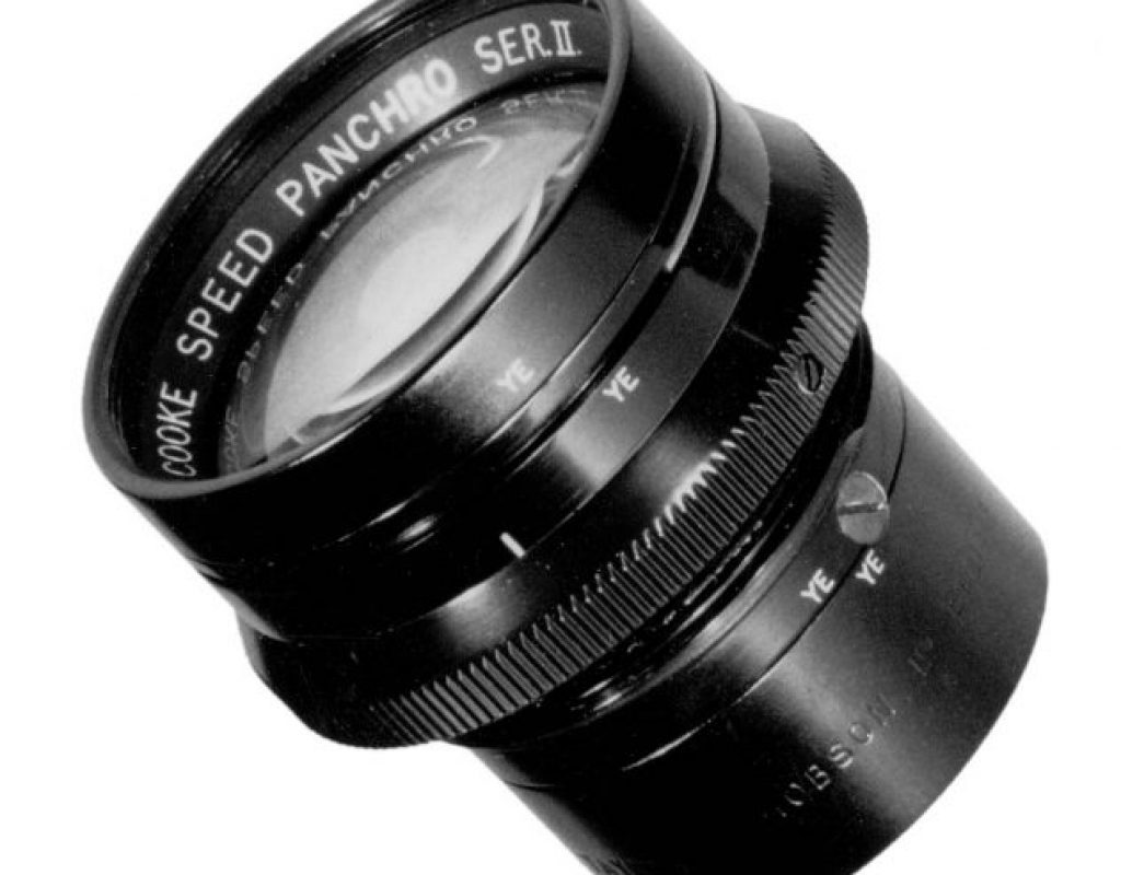
Every lens has a feel and a purpose. Some reproduce the world perfectly, some imperfectly. They all have their place, but I have come to appreciate “imperfect” over “perfect.”
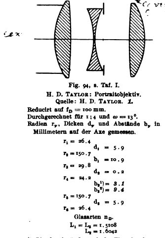
There is a sense in cinematography circles that digital cameras are too “clean.” Common complaints center around the fact that film’s analog nature introduces certain characteristics to an image that sensors don’t. The most obvious is that randomized grain, visible in film, is replaced in the electronic world by noise, which is less random and has a different “feel” altogether. Less obvious is the quirky way the three color layers that make up film (from the top down: blue, green, and finally red) reproduce images. Blue, being the top layer, exposes much more easily than red, because light has to travel through several layers of filtration before it reaches that bottom red layer. The red image tends to be just a little bit softer than blue or green, perhaps because red light has to travel through more layers before exposing, or possibly because its wavelength is longer so it focuses differently. (This is well known: the scenes that camera assistants dreaded the most in film took place in red-lit darkrooms, as lens focus marks became useless.)
It is these intangibles that gave film an abstract beauty, and abstraction is what audiences crave. Audiences don’t want to see realistically captured images: they want to see interpretations of reality that are more interesting than the reality they see daily. The more unique and compelling an image is, the more attractive it is to an audience… within reason, of course.
There’s only so far a color grade can be pushed, and even then the look tends not to be very “analog,” or randomly distorted. That’s why old glass is seeing a resurgence. Such lenses work their magic before the light strikes the sensor, and—unlike a color grade which works at the color bit depth of the source or intermediate digital files—they work at the full bit depth of the sensor. And old lenses do some wonderfully unpredictable things.
Lenses have always been a bit of a kluge. Zooms, in particular, are compromises in every way, and often show all sorts of defects from the distortion of horizontal and vertical lines to color fringing around contrasty objects. Primes are generally less prone to annoying distortions, but certainly possess more positive distortions that give them “character.”
One overlooked quality of lenses is lens color. A while back, while shooting a travel job, I had to mix Cooke S4 primes with an Angenieux 24-290 zoom due to limited equipment availability. It wasn’t long before I noticed that the Cookes, which are nice and warm, contrasted sharply with the Angenieux zoom, which appeared cool and cyan. While this is relatively easily fixed in a color grade, it does add time and expense to that process, and a less experienced colorist might not fix that issue at all.
When I got home I set out to compare and contrast lens colors so I didn’t end up in this situation again. I knew that director wanted to work with either Leica or Cooke primes, and I needed a zoom that would match either choice. This article illustrates how I compared both Cooke and Leica primes to Angenieux and Canon zooms in order to determine which pairing was the best match for color. In the end I found that the warm Cooke and Canon lenses matched fairly well, whereas the Leica and Angenieux lenses were a better match because they were both cool and a bit green.
What’s interesting is that the lenses weren’t simply an overall hue, but showed variations in how they transitioned from warm to cool. For example, in a range from blue to red, the purple hues transitioned to red faster on the Canons than on the Cookes but their overall warmth was the same.
I’ve come to think of all the common lens choices in the following ways:
Cooke S4 primes. They don’t always play well with horizontal and vertical lines, but those distortions work magic on faces and figures. They render skin tone as wonderfully “creamy,” and the quality of the out-of-focus image (known as “bokeh“) is painterly and slightly dreamy. They tend to pop warm hues and downplay cold ones, which—once again—is wonderful on faces. Their low contrast doesn’t work well with white limbo backgrounds, but otherwise they are my go-to favorites.
Zeiss Ultra Primes. These are my workhorse lenses, as they tend to be a little cheaper than Cooke S4s and are more often available when rental houses are busy. They are very clean and the wider lenses show gentle barrel distortion, which I find pleasing in an old-fashioned way. They don’t flare easily, and in general are just good, decent, all-around lenses. Where Cooke S4 lenses don’t work so well on white limbo backgrounds, Ultra Primes are much more contrasty and work perfectly.
Zeiss Master Primes. I’m not a fan. They are very, very good lenses, but they are so free of distortion that I find them a little boring. Still, they are probably the sharpest low light lenses around, and some of the sharpest lenses available overall. They show a little barrel distortion, like Ultra Primes do, but unlike Ultra Primes I find the quality of that distortion a little disturbing. For some reason the distortion never feels symmetrical to me, as if the lens is slightly offset in its mount, even though it is really the world that is slightly offset in relation to the lens. I can spot this effect fairly easily.
If I’m shooting a project where I know the production company wants to resize the image significantly in post, these are my go-to lenses as I know there aren’t many lenses that are sharper. Like Ultra Primes, they show a lot of contrast and are very resistant to flares.
Leica Summicron-C primes. I’ve used these, and they are nice lenses, but like the Master Primes they are almost too perfect. They are also a little cool and green, which is easily corrected but not my favorite look on faces. Still, they are razor sharp and free of distortion, and sometimes that’s the look you want. In a recent video comparing these lenses to Ultra Primes, I noticed that the Leicas didn’t cause highlights to bloom as much as the Ultra Primes but the field of view was completely flat, where the Ultra Primes added a bit of roundness to the image. I found the Ultra Primes to be technically lower in quality but artistically more pleasing.
Zeiss Super Speeds. These old lenses have a lot of character. Their bokeh is distinctive: highlights are hot in the center and bleed off into a gentle glow. They show more flare than their modern counterparts (Ultra Primes are basically updated Super Speeds) and a bit more barrel distortion, and they aren’t as sharp as the other lenses on this list, but they still do a surprisingly good job. In the early Alexa days I was often able to get that camera on jobs by compromising on lens choice to keep costs down, and I came to enjoy matching such an awesome camera to a set of old and worn Super Speed lenses.
Speaking of old and worn lenses… this is the part where I talk about my new favorite lens. A company in the U.K. called TLS (for True Lens Services) has been rehousing old Cooke Speed Panchro lenses, from the 1920s through the 1960s, for modern motion picture use. They have all the functionality of modern Cooke primes, but the funkiness of old and worn lenses from an era when lens technology was a lot less forgiving. (Recently, while shooting handheld with these lenses and controlling my own focus, I found myself spinning the focus knob crazily and wondering why it wasn’t engaged… but then noticing that focus did actually change. That’s how insanely smooth the focus mechanism is on these rehoused lenses!)
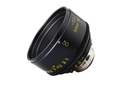
These rehoused old lenses are so popular that Cooke Optics dug the designs out of a filing cabinet somewhere and is re-releasing them as a brand new product, the Cooke Panchro/i Classic, in all their funky glory.
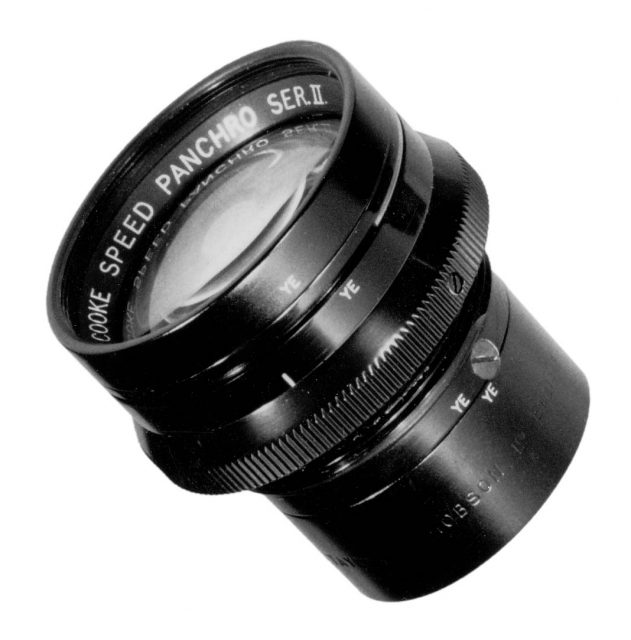
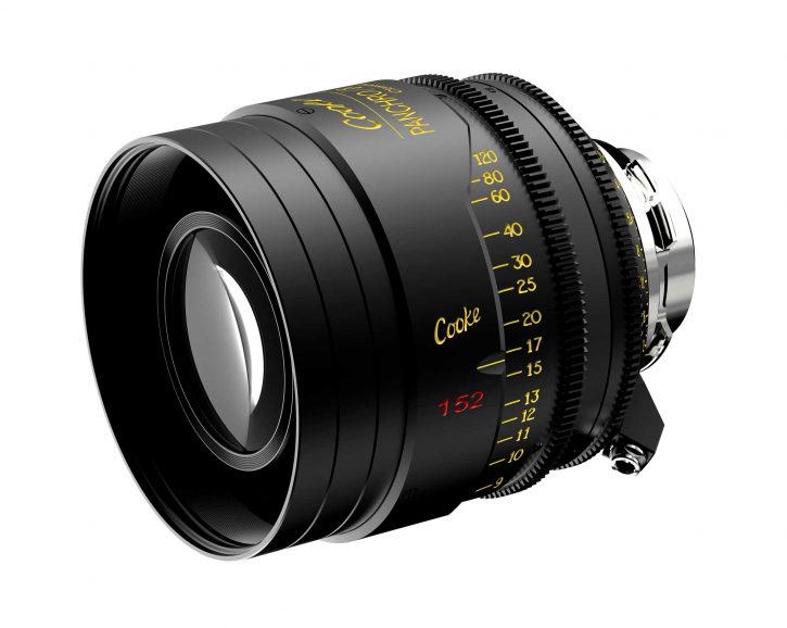
Cooke Optics recently released this promotional video showing off the “new” Cooke Speed Panchro, now known as the Cooke Classic:
These are the most imperfect lenses I’ve ever used… and I absolutely LOVE THEM.
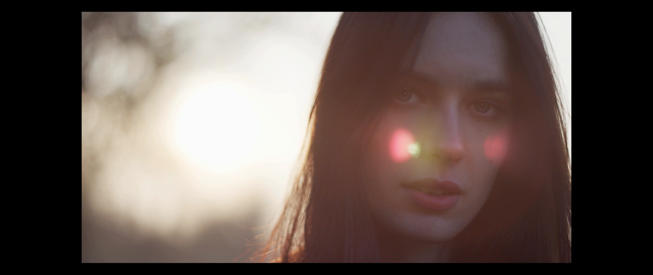
These lenses flare like mad. I remember a time when that was a bad thing, but modern aesthetics have changed. In this article I showed how lens flares introduce depth by creating a wash of light across the image at the point closest to the viewer, creating a barrier between them and the image. A setting sun gives one a sense of infinity within the frame, but a lens flare does the opposite by appearing closer to the viewer than everything else.
Flare can be used for dramatic purposes by forcing the viewer to look harder to see what’s going on. Suddenly eliminating that flare is even more dramatic as it suddenly drops the viewer right into the shot.
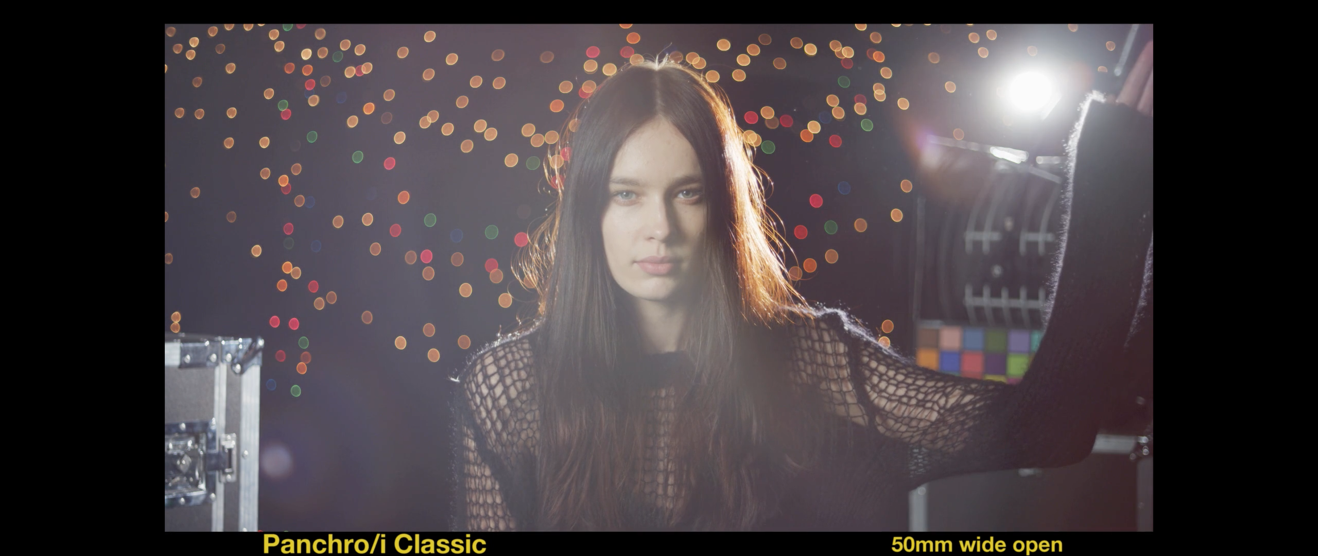
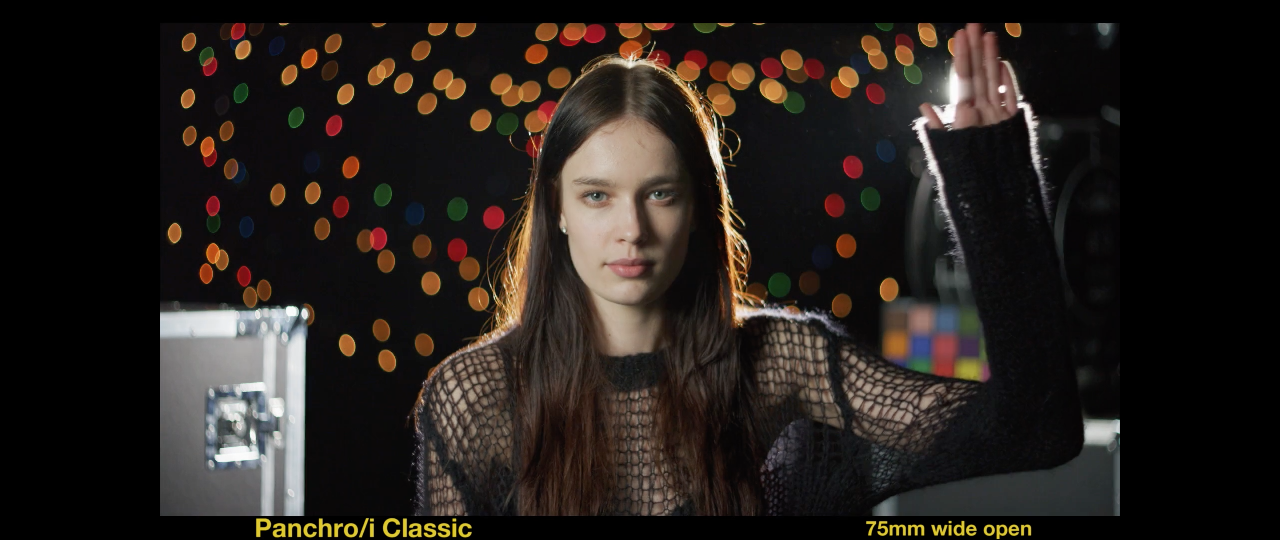
I used TLS-rehoused Cooke Speed Panchros lenses on a recent commercial, where we played “peak-a-boo” with the sun by flaring the lens and then shading it, and this added a lot of drama to what would have otherwise been a fairly boring shot.
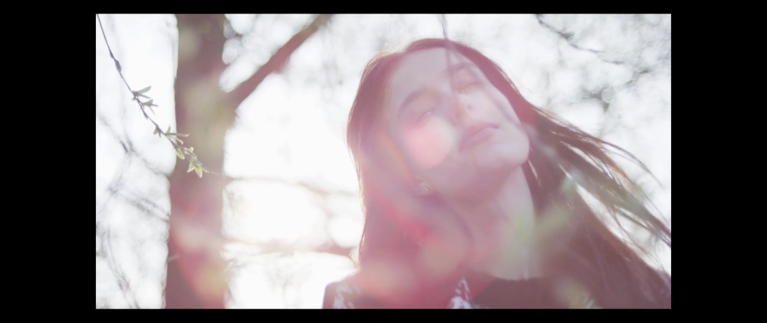
One of the things I love about these lenses is that the out-of-focus image is very smeary and painterly. It also seems to have layers. In this shot, which moves slightly from side to side, the out-of-focus branches in the foreground distort the out-of-focus branches in the background, like ripples in a pond. The layers of branches seem to interact with each other.
I exploited this characteristic in a recent commercial where we put wine glasses directly in front of a 100mm TLS Cooke Speed Panchro, with the aperture wide open, and the glass in the foreground of the shot created wonderful ripple effects in the background as they moved through the frame.
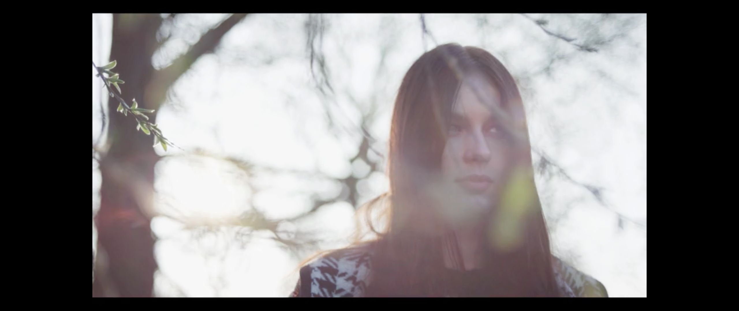
It feels as if the light from the soft branches in the distant background has to bend around the closer branches in order to reach the lens.
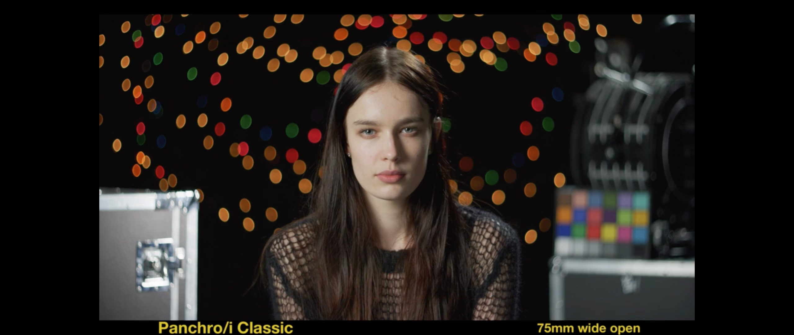
This shot shows another element of the Cooke Speed Panchro look: when used with the aperture wide open, the front of the lens cuts into the image somewhat, creating a soft vignette around the frame that also distorts the boken into ovals. The highlights at the top left of this frame should be circles, but they are cut in half by the lens housing itself. The result is swirling effect that pushes the eye into the center of the image. All lenses do this to some extent, but these lenses do it in the most interesting way I’ve ever seen.
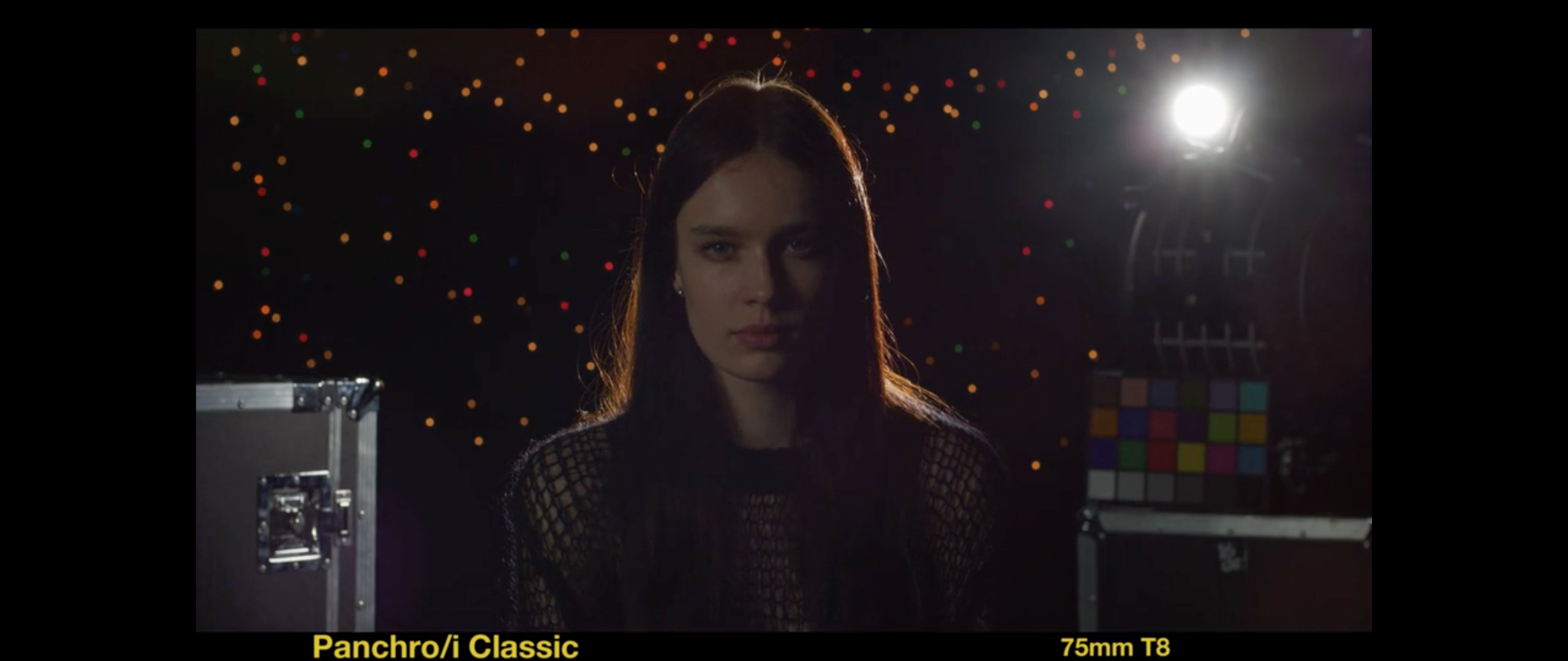
This “swirling” effect can be eliminated by stopping modern lenses down one stop from wide open, although older lens designs (like the Cooke Speed Panchros and the new Classics) often require 2 ⅔ stops before this effect dissipates. This effect is easy to see: look through the back of any lens, with the aperture wide open, and hold it such that the front end of the lens becomes visible, cutting off part of the image circle. Then close the f/stop down a stop or two. Now that the hole is smaller, you can’t see the edge of the lens cutting into the image anymore.
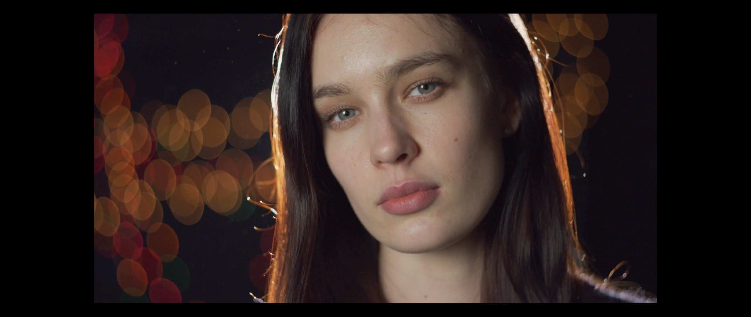
Cooke lenses have a creaminess to them that make people look great. What’s also interesting about this image is that we can see that the highlights have a very slight edge to them, where the outside of the highlight is a little brighter than the rest of it. “Perfect” boken means this highlight should be exactly the same brightness all the way across, but that can often feel a bit too “clean.” Zeiss Super Speeds make the center hotter than outside edge, but Cookes make the outside edge hotter than the center.
Too much of this can be unpleasant. Many still lenses will turn out-of-focus background highlights into donuts, with a very dark center, and those don’t blend together very well. The effect is very distracting as the background highlights end up appearing almost as sharp as the foreground. These Cooke lenses add just the right amount of edge, giving the bokeh the feel of a lens that’s not quite perfect, but in a pleasing way. The highlights feel less like donuts and more like diamonds.
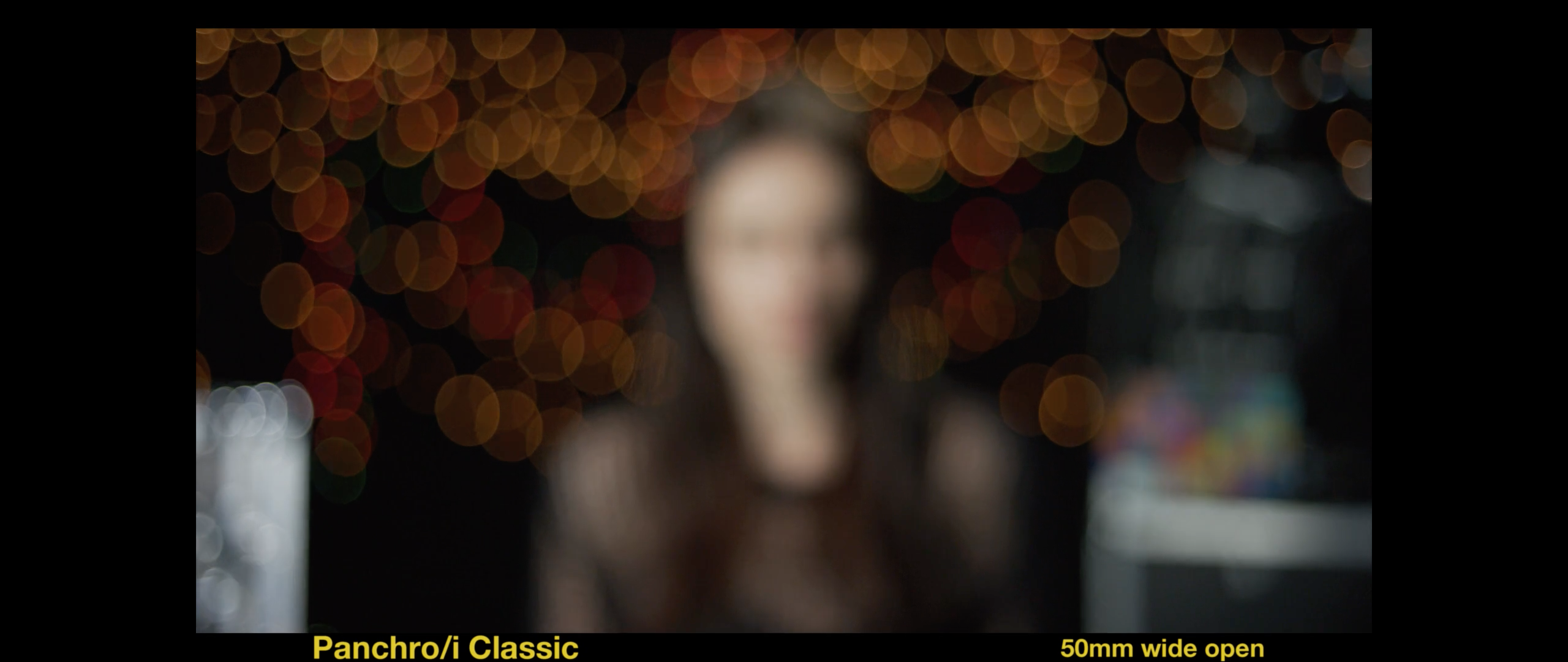
Throwing everything out of focus shows just how smeary and almost ghostly these lenses render out-of-focus backgrounds.
These lenses aren’t the answer to every production, but when they do work for the story or the product they really are amazing. At the moment it’s possible to find TLS-rehoused Cooke Speed Panchros at a lot of rental houses (I’ve found them in my native San Francisco Bay Area, and I also used a local set on a recent project in Phoenix). This summer you’ll see these lenses re-released as brand new Cooke Classics, and I suspect you’ll be able to find them everywhere.
At least I hope so… I’m going to be asking for them quite a lot.
(You can read my article on Cooke’s anamorphic lenses here.)

Filmtools
Filmmakers go-to destination for pre-production, production & post production equipment!
Shop Now