If you create content for television, it’s useful to get out of the house and see how others are actually viewing it. For example, we have all 16:9 HDTV sets and signals here, but on a recent road trip I saw far more 4:3 TV than I was expecting – as well as a lot of improperly-prepared content being chopped off as a result. Let’s walk through some of these very real-world issues.
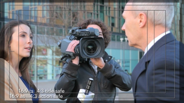
Viewers could be missing large portions of the image and additional graphics in the content you’re producing. image #21213340 courtesy Stockboutique/iStockphoto
The Full-Screen 16:9 Signal

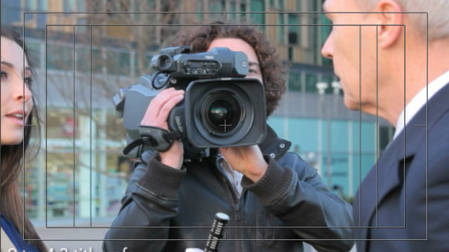
The image above is a 16:9 video capture, with safe area overlays for 16:9 and center-cut 4:3 video. The safe areas represent the typical 10% all around (5% per side) for Action Safe and 20% (10% per side) for Title Safe.
Why do we even have safe areas to worry about? Because old CRT-based television sets had two problems: One, the image could become distorted or out of focus as you moved closer to the edges. That’s why Title Safe is inset so far from those edges: To make sure any important text was readable. Two, the image could shrink as the CRT aged (or simply be misadjusted in the first place), so it was projected larger than absolutely needed – “overscanned” – and cropped off by the TV’s bezel.
As CRT technology got better, and was eventually replaced by flat screen displays, both the distortion and shrinkage problems have gone away. Indeed, for years many have been placing text banners between the Action and Title Safe areas, counting on it to be readable on most sets.
However, the overscan issue of what happens beyond Action Safe hasn’t gone away: Many HDTV sets today – including projection systems – still crop off part of the image, through some combination of scaling up the image and/or hiding the edges of the display behind the bezel. A typical – though hardly universal or standardized – default factory setting seems to be 5% all around (2.5% per side).
For better or worse, the user can usually override this if they know what button to press or menu item to dive into – but to be safe (no pun intended), you should assume that 2.5% is still potentially going to be cut off on each side. This is represented by the 50% gray overlay around the edges of the images throughout this article: Some may see what’s in the gray; many may not.
In the image just above, I’ve placed some sample text at the 16:9 and 4:3 action safe and title safe borders. However, note that the video was shot “protected” (taking into account) only the 16:9 safe areas, not the 4:3 safe areas. Because HDTV is the standard now, right?
4:3 Is Still Out There – And More Common Than You Might Think
During my recent travels, I stayed at:
- A business hotel with flat screen TVs, but a standard definition analog composite cable television system, meaning all the source images were 4:3.
- A state park resort with old standard-def CRT-based TVs and an analog 4:3 system to match.
- A private residence with flat screen TVs and digital satellite television, but just a standard definition subscription plus a standard-def TiVo – meaning most of their images (except for antenna-received HD) were 4:3.
Despite high definition digital being the standard for broadcast, a lot of facilities such as hotels still have analog standard definition infrastructures, and that’s not going to change overnight. Also, many (most?) satellite and cable providers still charge more for HDTV signals and receivers – and even if you pay that ransom surcharge, not all the channels they carry are high def.
Protecting for 4:3 Center Cut
So given that 4:3 presentation still exists, how are the images those being generated from the 16:9 sources? In many cases, they’re being “center cut” from the 16:9 source. The result looks like this:
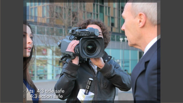
Notice that text that conforms to the 4:3 safe areas is still readable, while some of the text scooted out to the 16:9 safe areas is getting cut off. (Compare this to the previous image to confirm.)
Also notice that the video that was not shot protected for 4:3 center cut is getting cropped in a less-than-aesthetically pleasing manner. Over those two weeks, I saw a lot of newscasts and interview segments that were obviously not shot protected for 4:3, with interview subjects being cut off in a similar manner – some to the point of no longer being visible on screen!
So yes, unless you have specific knowledge of how a standard definition version of your signal is going to be created and distributed (and we’ll get to that later), you still need to shoot and design protected for 4:3 center cut.
But It Gets Worse…
Now let’s move to the common hybrid case of a 4:3 signal being viewed on a new 16:9 TV. By default, there will be bars of some color (usually black) down the left and right sides of this image, resulting in what some call a “pillarbox”:
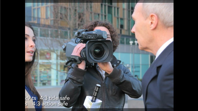
Viewers often don’t like seeing unused areas of the screen – and they may feel compelled to fill them in some way. The most common method for years was to stretch the 4:3 image horizontally to fill the 16:9 width:
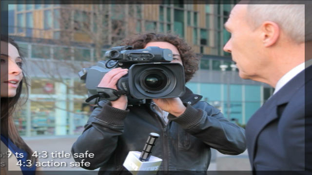
This used to drive me absolutely crazy. Much to my surprise, not only have I become resigned mellowed with age, the viewing public seems to have become more attuned to wrong aspect ratios, and I see this far less than I used to.
But sometimes, the cure is even worse than the disease. Many TVs now have a picture viewing option that scales up the image both horizontally and vertically, resulting in this:
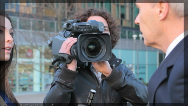
Notice what happened to the text? Yes, even the 4:3 Title Safe protected text is now all but cropped off. This is exactly what I saw at the residence I stayed at: Most of the news tickers, lower thirds, and other informational graphics were unreadable. (My dear wife and partner Trish, in her infinite patience, informed the homeowners about this problem and showed them how to resize their pictures – each brand of TV set having a differently-labeled button, just to make things more challenging. Unfortunately, not every house has a Trish.)
This means – if you really care about viewers reading the text you’re putting on screen, and you don’t have control over the transmission chain – that you should consider placing your text even inside the normal Title Safe areas.
I know; I’m sorry. But that’s your current reality. Unless…
The Letterbox Solution
As part of our travels, we had the opportunity to spend some time with the folks at HGTV. I asked them if they were protecting for 4:3, and they informed me they weren’t – instead, they were letterboxing their 16:9 content when it was converted to 4:3:
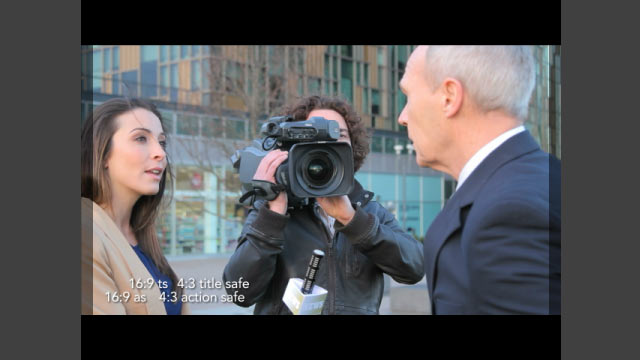
I was surprised at first – in the early days of HD, the conventional wisdom was that viewers wouldn’t accept such wide black bars – but then I saw the wisdom of their ways: Aside from giving them the entire screen to work with (which often leads to more aesthetically pleasing designs than protecting everything for 4:3 center cut), this inoculated them from many of the problems outlined earlier. For example, in the 4:3 image above, you can see that all of the text – 16:9 or 4:3 – is readable, and there was no harm in not protecting for 4:3 while shooting.
Next let’s look at the 4:3 signal on a 16:9 set:
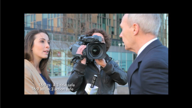
Okay, there’s a lot of wasted space, and the image is a bit small, but everything is still visible; nothing is cut off.
And what if the viewer hits that dreaded Zoom button on their remote?

We’re back to the “original” 16:9 presentation of the content! Yes, the resulting image is a bit soft, but I would consider that a lesser evil than having something important cut off.
If you haven’t already thought all these issues through, this leaves you with a couple of potentially difficult decisions:
- If you control your distribution pipeline, you might consider choosing letterbox over center cut when you create 4:3 versions of your 16:9 content.
- If you don’t have such control, you may need to inset important text, graphics, and onscreen action further into the center of the image than you even imagined.
You may be skeptical; I certainly wasn’t as sensitive to these issues before my recent trip. But I want to emphasize: These are not theoretical considerations – during my travels I saw multiple examples of what could go wrong if you don’t take these issues into account.
Additional Reading
I’ve written several articles in the past on moving between the 4:3 and 16:9 worlds. If you’re curious (taking into account that some things may have changed since these were written):
Open Wide: Creating That Widescreen Look discussed ways to simulate the widescreen aesthetic when stuck with 4:3 sources or projection.
The Hi-Def Checklist is a now-classic article on considerations when creating hi-def content, including frame rates, frame size issues, and creating content that would work in both 16:9 and 4:3 worlds.
Unsafe Areas discussed the new 4:3 center cut overlays introduced in After Effects CS4, including the correct placement of them (the defaults were nonstandard in CS4; they were changed to more standard numbers in CS5 and later). It also touched on the corrected non-square pixel aspect ratios introduced in CS4.
A Distorted View of the World was a case study in what could go wrong if image and pixel aspect ratios were not managed correctly as content is shuffled between 16:9 and 4:3 worlds.
Filmtools
Filmmakers go-to destination for pre-production, production & post production equipment!
Shop Now