Years ago, when I first lit a shot of an actor, head to toe, standing on a green screen cyc, I learned a lesson that has stayed with me to this day.
I’d never done anything like this before, and I knew I needed space lights but I didn’t know in what configuration they should be hung, or how many I’d need. I assumed I’d need to hang them everywhere, including over the actor, but my gaffer told me I didn’t. “Just hang them behind,” he said.
“But how does that light the floor around the actor?” I asked. “Trust me,” said my gaffer.
Sure enough, he was right: hanging the lights behind the actor lit the back wall while also spreading forward and lighting the area around the actor’s feet. It was a neat trick, as it allowed me to light the actor from the front however I wished without dealing with harsh top light.
I soon came to realize that this is a great method for lighting all kinds of sets.
Several articles that I’d read, in American Cinematographer and International Cinematographer magazines, suddenly made a lot of sense. In them, various DPs talked about how they always lit the backgrounds first. In the case of a sitcom DP, he lit the background first because there was so much of it, and he was likely to see a lot of it at any given time. In the case of a feature film DP, he lit the backgrounds for mood and then worried about where the actors landed later.
This made a lot of sense to me. The hardest thing to light in any set is the background, because it surrounds the action completely. Lighting actors is relatively easy as I know where they’re going to be, but at any given time they’re going to be photographed against a background that also has to be lit. And, while one can light actors to convey a sense of mood, that sense is conveyed much more strongly by lighting the background against which they are photographed. Actors may grow and shrink in frame, depending on the lens and closeness of the camera, but the background is ever present and will always fill the frame.
These days, where much of episodic television is shot at high ISOs and wide open lenses (with camera assistants pulling focus remotely, by eye, while watching 17″ monitors off-set), background lighting often helps to light the interior of the set as well. Practicals around the set provide edge lights for actors within the set. Light through windows reflects in shiny floors and reveals action in silhouette. When shooting a dramatic piece it is often possible to only light the background, letting the actor(s) go dark or move through pools of light. This is especially true when the set contains shiny surfaces, which catch the light and reveal shapes against which the action takes place.
This is a great way to “light” exterior sets, by the way: turn on practical lights in the background and then wet the streets with water. The background highlights reflect in the dark pavement, adding interest and depth while preventing streets from becoming black holes that need to be lit. Any time you drive through a major production hub, like Los Angeles, and you find yourself on wet streets but there’s been no rain, keep an eye out for production trucks.
The biggest barrier to this look is a director that is too literal. To them, darkness means lack of information, and directors want the audience to have information. A while back, a camera accessories company hosted a “camera shootout,” but instead of having every camera shoot the same thing, they opted to have a crew that would follow that camera around and “optimize” the image for that camera. Of course this completely invalidated the comparison, but it also had an interesting and completely unintentional psychological side effect: many directors, including some very big ones, watched the resulting footage and named a low end prosumer model as their favorite camera.
The reason for this is that this camera’s crew was very young and had recently graduated from film school. Such people are not generally comfortable taking chances, and this often equates to an aversion to darkness. The other crews were more experienced, and had no problems exposing for rich, inky shadows, but this younger crew added a considerable amount of fill light to the set and created the brightest images in the test. And that’s what the directors responded to: they weren’t as comfortable letting action play in darkness, even if the mood was right. They wanted to see faces.
To this end, I’ve decided to start talking about shadows not as the absence of information, but as shades of black. And black is not darkness or lack of information; it is simply another color, as in painting where one starts with a white canvas and has to add black in order to create mood. Black is an artistic choice, not an absence of dramatic detail.
There is probably no better movie to illustrate this point that the original Blade Runner, so I’ve hunted down some stills to show you what I mean. In each case I looked for images where the background is lighter than the foreground.
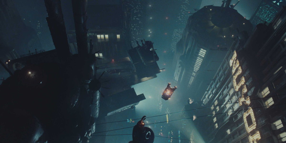
In this image, the surfaces closest to the camera are the darkest, and the background is very light and hazy. Buildings are lit somewhat, but the most striking shapes are the ones that are simply black. The police spinner is mostly black but possesses a few bright lights; still, the shape of the spinner, and what makes it stand out, is the fact that 80% of it is black against a bright background.
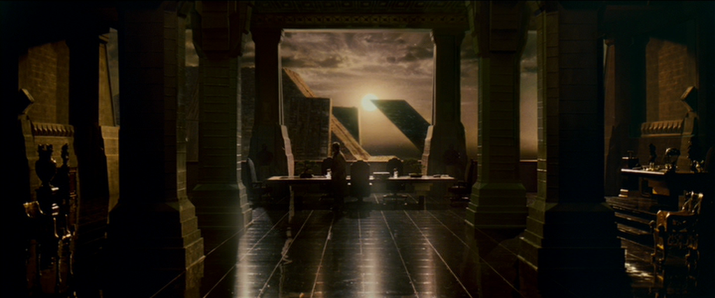
This still, of the interior of the Tyrel corporation, is lit almost entirely by the background reflecting in the shiny floor. This is similar to how one lights streets at night, simply by making them shiny so they pick up the background lighting. There are some edge lights picking out the desk, chairs and walls, but black is the predominant color and the light source is clearly meant to be the sun in the background.
I saw a low-tech version of this recently on the Netflix series Travelers. A short scene took place in a dark parking garage, and it was clear the DP didn’t have a long time to light it. The solution was to put an HMI light in the distant background aimed directly at the camera. This created a sharp highlight in the distance, a broad highlight in the concrete floor that extended into the foreground, and edge light on several columns, while leaving most of the garage in darkness. All that was left to do was add some side light to the actors in the foreground, and shoot.
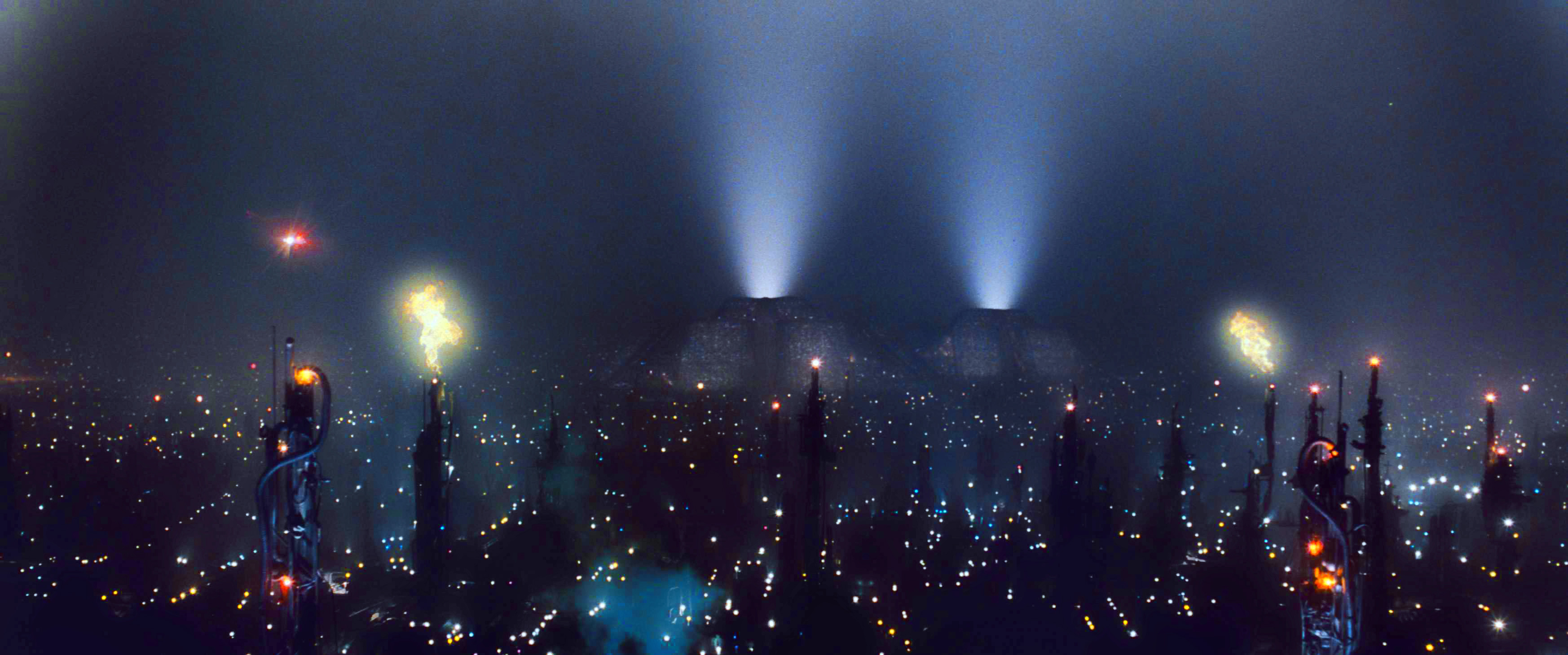
The color that makes this cityscape so striking is—once again—black. The contrast of the street and building lights against inky darkness is wonderful, and the light hazy atmosphere perfectly separates foreground from background. This is what happens in real life anyway, as atmospheric haze reduces the contrast of distant objects and foreground contrast becomes more pronounced.
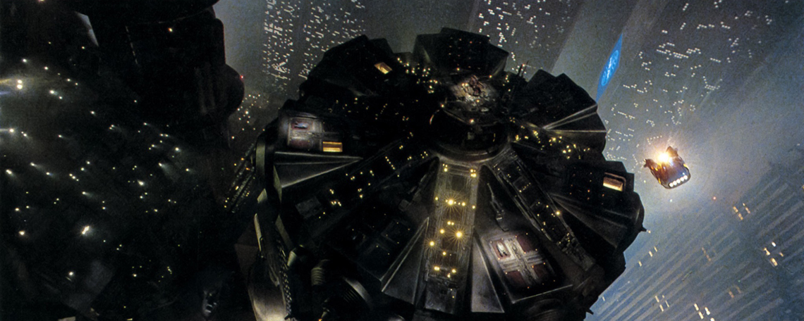
There’s very little need to light the top of the building other than to add a little extra interest, and perhaps show where the spinner is meant to land. The buildings at left aren’t front lit at all, and their blackness (with dappled highlights) makes the shot all the richer.
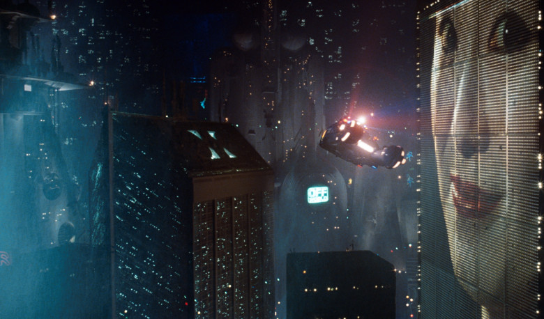
This is another example where the darkest object is also the closest, while the lit background shows us its size, shape and position.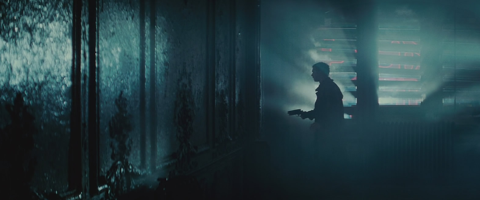
My guess is the shiny wall to the left is lit entirely by the reflection of the background window. We don’t see every detail in Decker’s face, but we know it’s him, we can sense his mood, and we understand his mission—all without being able to see him clearly at all. Most importantly, the mood of the shot is preserved without sacrificing drama, because we can see enough of what’s going on that we don’t miss any of the actor’s performance.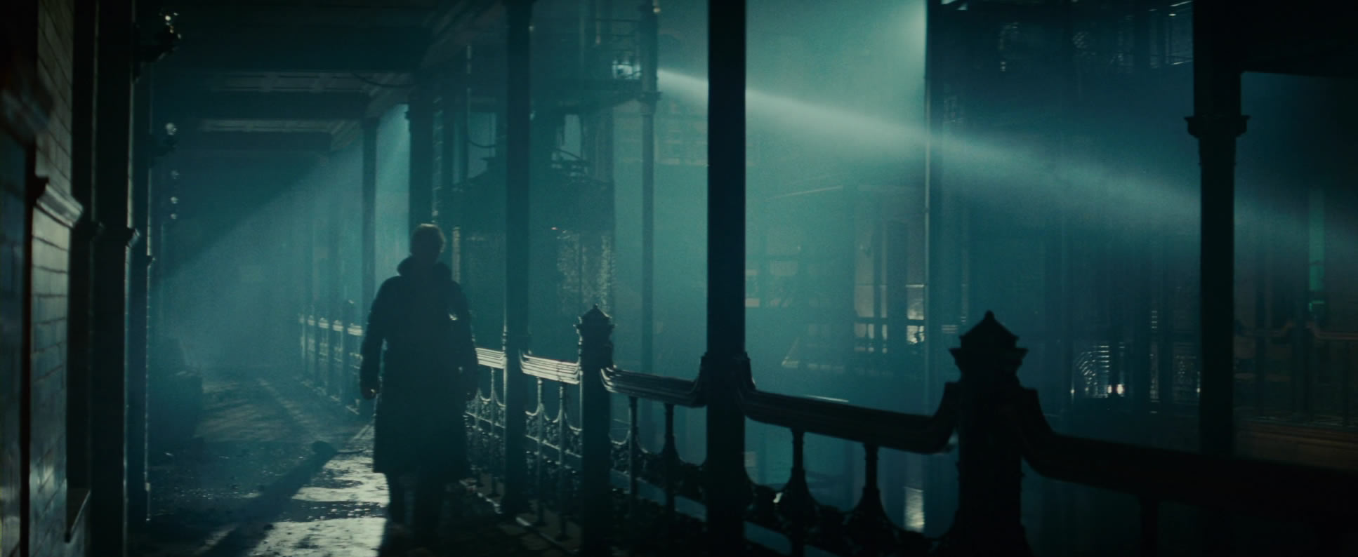
Once again, lighting the smoke in the background creates a bright canvas against which darker elements can play, creating an abundance of mood.
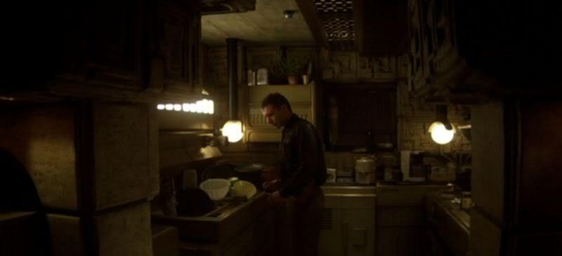
It appears that practical lights in the background are spilling forward and lighting surfaces close to the camera. These sources are likely augmented by smaller lights hidden near the camera and meant to create the same effect, but modern cameras and lenses would probably allow this shot to be done without any additional hidden units.
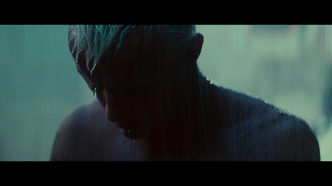
The background isn’t dark, but this shot is certainly full of mood and drama.
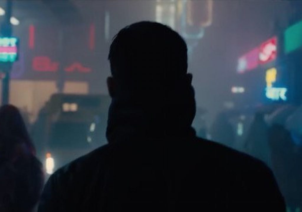
Stills from the upcoming sequel, Blade Runner 2049, show the continuation of this style, and indeed Roger Deakins uses it in many of his movies:
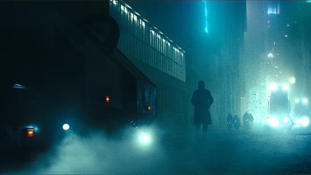
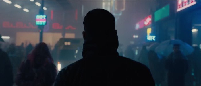
Many of us are trained to contrast light foregrounds against dark backgrounds, as that’s the best way to light actors such that their features are visible and they pop out from the sets. The opposite, though, is often more striking, especially when the most important areas of the frame are rich black against hazy mid-tones dappled with tiny highlights. The human visual system loves contrast of all kinds—bright/dark, color, sharp/soft, patterns/solids—and the more of these kinds of contrast we can work into our visuals the more interesting they will be.
The battle, though, is convincing directors that darkness is our friend. It’s not necessary to see every thing and every one all the time, and in fact mood often dictates that we don’t. The trick is explaining that darkness is just another choice in our color palette, to be used when appropriate, and is not simply missing detail. If they can tell us when they really need to see an expression, or see eyes clearly, we can make that happen, but mood is what happens in between those moments.
There’s a difference between underexposure and improper exposure, and directors often mistake one for the other. It’s up to us to show them what they may be missing.

Filmtools
Filmmakers go-to destination for pre-production, production & post production equipment!
Shop Now