I love stacking cucolorii (plural of “cucoloris”) and I thought it was time to write an article about how this technique works and why I like it so much. I was a bit stretched for ideas that would illustrate this concept… and then an eclipse happened. Why that made a difference is a very interesting story…
First of all, if you don’t know what a cucoloris (AKA “cookie”) is, look here.
Nature abhors a flatly-lit surface. Negative space in a composition can be stunning but generally our brains prefer variety to plainness. Legend has it that the first cucoloris was invented when the shadow of a ladder fell across a bed by accident, and the cameraman liked it so much he started hanging ladders in front of his lights. At some point his crew said “Enough!” and cut a bunch of random shapes into a piece of wood.
Cookies aren’t the only way to break up flatly-lit surfaces. I’ve seen crews use textured fabrics stretched across 4’x4′ frames to create an almost imperceptible shadow texture on blank walls. I’m also a fan of LightBreaks. I’ve used all sorts of random objects to create interesting textures, including empty milk crates, glass bowls and random bits of tape on windows.
For a number of years I shot a lot of corporate videos, and those were a great training ground as I could try out sophisticated lighting techniques without fear of failure–because, if I failed, I was the only one who noticed. The cornerstone of corporate video production is the “talking head” video, and often the most interesting thing in a talking head video is the background. I’d often find myself in a white conference room with blank walls and it was quite a mental workout to try to create a background that didn’t look like… well, a white conference room with blank walls. I’d empty equipment cases looking for something that would cast an interesting shadow.
One of my clients had a paint-textured muslin backdrop. It was pretty enough when lit evenly, but when I put a cookie in front of the light it really came alive. The combination of the paint texture and the “random” shadows created a very sophisticated pattern that was really interesting without looking terribly fake. There was something about the two overlaid patterns that made my brain say “Yummy!”
I didn’t always have a mottled backdrop, though, so for the times when I worked in blank white conference rooms I needed a method of creating two overlapping but different patterns. That’s when I started stacking patterns by, for example, placing a cookie and an empty milk crate in front of a light at different distances.
Here’s an example of a similar effect, taken from this article:
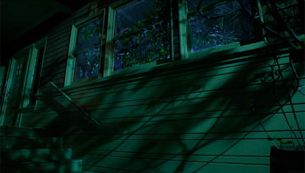
What I hope you’ll notice in this example is that there are two patterns, overlaid: one is soft and one is hard. That’s because I have two branches of leaves rigged in front of the light, placed a fair distance apart.
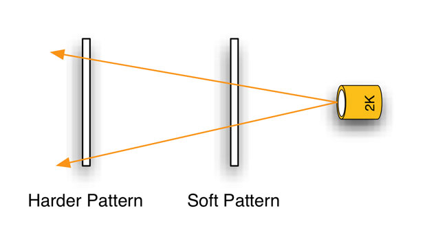
The pattern closest to the light is the softest as the light source itself is larger in relation to the holes in the pattern. The pattern farthest from the light is sharper both because the light is, from its perspective, a smaller source, and because it is closer to the lit surface.
Here’s an example of this in nature:
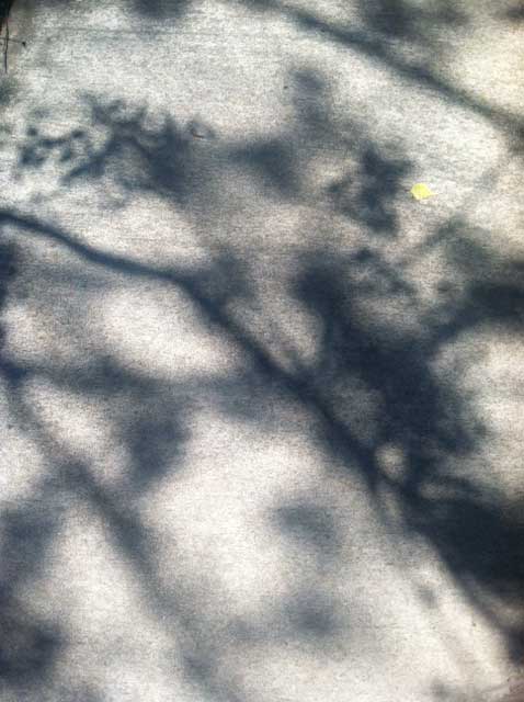
In this shadow of a tree on pavement the branches that are lower to the ground are sharper than the branches above them.
There’s another interesting effect happening here that’s easy to overlook. When light passes through an opening, that opening becomes an aperture that has a impact on that light. One of the reasons this particular tree cast such interesting shadows is that the gaps in the lower branches create virtual apertures that project the image of whatever is above them, typically light coming through other branches. It’s not just the distance from the ground that makes this shadow pattern so interesting, it’s how the light itself is shaped by the holes through which it passes and the images they relay from above.
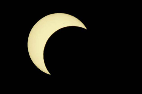
This is where the eclipse comes in. While I was upstairs watching it through stacked IRND filters my friends were outside taking pictures of the sidewalk:
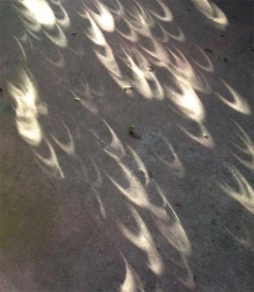
Why are all those bits of light shaped like a crescent? It’s because the tree leaves are creating apertures through which this is being projected:

Image courtesy of Adam Wilt.
That’s why stacking cookies can be such a powerful tool: not only are you creating both hard and soft shadows that interact in random ways, but every hole in the cookie farthest from the light is also projecting a pattern of the cookie that’s closest to the light. This effect isn’t always obvious, and it can take some tweaking of distances to get it right, but it can be an amazing effect. The bonus is that our brains seem to interpret this as natural beauty instead of a constructed lighting effect.
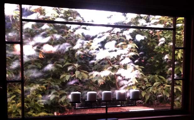
Eclipsed sunlight passing through leaves and striking a window.
Next time you need to break up a flatly-lit wall try stacking a couple of cookies and see what happens. Even though the cookie “pattern” is easily recognizable to those in the business, stacking at least two of them creates an entirely new kind of pattern that’s much more interesting. This is a great way to breath new life into an old tool.
Thanks to Adam Wilt for his eclipse photo, and to Diana Thomas for her sidewalk and window photos.
Art Adams is a DP who likes to spray paint with light. His website is at www.artadamsdp.com

Filmtools
Filmmakers go-to destination for pre-production, production & post production equipment!
Shop Now