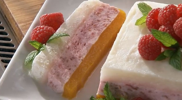
I don’t watch a lot of cooking shows, but the ones I see are not lit the way I would light them. An idea for a lighting setup has been kicking around in my head for a while and I finally had a chance to try it out on a shoot for Driscoll’s Berries. It worked! Here’s why…
Years ago I operated a camera on a cooking show and I remember that the lighting director, a DP who shot a lot of sitcoms, lit the kitchen as if it were a small sitcom set. He used small lights without diffusion, which resulted in shadows everywhere. It didn’t look very “natural” to me. Maybe that’s the wrong word: rather, it didn’t feel “believable.” The set looked exactly like what it was: a fake kitchen ringed with lights, lit big and bright.
A lot of cooking shows seem to take this route. They may use softer light but nothing about many of these lighting setups speaks to me and says “good taste” or “believable.” Friends who work regularly on cooking shows tell me that producers often opt for big and bright over subtle and complex, and much of this has to do with budget and dealing with cable networks that don’t really want artistry so much as inexpensive content.
I felt I could light a cooking show set in a way that reflected my background shooting commercials while also keeping in mind the demands of a fast-paced TV show. (I worked in episodic television as a camera assistant and operator earlier in my career and those shows move FAST. Cooking shows aren’t quite as complex as you don’t change sets much, but there’s still a lot to get through in a day.) Fortunately the production company, Compass Rose Media, appreciates high quality work and was willing to let me push the look a bit provided we stayed on schedule. (And we did!)
The problem I faced was threefold:
(1) Food doesn’t want to be lit the same way people are lit;
(2) People don’t want to be lit the same way food is lit;
(3) The two are in the frame at the same time.
Here’s my favorite video of the set of five that we shot:
There are four others that can be seen on the Driscoll’s Berries Youtube channel.
The set offered some interesting challenges. A lot of cooking shows are shot on location so it’s not unusual to find yourself working in a fairly small space. It’s always nice to work in a set built on a actual stage because stages have grids, which gets the lights off the floor and makes it easier for food stylists and props people to move items in and out.
More space also means that the lights can be backed away from the set, which results in less time for lighting. The closer a light is to the set the faster it drops off in intensity (see the inverse square law), so a small set requires the use of a lot of small lights that we have to blend together to create even illumination across the set. It’s much easier and simpler to use fewer, bigger lights farther away from the set.
This space was part of a stage (The Producers Loft) but the kitchen was off to the side of the stage and had a normal 8′ ceiling. Fortunately the left side of the kitchen was open and looked directly into the stage area itself, and part of the space opposite the back wall of the kitchen was also open. Rather than build an overhead grid I opted to use those openings for lighting, so gaffer Luke Seerveld set up an 8’x8′ sail cloth at 90 degrees to the talent and then added an 8’x8′ half grid as wrap-around fill. Additional fill in the form of a 4’x4′ “active” foam core bounce (“active” means lit with a light, as opposed to “passive” which collects light created by existing lamps) was placed on the opposite side of the main camera from the big soft sources.
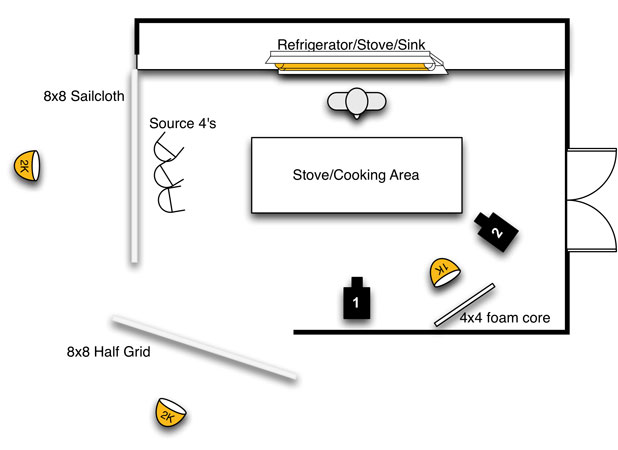
I normally like my fill sources to be as big and shadowless as possible but the biggest source I could fit in the space was a 4’x4′ bounce. In this case the hint of fill light bouncing off this card wasn’t enough to create an obvious shadow. I don’t generally like to see fill shadows cast in the opposite direction as the key light as that feels “lit” to me.
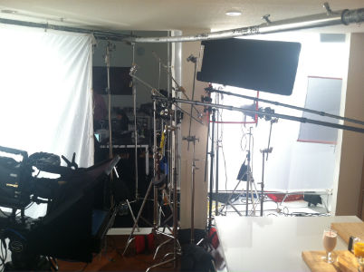
Above: Looking at the big sources from the food camera position. On the right is an 8’x8′ sail cloth built in a frame and lit with an open face 2K. To the left is the wrap-around fill light, an 8’x8′ half grid lit with another open face 2K and scrimmed down a little. We didn’t put the half grid in a frame but rather hung it and left it loose to make it easier to get in and out of the set. The “sunlight” Source 4’s are by the pillar surrounded by a number of empty C-stands whose heads are acting as subtle flags for parts of the set. The black flag keeps flare out of my lens, and although it looks like it’s blocking light from the set it’s set at such an angle that it doesn’t interfere with the set lighting at all.
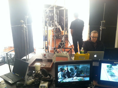
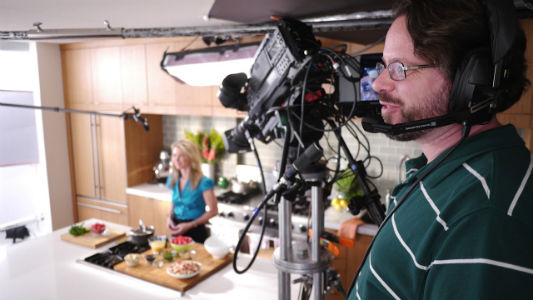
The view from the director’s station, looking between the soft sources into the set.
Normally I prefer the densest material possible, such as full grid, which creates very even highlights in shiny objects as well as very smooth and even shadows. Sail cloth passes a specular hot spot so it casts a faint shadow, but not so much as to be noticeable in this situation. My main concern when placing a side light is whether it will cause nasty horizontal nose shadows, and in this case that source was far enough to the side that it didn’t. It also allowed me a little more control over a big soft source than I’m used to: there was a refrigerator on that side of the set and if the talent walked toward to it she was going to get really hot, really fast. I was able to get rid of most of the nastiness very simply with a 2’x3′ double net:
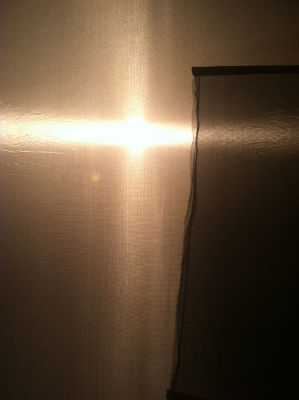
When our talent was at her usual position in the middle of the set her view of the key source, a 2K through sail cloth, looked like this.
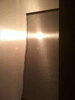
When she went to the refrigerator her view of the key source looked like this.
The large diffusion area made the light feel soft while the thin diffusion retained enough specularity to allow for some extra exposure control.
Exposure was very tricky on this project. We shot with two Panasonic HDX-900 cameras as they can be easily configured for studio mode and can be painted to match each other using paintboxes. The good news is that Panasonic color is some of the best in the world, especially when it comes to flesh tones. Their color science, at least for prism cameras (a category that includes the HDX-900), is top notch. The bad news is that these cameras are a few years old and don’t have the kind of overexposure headroom I’m used to working with. Brightness levels of more than about 2.5 stops over 18% gray cause objects to clip, and clip in a very “video-y” fashion. This caused me a lot of annoyance as we had several white background objects that had to be “dodged” in order to prevent them from clipping, and the set was so small that these stands would occasionally get kicked by people leaving the set just before we rolled.
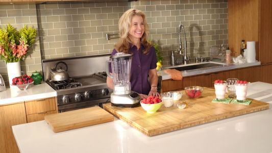
Looking into the set from the key side.
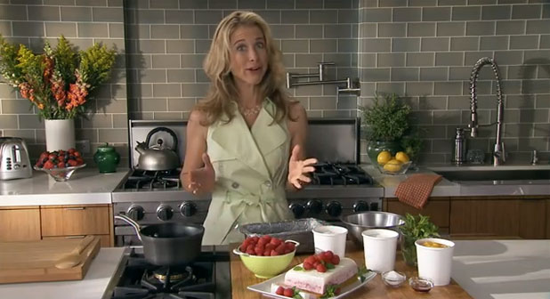
Above: A screen capture from Youtube.>A screen capture from Youtube. The large sources created beautiful highlights on anything in the set that had a shiny vertical surface, like the toaster (left), kettle (left of middle), and faucet (right). The white vase on the left was dodged with a C-stand knuckle, but the set was so small that occasionally this stand was occasionally bumped by people leaving the set. In some videos this vase is dark, as shown here; in others it isn’t. Older cameras don’t handle highlights as well as modern cameras, which adds to our lighting time.
The highlights on the camera left side of the talent’s face are from the sail cloth about 10′ directly to her left; most of the rest of the light is from the half grid cloth just left of camera, with a hint of fill from camera right. The “sunlight” was created using two Source 4 ellipsoidals with window patterns.
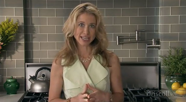
It’s easier to see what each light is doing in this shot: the highlights on the camera left side are from the sail cloth outside the left side of frame; the light from the grid cloth takes over and wraps around the front of her face, leaving a slight shadow on the camera right side of her nose and cheek to give her face some character and dimensionality; and the 4’x4′ bounce fill lifts those remaining shadows just a touch. The 4’x4′ Kino Flo above and behind her gives her a little hair light without casting obnoxious shadows onto the food.
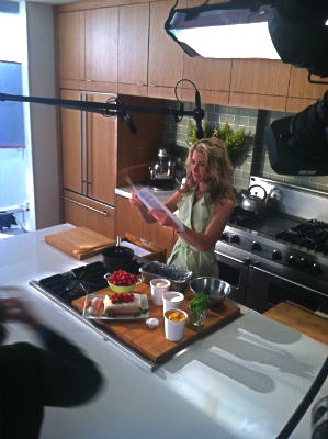
Above: Backlight placement. The Kino Flo has some diffusion on it, probably Lee 250, to make it a bit less harsh. Undiffused Kino Flos can cast very sharp shadows as the tubes wrap around objects in the long (4′) dimension, but don’t wrap at all in the short (2″ thick tube) dimension. We also added some 1/4 CTO to warm it up a bit. 3200K Kino Flo tubes look a little cool when mixed with tungsten lights, which average closer to 3000K, so we warmed it to match.
All this soft light made our talent look great, but the food was equally important and required different treatment. There are a lot of parameters to consider when shooting food and products, such as whether the item is tall and wants to be shot from a low position, or whether it’s low and wide and wants to be shot from above. In this case we were dealing with a lot of berries in bowls, which look best shot from above and backlit by hard light to bring out their texture. Hard light doesn’t look very good on people, at least not without a lot of work, so my goal was to light the food area with hard light without hitting our talent’s face or body. The solution was to use a Source 4 ellisoidal to cast hard light across the cooking area and make it bright enough that the food glowed but dim enough that the talent’s hands didn’t blow out every time she interacted with the food.
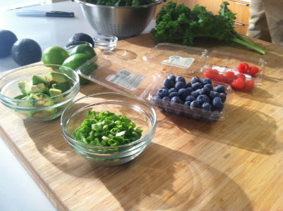
Everything looks better in backlight, especially food.
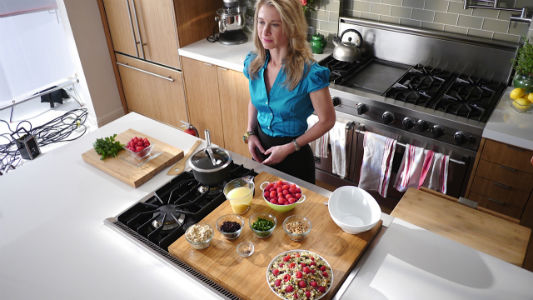
My view from behind the food camera. Notice the beautiful soft highlights on the back of the stove.
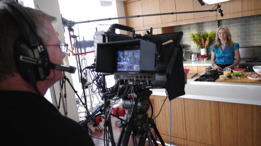
Camera operator Greg Peterson frames up the master shot. The red lines in the background, between his head and the viewfinder, belong to a double net that we added to even out the “sunlight” exposure across the top of the cooking area.
Backlight tends to look a bit brighter than it really is because most objects–including hands and berries–are slightly shiny. The specular highlights in the backlit berries played very well to the food camera placed directly opposite the hard light. From the main camera, looking across the table at a 90 degree angle, the hard light appeared less bright because it became side light, which doesn’t normally create intense specular highlights and didn’t make the talent’s hands appear very hot at all.
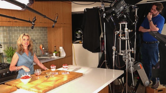
Above: Me looking pensive from the location of the food camera. Note the black duvetine covering the wall behind me, as well as the 4’x8′ pice of black foam core overhead: I often spend more time removing ambient light than adding light because ambient light can do nasty, distracting things to faces. For example, if I’d not blocked the white ceiling then most of the fill light would come from above, and the talent’s face would be beautifully lit on the camera left side but obnoxiously top lit on the fill side. By blacking out the brighter surfaces on the fill side I can then add the perfect amount of fill light from a more flattering direction.
We pretended that the food light was sunlight, and added a window pattern to break it up on the flat cooking surface. Nature abhors evenness, as do our brains, so breaking up the light with a couple of shadows made it look much more interesting and “random,” as if sunlight was actually coming through a window.
We added two more Source 4’s to create window patterns on the back wall to make them more interesting. I find that most patterns look fake when they’re fully sharp so I like to fuzz them out a bit, as if the glass was a bit dirty or the sun was partially obscured by haze. “Sloppy” light often looks more real than “perfect” light does.
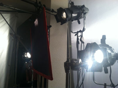
Above: Land of three suns. The empty C-stand knuckes are serving a purpose: we’re using them to further “dodge” areas of the set where we need to take some light off white or bright objects. Dots and fingers are fun and convenient but sometimes a big, soft and round C-stand knuckle shadow does just as well. The double net reduces exposure on the near side of the cooking area to make it appear to be lit evenly.
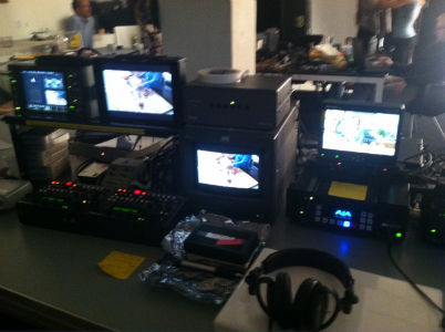
The engineering station. Our “color accurate” monitor was actually an old Sony 8045 SD CRT monitor as none of the common LCD monitors are good enough to use for critical color matching.
Turn the page to learn how we shot the food “product” shots, as well as to see a time lapse video of the lighting setup shot by my gaffer…
The product shots were tricky. We had a couple of hours to do them one morning (this was a two day shoot) and even though we only had five food setups we were really stretched for time. Shooting single items is easy: you pick the best spot for the camera, light the item with the appropriate quality of light, and shoot. Putting multiple items in a shot requires a lot more work, as each one may need a different kind of light:
Berries look best in strong backlight or sidelight, hard or soft.
Grains, like quinoa, require hard raking backlight from behind to bring out their texture. (If each grain casts its own tiny shadow then local contrast increases, bringing out each grain in fine detail. Soft light eliminates those shadows so the grains mush together into a blob.)
Vertical glasses require soft light from the side to bring out their roundness. The glass is going to reflect nearly any light source that hits it so a tall vertical source appears as a smooth, even and pretty highlight. Hard light would create distracting specular highlights.
Lighting lettuce with hard light from directly overhead brings out the color of the leaves and makes them appear slightly transparent. (Backlight doesn’t pop lettuce much because green absorbs a lot of light, and front light just makes it look flat.)
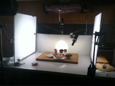
The basic food lighting setup. The large sources to the sides create vertical highlights in glassware. The pool of light through the tracing paper background gives the berries a little “pop.” The Dedo lights bring out textures in grains and lettuce leaves.
We tried to create a “one size fits all” approach with big soft sources on the sides and tracing paper across the back that could be light from behind, but we still had two or three Dedo lights working on every shot. Dedos are great because they’re small, punchy lights with a variety of control options, like blades and irises, that cut the light from everywhere except where you want it. We did our best to prevent their hard light from spilling off the plates and casting hard shadows on the countertop as hard edges would add to the complexity of the shot and distract from the roundness and softness of the food.
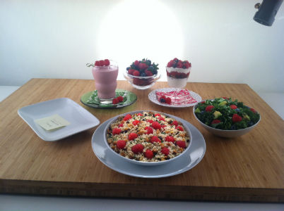
A closer shot. The quinoa (foreground) is lit from above and behind to bring out the textures in the dish. An iris limits the pool of light to the center of the dish, allowing the edges to drop off into shadow. This has two effects: we keep hard shadows off the countertop, which can be distracting, and the food appears to “glow” as the center is a little brighter than the edges. The salad is lit from above to bring out its color and textures.
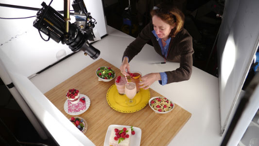
Art director Mykael Merryweather primps a smoothie. Food and product shots usually require the use of large lights and diffusion frames very close in, which tends to cramp everyone’s style a bit. Still, we manage. The light on the camera right side is lighting a smaller area of diffusion for this shot as I wanted less light wrap around the smoothies to accent their roundness. Lighting a round object with a big source can make for a very subtle shadow, so reducing the size of the source makes that shadow harder and the object appears rounder.
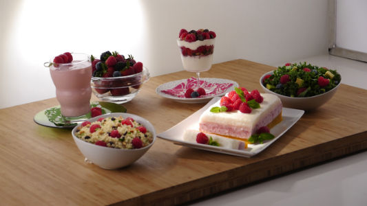
It’s tough to light so many different things in one frame!
Next time I think I’ll light the entire surface of the tracing paper from behind instead of creating a small pool of light, resulting in a cleaner look that lights more food items faster. I’m happy with what we did here but I’m always, always, always learning and refining my approach. I learn something new on every single job.
Here’s a time lapse video of the lighting setup, courtesy of Luke Seerveld (the tallest guy you’ll see). Director Steve Weisser wears the red shirt.
Raspberry Rhapsody from Seerveld Media on Vimeo.
I had a great crew in gaffer Luke Seerveld, key grip Joseph Farfone, and swing Joey Boedner. The manager of the rental house that provided the gear liked the “vibe” on set so much that he recommended all of us to another company that came to town for a multicam project. Doing good work is important, but doing it professionally and pleasantly is equally important, if not more important. If the footage looks great but the set is tense and unhappy then that will not only affect the talent’s performance but the client will never want to go through that kind of experience again. There are lots of jobs where quality is less important than having a good experience, and we see those on TV all the time. Keeping the mood on the set light yet professional wins every single time, and if this results in great footage as well then you and your crew will be golden.
This requires a very good crew and a lot of confidence in yourself, but it’s absolutely crucial to developing a career. I’ve never heard anyone say, “Yeah, that DP screamed a lot and we can’t wait to work with them again!” There are people who can get away with this but they tend to be very, very good. They also have a hard time getting crews, or getting crews for reasonable rates, as crew will jump ship at the first sign of a more pleasant job or charge higher rates than they would otherwise. A good vibe on the set not only keeps the client and talent happy but keeps the crew happy as well, and a happy crew will watch your back and come through for you when you really need them to.
The vibe comes from the top of the food chain, and DP is pretty close to the top. When I worked as a camera assistant I had the chance to do a series with a DP who ran a very tight ship but was very nice about it. She picked her battles, and although she treated her crew well you knew that you’d better be on your game all day long. I always had to watch her to see if she had her meter out, because she’d look at it and say “T4” in a normal voice and expect me to hear her. She wouldn’t even look over to see if I was paying attention: I just had to be “on.” She expected her crew to be tuned in all the time, but she’d also come around and tell jokes, chat, and compliment us when we did something well. That combination of expecting everyone to be “on” while keeping things light made for a really efficient crew that had a lot of fun at work.
We all left the shoot with flats of berries, so Driscoll’s has learned this lesson as well.
I love my job.
Thanks to Luke Seerveld for a number of the stills used in this article as well as his GoPro time lapse video.
Thanks, also, to director Steve Weisser, producer Molly Jansen and Compass Rose Media for pulling together a great crew for this job and making this a very positive experience.
Art Adams is a DP who loves his job berry, berry much. His website is at www.artadamsdp.com.

Filmtools
Filmmakers go-to destination for pre-production, production & post production equipment!
Shop Now