A while back I posted a Quicktime movie of this project, shot for the California “No on Prop 8” campaign. At the time I promised that lighting diagrams would be along shortly. I lied. I just got around to this today.
But… better late than never, as they say in the embalming trade. The project is only five shots long (originally six, but one got cut), and we took about four hours to shoot it with a small volunteer crew and donated gear from Chater Camera.
The lighting setups were fairly simple, and to prove it I have provided diagrams and explanations, starting on the next page…
This is the first shot in the piece, and the last shot we executed. During location scouting I noticed that the main living room window faced due west, and figured that I could use that to my advantage as the day wore on. I made sure that we scheduled our biggest shot for this room, the final shot of the piece where the actor heads toward the front door, first–so that we didn’t have to block out a lot of unwanted sunlight.
For this shot, done late in the day, I used the sunlight to my advantage: we hung an 8×8 grid cloth across the front of the window and used the sunlight to create a big, soft but directional source. A silver card provided the final touch by putting a highlight into the left side of the chair arm. The background was lit by ambient light.
I like grid cloth a lot. It’s very soft and has almost no specular quality to it, which means that it yields soft light with no hard light mixed in. An example of a soft diffuser that lets some hard light through is poly silk: the fabric itself lights up and creates a large source but if you look through it toward the light you can see a substantial hot spot where the light is. That hot spot will create a hard shadow.
Sometimes I like a bit of specular light. I frequently use a 2×3 or 4×4 silk next to the lens, filling actors from the key side, because the specular light will create a nice hit in the actor’s eyes. But in this case I wanted a nice smooth solid source. Why? I’m not sure. It just felt right.
If you like shots containing plants, you’ll love the next page…
This shot was lit very simply, by bouncing a 575w PAR into the hardwood floor just to the right of the shot. Light from below feels like ambient light to me, and the feel of this shot is that sunlight is striking the floor just outside of frame.
Here’s the original shot, brought in from RedCine with minimal correction:
Here’s the shot with some basic color correction, setting the pedestal, gamma and gain using Magic Bullet Looks:
The plant looks a bit down to me. At the time it looked okay but now… it needs a little pop. Initially I tried using Looks’ spot exposure adjustment, creating a round feathered pool of increased exposure around the plant, but that just didn’t look right. Instead I decided to use a “negative ND grad.”
An ND grad knocks down the exposure in half of the frame and then blends back to normal exposure in the other half. If you look at an ND grad the top, or one side, will look dark and the bottom, or opposite side, will appear clear. The dark feathers to clear in the middle of the filter to hide the area of transition. Magic Bullet Looks has a digital ND grad that emulates this affect as long as nothing in the affected area is clipped. (Clipped highlights turn gray when darkened and look very much like dark clipped highlights–or, in film terms, “a mistake”.) In this case, though, I wanted to do the opposite: I wanted to increase exposure in one part of the frame and have a transition to normal exposure in the rest. So I set the digital grad in Magic Bullet Looks so that it darkened the left side of the frame… and then I entered a negative value for the grad. That lightened up the area I’d just darkened:
This worked very nicely. The effect is completely hidden.
One other trick: the beam in the ceiling in the background on the far right was really bright due to reflected sunlight from outside, so I used a polarizing filter to reduce the shine and make it less bright.
If you haven’t eaten yet you’ll love this next setup…
We set the table to show the aftermath of two people eating breakfast. The room was full of windows but there wasn’t much shape to the light, so we added a 1200w PAR and a bead board bounce from the side:
Surprisingly, this was all we needed. Tabletop photography is all about bringing out textures and shapes of everyday objects. Usually you’d never see a slice of melon or a coffee cup lit that nicely because ambient light doesn’t have that affect. But adding a soft source from one side to “pop” the objects while letting the fill side go a little dark brings an artificial contrast to the shot that brings it to life.
I used bead board just because it’s my portable bounce surface of choice. It’s very matte, whereas foam core has a specular reflection that can create unwanted shadows and highlights. It’s usually not that big a deal to use foam core as a bounce, but if I have bead board available I tend to use it instead.
The 4×4 floppies are blocking ambient light from the living room in order to darken the shadows on the table.
I have a theory that says that people rarely want to see reality in cinematography: they want to see a version of reality, which isn’t the same thing. A good example of this awaits on the next page…
While my partner was helping art direct this shot my camera assistant, Phil Bowen, told him, “I’ve spent an entire day watching a crew light a shot like this.” And that’s what I was afraid of: this kind of shot is very difficult to make pretty in a hurry. It’s a lot of flat surfaces with no texture to break up the light. In other circumstances I’ve used a Source 4 Leiko with an out-of-focus pattern to create a dappled sunlight effect but that didn’t feel right here. Instead I decided to “fix it in post.”
Here’s the original:
The online editor, Craig Thomas, flipped the shot in post as it cut better that way with the shots that came before and after. Using Magic Bullet Looks I both darkened the edges of the shot and blurred them a little, to change what would otherwise be an ordinary and somewhat dull group of pictures into imagery that looks more interesting than what we’d see in every day life.
To light this I simply put a bounce card parallel to the pictures and lit it with a PAR. We added 1/4 minus green and 1/4 CTO to create a sunset look, although that backfired a little bit (read more about that here).
Finally we get to the last shot of the project, which, naturally, we shot first…
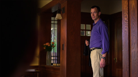
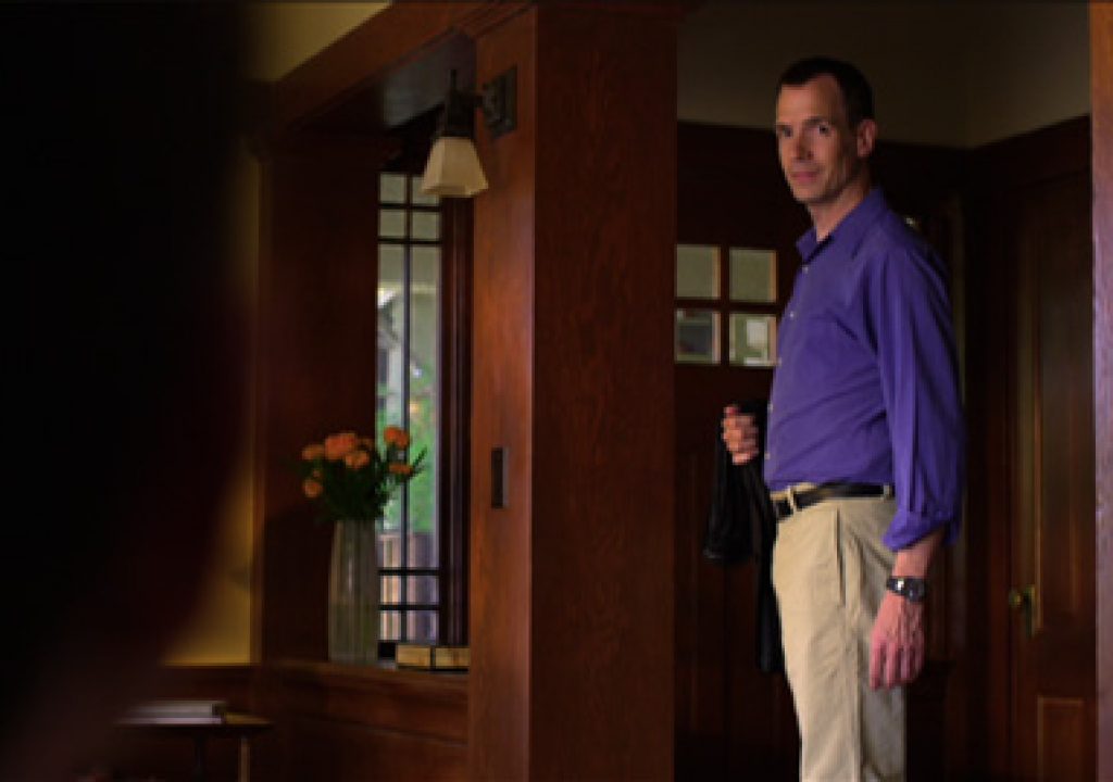
In this shot the camera moves from behind the head of someone sitting in the foreground to reveal the front door and our actor. Here’s the lighting plot:
Shooting in a house built of dark wood is a dream. It’s easier to pop people and things by lighting them brightly against a dark background, and much more difficult to “unlight” bright backgrounds in order to draw attention to people and objects in front of them. A lot of my work is corporate marketing pieces shot in white conference rooms or on stages against white limbo, so having a dark rich background was a bit of a treat.
We lit our primary acting area with a 1200w PAR bouncing into an 8×8 Ultrabounce. Ultrabounce is the new rage, and rightly so: Gryflon is a great bounce material but it’s a little bit shiny, which can create unwanted specular reflections (I think we’re seeing a trend in my bounce preferences). Ultrabounce has a perfect matte finish. It glows, but doesn’t have a hot spot.
Due to the size of the room the PAR was pretty close to the Ultrabounce and didn’t fill it completely, so I asked for a 4×4 frame of Lee 250 (half 216) to be put in front of it. That spread the light over the entire Ultrabounce surface. There’s no point building a large bounce source and then only lighting the center of it, because then you have the possibility of an 8×8 source but the reality of a 4×4 source. If a 4×4 source is all you need then you’re better off using that size to begin with: you’ll save space and it’ll go up much faster. Otherwise, fill the entire source with light.
One thing to watch out for in this situation is that the frame of diffusion that you put in front of a light to spread it can then become another source of light. I could have had beautiful soft light from the 8×8 marred by a much smaller kick off the 4×4 diffusion. That didn’t happen here, but it’s something to keep in mind as it could take a couple of minutes to flag the 4×4 frame such that it’s not visible to the talent.
I’ll often stand in the talent’s position and look around to see what unwanted light sources are hitting me. That’s a great way to catch things like spill off the back of diffusion frames, light leaks through barn doors, hard sources that aren’t sufficiently flagged or black wrapped, etc. If you can stand on the actor’s mark and see a light, that light can see you–and it’s important that you only see the lights that you want hitting the actor.
The background sunlight “hits” were created by bouncing a 575w PAR into a piece of black foam core with bits of broken glass taped to it. Those “hits” didn’t pop the background much initially so we added a 4×4 floppy between the table lamp and the 8×8 bounce source in order to darken the background shadows and create some more contrast. Hits of bright sunlight against a bright wall don’t read so well, but hits of bright sunlight against a dark wall reads fine.
There was a window on the far side of the set that looked out onto blue sky, and that’s the blue highlight that you see in the post on camera right. I thought it was a nice touch so we left it alone.
That’s about it. We used two lights and a bit of grip gear and managed to pull off something really nice. Having the right location helps reduce lighting needs considerably, and we lucked out by finding such a nice place to shoot.
Thanks to a stellar crew who helped make this spot a reality, including director Tom Donald, key grip extraordinaire and occasional gaffer Todd Stoneman, camera assistant Phil Bowen and data wrangler Simon Sommerfeld.
Coming soon: an article about another RED shoot that was lit even simpler. Stay tuned!

