In a previous article I described how to place a hard key light. In this article I’ll look at why soft sources are a bit more realistic in color cinematography, require less precise placement, and can help define the volume of a space.
In my last article we talked about how to light faces: where shadows should fall for “classical” modeling and what to look for when struggling to create a classical portrait of someone who has a non-classical facial structure.
In this article we’re going to talk about soft light, the most forgiving light we’ll ever use on a face. This doesn’t mean that we should always use it–the story and emotion driving the project you’re shooting should guide you in your lighting strategy–but soft light is most forgiving of facial oddities. It’s also a style that we easily accept because, in the real world, any setting that is not lit by direct sun is usually lit by some sort of bounced or diffused light.
Hard light works wonderfully in black-and-white filmmaking because the medium is already a bit abstract: hard shadows play better when the image is one step removed from reality, and the lack of color certainly creates a different world for the viewer. Hard shadows also reveal textures well, and our eyes love texture. Soft light, though, generally plays better in color because it’s closer to how we see the world. Hard light can look fake in color photography because multiple hard sources can make a space feel “lit”: the quality of the light is not what we’d expect in that environment, and that pulls us out of the story. There are exceptions to this (the first three Raiders of the Lost Ark films are great examples) but it takes a lot of practice and a good eye to get away with hard light in color cinematography.
But enough about theory. Let’s look at some virtual faces, created in Poser 9:

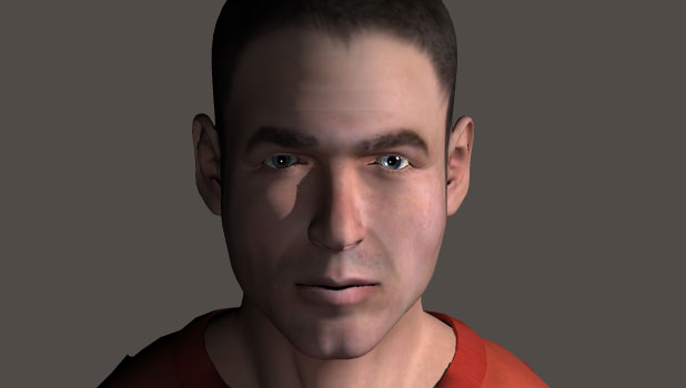
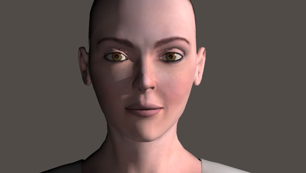
In my last article I presented this image as an example of classical Rembrandt modeling with hard light. The trick with hard light, though, is that it is quite face dependent. What works on one face may not work on another:

This example isn’t as bad as it could be because Poser doesn’t supply me with challenging facial models. As you can see, though, her face looks very different from his. His lighting makes him look ruggedly handsome whereas hers is acceptable, but maybe not optimal.
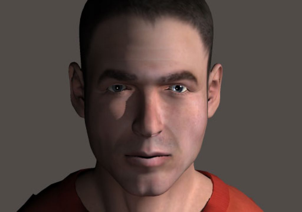
This is what happens when I diffuse the key light significantly. This look is reminiscent of what might happen if I placed a frame of Lee 129 (a very dense diffusion material) two to three feet to the side of his face, between him and the lamp. The camera right side gets all the light, but the camera left side gets only a little bit of the light. If you look in his eyes you can see the soft key strongly in his camera right eye but very weakly in the left one. You can also see the fill light I placed near the virtual camera as a pinpoint in both eyes.
Let’s see what happens to his female counterpart under the same lighting:
Wow, that’s beautiful.
There are three key differences that I see between hard light and soft light:
(1) Hard light creates hard shadows that enhance defects and create very dramatic modeling on a face, whereas soft light’s broader gradations conceal facial blemishes and don’t have to be placed as precisely because they aren’t as distinct.
(2) Hard light usually creates two tones on a face: a bright side and a dark side. Soft light creates an almost infinite number of tones in the transition between the key side and the fill side, and our eyes like tonal complexity.
(3) Soft light comes from a source that’s large in relation to the subject. As healthy skin has a little bit of shine to it the source will reflect in the skin, adding a very soft but beautiful highlight. Hard lights will not do this unless the face is very, very shiny, and even then the highlight will be a small one.
Putting diffusion material between the light and the subject doesn’t automatically soften it. The size of the diffusion and how close or far it is from the subject make all the difference. When you diffuse or bounce light the lamp itself is no longer lighting the subject; rather, it is lighting the diffusion or bounce card, which is glowing and lighting the subject with the light that it is emanating. The lamp makes the diffusion or bounce surface bright, and that radiating brightness lights the subject.
The softness of a light on a subject depends on how big that light source is in relation to the subject. For example, a 4’x4′ frame of Lee 129 diffusion placed 3′-4′ from a person’s face will create very soft shadows, whereas the same frame placed 30′ away will cast very hard shadows. From the subject’s perspective the close frame will appear to be a huge source, while the far one will be very small.
The example above shows what happens when the diffusion is placed to the side of a face. Let’s see what happens when we bring it to the front of the face, closer to camera but still to one side:
This, too, is a very interesting look. The shadow on the camera right side of his face near his ear is interesting but won’t happen in real life; it’s a side effect of how Poser renders light and has no bearing on reality. The rest, though, is very realistic. Note how the nose shadow is minimized but still gives the nose shape due to the high contrast of its decreased shadow. That shadow isn’t hard and harsh but soft with a lot of gradation over a short distance. The front surfaces of his face reflect the large source and appear to glow: I see this in his forehead, just above his smile lines and on his lips. This effect is exaggerated here by the software but you should see some of this every time you use a soft source close to a person’s face.
She looks great as well. Notice how soft the highlight from the key light is in her eyes. The larger the source the less bright any part of it will be, so it creates a larger but dimmer eyelight. This is why an intentional eye light is usually created using small, dim, specular sources, but that’s a subject for a future article.
Let’s move the light dead on:
This is classic beauty lighting, although on a man it doesn’t feel as glamorous as it does on a woman. The light is coming straight down the axis of the lens. If I were to do this with physical lights I would cut a hole in a 4’x4′ piece of foam core, stick the lens through it, and then light the front of the foam core as evenly as I could with two lights, one from either side. Placing the camera and the rig about 4′ away from the subject will produce this look, where the center of the face gets all the light from the card but the sides of the face receive less light as they curve away from the opposite side of the bounce card.
The look is similar to that of a ring light, although a ring light is smaller and casts sharper shadows for a more dramatic look.
This look can also be accomplished by placing two 4’x4′ Kino Flos horizontally on either side of the lens, exactly at the lens height and as close to the lens as possible. The look isn’t exactly the same but it’s similar.
Here’s what this setup looks like on a woman:
This is an idealized face lit with an idealized light, but you’ve seen this look in a hundred makeup and fashion commercials. The center of the face appears to glow due to the soft reflected highlight of the source while the sides drop off because they only receive light from one side of the source and are blocked from the other.
I’ve found that building a source that’s as wide as the distance to the subject works best at achieving this look. If the subject is 8′ away from the camera I’ll build an 8′ wide by 4′ high source. (For this look the width of the light is more important than the height. More on light shape in a future article.)
Let’s look at soft lighting from below the lens and using soft light to define spaces on the next page…
I’m a big fan of soft light from below, but students often resist this approach because it is supposedly “horror” lighting. As part of a basic lighting demonstration lighting teachers often show that hard light from directly below a face looks like something you’d see in an old Hammer horror flick, and everyone dutifully takes note that light from below the lens denotes evil.
Uh, no.
When I was a camera assistant I worked a lot with a DP who lit a lot of scenes by putting foam core beneath the lens and bouncing light off of it. The result felt very natural and real, as if sunlight were coming through a window and bouncing off the floor.
I’ve gone through a lot of lighting phases in my career where I’ll try a style out for a while and then move on to something else. Right now I’m lighting a lot of shots with soft low light because, to me, it feels real and unlit, whereas light from above can feel artifical or predictable. I’m not a slave to this style and I do frequently light with sources placed above the lens height, but I do find a lot of situations where soft light from below is more interesting and believeable than lighting from above.
Here’s an example:
This guy could be sitting at a table in a restaurant, near a window where sunlight is coming in and pounding the table in front of him. He could also be sitting at a dinner table where an overhead light is bouncing off the table cloth. Back when I shot mostly corporate videos I found that the fastest way to light the traditional “We’re having a corporate meeting” setup was to hang a light over the conference table and aim it straight down onto the tabletop. I’d scatter some papers around to bounce the light onto the people, and then I could put the camera anywhere and get a decent-looking and realistic shot of anyone around the table without having to relight each setup or avoid shooting my lights. The tabletop looked a bit bright but people will buy that look in that environment.
Same thing here: maybe she’s lit by sunlight hitting a piece of paper she’s holding in front of her, or light is bouncing off the shirt of someone standing in front of her. There’s a famous scene in the film Peggy Sue Got Married where a nighttime basement scene is lit by one light coming through a window. It falls directly onto one of the characters in the scene but the other character is lit only by the reflected light bouncing off the first character’s sweater. When the characters move apart one of them recedes into darkness as the bright sweater moves away.
That’s one of the things that I love about soft sources: they can create a feeling of space. I’m not talking about massive sources that are used as shadowless fill or as a base light for a set; I’m talking about things like sunlight hitting a table or a character walking past a lamp with a lampshade. The soft vs. hard quality and brightness of a nearby soft light will change depending on how people and objects move in relation to it. If a room is lit by a single shaft of sunlight hitting the floor and a character is moving around the room outside of that shaft, the light falling on that character from the hot spot on the floor is going to change as they move around the room. The farther they are from the hot spot the less directionality there will be, but as they get close to the hotspot the bounced light will become brighter and much more directional. If they cross from one side of the room to the other they’ll go from being frontlit to being backlit or unlit.
Soft sources are a great way to define spaces. I call this kind of lighting “volumetric lighting” because it helps the audience feel the volume of a space. Hard sources tend not to do this so much as their character changes less as you move around them: they always cast sharp shadows, so the character may become brighter or darker and the shadows may shift as they move within the light’s beam, but there’s less feeling of movement in relation to the light source.
Let’s pretend our subjects have walked away from the sunlit surfacing they were sitting at:
Imagine this look happening in the same shot as the previous look: this is position two, and the previous images were position one. Can you get a sense of where these people are in relation to the lit surface they were sitting over a minute ago? Do you have a sense of where they are in relation to that surface?
Here’s what happens if we leave the light where it is and make it a small source:
That’s a very, very different look. You can get some sense of where they are in relation to the light source, but that’s a very harsh and artifical light source. That may be appropriate for your scene, and if so–use it!
As always, the ideas I’m expressing are guidelines only. I’m not dictating how you should light, only showing you the possibilities and how I interpret them artistically. Experiment, decide what you like, and then incorporate what you’ve learned into your own style.
Art Adams is a DP with a soft light touch. His website is at www.artadamsdp.com.


