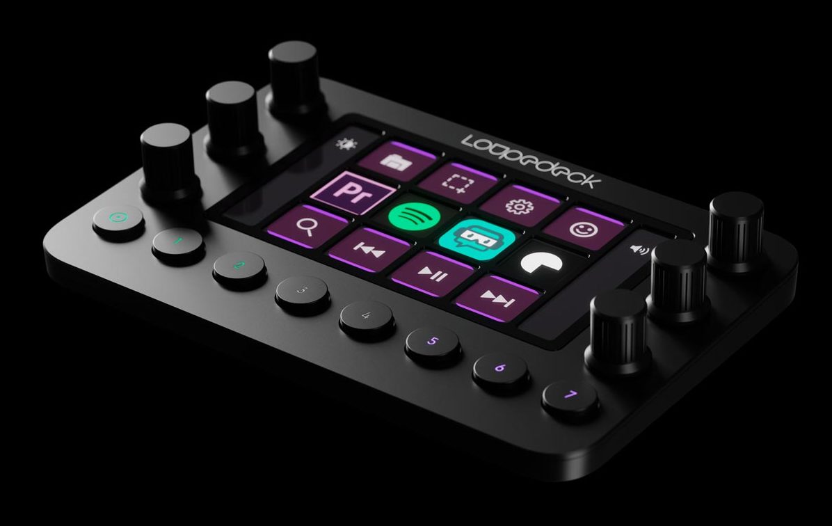
I’ve made no secret that I am a huge fan of the Loupedeck CT. So much so it took three reviews to really do it justice. I was less a fan of the Loupedeck + until overlays were created to make it easy to use. A more recent product in the Loupedeck product line is the Loupedeck Live and it’s basically half of a Loupedeck CT.
I was thinking about how to talk about the Loupedeck Live without repeating myself since I covered CT so deeply. What I haven’t done is work with Avid Media Composer and any Loupedeck product. A job presented itself where I could make use of the Loupedeck Live with Avid Media Composer and here we are.
Is the Loupedeck Live worth the cost?
The main question I get asked about the Loupedeck surfaces, in general, is if they are worth the cost. I think the answer is yes for the CT as it’s so versatile and adds some deep customization to your editing software you might not have had before. Yes if you’re willing to put some time into the setup and customizing it for you.
The second most question I get asked about the Loupedeck control surfaces is what is the difference between the Loupedeck Live and the Loupedeck CT?
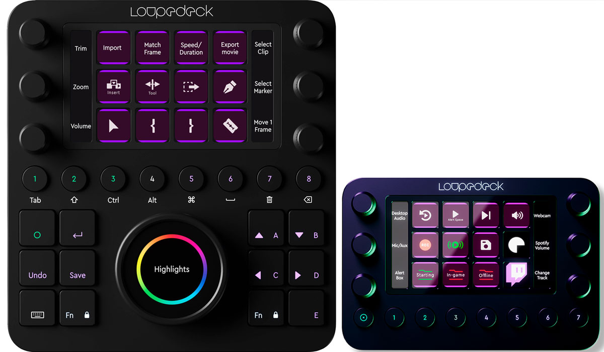
The short answer to that second question is that the Live feels like the top half of the CT. You get the 6 dials, the 12 touch screen buttons. What you don’t get is the extra 12 physical buttons at the bottom and the big, round dial with the touchscreen in the center. You also get 8 ROUND buttons across the bottom but the one on the left is a home button. So that’s more like seven. On the CT the home buttons is a square button. Okay!
You also have to look at price:
Loupedeck CT: $549
Loupedeck Live: $269
Is that extra $280 worth it for video editing? Probably not … but maybe depending in your workflow geekiness. I’ll have to cover the deep-dive-difference in the Live and the CT in a future article.
It’s called the Loupedeck Live because part of the marketing pitch is that it’s geared toward streamers. There’s some new functionality that has been built into the Loupedeck software geared toward streamers but you can still get great editing functionality out of the Live like you can with the CT.
That editing tool I was able to use the Live with was Avid Media Composer.
I had wondered how well the Live would adapt to Avid considering the deep hooks the Loupedeck software has into the Adobe apps like Premiere Pro. The short answer is the hooks in aren’t deep as the Adobe products as far as I can tell but since the Loupedeck can emulate keyboard presses there is a lot you can do with Avid as keyboard support is pretty deep. It can go even deeper if you set up your own keyboard beyond the Avid default.
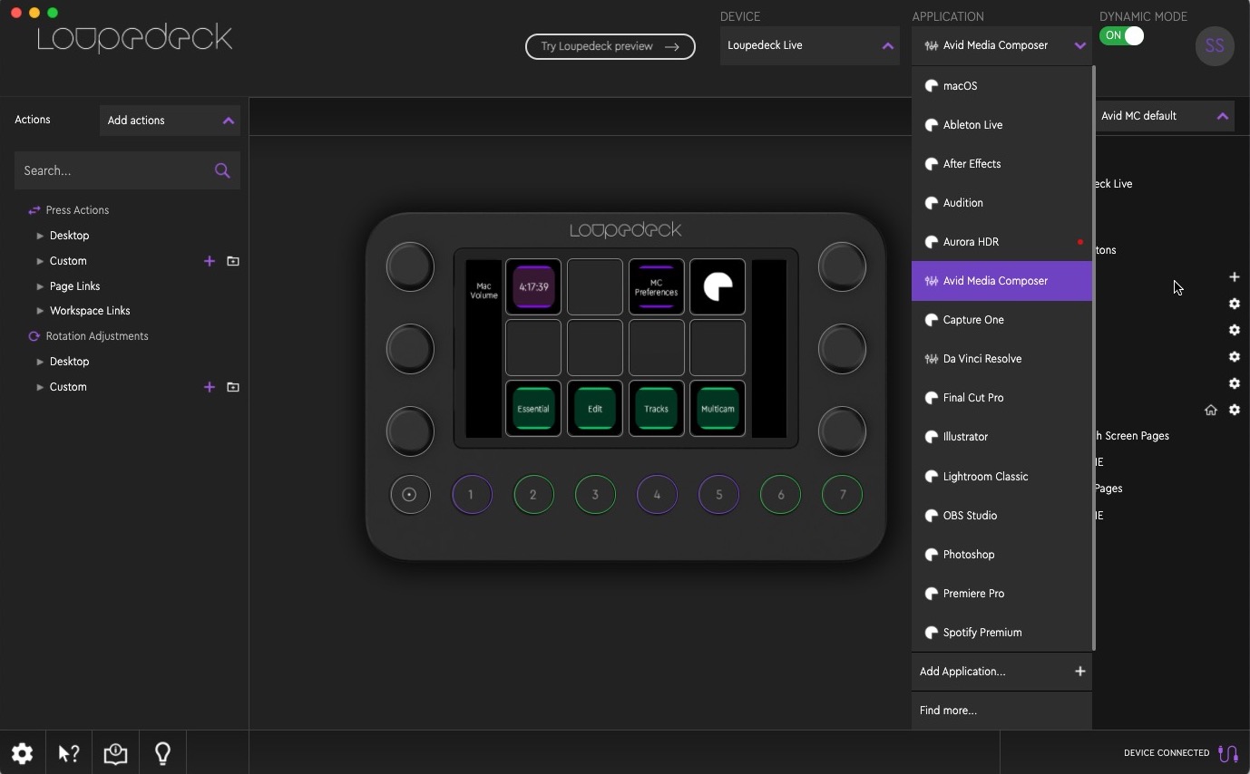
One thing I didn’t notice when I first went to adapt the Live to Avid was that there is a custom Avid Media Composer profile you can download from the Loupedeck website. It’s a custom profile meaning you will install the Loupedeck software and then import the profile via the settings.
With “native” app support (I don’t know exactly what Loupedeck calls it) the application’s commands are listed on the left side of the setup interface. Not the same with something like Avid where you have to import a profile. All of the prebuilt Media Composer settings are located under the Custom twirl-down for the Press Actions and the Rotation Adjustments. Because that is what you’ll be doing, pressing and rotating.
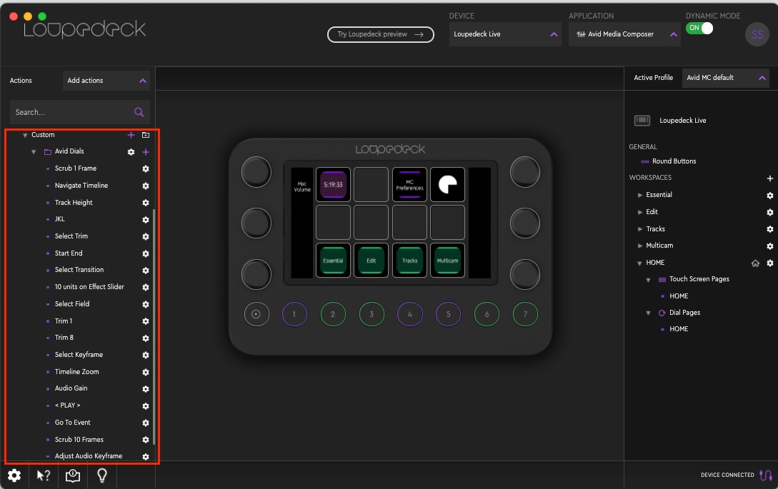
Since Avid doesn’t allow deep third-party hardware integration I’m guessing that someone went in and built all of these actions with the default keyboard shortcuts so kudos to them. That was a big job.
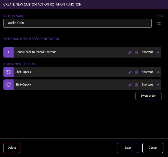
The bullet point list for what has been set up in this profile is this:
- Navigating and Zooming in Timeline
- Record Volume Automation with a dial
- Creating macros e.g. to open a (color) workspace and its corresponding tool with one button
- Using dials for Clip Gain, Track Height, Keyframe Values, Next/Previous Event, Trimming a clip etc.
- Quick enabling of most common tracks
- Quick access to Effect Palette, Audio Mixer a.m.m. (I don’t know what a.m.m. is
)
The default Avid profile begins with four different Workspaces: Essential, Edit, Tracks and Multicam.
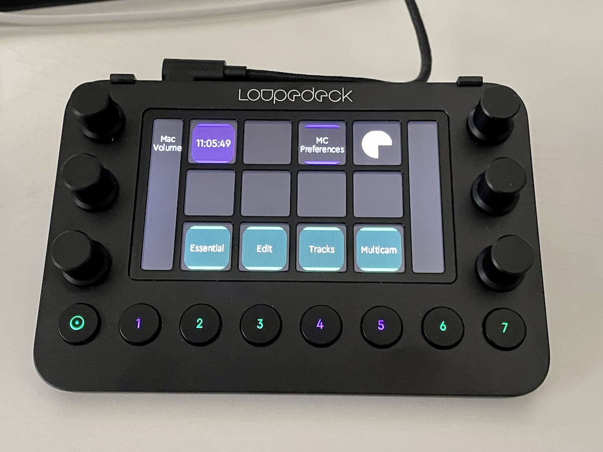
The user can set up many different Workspaces and tailor them to their liking. You can also have different profiles and you’ll probably want to first adjust some of the default keys as you don’t really need things like IN/OUT and Clear IN/OUT on the Loupedeck since they are right there on the keyboard. I wish there was a way to duplicate an existing Active Profile in the Loupedeck software. That way it’d be easy to modify an existing one. I couldn’t find that option.
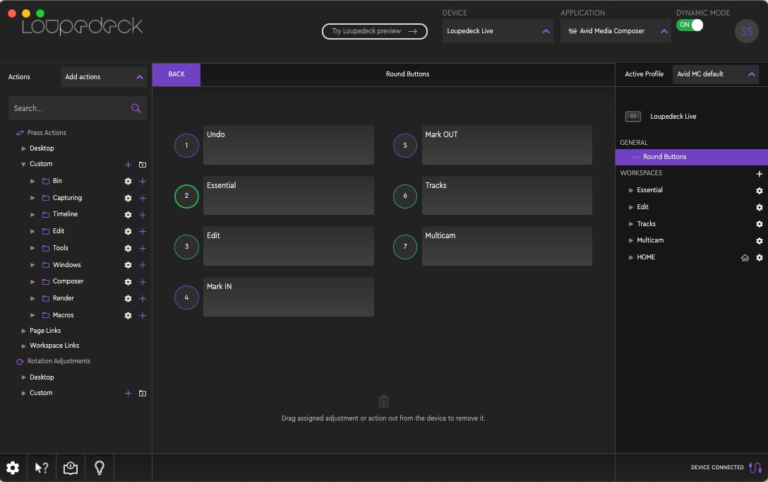
There are other keyboard things you want on the Live as they can be useful on the Live’s dials. Things like the Trim single frame and Trim multi-frame are on your keyboard but it’s nice to turn a knob instead of repeatedly pressing a key when executing some trims, called Trim 1 and Trim 8 on the dials. Many of these Avid commands are mapped via their default keyboard shortcuts to the Loupedeck Live dials. It’s a great setup.
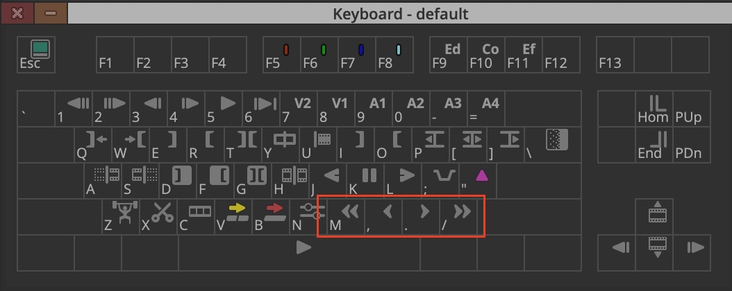
These trim dials correspond to the m,./ keys on the keyboard and can be used to both move clips while in Segment mode, slip a clip when your playhead is parked on it as well as trim edits while in Trim Mode.
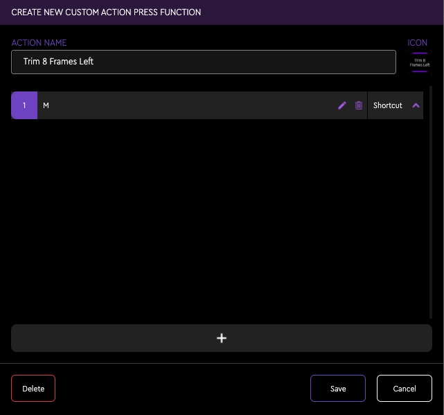
These trim functions are incredibly fulfilling to execute with a dial.
Is there a bit of a delay when you execute something like these trims? Maybe a minuscule one but it’s quite small. No more than other hardware surfaces like a Contour Shuttle Pro. It may be fractionally slower than executing something in Premiere Pro but it’s almost unnoticeable. It works very well.
If you’re an Avid editor contemplating a Loupedeck control surface I would encourage you to read at least part one of my in-depth Loupedeck CT review as it goes into a lot of detail that is applicable to the Loupedeck Live as well. And there are a couple of other parts to the coverage if you want to dive deep.
But what can something like the Loupedeck Live add to my already streamlined Avid editing experience?
If you’re an Avid editor looking at a Loupedeck product then you most likely know the keyboard shortcuts already. The thing to look at is what can a product like the Loupedeck add.
The first thing is the addition of the dials. There are certain edit tasks that lend themselves to rotating a dial and it’s a real joy.
Here’s a list of functions that I find very nice to use with a dial:
- Timeline Zoom
- Adjustment of Track Heights
- Raising and lowering of Audio Gain
- Scrubbing 1 or multiple frames
- Trimming frames when in Trim Mode
- Moving clips via Trim Left/Right when selected in Segment Mode
- Adjusting selected slider parameters in Effects Mode
Seasoned Avid editors will have to get over the hump of reprogramming their muscle memory but let’s take timeline zooming for example. Yes, you’re removing your hands from the keyboard to use a daily but instead of having to hit modifier+] key over and over to zoom in you can just twist the Timeline Zoom knob on the Loupedeck. Even if you have mapped timeline zooming to single keys (as I have on F11 and F12) there are still multiple key presses to keep zooming in. The dial is very nice.
For years I’ve had a customized Media Composer keyboard which means some of the default MC Loupedeck profile doesn’t work so I’ve made custom tweaks to my Loupedeck Live Media Composer profile.
Just a few notable differences between my keyboard and the default Avid keyboard is the change of number keys to target tracks as well as the Smart Tools. I also like to map the Audio Data options under the timeline hamburger menu (None, Waveform, Clip Gain and Volume) to shift+F9 – F12 but like it even more on the touch screen display. By mapping those options via the Media Composer Command Palette to keystrokes I could assign that to a button in the Loupedeck Live.
Same thing with the Smart Tools. Keyboard shortcuts mean they can be mapped with the Loupedeck.
Another thing you can do with these custom mapping options is assign a custom icon if you don’t want to use the default text. I just took a screenshot of these Smart Tool icons right out of the timeline and loaded those in the setup.
So my custom Loupedeck Live Avid workspace looks like this:
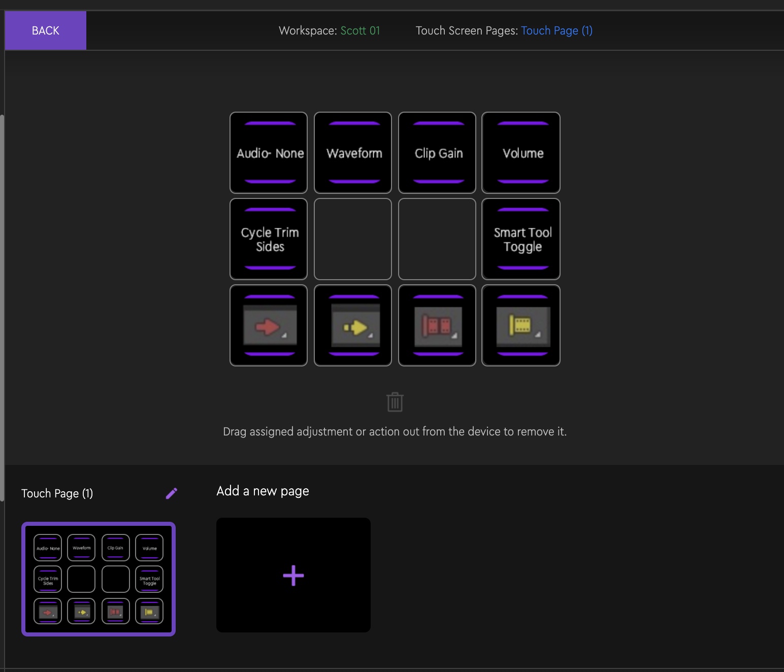
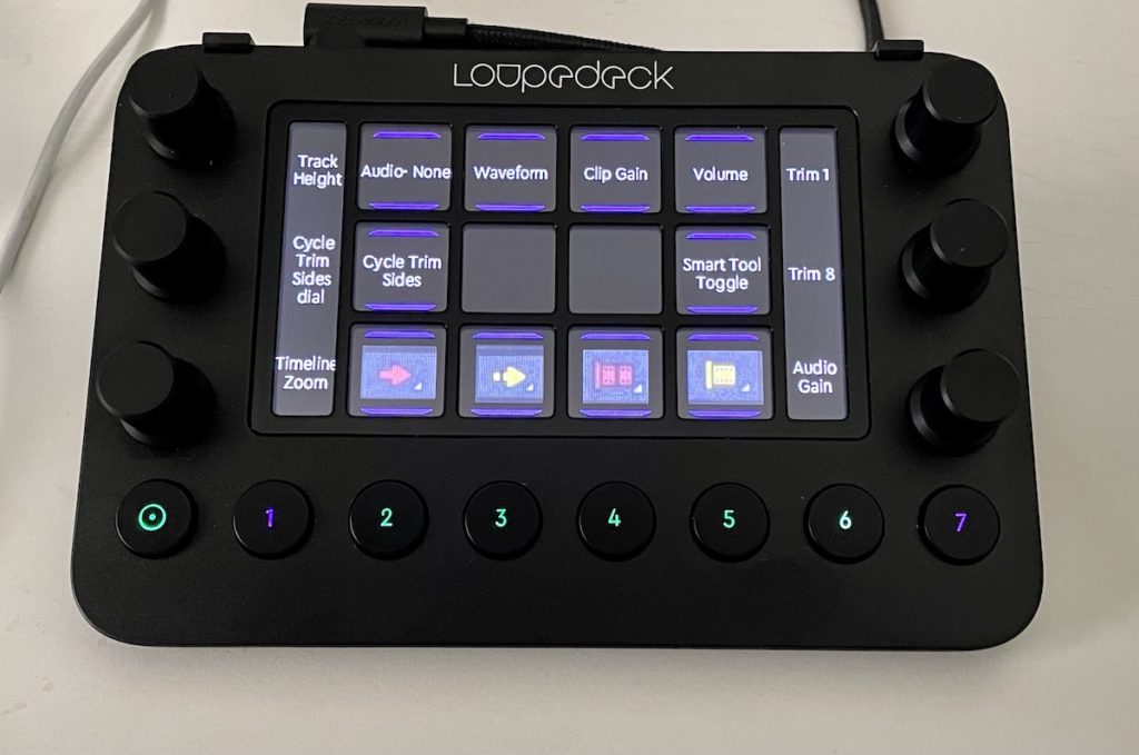
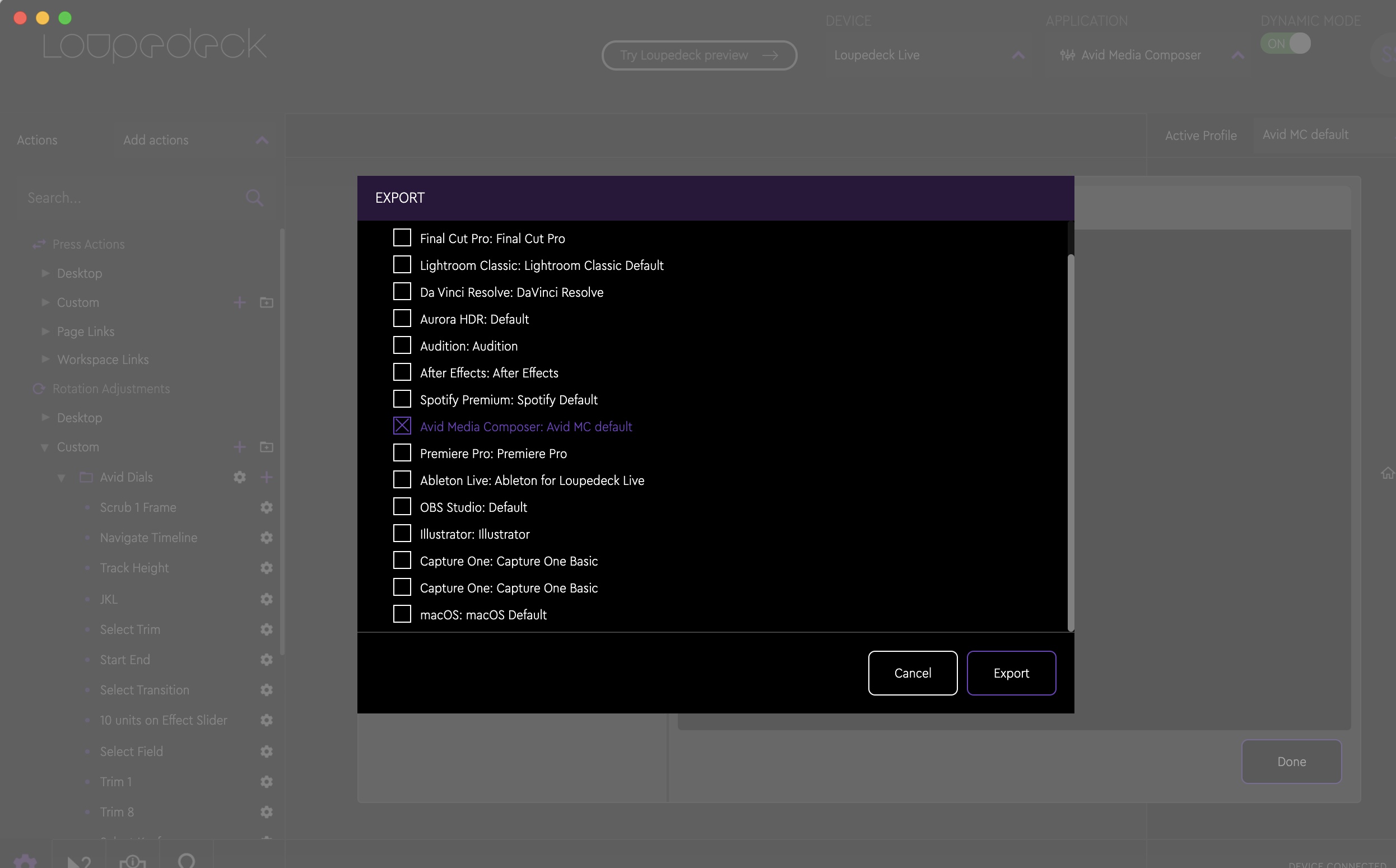
Once you’ve taken time to set up a custom Loupedeck profile then you can save that for safekeeping or to move to another device.
There’s no question that it can take some time to really customize the Loupedeck console beyond the default setup. And if you’re a keyboard customizer of your Avid keyboard you’ll want to dig deep into what you can do with the Loupedeck. But it took time to customize your Avid keyboard so that shouldn’t be an issue if you decide to go all in with the Loupedeck Live. I think you have to fully commit to something like this to get the most out of it. Retrain your brain a bit and it can speed you up and add a new level of functionality to your editing flow.
Sure Scott, but is it really faster? I mean… really?
One big question the Avid editors reading this review will ask about is if using the Loupedeck is faster than doing everything by the keyboard. Media Composer is very much a keyboard-driven NLE and good Avid editors can drive a large part of the edit from the keyboard.
I believe it can be. Adjusting audio gain via a dial and not a keyboard combo is very fast considering you often have to implement the key combo multiple times as you change an audio level. A twist of a dial is a very natural way to do this and it beats mousing it with the Audio Mixer by a mile.
Same with zooming the timeline in and out. Long ago I mapped timeline zooming to F11/F12 as it’s much faster than modifier + bracket key. You only have to reach a small amount above the keyboard to twist a Loupedeck dial so I think it’s as fast as regular keyboard zooming via the keyboard. The only thing that might be faster is a keyboard with a dial built-in but that option in the Logitech Craft keyboard has other problems.
Having the Smart Tools mapped to the keyboard is essential for faster Avid editing and the default for those is with a shift key modifier. I love having them front and center on the touch screen buttons and it gives me back some trim keys that I had mapped away to get the Smart Tools more front and center.
As I mentioned you can get a lot more value out of the Loupedeck if you take time to customize it. Beyond just mapping keyboard comments to buttons and dials, the Loupedeck software allows for the building of some deep macros that can execute multiple keystrokes and commands. It’s probably not as in-depth as the much loved Keyboard Maestro tool but when macros were added a few software versions ago it added a whole new level of functionality. My next task is adapting some of my favorite Premiere Pro macros that I’ve built into my Premiere Loupedeck profile to Avid.
Again, you’ll get out of it what you put into it.
Yea but what about all those other tools Avid editor use?
For some reason, I often see comparison questions asked about the Loupedeck CT vs other control surfaces more on Avid forums more so than other NLE forums . Below are some quick answers that are my opinion only.
Loupedeck CT vs. Wacom tablet: These are two entirely different types of input devices and, IMHO, can’t be directly compared. I’ve never been able to get into pencil/tabled-based usage for editing and have found it slows me down vs. traditional keyboard and mouse when you’ve mapped your keyboard. Others love a Wacom for editing and swear by it. The truth is you could supplement your Wacom with a Loupedeck and use both.
Loupedeck vs Stream Deck: These two are more similar but a StreamDeck is just a bunch of programmable buttons. There are no dials on the StreamDeck which makes it more limited than the Loupedeck. Since the LD added macros a few versions ago a lot of the StreamDeck advantage has been taken away. The Loupedeck software also executes the macros a lot faster than the Stream Deck, which I like better. Yes, those little LCD screens and physical push buttons of the Stream Deck are super cool but I’ll take functionality over super cool once the supercoolness wears off.
Loupedeck vs a gaming mouse: Gaming mice also have a very loyal following among Avid Media Composer editors so that’s another comparison question. Like the tablet, they are very different and could complement each other. Don’t sell your gaming mouse to buy a CT but if you have the extra cash then why not?
Imagine the ultimate editing control surface setup: A Wacom tablet in its prominent place, a gaming mouse for when you needed it, a Stream Deck just so you could look cool with the colored and animated buttons, and a Loupedeck CT there for all the knobs and dials. That’d be some kind of setup. You credit card company would thank you.
Filmtools
Filmmakers go-to destination for pre-production, production & post production equipment!
Shop Now
