The second stop in our overview of 3D lighting in After Effects is the subject of shadows. In the Dark Ages (before version 5, when After Effects got 3D), in order to fake the all-important perspective clue of one layer darkening another layer behind it, we needed to use plug-ins such as the stock Drop Shadow effect, Real Shadows from Red Giant Software’s Image Lounge, and CC Radial Shadow (formerly part of Cycore Cult FX; now included with After Effects). With the introduction of 3D space in After Effects back in version 5, the correct casting of shadows between layers became somewhat “automatic” – as long as you know how to set it up.
One of the main points we drilled home last month was that the way lights interact with layers relies on the settings for both the light and the layer. This is also the case with shadows. Several items need to be set up properly to see a shadow:
- The Cast Shadows option must be enabled in the Light Settings (the default is the last setting you used).
- The layer receiving the shadow must have its 3D Layer switch on, and have Accepts Shadows set On in its Material Options. The default is On, but it will be Off if you duplicated a layer that had Accepts Shadows set to Off.
- The layer casting shadows must also have its 3D Layer switch on, and have Cast Shadows set to On or Only in its Material Options. The default is Off, which is probably the first “gotcha” most encounter when trying to set up shadows.
- The light and layers must be positioned in a way so that one layer is between the light and the second layer, and there is some distance between the two layers. This is the second gotcha most encounter, as new layers default to being the same distance from the viewer in Z space – and if there is no gap between the layers, you won’t see a shadow.
One other point: The light must have its Type set to anything but Ambient, as ambient lights are everyone, and by definition cannot cast a shadow from one layer onto another. If you are new to experimenting with shadows, start with the Light Type set to Point , as you don’t have to worry about aiming it – it shoots rays in all directions.
Shadow Size
Two conditions determine how large a shadows appears to the viewer: the Light Type, and the relative positions of the light, camera, and layers.
Spot and Point lights shoot light rays out at angles from a central point. The further away you are from a Spot or Point light, the more spread out its rays are. When using these Light Types, if the light is closer to the layers than the camera is, the resulting shadow will appear larger than the layer casting the shadow. For really exaggerated shadows, cozy the light right up to the layer casting the shadows.
On the other hand, if the light is further away from the layers than the camera, the resulting shadow will appear smaller than the layer casting the shadow. Depending on how the layers are positioned, the layer casting the shadow might then completely obscure the shadow itself. This is another reason why shadows can seem to be “broken.”
Parallel lights shoot their rays all in the same direction – they don’t spread out over distance. This means that the shadow received by a layer is exactly the same size as the layer casting the shadow. But – and this is a big one – the shadow appears smaller when viewed by the camera. This is because the layer receiving the shadow is some distance from the camera, and the further away that layer is, the smaller the shadow will be scaled down through the natural effects of perspective distortion. As a result, parallel lights can’t cast shadows that appear larger than the layer casting the shadow.
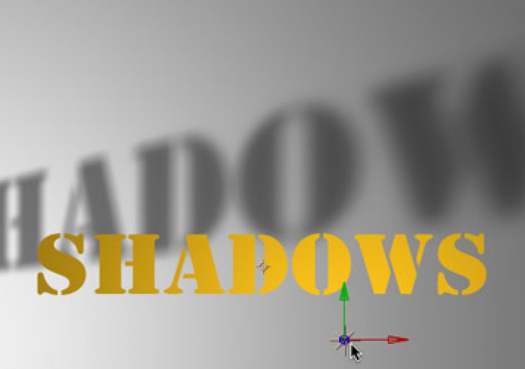
Of course, shadows can be distorted into appearing larger. This happens when there is an angle between the layer casting and the layer receiving the shadow, such as in the illustration at the top of this page – think of the long shadows you cast on the sidewalk early or late in the day, when the sun is low in the sky. The bottom line is, in contrast to plug-ins where you can edit a parameter for shadow size, you have to carefully manage the positions of objects in 3D space to get the size of shadow you want.
next page: shadow detail and color
Life on the Edge
The sharpness of a shadow’s edge is also controlled by more than one factor. The easiest to grasp is a light’s Shadow Diffusion setting. This parameter is defined as a number of pixels; at first glance, you might be tempted to think it means how many pixels of blur is being applied to the shadows. What it really defines is the “size” of the light (a parameter some may be familiar with from traditional 3D programs).
The Shadow Diffusion parameter – illustrated at right – controls how large the virtual light is, which in turn affects how spread out the edges of shadows are.
If a light was infinitely small, light rays can come from only one place. This means they hit a layer’s edge from only one angle, casting a nice, clean, sharp shadow onto another layer. However, if a light had some width to it, the rays it casts would be coming from different angles – some from the left edge of the light, some from the right edge of the light, and others inbetween. This scattering of light ray angles results in the edge of the shadow being spread out. Larger Shadow Diffusion parameters result in softer edges for the shadow; increasing the space between the layer casting the shadow and the layer receiving it also increases the shadow softness, as the rays get more spread out over distance. The Shadow Diffusion parameter is grayed out for Parallel lights, as all of their rays by definition come at the same angle.
But Shadow Diffusion is not the only thing that affects the sharpness of shadows – the type of rendering engine also plays a big role. Shadows are calculated differently for the old (and now discontinued) Standard 3D and newer (and now default)Advanced 3D Rendering Plug-in. Which to use was selected in the Composition Settings dialog, under the Advanced Tab; the default was the last one you chose. (In newer versions of After Effects, there is an OpenGL rendering plug-in; it can have poor quality shadows depending on how advanced your video card is.)
If you choose the Advanced 3D engine (which is now the default), click on the Options button and familiarize yourself with Shadow Map Resolution, which controls how sharp shadows are rendered. Larger Shadow Maps result in sharper shadows, but take longer to render. Small Shadow Maps render faster, but in extreme cases can look like an image that’s been scaled up beyond 100%, with the resulting aliasing artifacts. The default for Shadow Map is Comp Size, which tends to be on the small side, with a look somewhat similar to using the old Standard 3D Plug-in.
The old Standard 3D plug-in had some built-in softness to its shadows (above left). The Advanced 3D plug-in uses a different algorithm to calculate shadows. How sharp the resulting shadow is depends on the Shadow Map size, with small maps giving blurry shadows (above) and high sizes giving sharp shadows (left) – with a corresponding impact on render time.
Shadows are one of the biggest rendering hits inside After Effects. Allocate some time during a project to experiment with different Rendering Plug-ins and Shadow Map sizes, to balance off the look you are after versus the rendering time you can tolerate. There is no hard and fast rule on what works best; it depends completely on how your project has been set up. If you were already using Shadow Diffusion to soften the edges of your shadows, play around with setting Shadow Diffusion to zero and using a small Shadow Map size to “blur” the edges – if it looks good enough for your application, it will save you a lot of rendering time.
The Color of Darkness
Quite often, you don’t want your shadows to be 100% dark. Play around with the Shadow Darkness parameter in a light’s Settings to make its shadows more or less dense. Also be aware that adding Ambient lights to a comp can wash out shadows.
Shadows default to being black. Some 3D programs allow you to change the shadow color in the light’s settings, but this is not the case in After Effects. Instead, back in version 5.5 layers gained a Material Option called Light Transmission. It defaults to 0%, which results in a black shadow; as you increase this parameter, the shadow takes on more of the color of the layer casting the shadow.
To make this set-up easier to manage, parent the two layers together to make them easier to move as a group. If two layers are at the same position, the layer on top in the Timeline window should render “in front of” the duplicate underneath, so you don’t have to worry about the original blocking the shadow created by the duplicate – but if are the type that worries anyway, edit the position of the duplicate to be fractionally further away from the light than the original.
In the third installment of this series on 3D lighting in After Effects, we will discuss different approaches to creating gel and gobo effects.
The first installment, which contained an overview plus an important discussion on Material Options, can be found here.
The content contained in our books, videos, blogs, and articles for other sites are all copyright Crish Design, except where otherwise attributed.

