After much experimentation, and a bit of failed hacking, I’ve come up with a good full-range Cine-EI LUT for Sony FS7/F5/F55. Read on, and download it and the end of the article…
This is essentially a continuation of this other article. If you haven’t read it first then it might be a good idea to check it out.
Recently I shot a project with three RED Dragons. The client booked the cameras and the crew before they hired me, so I stepped in a bit late and wasn’t involved in the camera specs.
All three cameras displayed images that were overly red. I’d never seen that before. If I saw that in one camera then I might have thought it was a software glitch, but I saw this in all three cameras. We looked through the surface menus and, as best I could tell, everything was fine. While the director desperately played with gain settings to try to remove the red cast, I wracked my brain as to what might be happening.
And then… I recalled a conversation I’d had with a color scientist a while back. We were talking about sensor packages and their attached spectral shaping filters, and how that filtration affects the image. “A common trick sensor manufacturers use to boost ISO,” he told me, “is to let a lot of extra far red/IR pass through to the sensor. This boosts exposure in several color channels, much like flashing film, and reduces noise, making the sensor appear more light sensitive. Unfortunately this causes crosstalk between color channels, which desaturates color significantly.”
He went on to describe how cutting far red/IR closer to the visible spectrum would eliminate that crosstalk and result in much more saturated and accurate color, but at the cost of making the camera slower. It occurred to me that might be the difference between RED’s low light and flesh tone OLPF filters.
I got into the menus of the nearest camera and drilled down to the settings for the OLPF’s color matrix. The setting said “flesh tone.” “What kind of OLPFs did you order?” I asked the client.
“Low light. Why?”
The rental house normally sends out flesh tone OLPFs in their Dragons. For this order they swapped out the OLPFs to low light, as requested, but neglected to change the color matrix to follow. We were looking through the low light OLPF using the flesh tone matrix, which made the image look red. This is consistent with the theory stated above: the low light matrix would likely de-emphasize red because the OLPF filter package is letting a lot of it through. The flesh tone matrix would likely boost red saturation because the far/IR cut was much lower, blocking IR and most far red wavelengths.
Why am I talking about the color red? You’ll see in a moment.
A while back I tried to match a Canon C300 to an Alexa. I got close, but only because Alexa is generally the most color accurate camera I’ve worked with and matching any camera to it usually results in accurate color. The exception to this is red. Under tungsten light my new C300 settings looked pretty good, but under daylight the slightest hint of red in flesh tone skewed the toward magenta. This is a really ugly look for a face, so I discontinued use of those settings. (I did get a number of emails from satisfied customers, though.)
Canon’s reds are generally skewed a bit toward yellow. My theory is that skin imperfections that are normally red melt away when their color is shifted toward yellow, making them appear less red and more like flesh tone. Any attempt to “fix” this on the part of the user causes an overcorrection that pushes red toward blue, making imperfections stand out even more.
In this article I wrote about my attempt to use LUTCalc to shoehorn Alexa’s color into Sony’s FS7, F5 and F55 cameras. I took that LUT to a shoot last week and gave it a try. As we were shooting in SLog3 and I used it only as a monitor LUT it was a simple matter to test drive it on a real job.
It didn’t work.
The contrast was very nice, and the color was very pretty–except for red. Our talent was a very tan man with golden brown skin, and my improvised Alexa LUT turned his skin a bit peachy. It wasn’t a terrible look–it was nice if for no other reason than it wasn’t the usual look I get out of FS7s and F5s–but it wasn’t color accurate. I’d built a backup LUT so I plugged that in for the rest of the day.
Alexa reds are a little bit blueish. My theory is that this LUT pushed Sony reds in a direction they never expected to go: away from yellow and orange and closer to red, resulting in the “peachy” look.
I’ve been defeated by red on several occasions now. It seems to be the one hue whose manipulation results in dire consequences. Until I learn more I think I’ll still to working with OEM color gamuts and focus on gamma curves instead. I’m not just fighting color science math when I push red around in various cameras, but I appear to be fighting the spectral cutting filters as well. That tells me there’s only so much I can do with numbers.
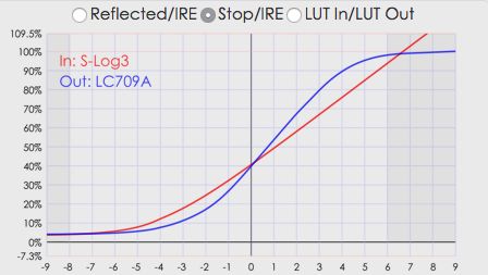
Determined to create something that gets a bit more out of Cine-EI mode, I went back into LUTCalc and did some experimentation. The result of this was the discovery of a very simple way to create a full range LUT with increased contrast while still using the Sony LC709 Type A gamut. “Full range” means that the LUT uses the full video signal range of 0-109%, instead of LC709A’s 4%-100% range. This results in deeper blacks, whiter whites and increased contrast in mid-tones. I like LC709A, but over time I’ve come to feel that it’s a little too desaturated and flat in the mid-tones. I want something with a little more punch.
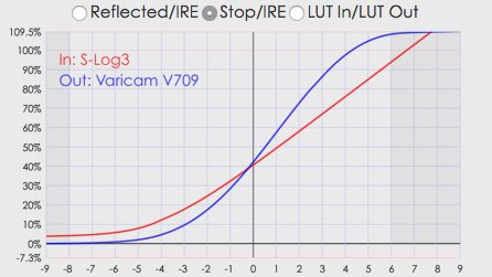
I set up LUTCalc to translate SGamut3.cine/SLog3 into the LC709A gamut, but I used the Panasonic V709 gamma curve instead of the LC709A curve. V709 is the curve used in the Varicam 35’s Rec 709 LUT. It’s full range, starts at 0% and ends at 109%, is about as punchy as the Alexa Rec 709 LUT… it seems to do exactly what I want it too. (This is almost too easy. I wanted a LUT that was complex enough to take pride in, even though I’m not particularly adept at LUT manipulation yet.)
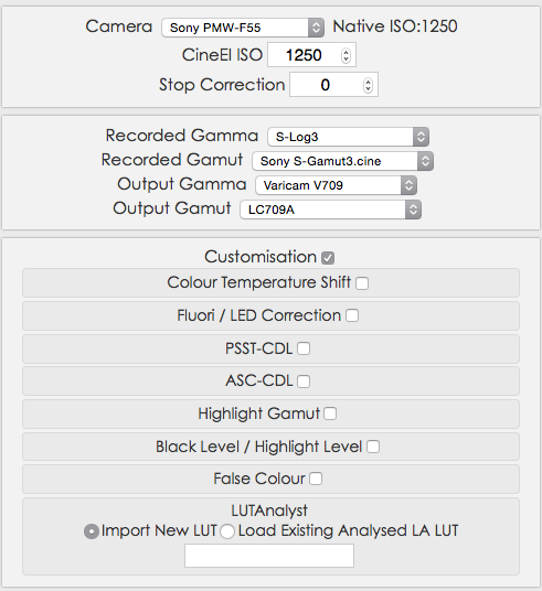
It seems that gamuts and gammas can be safely mixed and matched in LutCalc. The gamut defines how the camera responds to color, and the gamma defines the tone map, or the “S-curve,” of the image. I played around with pushing LC709A’s gamma curve up to 109%—it’s easy to do—but in the end using the V709 curve was a much more elegant and simpler method.
Charts are good at showing some things and not others. They break down components of a video image so we can more easily see what’s happening to it, but they aren’t a substitute for real world testing. They are still informative, so I took the liberty of using them for some comparisons.
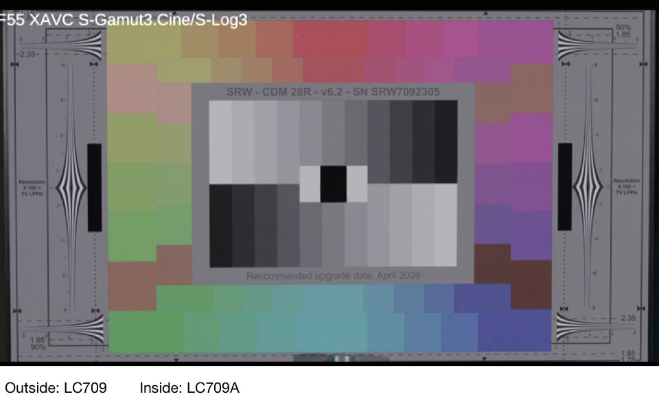
The outside set of chips is LC709, Sony’s very saturated Rec 709 implementation for Cine-EI. The inside set is LC709 Type A, Sony’s attempt to emulate Alexa color. As you can see, Type A’s hues are less saturated than are LC709’s, particularly in red. This has the effect of making flesh tones look a little darker, at least in the chips on the left side of the chart.
LC709A’s blacks are lifted to 4% because that’s what happens in Alexa’s Rec 709 LUT. I wondered what would happen if I pinned LC709A’s blacks to zero. Any time we push the black level down we increase saturation, and that 4% adjustment was likely to have a noticeable effect.
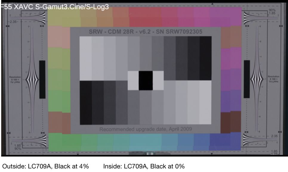
As you can see, lowering the black level by 4% increases saturation significantly. The question I had was whether saturation increased to the point where the difference between LC709 (the fully saturated gamut) and LC709A was negligible.
LC709A is still less saturated, which is good: LC709 is way too saturated for my taste. I’ve used it to great effect on toy commercials but I wouldn’t shoot anything terribly sophisticated with it. LC709A still looks a bit dark in the mid-tones, though. Where LC709 is too saturated, LC709A is not quite saturated enough. I wonder if the reduced saturation makes the camera look darker than it should in Cine-EI mode. Alexa flesh tones exposed in a similar way look great, but Sony flesh tones look dim.
When I stacked LC709A with the Panasonic V709 curve, and then compared that to the LC709A curve with blacks pegged at 0%, I received a pleasant surprise:
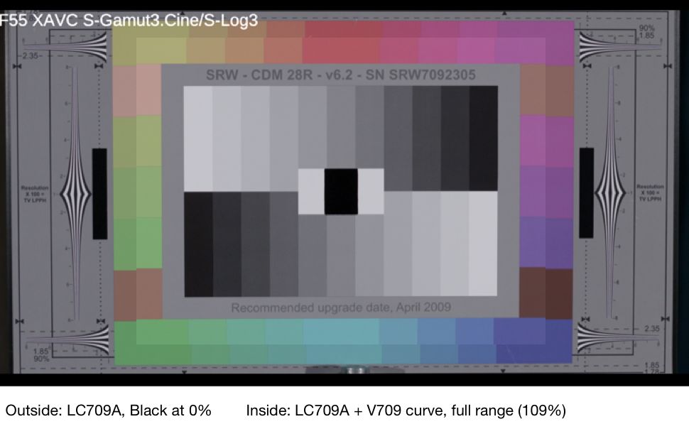
That’s brighter and cheerier! The hues are still less saturated than LC709 but everything is a bit brighter as this curve extends to 109% instead of Sony’s 100% at base ISO. Blacks are blacks, contrast is pleasantly punchy, and I’m using the full “bit bucket” for a little extra contrast in highlights.
A number of people have suggested that instead of dividing my ISO by 2, as I do to crush noise when shooting with Sony FS7/F5/F55, I should set my light meter’s ISO lower by ⅔ stop and leave the camera at its native ISO. I toyed with this idea until I saw one of my old spots, shot on an F5 at its native ISO, and cringed at how noisy the blacks are. I’m shooting a moody night exterior project next week, and even if I rate the camera ⅔ stop slower that will boost mid-tones and shadows, but it won’t do anything to curb noise in deep blacks because black is always at the same level no matter how I adjust my meter. Changing the ISO in the camera remaps the tonal scale so that noise is pushed down the scale toward 0%, something that doesn’t happen if I simply reset my meter.
Black will always be noisy when the FS7 is set to ISO 2000. If I set my meter to 1250 and give the image 2/3 stop more exposure, black will still be black—and noisy. Mid-tones will be brighter but that does nothing for areas of the image with little to no exposure. Much as I’d love to set the FS7 to ISO 2000 and my meter to 1250, I will instead set the camera to ISO 1000 and my meter to 640 and see what happens. (I may find that the V709 curve’s brighter mid-tones allows me to set my meter closer to the camera’s ISO, say 800.)
Here’s the difference between the two curves:
Here’s what all these LUTs look like when applied to a real image:

LC709

LC709A

LC709A, black level at 0%

LC709A with V709 gamma curve
This is the LUT I’m going to use on my next project. I know LC709A really well, and my only serious complaints about it have been that it tends to look a little dark, a little milky due to the lifted blacks, and the mid-tones are a little flat. With blacks lowered and the highlight range extended by using the V709 gamma curve, this looks vastly better to my eye.
I’m calling this new LUT “AA709A” and you’re welcome to download it here. I’ve included a small package of post LUTs as well, as well as a version to use at ISO 1000. Use at your own risk, and enjoy.
NOTE: A reader pointed out that two of my MLUTs had the same gamma, which isn’t right. I then realized that I didn’t need either of them as we only need one MLUT for the camera because ISO changes are handled by applying a 1D LUT in the camera itself. We need different LUTs for post, though, because that compensation doesn’t happen automatically in a grading app.
The only MLUT you need in the camera is AA709A. Post will need a LUT that reflects whatever ISO you shot at.
I’ve updated the file by removing the Pull 1 and Push 1 MLUTs and leaving only the native. The grading LUTs are the same. Sorry about that, I shouldn’t do picky things late at night.
Disclosure: The chart shown is the DSC Labs Chroma Du Monde 28R+4. I have worked as a paid consultant to DSC Labs.
Art Adams
Director of Photography
www.artadamsdp.com

Filmtools
Filmmakers go-to destination for pre-production, production & post production equipment!
Shop Now


