Media Compser editors know that our Title safe and Picture safe guides are an essential part of our titling workflow. Working in Photoshop is no different, but sometimes I see editors run into problems with their guides in Photoshop, and just need a little push in the right direction.
Whether you’re new to editing, or a seasoned veteran, it’s difficult to attempt to learn other applications while you are spending your days editing. I always hear people say things like “well, just pick up a subscription to (insert your favorite online training course here), and you can learn at your own pace”. To be honest, I don’t have time for that. Between my day job of editing for 8-9 hours, and then doing my online training, articles, etc and then on top of that, being a husband and a father, I A) don’t have time, and B)I’m not going to spend the monthly cost, that I’ll barely have time to use. Well, that’s where this article series is going to come into play. It’s designed to give you bite sized pieces of information, that you can use in your daily work, and hopefully speed up your workflow in the process. In this Quick Bite, we’re going to look at your Photoshop work and we’re going to talk about keeping your text and elements inside of safe title and safe picture.
Now, most editors when working in Media Composer, will be exporting still frames to take into Photoshop, to manipulate, or maybe use as a reference frame for some titles they are creating. Problem is that many editors ignore safe title and picture in Media Composer, so why would they use it in Photoshop. There’s also a bit of a “Gotcha” when working with still frames you’ve exported from Media Composer, and getting Photoshop to show you your “Safe Boundaries”. So, to get your stills out of Media Composer, simply set up your favorite export preset, and export the element from your timeline.
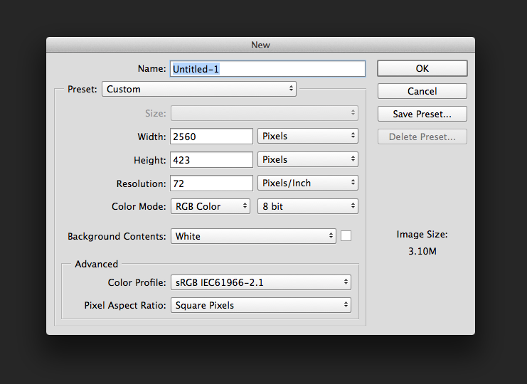
Most editors will now simply right click on their new still image (on their desktop), and say “Open In Photoshop”. Once Photoshop opens, they immediately attempt to get their “safes” to display on top of their image, and they will get frustrated when it doesn’t. Well, let’s back up and bit and talk about what you need to do in Photoshop from the beginning, to get your safes to appear on top of your layered document.When you first launch Photoshop, and you are going to create a new Photoshop document, you are greeted by this window.

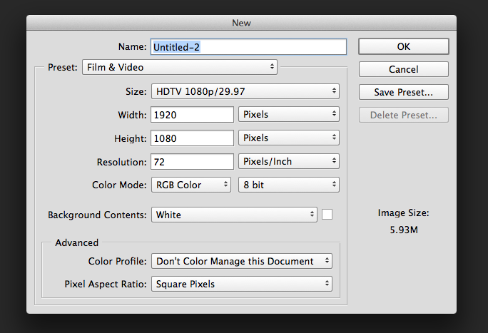
Most people, at this point, simply enter in the dimensions of the Photoshop file they want, click enter, and are on their merry way. The problem is that they aren’t thinking about what exactly it that they want Photoshop to do for them, namely, create them a composition for TV or film. With that being said, to create a Film/TV composition is very easy. All you have to do, in the same window, is to simply click on the Preset drop down at the top of the window, simply select the Film/TV option, and now they can use the “Size” drop down to find the exact Photohshop comp size that they need. For the purposes of what we’re doing, we’re going to select an HDTV 1080p/29.97 Comp that is 1920×1080 square pixels and 72 dots per inch (dpi).

To be honest, this is really THE most important step in the process, and if you make a mistake here, you’ll be in for a world of hurt! Okay, now that we have everything set to go, let’s create our Photoshop file, and let me show you how to get those pesky safe margins to appear.
With your new document ready to work with you’ll notice that Photoshop has immediately added the safe margins to your document. But, I’ll bet that if you go back and create a new document that isn’t using the “Film/TV” preset, you won’t get it. That’s because that document is just a normal, run of the mill document that isn’t designed for film or television, therefor you don’t get the safe title/picture preset. To turn the safes off, simply hit CMD+Colon/Semi-Colon on the Mac or CTL+Colon/Semi-Colon on Windows, and you’ll notice that the safes will appear and disappear. You’ll also notice that you can navigate to VIEW>SHOW>GUIDES to get them to appear and disappear. Love the shortcuts. Remember them, as they’ll help you exponentially speed up your workflow.
Now let’s say, hypothetically, that you needed to add a few more guides, as you want your text to line up with something in a shot, or you just want your text in a position, other than sitting on title safe. Well, no problem. All you need to do to add more guides is to first, turn on Rulers in your document, by navigating (again) to VIEW>RULERS. Now, simply click on the ruler(s), and drag new guides out to wherever you need them in your document, and start creating your text.
This brings us to an important problem that Media Composer editors run into all the time. They’ve exported some still images from Media Composer to work with in Photoshop, and when they open them as new documents, the shortcut doesn’t work, and navigating through the menu to get the guides to appear doesn’t work either. I’ve seen editors actually go into After Effects to create Photoshop files, because they couldn’t get the guides to appear in Photoshop. Well, the reason they don’t appear is that Photoshop assumes that you’re just opening some random image to work with, and not necessarily a “Film and/or TV” element. That means that when you open up a document exported from Media Composer, you’ll need to add a couple extra steps to get the guides to appear. Nothing too big. Just create a new document, the dimensions you need it to be, using the “Film/TV” presets, switch back to the document you want your safe margins on, and then do a CMD+A (Mac), CTL+A (Windows) to select the entire image, and then copy and paste it into the new document you created. Now you have the guides all set to go. What’s important to keep in mind is that once you paste the image into the new document, it is considered a new layer, and not a “background” like it was before. If you want to have the layer as a “background” layer in the new document, the way it was in the old one, simply select any layer in your document, and navigate to the “Layers” quick menu, and select “Flatten Image”. Once you do that, your new document will be exactly the same as your old document, except now you have the guides to set up your titles, however you need them.
As I mentioned before, this is the first of many “Quick Bites” I’ll be doing for Media Composer editors who want to get more out of their Adobe Creative Cloud memberships, and we’ll be covering topics that range from Illustrator to Premiere to After Effects as well. If you’re having problems figuring something out, chances are someone else is as well, so don’t hesitate to drop an e-mail with your Media Composer to Adobe Creative Cloud workflow, and who knows, your question might be answered in my next Quick Bite.
Kevin P McAuliffe is a Senior Editor at Extreme Reach, in Toronto, Canada. You can send him an e-mail at kevinpmcauliffe@gmail.com or follow him on Twitter @kpmcauliffe.


