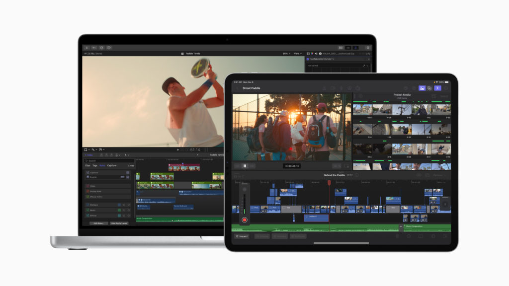
I’ve just been in Cupertino, inside the ring at Apple Park, where the attendees at the Final Cut Pro Creative Summit have been shown the soon-to-be-released 10.7 version of FCP for Mac, version 1.3 for iPad, plus new versions of Logic on both platforms. This FCP release is due later this month, and it’s great to see what’s coming before it arrives — a rare treat from Apple. While the crowd at the Summit was first to see it, there is an official press release out now, and we’re allowed to talk about it.

This isn’t a blockbuster release jam-packed with new features, but it does include some crucial changes which will improve the daily lives of FCP editors. It’s not been abandoned, it’s not becoming a subscription, and development continues on Apple’s flagship NLE. Let’s explore.
An officially scrolling timeline
Although a scrolling timeline has been technically possible for a while now (with the help of CommandPost) the new official implementation is smooth, responsive, and really helps you to view a timeline in detail as it plays forward. Turn it on, and when the playhead reaches halfway across the timeline pane, the playhead stops moving and the timeline starts to scroll along instead. Audio waveforms and video thumbnails redraw automatically, even as you zoom the timeline in and out during playback, so you’ll be able to constantly assess what you’re about to see and hear. Excellent.
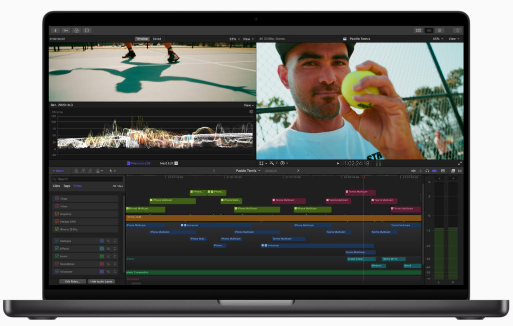
Video roles can be seen in color
Audio roles have always been more widely used than video roles, but that’s about to change. Now, video role colors are shown when a clip’s audio is expanded, or when Audio Lanes are active. Why is this a big deal? Let’s take a quick tour through roles, because though they’re important, they’re not widely understood.

Roles are a way to tag each clip to mark its job in the timeline. By default, you’ll see dialogue, effects or music for audio clips, plus video or titles for video clips — though you can make your own roles to go way beyond this. You can make audio roles for each person who speaks, or video roles for each kind of shot if you like, and each roles comes with its own color. When you export, you can be selective about which roles are included.
Practically, this also means you can color-code your timeline, and it’s very convenient indeed to see where the music, titles and effects are at a glance. But editors who wanted to color-code all the video clips in their timeline would be largely foiled, because until now, a clip’s audio role color took precedence over the video role’s color. If you wanted to make all your b-roll red, and your star close-up gold, you wouldn’t see those colors unless you detached the audio (usually a bad idea) or hacked the system and applied audio roles to those clips instead. Now you don’t have to.
Although the default for regular video clips and dialogue audio clips remains blue, it’s worth creating a few new video roles so you can easily tell the structure of your edit from a quick glance. You’ll want to experiment to discover the strategy that works best for you, but perhaps begin by creating video roles for b-roll, for interview clips, for VFX shots, stock footage, and for any temp items you’d like to revisit later.
When you bring these clips in, you’ll need to do one of three things to see the video role colors:
- Bring in only the video part of the clip (this worked in previous versions)
- Expand the audio by double-clicking on the audio waveform (or typing ⌃S)
- Open the Timeline Index, click into the Roles section, and click Show Audio Lanes
When you combine this with the new scrolling timeline, you’ll have a clearer view of how your edits are made, and a quick zoom out will show you when you’re due for another cutaway. Good stuff.
Collapse to Connected Storyline
This one is huge for anyone who builds complex timelines and wants to regain control. With the trackless Magnetic Timeline, it’s easy to stack up connected clips to the point where you need to scroll vertically to see just what’s going on. Yes, you can control the height of clips, but at some point the compromises can become a bit too much on a smaller screen. Now, there’s a quick and elegant solution. Select all the connected clips that you’d like to collapse, then choose the new command: Collapse to Connected Storyline (⇧⌘↓).
This isn’t like the “Simplify Sequence” command in Premiere Pro, though; it’s more like Resolve’s Timeline > Clean Up Video Tracks > Flatten Unused Clips. Here, any overlapped parts of clips lower down in the timeline will be removed, leaving only the visible parts of each clip grouped together in a new storyline, and without changing the audio mix. Instead of a huge vertical stack, you’ll have a simple flattened sequence that plays the same as it did before — gap clips reveal the clips below them; transitions flatten correctly and J- and L-cuts survive too. The resulting connected storyline sits just above the primary storyline.
Obviously, you wouldn’t use this command if you were showing all these connected clips at once in some sort of split screen composite, but for regular edits, this will be a very helpful way to simplify a complex timeline. Anyone who needs to send their timelines to other editors or for finishing in other NLEs will also appreciate this new command. Previous versions of FCP did have a way to collapse clips to the primary storyline, and that command remains, but this is a very neat halfway step.
Object Tracking ML improvements
If you have an Apple Silicon Mac, this release promises a new machine learning model that offers improved results. The default object tracker still includes Point cloud, Combined and Automatic options, but it’s good to see an update to one of the more prominent ML features in FCP. In the demo room after the event, we also told that the Scene Removal Mask model had also been improved.
Max and Ultra chips see faster exports
Apple silicon Macs with multiple hardware export units will be able to export to hardware-accelerated codecs (H.264 and HEVC) more quickly. We weren’t able to test this much as it requires a longer timeline than was available, but it should be a serious boost for anyone working on longer-form content.
Other updates
FCP for iPad sees a couple of new features: there’s a new Voiceover tool, you can group selected clips into a connected storyline, and there are new color grading presets, titles and generators coming soon too. Logic updates include Mastering Assistant and support for 32-bit float audio; the new Sample Alchemy and Beat Breaker tools for manipulating and reshaping samples, and the iPad version can also use the built-in microphone to quickly sample sounds from the environment.
Conclusion
Over the last few years, the pace of Final Cut Pro updates has slowed, and some had feared that the app had been abandoned. It hasn’t. Now that FCP for iPad has been released, more of the dev team has been largely freed up to work on the Mac version. While I don’t know that many app teams can match the crazy pace that Blackmagic have set, I’m looking forward to this release, and to 2024.


