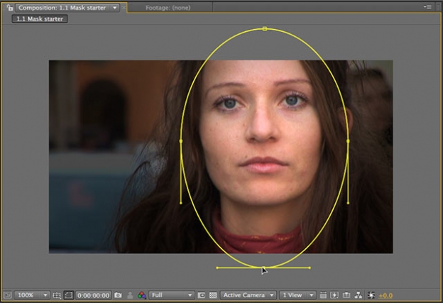
Earlier this week, we posted a video on using 3D lights in After Effects to enhance a scene. One of the main reasons for doing so was to add a vignette, where the edges of the frame were darkened, and the center of the frame – where the main action occurred and the main title appeared – was brightened. It’s not as sexy as blowing something up, but it is an effective, more subtle way to help focus the viewer’s attention on the area we wanted, and not have them unduly distracted by non-essential action happening in the background.
A few years ago, we created an entire video course dedicated to different ways of creating vignettes. Among the techniques demonstrated were:
- masking
- gradients
- painting
- effects
- 3D lighting
We also demonstrated a few alternative approaches, including using blending modes and combining multiple images.
The first movie below is an overview explanation of the course, while the second movie demonstrates the masking technique inside After Effects:
If you’re not already a Lynda.com subscriber, you can click here to start a free 10-day all-access trial; note that they will ask for your credit card up front in the event you like what you see and decide to continue with a regular subscription.
- This link will load a PDF on creating standard vignettes by darkening parts of the frame.
- This link will load a PDF that goes into extended techniques including blending together different shots or effected versions of shots, as shown here.
Both articles focus on using Adobe After Effects, but also touch on using Apple Motion.
Going even further, fellow PVC writer Rich Young created a nice round up of vignette techniques in Adobe After Effects and Premiere Pro.

