This is part 2 of a series that looks at trends in corporate motion graphics. Part 1 looked at the Hollywood films which became landmarks in motion graphics design, in Part 2 we look beyond feature films.
As the interest in motion graphics rapidly expanded following the release of Seven, Hollywood embraced innovative title design, and many Hollywood title sequences helped define the look of motion graphics for years to come. As I noted in Part 1, the early books on motion graphics design tended to showcase the same landmark Hollywood pieces, but not every great title sequence was a useful reference when making corporate videos.
More recently, title sequences for television programs have been receiving the same love and attention as feature films – but once again, it can be frustrating that even the most brilliant title sequences have little relevance to conference openers or training videos. Considering its global popularity, “Game of thrones” may have the most distinctive and recognizable opening titles of any TV show to date, but it’s not exactly useful as a reference when your job is to animate sales projections or illustrate product market shares.
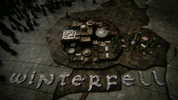
Game of thrones – instantly recognisable, undeniably awesome, but not much use as a reference when you have to present graphs and sales figures…
So while some of the greatest Hollywood title sequences of all time have had little impact on corporate motion graphics, other – often much more modest – productions have left a long lasting impression. It’s these influences that I’ve collated together here in part 2.
A huge part of working in corporate video production is being able to translate business requests onto the screen, and as corporate clients aren’t necessarily video experts (just as video producers aren’t lawyers or accountants) they don’t always know what to ask for, or how. One of the biggest challenges for corporate motion designers is to see the potential for innovative and engaging graphics even when the source material initially appears dull.
Corporate clients don’t specifically commission boring, uninspired videos – but it’s very easy for a production company to produce something average simply because it didn’t occur to anyone that there was the potential to make it better. A stylish design doesn’t need a Hollywood level budget and a huge production crew – it really just needs a bit of enthusiasm even when the topic isn’t anything to get enthusiastic about.
In the list I have assembled here, at least three examples were produced by students, and what was effectively their homework went on to be seen by millions of people and has been used as a reference for production companies on real-world projects.
As I said in part 1 – in your part of the world, with your clients, your list may be different. But these are the styles and trends that have resonated with the clients I’ve had, at the production companies I’ve worked for.
The kid stays in the picture
2002
2.5D photo treatments
“The kid stays in the picture” was released in 2002 and is variously described as either a film or a documentary. So I suppose it could have been included in part 1 with the other Hollywood films, except I haven’t seen it- so I’m not exactly sure what it is.
And that’s an interesting observation in itself. Of all the references I’m listing here in both parts 1 and 2, this one is the only one I haven’t actually seen – and yet here I am writing about it. This is because the legacy of TKSITP isn’t a particular design style, but more of a technique. It was TKSITP that introduced the 2.5D photo move effect to the world, and it’s still here today.
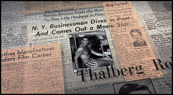
It’s all about the parallax
The technique involves taking a conventional flat photograph and masking the subject matter out into several layers, and then separating those layers in Z space. Then you add a 3D camera and as you pan and move across the photo, the staggered layers introduce parallax and depth to the scene.
By creating a technique to make ordinary photographs more visually interesting, TKSITP opened up new avenues for corporate videos that would otherwise be little more than slideshows. A recurring problem with corporate productions is the lack of interesting assets, but now there’s a way to make a single photograph interesting, and to hold that interest for a longer period of time.
In my part of the world, the technique was demonstrated by Adobe presenters at the launch of After Effects 5.5, and they introduced “The kid stays in the picture” effect to audiences that had never heard of the film itself. I assume this Adobe presentation was the same worldwide, as the online community quickly filled with articles and tutorials on how to reproduce the effect. Quickly “The kid stays in the picture” became a term for the technique itself – similar to the way the “Ken Burns effect” is now used. The 2.5D technique spread so rapidly throughout the online community that – like myself – most people who used the term had never seen the original.
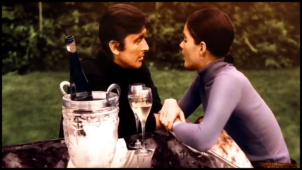
The 2.5D technique was quickly extended beyond just photos – text bullet points, title cards and company logos were soon being staggered in z-space with 3D cameras, an approach which still works well today. In fact, the basic approach is roughly the same as the one used by Hollywood to convert films to 3D.
Since the original documentary was released in 2002, a number of After Effects tools have made the process a little easier. The roto-bezier option has made masking faster, the roto-brush feature has made it easier to mask moving footage, and there’s at least one script over at AEscripts that helps set up the layers automatically. Some people have even tried using the puppet tool to add small movements to the subject matter itself.
In an article I wrote on the After Effects camera, I included an expression that automatically scales 3D layers, so they always appear the same size as their z-position changes. Setting up a 2.5D scene with this expression means you can adjust the position of the layers and cameras in real-time without having to stop and re-scale everything manually – not only automating the process but allowing real-time creative feedback.
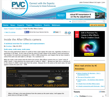
Check out my article on the After Effects camera for expressions to automate the process.
Jet – “Are you gonna be my girl”
2003
Honourable mentions:
Jayse Hanson “Growing elements” Creative Cow tutorial
Video CoPilot “Evolution” design elements
This one may be a bit controversial. I added it in, I took it out, thought about it and added it back in again. Then I took it out, and finally I’ve decided to put it back again because both Jet and myself are from Melbourne.
The reason I’m unsure about this one is because it’s difficult to remember what it was like in 2003. There was no YouTube. It was difficult to send an email with an attachment larger than 5 meg. Internet speeds were slow. It took specialized software to compress videos and upload them for other people to watch, and it wasn’t necessarily easy to get them to play. All of this meant that back then, it was difficult to find sources of inspiration and to share them.
One of the reasons that Hollywood title sequences were so influential may have been because they were so readily distributed. If a film was good, many people saw it and talked about it. If a training video was good – well, even if it was really good how did you share it with other people?
Around this time, Australian band “Jet” had a hit with their song “Are you gonna be my girl”, and so lots of people saw the music video and they seemed to like it. Here was a style reference that was easy to remember and easy to share – like Hollywood films, music videos were regularly broadcast and promoted online.
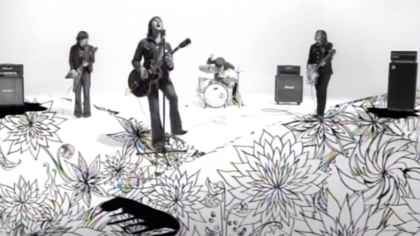
By 2003 the design world was getting over the grunge look. Ever since the “Seven” title sequence, motion graphics had been dirty, wiggly, glowy and so on. It was time for a new look.
The video to Jet’s “Are you gonna be my girl” is relatively simple. The band perform against white, some ink flows out from under one of the guitar cables and becomes a dancing girl silhouette, and towards the end some of the artwork from their album becomes part of the set.
But it’s the artwork at the end which made people excited. Perhaps because there’s hardly any of it when compared to the full duration of the video, it made a bigger impact.
The odd thing about “Are you gonna be my girl” is that it was often used as a reference for a style that it implied, rather than actively shows. There really are very few shots in which the artwork – which came from their album cover – is shown with the band. It’s the suggestion of a style rather than showing the style itself that made the video popular amongst designers. Perhaps there were better – and earlier – examples that had been made but they simply weren’t that widely distributed. In the time before YouTube, if you saw a video somewhere there was no guarantee you’d ever see it again. So it’s possible that “Are you gonna be my girl” became a popular reference simply because it was popular.
But it was increasingly evident that having design elements grow on screen was the next big thing.
For a few years this style quietly simmered just below the surface of the corporate design world. It was hard to describe it. What did you even call those things that looked cool? I used to call them fleurons, which was being pedantic, but noone knew what I was on about. Most people just called them “flourishes”.
A few years later in 2006, After Effects uber-designer Jayse Hanson posted a tutorial on Creative Cow that demonstrated how to animate growing design elements. This tutorial clearly demonstrated a look and style as well as showing how to actually do it. It was also fundamental in introducing the world of decorative fonts and design elements to viewers that may not have known that these sorts of things existed for free. Suddenly there was a clear reference. Growing design elements took off.
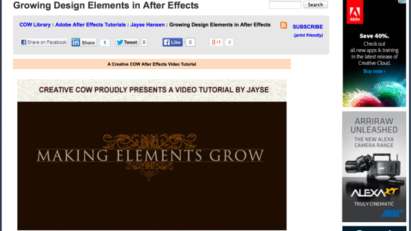
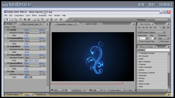
While Jayse’s tutorial hit a nerve, shortly afterwards Video CoPilot launched “Evolution” – a collection of pre-animated growing design elements that came with a few free design templates. With Video CoPilot having such a broad reach amongst After Effects users, news spread fast.
With Evolution, users could create cool new growing and flowing designs quickly and easily. With very economic pricing for their bundle, it appears the product was a success and soon all sorts of videos and presentations were sporting – or should I say sprouting – a new look.
iPod Nano TVC
2006
Lightstreaks
By 2006 the original Apple iPod had a clearly established identity thanks to the iconic silhouette ad campaigns that had been running for a few years. When Apple launched the new Nano model at the end of 2006, they tweaked the visual style of the silhouette theme and introduced glowing lightstreaks.
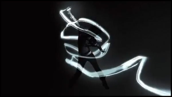
Shortly afterwards, tutorials began to appear demonstrating how to recreate the lightstreaks in After Effects using Trapcode’s Particular, and the corporate world’s love affair with lightstreaks began. When Trapcode updated the Particular plugin to version 1.5 they even added a new streaklet particle to make the whole process easier.
Personally, I was incredibly impressed by the Video Copilot lightstreaks tutorial. When it was made in 2007 I hadn’t used Trapcode’s Particular before, but I had always assumed that a particle plugin would only be used to generate explosive particle visual effects. It had never occurred to me that you could use a particle plugin to draw a line – and a line that was in 3D space! I often wonder who thinks of these things first. Hats off to them…
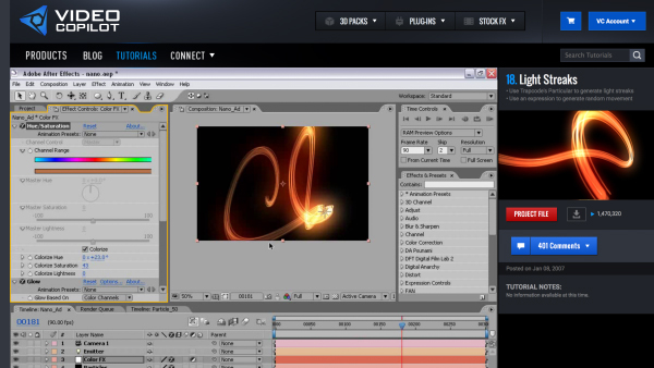
Video CoPilot’s Lightstreaks tutorial… In 2007 mind=blown!
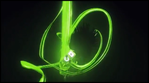
Lightstreaks are the salt and pepper of the corporate video world – you add them to anything bland to make it more interesting. If nothing else, lightstreaks can introduce movement to logos, titles, text captions and so on. In the corporate world, where trends and styles change slowly, lightstreaks can still be seen as a modern, cool look.
Lightstreaks are now such a common, ubiquitous visual device that it’s difficult to come up with anything insightful to say about them, so I’m not going to try. They’re frickin’ everywhere.
Hewlett-Packard “Hands” TV Commercials
2006 – 2009
Production by Motion Theory
Before I look specifically at Hewlett-Packard’s “Hands” campaign, it’s worth putting them in context first.
Almost by default, businesses use PowerPoint to communicate. Nearly all conferences, presentations, pitches, product launches, inductions, etc revolve around some form of PowerPoint presentation. Even the way that PowerPoint presentations are structured can be taught and formalized- marketing people will talk about beginning with a ‘value proposition’ and ending with a ‘cta’. PowerPoint presentations may rightly have a reputation for being boring, but they are how businesses think – PowerPoint is a window to their soul.
When production companies are commissioned to produce a video for a corporate client, the brief itself may be a PowerPoint presentation. Sometimes companies specifically want an existing PowerPoint presentation re-created as video to make it more interesting.
This is the perennial problem that faces video producers, directors, and motion designers every day. The whole point of corporate video production is to create something more interesting, engaging and entertaining than a PowerPoint presentation, but they’re so pervasive it’s difficult to think differently. Just how exciting can a list of text bullet points be, anyway?
The problem isn’t just one of creative imagination. It’s that big companies can become so bogged down by the slideshow paradigm that they just can’t imagine approaching a video production from any other perspective. By the time you factor in trying to get cooperation between multiple departments, legal approval, corporate brand guidelines and so on, in some cases there’s very little wiggle room for a video production to be anything more than a glorified PowerPoint.
But if you’re going to make a glorified PowerPoint, you may as well do it in style – and that’s what makes the Hewlett-Packard “Hands” campaign such a great reference. The fundamental visual device – hands – can be adapted to anything that exists in a slideshow format, it’s a universal approach to transform a simple presentation into a visual fx masterpiece.
Although the original TVCs were only broadcast in the USA, they quickly spread online amongst motion designers worldwide, and websites such as Motionographer helped bring the spots global recognition.
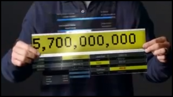
The “Hands” TVCs are instantly recognizable because they don’t show the presenters head – even when the presenter is an international celebrity. This alone is pretty funny, and I would love to have been in the room when it was pitched that they’d use a superstar like Jay-Z but not show his face.
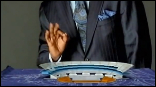
I’m a celebrity, get my head out of here…
Instead, each TVC is structured around a sequence of choreographed hand movements which reveal images, illustrations, effects and so on to match the voiceover. Each individual moment may only last a few seconds before transitioning to the next – and the transitions themselves tend to be clever and eyecatching. With all of the animation tightly motion-tracked to the movements of the hands, the scenes feel dynamic and integrated.
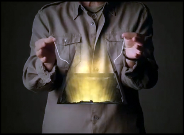
Live-action hands interact with animated elements in motion-tracked 3D space.
The actual execution of the campaign by production company “Motion Theory” is flawless, and an insightful “making-of” video exists on the internet that demonstrates how much work goes into each gag.
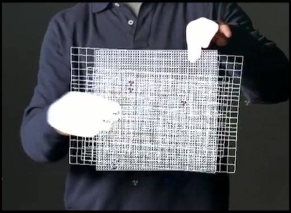
The overall “hands device” is visually interesting, novel, and entertaining. The campaign seemed to have been hugely successful for Hewlett Packard, and judging from online articles it seems they ran them for a longer period than they originally intended. By the time Jerry Seinfeld appeared in one in 2007, the spots were so well known he was almost doing a parody of the style itself, and he opens with a joking reference to the earlier Hands TVC that featured Jay-Z.
What’s so brilliant about the hands device isn’t just the eye-catching visual fx. It’s the fact that the basic device is so easily adapted to corporate presentations – the basic hands device solves a lot of problems faced by corporate video producers.
Firstly, the hands device can present otherwise boring information in a visually exciting way. Remembering that even though businesses basically think like PowerPoint, choreographing a sequence of hand gestures and staggering the reveal of graphics in 3D space can make even the most generic presentation look great. Something as basic as a reveal of text bullet-points can suddenly become a sequence of clever animated reveals, based on nothing more than a few waves of a hand. Graphs, photos, plans, diagrams and so on can now be presented in a way that’s much more interesting than a simple fade up. Just having hands wipe on a motion-tracked text super out of thin-air can look really cool.
In addition to solving the basic fundamental problem of making corporate information look interesting, the actual production process is technically challenging. This makes it exciting for everyone involved in making the video- the effect relies on a live action shoot, motion tracking, 3d animation and 2d compositing, all bought together by clever designs. It’s also not something that can be done overnight – it will definitely keep a post studio busy for a few weeks.
Even though the production requires a live action shoot, there’s no synched dialogue involved. Not only does this mean you don’t need a sound recordist on set, but it also means you’re not limited by the quality of a particular staff member’s delivery on camera. It’s reasonably common when making corporate videos to use real staff members, so they’re not professional actors and some are simply dreadful when they try to talk naturally on camera. There’s only so much you can do in post when faced with poor reads or stiff performances, but these issues can be mitigated or mostly avoided by using the “Hands” device.
Not only do people read much better when they’re not being videoed, but as you never see the presenter’s face then the audience will not know if you’re using the real CEO or a paid actor.
Producing a corporate video that uses the “Hands” device isn’t exactly simple, but if done well the final result will look great. It’s the sort of production that will look impressive on the showreel and can instantly elevate you (or your company) above the competition.
“Say what again” (Pulp Fiction) – Typography assignment
Jarrat Moody
2006
Kinetic Typography
Honourable Mentions:
MK12 Brazil Inspired: Machobox (2002)
JJ Walker Showreel (2004)
Bram Stege – Typography Assignment (2005)
I met the Walrus (2007)
Type Monkey Script (2013)
Animating type is not new, and for as long as there have been movies there have been opening titles, title sequences, dialogue cards, and other examples of moving type. It’s such a fundamental part of motion graphics design that a colleague of mine once commented that she felt like her job consisted of thinking of different ways to reveal text. Even a fresh install of After Effects comes with hundreds of text animation presets – so it’s not exactly difficult, either.
More recently, a distinct style of type animation has emerged that is now referred to as “kinetic typography”. In this genre, the entire piece consists of animated type reveals – the type IS the video. This style has become so widespread that you can even purchase an After Effects script to automate the process for you – Type Monkey.
When Jarrat Moody enrolled in a course called “Time based typography” at the Savannah College of Art & Design, he probably didn’t expect one of his class assignments to go viral, and instantly catapult his work globally alongside established motion graphics agencies. But when he decided to use a scene from Pulp Fiction as the base for his assignment, and uploaded the result to YouTube with the title “Say What Again”, that’s exactly what happened.
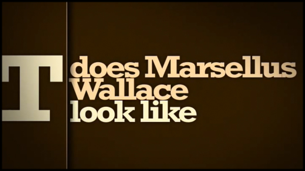
Jarrat Moody’s “Say What Again” animation is the piece that made people sit up and pay attention to kinetic typography, even though it wasn’t the first video made in this style. In fact – it wasn’t even the first piece of kinetic typography to use that scene from Pulp Fiction, it just happened to be the one that went viral.
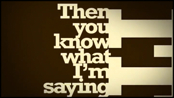
Jarrat emailed:
Not only did it go viral, but because it was a school assignment there were many other similar examples uploaded by other students. If you liked the Pulp Fiction scene, it was easy to find others to reference as well. After a few years, there were so many examples floating around that design sites started posting compilations and using the term “kinetic typography”. While keen designers will have seen many of these before, it’s Jarrat Moody’s “Say What Again” that everyday people and corporate clients are most likely to have seen.
At this point, I’d like to emphasise that I’m not trying to present a definitive history of animated type, and that I’m simply identifying particular pieces that influenced the corporate video world. However kinetic typography is an interesting case because the style is so dominant now and yet it is easy to find examples that are well over 10 years old.
The Savannah College of Art & Design is not the only school in the world to assign students the task of animating a scene from a movie using only type. More than a year before Jarrat uploaded “Say What Again” to YouTube, an art student in the Netherlands was given a similar assignment as part of his multimedia design course. Bram Stege thought about the task and decided to use the “Say What Again” scene from Pulp Fiction.
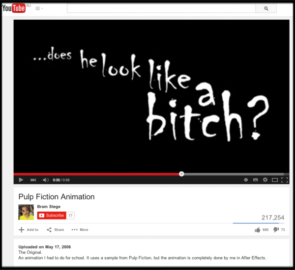
This is not the Pulp Fiction animation you’re looking for… a year before Jarrat Moody, Bram Stege used the same scene for his assignment. Great minds think alike…
Bram emailled:
So I took this sequence from Pulp Fiction because I thought the BIG letters could be used for the character of Samuel L Jackson and the small letters would fit Brett’s character. I tried to make this so that the big letters would push the small letters into the corner of the frame.
Both Jarrat and Bram were keen to point out that they were not the first to produce videos on this style, and while I can’t present every example of kinetic typography, I can nomimate a few earlier influences.
The earliest example I’ve found which is clearly recognizable as kinetic typography is a short produced by MK12 in 2002 called “Brazil inspired:Machobox”. It’s now over 12 years old, which is why the preview video is so small! It may not be as frenetic as the Pulp Fiction example, but it’s still clearly in the same genre.
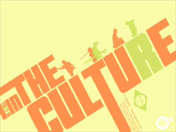
Made in 2002 by MK12, Brazil inspired:Machobox is instantly recognisable as a piece kinetic design / kinetic typography.
It’s great that this video is still online after 12 years, and as it was made at a time when the fastest Macs ran on G4 processors it’s also testament to the fact that great design doesn’t need supercomputers or special software.
Just over a year later, JJ Walker posted a showreel that was also very “kinetic” in style, and although it has more character animation than typography the dynamic (kinetic!) moves between frames are clearly identifiable. During these years before YouTube and Vimeo, the only way to share inspirational showreels was through online forums and email lists. When are really good one came along, you could almost see the ripples of influence spread online as the link was shared, discussed, analysed in detail and referenced for years to come.

JJ Walker’s 2004 showreel oozed style and cool, with kinetic transitions between frames.
When JJ Walker launched his reel in 2004 the link quickly spread amongst the online community. Many other designers were just as blown away by that 2004 reel as I was – it was so influential that I saved a copy as a reference, and even over 10 years later it’s a great piece of work (which isn’t true of the stuff I was doing in 2004!)
In part 1, I noted that the “digital rain” style in “The Matrix” was so influential that it inspired the release of custom software to create the same effect. Similarly, the style we now call “kinetic typography” has not just expanded to become an entire genre, but has also inspired the creation of custom software to automate the animation process.
Conceived by Orrin Zucker, and coded by After Effects expressions legend Dan Ebberts, “Type Monkey” was launched on the AEScripts website in 2012. Orrin Zucker, the designer of the Type Monkey script, says:
From a corporate perspective, there are two huge benefits to kinetic typography. The first is that you don’t need a huge bunch of assets to begin with. Although it helps to have a decent collection of fonts, beyond that there’s no need for a live action shoot or other stock footage. Kinetic Typography isn’t simply a genre, it’s also a solution to one of the biggest recurring problems faced by corporate video producers – what to show when there’s nothing to show. The second benefit is that it isn’t technically difficult to do – it’s the sort of thing a single animator can put together in a few days (short, simple versions in a few hours).
So even though you might not have any visual assets, and you may not have much time and money, kinetic typography is a style that will still give you a result that has great impact.
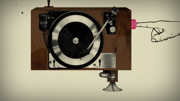
“I met the walrus“, mentioned by Orrin Zucker as an influence, was nominated for an Oscar in 2008.
iTunes – Coverflow
2006
Apple
In Part 1, where I looked at feature films, I said that the title sequence for the film Seven sparked the renaissance of modern motion graphics design, and Hollywood title sequences are generally regarded as the benchmark of high-end motion graphics design.
The exasperating part of this for anyone making corporate videos is that even though a film may be inspiring, it may not be relevant to the type of corporate work you do on a daily basis. The opening title scroll to Star Wars may be iconic, but not especially useful when you’re looking for cool ways to present annual sales figures at a board meeting (although I’d like to see someone try).
Launching a product, or presenting an updated range of products is a perfect example of something that Hollywood titles have had little influence over. A product shot is a product shot, and there’s only so much you can do with a product photo that’s interesting and innovative.
So when Apple released an update to iTunes in 2006 that included a new feature called “coverflow”, it was instantly seen as a new and innovative way to present a range of products or logos.
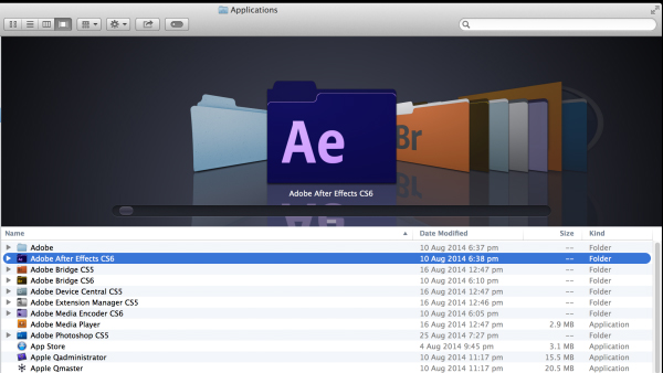
The coverflow effect soon spread beyond itunes and became part of both iOS and OS X, where it’s still a key navigational device today. After Effects tutorials and templates quickly appeared, and while the original Apple coverflow effect was a basic linear move, pretty soon designers worldwide were coming up with variations and more elaborate interpretations. I have lost count of the number of variations on the coverflow theme I’ve come up with over the years, some very simple and others very complex. My clients usually refer to this style as a “carousel”, and even though it’s been around for a while it can still look very elegant.
The Crisis of Credit Visualized
2009
Jonathan Jarvis
In 2009 a short, concise animation was posted on YouTube explaining the 2009 Global Financial Crisis. Like the “Say What Again” piece, it was the work of a student – Jonathan Jarvis. If you compare it to other YouTube videos – such as a cat playing a keyboard or a guy chasing a dog – then the number of views is respectable but modest. What the number of views doesn’t show is the incredible resonance this video had with corporate video clients around the world.
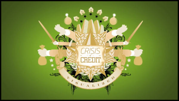
To appreciate the significance that “The crisis of credit” had on corporate videos, you need to appreciate how rare it is for a client to actually come to a video production company with a clear idea of what they want.
The crisis of credit is an example of a video that came out at the right time, with the right tone, on a topic that everyone was interested in.
“The crisis of credit” may well be the “Se7en” of corporate video animation.
It made accountants, bankers, lawyers and other typical clients sit up and say “I want something like that”. It demonstrated that corporate videos – and motion graphics- could be entertaining and engaging whilst also having a distinct style. For the first time office workers and other business clients who may have previously left concepts and design up to the production company were coming into briefs with a firm example of what they wanted.
The video itself was made using vector-style artwork that is now readily available from stock footage sites. The icons are just quirky enough to give the video a sense of style, but also normal enough to remain credible. Graphics devices such as the long arms give the video a sense of fun, whilst still being authoritative.
What’s every bit as significant as the choice of artwork is the simplicity of the animation. This is a corporate video that could feasibly be undertaken by a single animator. The actual animation itself was generally simple – basic reveals and moves with a bit of bounce, or even just a bit of wiggle.

With no live footage, no greenscreen compositing or other complex visual effects, even relative newcomers to After Effects would be able to put together something in a similar style. Subsequently, the video appealed to corporate clients not only because of the look, but also the budget.
Corporate videos may not have the glamour of feature film title sequences and visual effects, but they represent a huge market. It’s a pretty safe bet that on a global scale there are more animators out there producing videos for corporate clients than there are working on title sequences for Hollywood films.
In the corporate video industry understanding the context of your clients can mean the difference between winning and losing pitches. Corporate clients don’t necessarily want Hollywood level productions, and simply pitching the latest awesome movie title sequence isn’t going to land you work with accounting and law firms. In many cases, these corporate clients require videos that share lots of dry data in a clear and concise manner. They want videos that they can relate to, and not ones that look like Iron Man or Transformers.
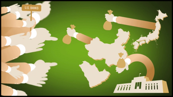
See the bendy hand? Accountants just love the bendy hand…
Producing exciting corporate videos for relatively straight clients can be challenging, and this is why “The crisis of credit” remains so significant.
When your accountant can’t wait to show you a video they found on YouTube that doesn’t involve a cat or someone getting hurt, you know it’s special.
Hungry Beast – ABC TV
2010
Designer: Patrick Clair
If you’re not Australian then you probably haven’t heard of “Hungry Beast”. In fact, even if you are Australian you might still be scratching your head. “Hungry Beast” was produced by the Australian ABC in 2010, and was a current affairs show squarely aimed at an undergraduate audience (that’s a fancy way of saying it’s for college students).
What set Hungry Beast apart from other, similarly undergraduate shows was the extensive use of motion graphics and the clear sense of design. There was no doubt this show treated motion graphics as a fundamental part of its identity.
In addition to short and clever stings between segments, each week “Hungry Beast” would include a longer feature animation on a topical matter, a segment they called “The beast file”.
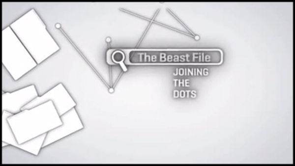
These distinctive animations consisted of one continuous camera move as many small icons built up to form a larger image. The hallmark of these longer pieces was the dramatic end-resolve, as the camera settled into its final position and revealed the overall shape that the many smaller images formed.
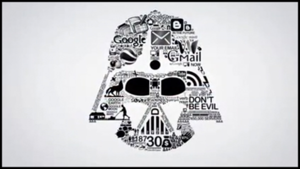
…skip to the end…
In terms of “feel” they always reminded me of the way I felt as a kid reading “Mad” magazine, when you had to fold in the back page together to reveal the gag.
While some of the Hungry Beast features went viral – the one on Google currently has over 800,000 views – it’s a safe assumption that many overseas viewers didn’t realise that these animations were part of a weekly television show.
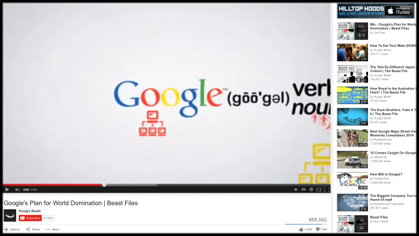
The Google one kinda went viral, but every episode featured an animation made in this style.
Like “the crisis of credit”, Hungry Beast regularly took fairly dry subject matter and turned it into entertaining, engaging and thought provoking videos. Like “the crisis of credit” these pieces demonstrated a clever and clean way of representing statistics and other business data. The use of many small icons to build up a larger image to be revealed at the end provided a strong narrative device and a clear, overall structure.
Also, like “the crisis of credit” the underlying animation techniques are fairly simple. Dealing with so many individual images and combining everything into one continuous camera move takes a certain level of skill and experience with After Effects, but it’s still achievable on a small budget when compared to organizing live-action shoots.
Subsequently – in Australia at least – “Hungry Beast” briefly became a poster child for corporate video animations. Corporate clients who were looking for a way to make their message look visually appealing were easily sold on the Hungry Beast formula used for their “beast files”.
While Hungry Beast was popular with its intended audience, it was always a niche show and it only lasted for two seasons. Now that it’s been off the air for a few years, the show itself is a dim memory – but the legacy of its motion graphics design lives on in the corporate world.
As for Patrick Clair, the original designer, he’s gone onto even bigger and better things – he recently won an Emmy for designing the opening titles to HBO’s “True Detective”.
Social Media Revolution
2011
Erik Qualman
There was a time, not so long ago, when you could use the phrase “social media” and no-one would know what you meant. It certainly wasn’t something that businesses were concerned with.
It’s amazing how different the internet was even 10 years ago. In 2005 Myspace was the most popular networking site in the world, no-one had heard of Facebook (it was only available to college students) and Twitter didn’t even exist.
But as it became clearer that the internet was rapidly becoming very important, businesses started to pay attention to this new phenomena, and the term “social media” was born.
All around the world marketing departments, advertising agencies and anyone with vague eye to the future could tell that social media was quickly becoming a big thing – but many of them struggled to convince their bosses and clients to pay attention. Social media was becoming a common discussion point at meetings, conferences and even marketing pitches – but how could an agency pitch a social media strategy if their client didn’t even understand what that meant?
At the end of 2010, Erik Qualman published a book called “socialnomics”, and soon afterwards he released a video that animated some of the statistics in the book, set to the distinctive FatBoy Slim tune “Right here, right now”. Both the book and the video were hits, and right now that original video has over 3 million views on YouTube.
Shortly afterwards, Qualman revised and updated the video and refined many of the graphics. While the original video was mostly text based, the revised 2011 version included several more visual elements – the opening, for example, featured a number of social media icons building up the letter S before zooming out. Other scenes that were text-only in the original video were replaced with more sophisticated graphics and animations.

Although the total number of views for the revised video is lower than the original, it was this new version – still with the same FatBoy Slim soundtrack – that went viral amongst marketing departments, agencies and office workers around the world.
What the corporate world loved about the video wasn’t just the style but the message. This was a video that tapped into a nerve running through the entire business sector, presented in an interesting way.
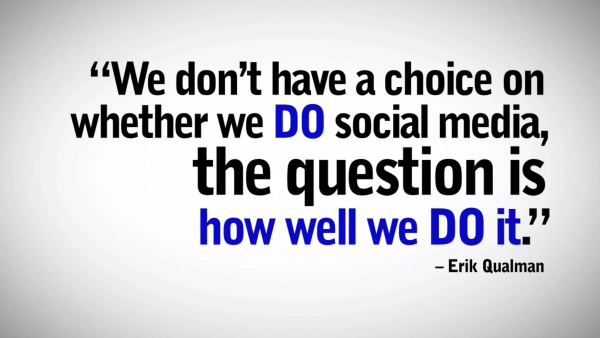
Of all the inspirations listed in this article (parts 1 & 2) the Social Media Revolution is unique because business clients saw it and wanted it exactly as it was. It wasn’t just the design they liked – it wasn’t the text reveals or kinetic moves between different frames that they saw as inspiration. It was everything – the overall message, as well as the visual style. Even the music. Clients around the world wanted THIS video – not just a video that looked like it.
From a production perspective, the Social Media Revolution is a simple piece – it had been made by a single animator. This is a style that doesn’t need actors, a live action shoot or even a voiceover. It doesn’t need a team of visual fx experts, complex compositing or fancy effects. In fact, the end result can be seen as a glorified PowerPoint presentation – it’s really just a collection of statistics, quotes and bullet points. It would be easy to extract still frames from the video and build a PowerPoint presentation that has exactly the same content, just without the fancy transitions and music.
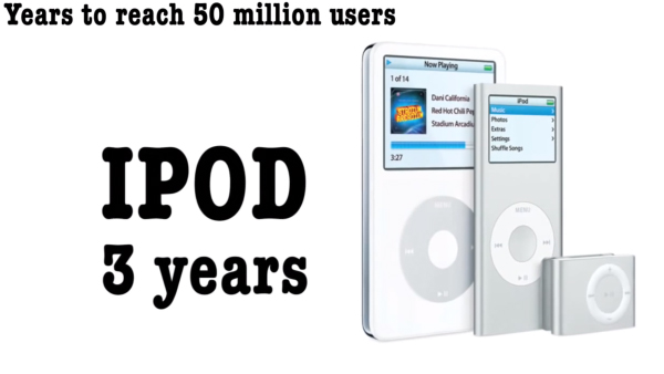
By using video instead of a basic PowerPoint, Qualman made the content more visually interesting. Although there’s a lot of text, it is revealed in interesting ways (but only using standard After Effects text presets) and the transitions between scenes are used to emphasise key points, not just to move from one scene to another.
I’ll finish up with a personal confession. Since 2009 I have remade this video for different business clients at least twice. In both cases, the client wanted the same video, just with a few extra facts unique to their company, and with a few extra quotes from their own staff members. I had to remake it from scratch to match the ultra-widescreen formats used in their conferences, but otherwise the underlying content, the style of the graphics, the transitions and so on – even the music – was the same.
Filmtools
Filmmakers go-to destination for pre-production, production & post production equipment!
Shop Now