I’m a huge fan of the TV series Mr. Robot. Not only does it have one of the deepest and most intricate storylines I’ve ever seen on TV, but the photography is wonderful. I’ve been analyzing the compositions and trying to figure out why they work, and doing some of my own experimenting on Instagram. In this article I’m going to look critically at a scene from Mr. Robot, and then show some images from my Instagram feed that try to replicate this style.
Here’s the scene I’m going to look at. (I tried to embed it, but Youtube embeds the wrong video.) Go take a look, and then come back.
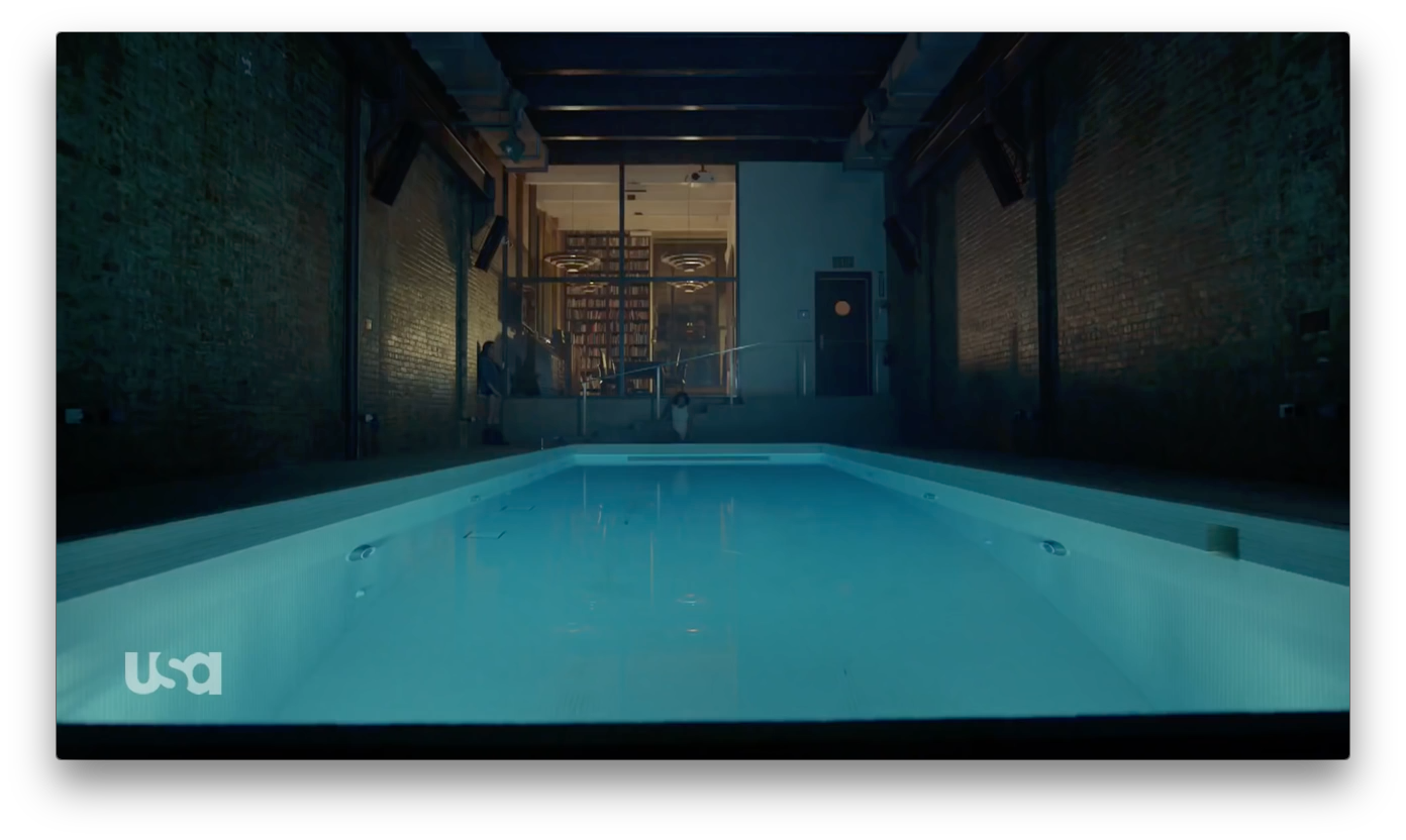
This is a style of framing that I love, and I see it a lot in David Fincher’s work: the camera is a passive observer, almost too cool to be involved, and sometimes the people within the frame seem the least important thing in it—but that only draws more attention to them. I feel some of that here: the symmetrical composition emphasizes the space, and the foreshortening of the pool leads the eye back to where the actors are… but somehow the people aren’t that important. Being humans, though, they are the most important objects within the frame to other human beings, and that dichotomy—that we want to see the actors, but they are not important to the composition—is what makes the frame interesting.
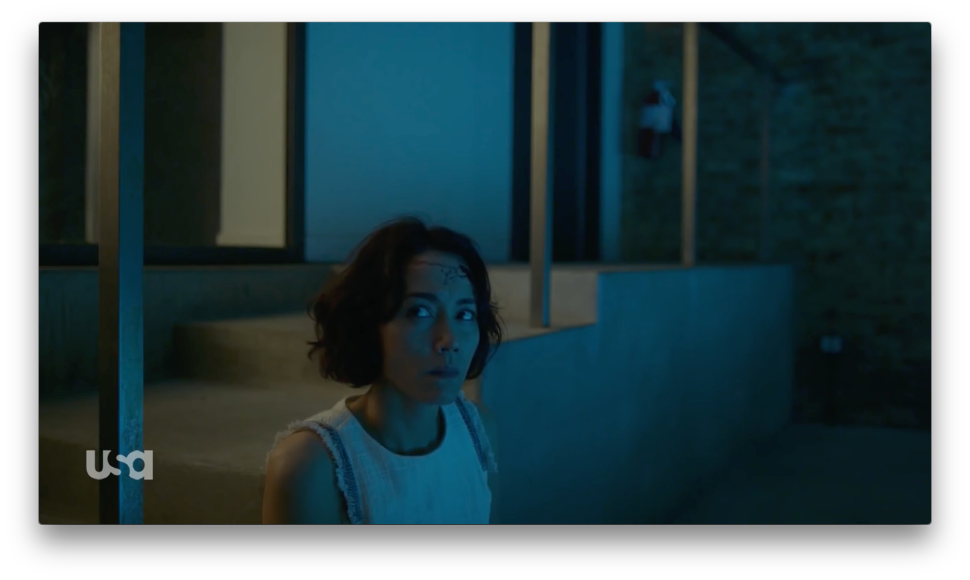
I love this frame. People are nearly always framed “wrong side” on this show, but I love the look. It’s so much more interesting than the same old thing. Leaving space for the “look” is standard to the point where it has become formulaic, and such frames often require an opposing angle to complete them: they aren’t full frames in themselves, they are meant to cut with another frame with an actor on the opposite side of the composition, and the two frames together balance each other out.
This is a completely self-contained shot. It’s a still photo. The warm/cool contrast divides the two spaces scene in the wide shot, and all the lines in the composition lead us to the actress: the line of the steps, the greenish-blue foreshortened side of the steps, and the strong verticals push us toward this actress.
Painters use a lot of tricks to move the viewer’s eye around a frame, and many of them are seen here: the actress is framed by verticals, and she sits at the intersection of a number of different shapes and hues. One of my favorite books, “The Simple Secret to Better Painting,” talks about several “secrets,” but the one that comes to mind is the mantra “Never make any two intervals the same.” Placing a subject the same distance from the side and the top of frame is boring. Centering a subject can work, but otherwise repeating distances from the sides of the frame, or within the frame, can be dull. She doesn’t sit directly between two verticals, she’s slightly offset. She’s not in the middle of the horizontal frame, but slightly offset. She’s low in the frame, not quite halfway between top and bottom.
Her look, towards the short side of the frame, almost draws me in to the story more than a standard frame would, because I feel as if she’s uncomfortably close to the person speaking to her. The action feels as if it is happening just beyond the frame edge, and there’s not a lot of distance between her and that edge. We’re used to seeing some space in front of the person who is talking, so when that space is shortened it can feel as if they don’t quite have enough room to breath.
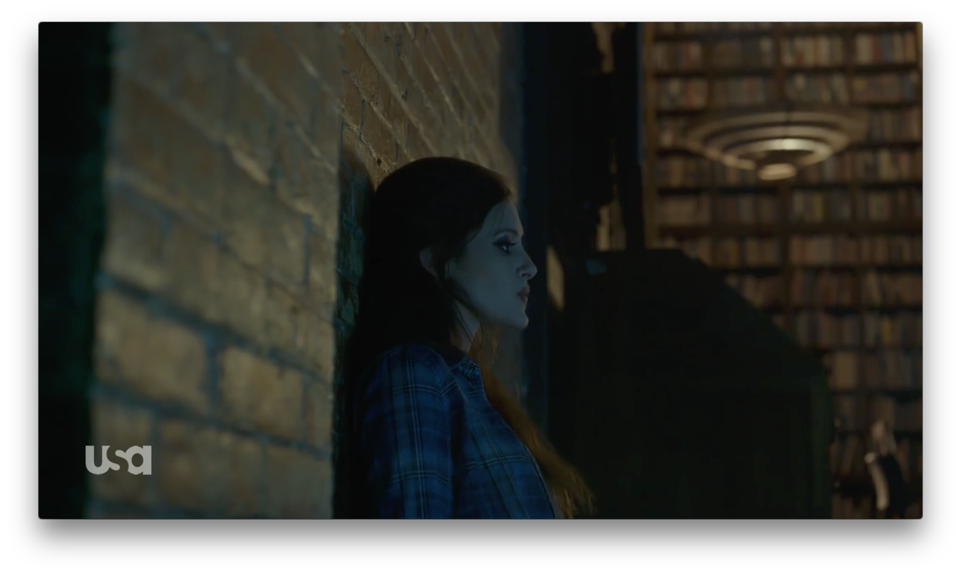
In this case, this actress’s eye is almost exactly in the center of the frame. The center of frame is a position of power, and as she’s the kidnapper and the other woman the kidnappee, this makes complete sense. My eye moves in a line across the frame, from the shiny wall to her left, through her face and to the light fixture in the background. The combination of this line, and her vertical body placed dead center of frame, creates a powerful, static frame full of tension. The side view control indicates that she’s feeling detached, even though she’s in control.
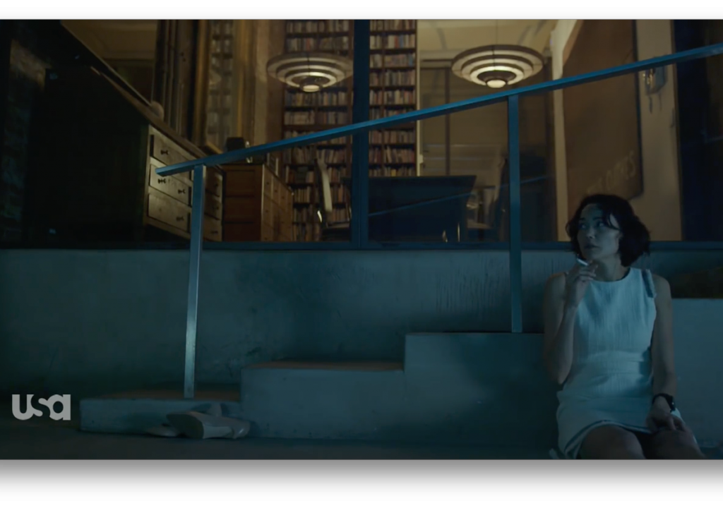
This frame harkens back to the first frame we saw. We could take the actress out of the frame and it would still be complete. The fact that she’s in there is important, but she’s clearly the one object that could be eliminated from this image if need be. The fact that the frame is so symmetrical otherwise, and she is placed on the very edge of frame, just makes us look at her more. The camera almost doesn’t care that she’s there.
This is an interesting example of vertical balance. Left-right balance is often taught in schools, but vertical balance plays a large part in both painting and still photography. The warm library in the background is balanced by the coolness of the steps. The light fixtures could almost be silent uncaring observers. The actress is balanced diagonally by the desk at the upper left. If I let my eye roam through the frame, it starts in the center—after the edit—and then moves to her. Then it moves down the steps, up to the desk, across the lights, down the painting on the wall, and back to her. That’s considered to be the perfect painting composition: when elements within the frame draw the eye around the painting in a circle and keep your gaze from leaving the frame. This is harder to do when a painting sits on a wall, surrounded by other beckoning paintings, so painters work very hard at keeping your attention focused on and moving around their image for as long as they possibly can, as that’s very pleasing to the eye and helps to sell paintings.
The difference is that, in paintings, corners are sometimes called “eye drains” as they lead the eye out of a painting unless there’s something to keep your attention contained. I don’t find that to be the same with motion pictures. The edges and the corners of the frame are often the most interesting places. I’m not sure why, but it could be because two strong edges—one horizontal and one vertical—come together, and objects placed there are emphasized by the complementing edge. In this case, the actress’s proximity to that right vertical edge, and her vertical posture, combine to make this a very compelling frame. Her vertical posture would still be interesting at the center of the frame, but her close proximity to the vertical edge adds something striking to this composition.
The shots bounce back and forth a bit between numbers 2, 3 and 4 above… varying size and composition on the seated woman but not on the standing woman, who at this point is in control. Then we get to…
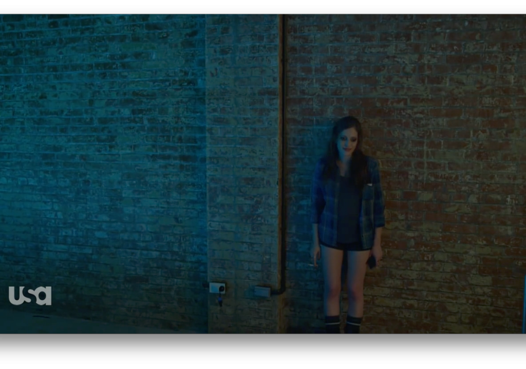 This is an odd but interesting frame. One thing that I’ve noticed about shots with a lot of headroom is that it makes us feel taller, as if we’re looking down on the action. Framing downwards can feel a bit too literal, but framing so that our natural horizon—where our head is level, our height is just taller than anyone else in the shot, and we’re looking horizontally into the distance—is just above the subject makes us feel a bit higher than if we’d simply raised the camera and tilted down. This also retains the verticalness of that support post, which would be keystoned if the camera was tilted down more. A keystoned shape would be less powerful compositionally than the perfect vertical edges seen here. Those vertical edges complement, and add strength to this actress’s vertical posture, even though we are looking down on her.
Once again, the composition only grudgingly makes room for the actress.
This next sequence is wonderful:
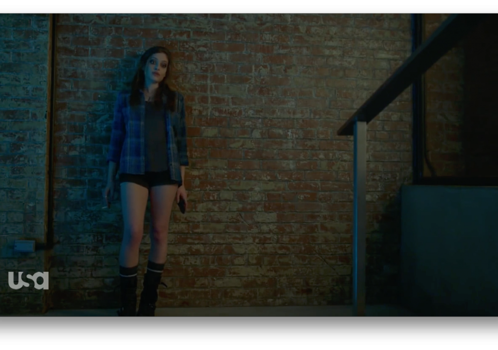
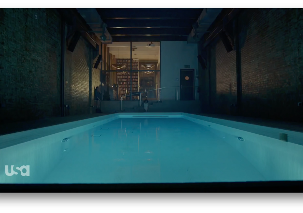
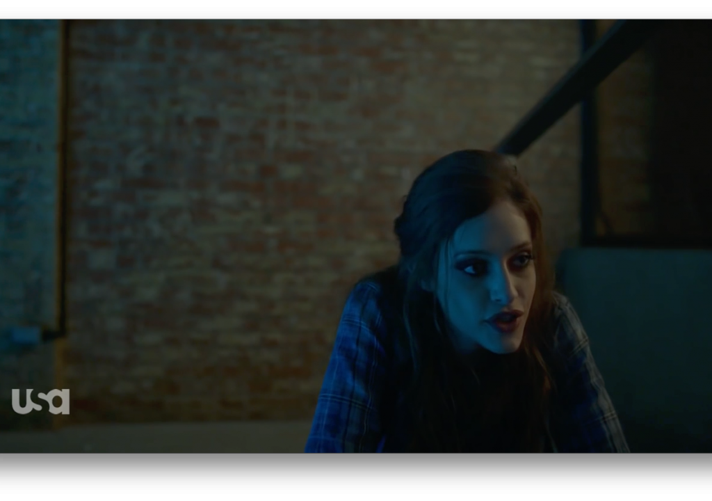
That top frame seems almost normal… but it’s only purpose is to set the stage for that last frame. The editor cut out to the wide shot for the middle of the walk, either because the shot died (became less powerful) or to shorten or lengthen the timing of the actress’s move, but that first and last shot are the same frame. The only thing that changed was the position of the actress, but her movement completely changed the composition of the frame. That’s hugely powerful.
Shaky-cam has been the rage for a long time, but I think the only reason it’s stuck around is because people who aren’t terribly visually sophisticated feel that it makes dialog and action more interesting. (I have worked with a director who, on more than one occasion, has walked over to the dolly in the middle of the day and said, “Let’s start shaking the camera. This material is really boring.”) Mr. Robot employs long, lingering takes, unconventional framing, and a static camera to create mood and stir emotions in ways that a constantly vibrating camera could never do. It’s almost as if they’re saying, “You, the viewer, are powerless to affect the events you are seeing… no matter how much you may want to. You are detached, and yet you are placed helplessly in the middle of the action.”
The diagonal line of the handrail guides us right to the actress, and the negative space and vertical post at the left push us right into her.
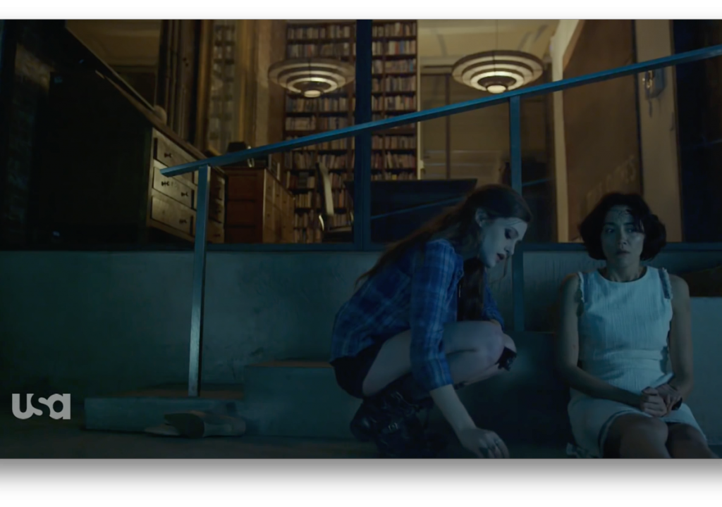
This shot confirms the uncomfortable closeness of the previous shot. The handrail now seems to frame their corner, but still… the camera feels detached and the composition seems as if it could care less whether there were people in it. That makes it much more compelling.
It’s interesting that the seated actress is accentuated by all the vertical lines in the frame, while the kneeling actress is accentuated by the diagonals (the stair and the top of the railing).

There’s so much free space on the right of frame, and yet our characters are crammed into the left corner. There’s a part of me that wants this woman to flee frame right. It’s as if freedom is just on the right of frame… but she’s trapped, and danger is only a short distance away. All that space is pushing her left, exactly where she doesn’t want to be.
If this action had been framed to the right, in a more traditional manner, then most of the frame would have been the body of the person on the left, and I think that would have been less powerful. One character would be pushing the other to the right edge of frame, whereas here the camera shows one character dominating another in a frame where there’s plenty of room for both, but it’s not being used.
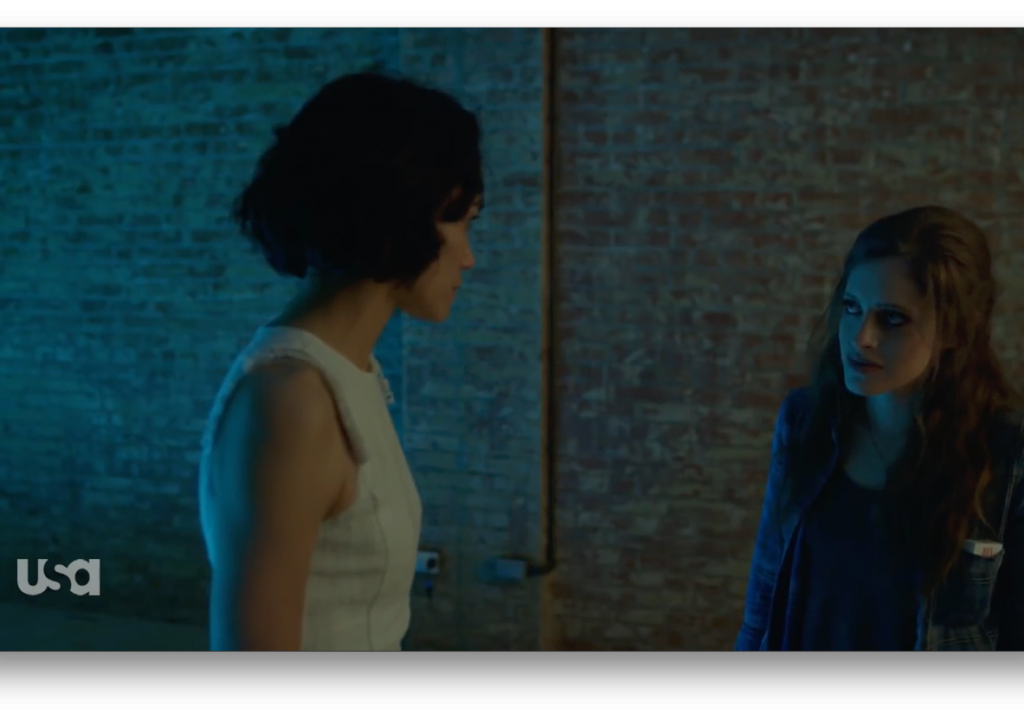
Things have suddenly changed. The kidnappee is now nearly in the center of frame—a position of power—and has a lot more space around her, while the kidnapper is pushed uncomfortably close to the edge of frame, and is partly cut off.

We’ve jumped the 180-degree line, but it works because we can see the geography: both characters are in frame in both shots and we can see their spatial relationship. If they’d been two disembodied heads in closeup then this would have been a much more jarring cut.
Notice that the frame basically puts us at the kidnappee’s head height. When we look at objects or people we put them in the center of our vision, so in a way it’s as if we’re standing right there, at her eye level, helplessly observing.
This power relationship doesn’t last long.
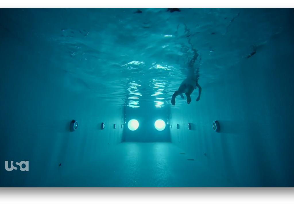
Once again, the shot is all about the geometry of the pool. The fact that there’s a person floating in it is completely incidental… and that’s what makes the composition so interesting. Creating such a strong, and symmetrical frame brings more attention to the one thing within the frame that breaks that symmetry.
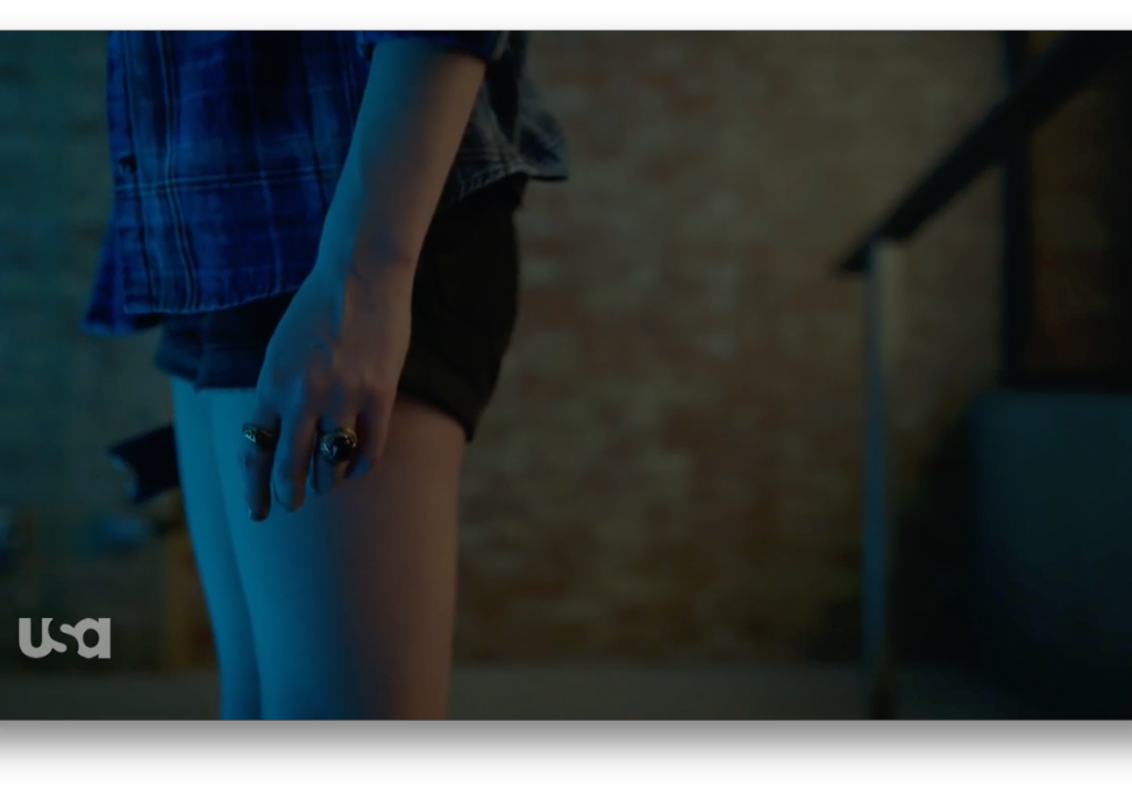
I love that this emotional moment is played entirely off the character’s hand and body movement. This shot finally allows us to participate by imagining what her emotions are, rather than explicitly showing us. This shot would have been boring if she were framed to the right. It’s almost as if space in front of the character can be interpreted as moving forward in time, because there’s room for forward movement and, in theory, time and space for other characters—and perhaps the viewer—to react to sudden actions. Putting the character against the frame edge like this, where forward motion would take her out of the frame, builds tension as it’s much easier for them to move quickly and vanish outside of the frame.
Also, as our eye moves around the frame, it is forced behind her and back again, while her attention is directed the opposite direction. If she had some lead room we could almost “see” what she’s seeing, but without the lead room there’s a bit more tension. It’s as if she’s looking out a window, but we’re too far around the side to see through it as well.
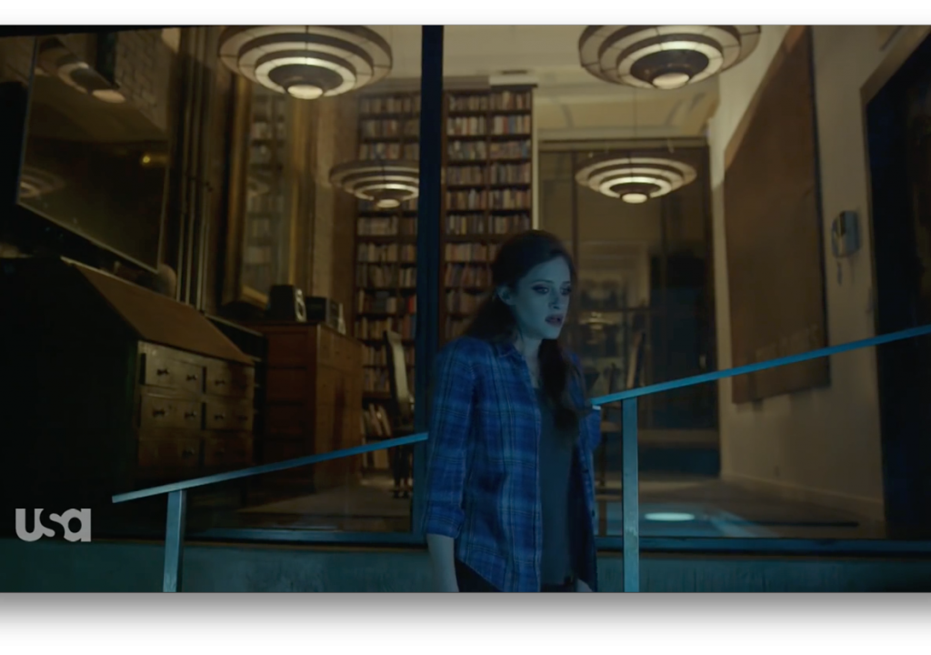
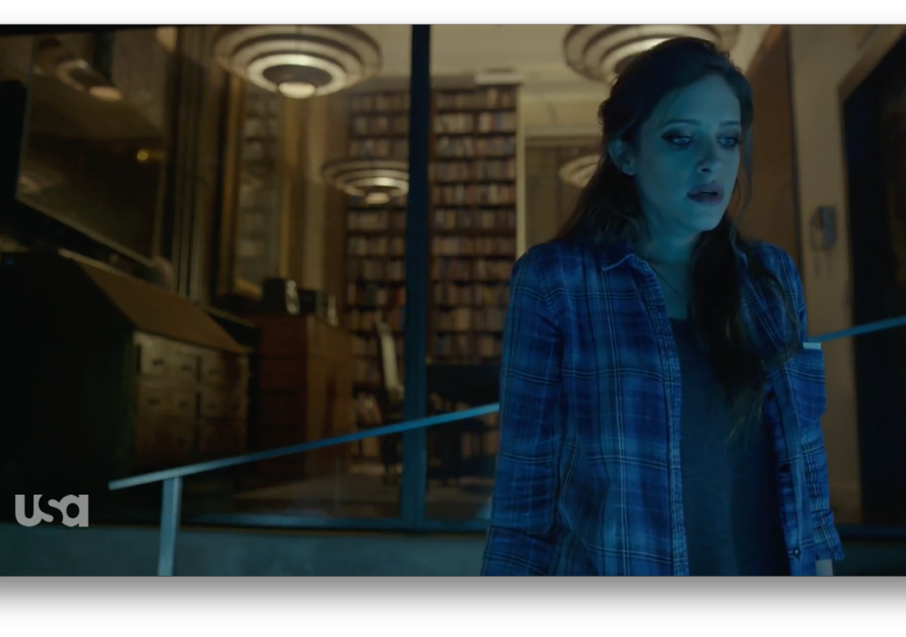
This show very rarely puts people toward the top of the frame, and the fact that she steps into this says something about how she feels about what she’s done. I’m guessing she’s shocked, but okay with it.
Once again, the camera doesn’t move and the background is fairly symmetrical. The one object that doesn’t fit in the frame is the character, and that only makes us look harder. Somehow her placement on the right side of frame, with her look going off the same direction, makes whatever is outside the frame feel just a little bit closer than it should. And when it came time to change the composition, the camera didn’t move—the actress did.
I strongly recommend you watch this series for its wonderful cinematography and its exceptionally intricate and thoughtful storytelling. Until then, though, I’m going to regale you with a few Instagram photos where I’ve been experimenting with the same kind of framing.

I took this late at night after flying in to San Jose Airport after an out-of-town job. I love the texture and shape of the ceiling, the row of lights along the wall, and the shine on the floor… all of which leads me to the vanishing point at the end of the terminal. In a way I’ve simply framed for the most interesting part of the view, but there’s something powerful about all those leading lines being “above” me at the top of the frame. Everything draws my eye to the end of the terminal, but there’s enough foreground contrast, shapes and people in the frame to make my eye move around the image repeatedly.


I photographed this dog twice: once on a tech scout, and once on a shoot day. I’m not sure what I like about the top picture, but I think it’s the juxtaposition of the dog at the bottom right, doing something in the very corner of the frame, and the leading lines either expanding, to bring my eye to the dog, or contracting, to lead them away. There’s a dichotomy here that works for my brain. My eye moves back and forth along those diagonals, and there’s satisfaction in landing on the dog.
The top picture just feels right. I like the diagonal lines that lead me to the dog, I like the curve of the leash running from the corner of the frame along the left edge, and the dog at the bottom left is diagonally balanced against the door at the top right.

I saw this while walking my dogs after a rainstorm. I start looking at the speed bump at the bottom of the the frame and then follow the vertical center line of the road up to the highlight, before changing course and returning to the speed bump, which stops my eye from wandering out the bottom of the frame. There’s some competition between the speed bump, which is a strong compositional element, and the diagonal shafts of sunlight raking across the leaves, which create interest due to contrast and texture.
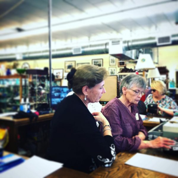
I hate antique stores, but I get dragged into them occasionally. I do my best to find interesting photographs while I’m inside. I very much like this shot: in a way, this is how I saw the scene, standing at roughly the same height as the woman in the foreground and staring straight at her. The line of heads leads me to the right, the lamps lead me to those beautiful overhead diagonal lines raking into the distance, and then I circle back down the verticals at the left of frame and return to the center of the image, which is a very strong position within the frame. The tabletop in the foreground directs my attention back into the middle of the frame and frames the bottom of the image nicely. In a way, this frame is just the right size to capture my field of view while balancing out perfectly.
This feels very much like a painting to me. And, indeed, this is how landscape or classical painters paint: they paint from their standing or sitting height, and their gaze extends horizontally to the horizon. A lot of the action falls below the horizon and the sky falls above. (I might have been standing on something when I took this photo.) I like how the bottom edge of the frame brings out the horizontal lines of the surfboards, and the (nearly) vertical sign post in the (almost) center of frame adds some interest, and keeps attracting my eye to the center of the frame. Vertical lines are very powerful, and that sign is the only strong vertical in the frame.
I feel like there’s an oval that runs from the surfer on the right, across the surfboards and surfers, up the blue umbrellas to the lifeguard station, across to the sign and then back to the surfer on the right.
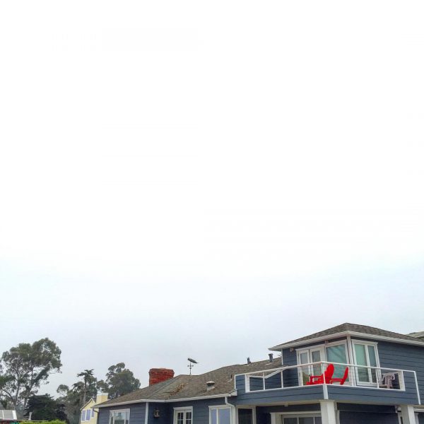
The only things that interested me in this shot where the bright red chairs, so I excluded everything else as best I could. My eye goes to the chairs, down the street to the trees, up and across the negative space at the top and back to the chairs. It’s as if the negative space is pushing my eye down toward the bottom of the frame.

Once again, this is framed as if I put a square box around my vision as I stared directly ahead. I like the symmetry and the feeling of detachment, while catching an interesting slice of life that feels perfectly balanced. I especially like the street lamp in the center of the shot. Rather than work around it, I used it—and the result feels as if the image is visually pivoting off that strong center. I love that it falls directly between the man and the surfboard, with the dog joining the two.
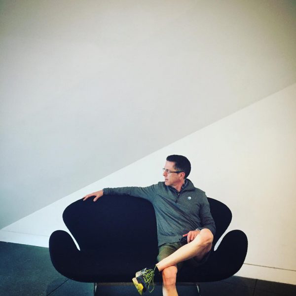
I love that the chair is level and centered, and the shapes on the back wall and the floor frame the subject perfectly. Once again, this image feels as if I captured my field of view as I looked directly ahead from my normal height… which is exactly what happened.
I feel as if the space at the top of frame is pushing my eye downwards, or at least containing it at the bottom of the frame.
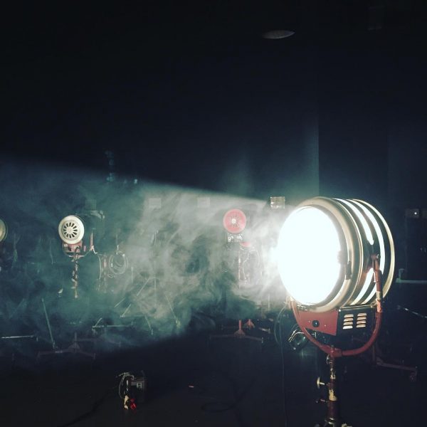
This works, but I’m not sure why. Going back to the painting analogy, there’s almost always more landscaping than sky in a painting because that’s how we see the world: when you’re close to the ground you see a lot of it but it’s flat and without a lot of dimension, while the sky is distant and all surrounding. Framing objects at the top of a frame almost seems artificial when I think of things in this way.
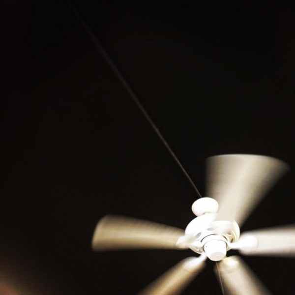
I’m not sure why I like this shot. It’s another bored still from an antique store, but the high contrast and the diagonal line that leads me to the fan really appeal to me. I like that there’s a focal point, but it’s not completely contained within the frame. There’s action happening outside of the frame that I can’t see, but somehow I can feel it.

Once again, taking a picture from head height and framing for a level horizon resulted in an image whose architecture frames the subjects beautifully. Shots dominated by architecture can yield stunning results when the composition frames a human subject or two. Extra points for the architecture being the focus of the composition, with the human subjects breaking its symmetry.

This is a composition that is all the stronger for having a square frame. It’s easier to perform a compositional balancing act between left and right in 16:9 frames, as there’s more horizontal space to work in than vertical. Top to bottom balance is harder in such a wide format as there’s not much vertical space to balance. A square format is easier to balance in both axes, but vertical balance is still possible in wide formats.
My guess is that “traditional” headroom exists because it is easier to simply fill a wide format top to bottom than to carefully balance elements vertically in such a narrow space.
In this case, I like the way the post on the left and the bush on the right combine with the ground to create a triangle that frames the dog. I like that the dog is centered, but the rest of the composition feels a bit off center.

I take a lot of pictures in airports, as they can be geometrically interesting to a bored person waiting for a late night flight. Here I like the blue monitors as a focal point, surrounded by strong lines that lead my eye around the frame and back again. For example, if I start at the monitors, my eye drifts right along that wide overhead barrier until it hits the post at right, which pushes me up toward the ceiling lights. The lights and the pattern on the ceiling push me back toward the blue monitors. This kind of composition, where the eye has a path it can follow repeatedly around the frame, tend to be the most interesting and pleasing. (This kind of guidance will become more important in a 4K world, where there’s so much detail in the frame that we must tell viewers where to look or they’ll become frustrated.)

I find myself balancing images in square photographs by placing objects in opposite corners. As we saw above in the Mr. Robot samples, this is also possible in wider formats like 16:9. (It might be a bit more challenging in 2.4:1.)

I saw this painting in an antique store and decided I liked the way it hung against that bright red wall. There’s some competition between the red border and the little girl that keeps my eye moving diagonally between the two corners. The bright red background almost pushes my eye into the little girl, and the fact that she’s also wearing a red shirt creates a sense of unity between the elements.

I shot this in a hotel room in Boston. I like that the window takes up the entire left side of frame, and the left edge of the window and the left edge of the frame complement each other. The black on the right of the frame balances the composition somehow. “Negative space” is when the shape of the space around an object becomes interesting in itself, but in this case the black is a tangible thing. It doesn’t feel like space to me.

Another airport shot. This composition draws attention to the people because they break the otherwise perfect symmetry of the train car.

I’m not sure why I like this photo of one of my dogs so much. Once again, the shape of the space pushes my eye to her, and I like that her eyes are centered left-to-right but the rest of her body extends into the corner in line with the top edge. The vignette also helps to contain my eye within the frame and define the shape of the space.

And, lastly, a very odd-but-interesting pseudo self portrait, taken in a restaurant in Santa Cruz. The screen is balanced diagonally by the brightly-lit column in the background, and the diagonal edge of the booth connects those two elements nicely. I really like this image, but when I shot it I didn’t have a sense of what I was creating. I framed the screen, and used some architectural elements to round out the frame top-to-bottom. I had no idea how interesting this would be until I looked at it later.
For most of my career I’ve focused on framing objects. I think what I’m learning from Mr. Robot, and from playing around on Instagram, is to let go a little and compose for space as well. I now look for opportunities to balance objects top-to-bottom and diagonally in addition to left-to-right, or use space to push my eye into a subject at the corner of a frame. I like to move my eye around the frame and see if it is comfortable sweeping around continually, or if there’s nothing to stop it from drifting away—in which case I might adjust the shot slightly to push my gaze back into the image.
In a way, this is a very left-brained way to compose, and I quite like it. I hope to do more of it. The problem is finding clients who are visually aware enough to let me. As a director of photography I tend to be a bit more advanced in that regard, which makes it hard to sell advanced or unusual concepts to clients who have a lot of money on the line and need to know that what I shoot for them will work as needed. Hopefully Mr. Robot shows that this kind of work has a place in the mainstream. It’s different (for moving images, but quite common in still images), it’s interesting, and it’s compelling. And it’s fascinating that, right now, the best storytelling—and some of the best cinematography—is on TV instead of in the cinema.
Art Adams
Director of Photography

Filmtools
Filmmakers go-to destination for pre-production, production & post production equipment!
Shop Now