Big, happy news came to light yesterday for most all Adobe Premiere Pro users out there; that is happy news for those who are on the Creative Cloud subscription model. The news came in the form of the announcement of another big update to PPro that should hit in October and bring a ton of new features to now just Premiere but also After Effects, SpeedGrade, Prelude and Media Encoder. No mention has been made of Audition (or Encore for that matter but Encore never made it to CC). Read on for analysis of some of these features.
This is some rather rapid development that we’ve been seeing in the Adobe products since the controversial release of the Creative Cloud. That was one thing that Adobe promised and they have been delivering (they're neck and neck with Apple's FCPX team!). From the Premiere standpoint of this controversy, I believe they have been delivering not just because they want to make good on the promise of the CC subscription model but because they taking their commitment to making Premiere Pro CC the best NLE out there very seriously. That is good for us editors.
While we’re on the topic of the Creative Cloud subscription model though … did you see this new $9.99 Photoshop Photography Program Adobe is offering that includes Photoshop and Lightroom as the two main apps? We’re still waiting for a similar program with only the video apps.
Here’s my 5 favorite features I found after digging through yesterday’s announcements. Where there is an accompanying video I’ve embedded that as well so be sure and watch through them for more details.
SpeedGrade Direct Link
Many of our users wanted a simpler, more integrated color workflow with Adobe Premiere Pro.
This is probably the signature feature of this update and that above quote from Adobe's overview video is probably the understatement of the year. Notice that the heading says Direct Link and not Dynamic Link. This is important to note and was even corrected by Adobe’s PPro product manager on Twitter:
@StrypesInPost @walterbiscardi @editblog @AdobePremiere Direct Link. 🙂
— Al Mooney (@al_mooney) September 9, 2013
In theory this should be a one menu click to smoothly and quickly open a PPro timeline in SpeedGrade that both looks and feels (and hopefully behaves) just like a PPro timeline. Yes Direct Link adds yet another bit of terminology to the lexicon but it’s important to separate Direct Link from Dynamic Link for a couple of reasons: Direct Link, at least to me, implies that this link is faster and more stable than a Dynamic Link. I’m thinking a near instant conform of that PPro timeline though I don’t see how it can be possible with an incredibly complex timeline. Second, for many Dynamic Link has a bit of a stigma in that in has burned a few on occasion when using complex Dynamic Links to After Effects. I know I’m wary of it because it has burned me.
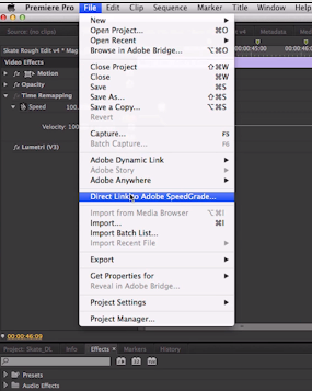
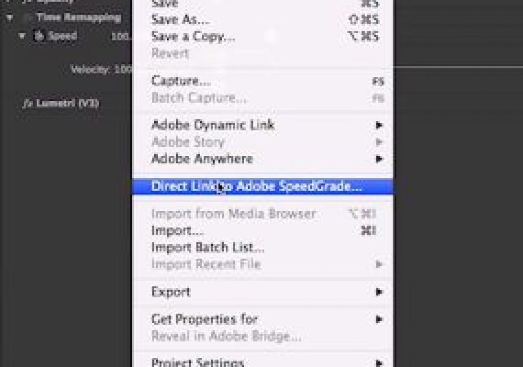
That Direct Link to Adobe SpeedGrade is a nice, new menu item.
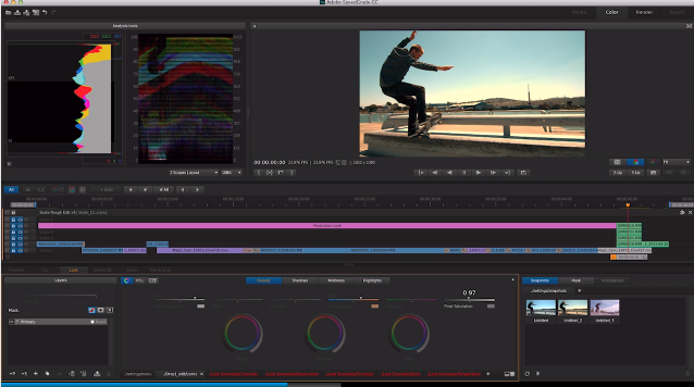
That timeline looks nice and (somewhat) complex but, most importantly, it is in SpeedGrade
The best thing about this new Direct Link for Adobe is that it will get people using SpeedGrade. No question about that. Adobe didn’t spend the bucks to add SpeedGrade to the suite just to have people use Resolve.
And it’s also worth noting that Adobe says “the Mercury Playback Engine has been added to SpeedGrade.” That should mean very good realtime playback if you have a good GPU. That’s one big plus that Resolve has always had over most everyone else: great playback with the right GPU. We’ll see how well this works with SpeedGrade.
Monitor Overlays
This is a feature that will probably be most loved by hardcore, dedicated editors. Since video clips contain any number of bits of metadata it’s often very helpful to see them! While Final Cut Pro 7 has long had an option for similar timecode overlays what Adobe has shown looks to supercharge this feature with a very customizable tool.
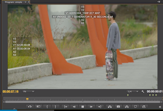
It's nice to see some data from source material ready to read!
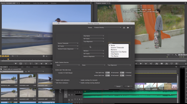
It's even nicer to see a box that looks like it has a lot of customization options
It would appear that you can choose exactly what you want displayed and you have some control over the area of the frame in which to display it. That’s a good thing. This will be most welcome. Why all this data isn’t currently available from the Info tab is beyond me. And this new timecode overlays feature better get it’s own keyboard on / off toggle shortcut!
Ripple deletion of sequence markers
While this feature isn’t mentioned on the update page it is mentioned in the video and it is very important. If you go so far as to place markers into an edit sequence then most likely you’d want those markers to move when changing the duration of a sequence via editing. The lack of the ripple movement alone means I often think twice about how to use PPro’s rather anemic markers when it comes to marking up a sequence. To have those things move with some edit operations is what we want. And while the video says “ripple deletion” Twitter has confined they should move with INSERT editing as well.
@editblog @adobepremiere Al Mooney just confirmed that it works with INSERT EDIT too…but not moving clips. It's a step in the right dir tho.
— Shane Ross (@comebackshane) September 9, 2013
So it doesn’t do everything perfectly but I’ll take it. Maybe next time we can get them to move when performing ripple trim edits. Speaking of trimming …
“leaner trim icons, new slimmer trim cursors”
These two thing are listed deep within the post about this upcoming release. They are listed separately and sound like they might be the same thing. PPro’s trimming functionality is a curious thing as it’s quite powerful and generally a joy to use if you’re coming from FCP7. If you’re coming from Avid Media Composer it’s frustratingly limited with some glaring omissions. One common complaint I’ve heard about PPro trimming (which was revamped in CS6) is that the cursor icons seem to often get in the way. There’s really no way to override it or turn it off ala Media Composer’s Smart Tool. Maybe this new slimmer and leaner trimming can remedy some of that.
Now can we get some real and proper dynamic slip and slide trimming?
Adobe Media Encoder enhancements
While Sorensen Squeeze is still my go to encoder overall, Adobe Media Encoder is very good and getting even better with this release. It’s integration with PPro will undoubtedly get me using it more. A couple of notes that are worthwhile:
• Native Adobe Premiere Pro CC projects – This is the biggie for me. While we have been able to send sequence from PPro to AME via a queue from PPro I’ve always found this to be a big buggy, especially with complex sequences. Batch Exporting has been a great FCP7 feature for years now so this support in AME will let editors do something similar: Give different sequences different encode settings and output them to different locations.
• GPU Enabled Rendering – GPU support has made Squeeze super-fast for H264 encodes for a while now. I’ll definitely be doing a speed test to compare the two.
• Watermarks and TimeCode overlays – This will make for a nice dailies and BITC generation tool. And image processing means you’ll be able to add a LUT to that ugly Log Alexa footage so your client can see something pretty as they are making notes and building a paper edit!
#myJDI
One JDI will be coded @ #IBC. TO VOTE: tweet 1 of these 5 most requested features & #myJDI by 6pmPST Tues Sept10: pic.twitter.com/cORZDkLF6M
— Adobe Premiere Pro (@AdobePremiere) September 10, 2013
And we can’t mention this coming Adobe Premiere Pro CC update without talking about the +1 more feature – decided by YOU. This comes in the form of a JDI or “Just Do It” feature. Adobe is holding a Twitter contest to decide which of these features “they will add ”will be coded at the IBC Show and included as well.” The contest only runs from Monday, Sept 9th at 6pm PST to Tuesday, Sept 10th at 6pm PST so by the time you read this it’s most likely over but here are (were) the choices:
- Render Multiple Sequences: Ability to highlight sequences in a bin, and choose to render them all – not encode, just render any effects on those timelines.
- Add Effect Preset: Double clicking an Effect Preset adds it to the selected clip instead of editing the preset. Making them the same behaviour as adding the base effect or plugin keeping workflow consistent.
- In/Out Ripple Delete: Ripple Delete works on in/out ranges not just selection
- Add Keyframe Shortcut: An Add Keyframe keyboard shortcut.
- Toggle All Target Shortcut: Ability to toggle target all tracks on and off at the same time.
Okay, the Twitter contest is kind of a gimmicky thing but it’s nice to see Adobe constantly looking at the simple little things like this. If these types of things are easy enough to add that you can do it at a trade show then have a few folks work an extra weekend and give them all to us!!
My vote is the #4 Add Keyframe Shortcut though #5 would be nice too. Hell they all would be nice. I’ve seen a lot of people voting for #3 In/Out Ripple Delete: Ripple Delete works on in/out ranges not just selection … but you can already to this for the most part via the extract command:
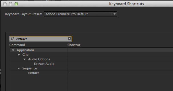
Get to know the EXTRACT command and you kind of already have a Ripple Delete that works on IN to OUT ranges.
If you want it to delete just a single clip then use Mark Clip command (default keyboard button is X) to mark the clip via an IN to OUT range and hit Extract (default keyboard button is ’ ). Try it a few times to see how it behaves as it is a bit different that a basic ripple delete but it's very close … and then go vote for #4 ! Hurry as the contest ends tonight.
The winners here are editors who use Premiere Pro CC.
Filmtools
Filmmakers go-to destination for pre-production, production & post production equipment!
Shop Now