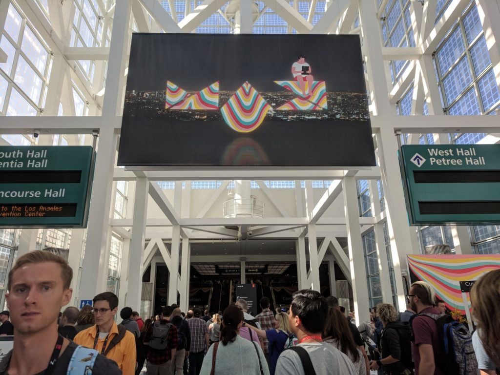
Over 14,000 people descended on the Los Angeles Convention Center for Adobe MAX, billed as “The Creativity Conference”. Every year, Adobe picks a city to host their massive get-together and this year LA was the happy host. Since it was a quick Metro ride away, I was sent to check it out.
I had never been to Adobe MAX, or anything like it, and I must say I wasn’t quite prepared. The last time I was in the Convention Center was for SIGGRAPH in 2017, but to compare the two was naive of me. Where SIGGRAPH was much more formal and academic, Adobe MAX felt like summer camp. The feeling was akin to expecting water and getting root beer.
We’ll get the important stuff out of the way to start: releases and updates. MAX coincided with the release of a handful of new updates to the Adobe Suite, many of which I’m personally excited for. Overall, the name of the game now and going forward seems to be leveraging machine learning in the form of Sensei, and enhancing the user experience.
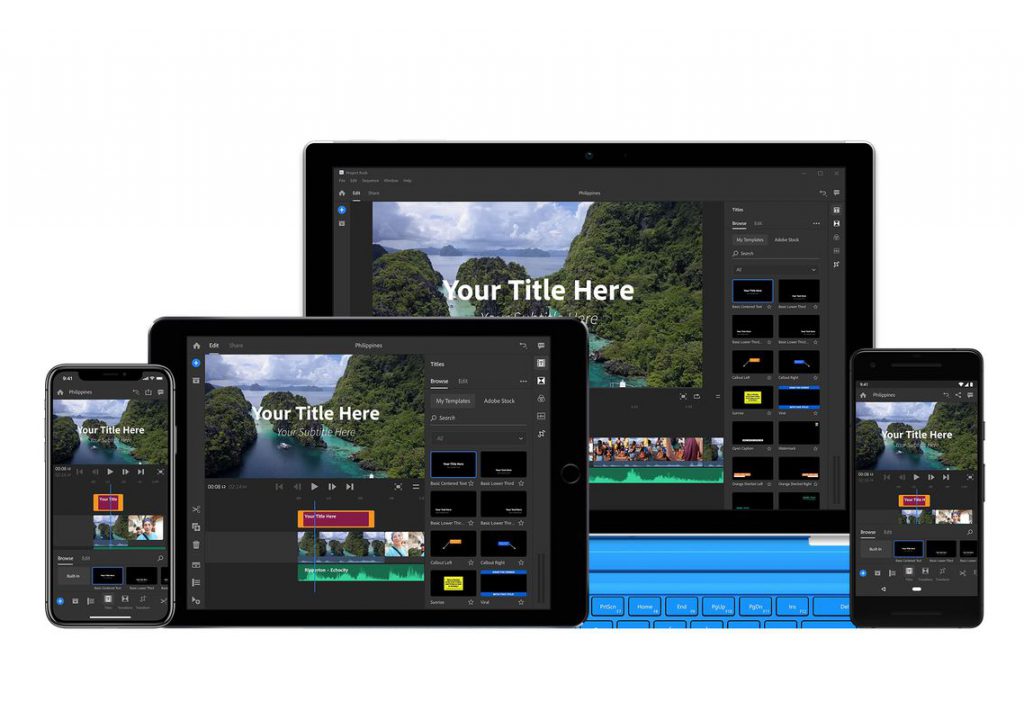
One of the clear points of pride for Adobe was launching Adobe Premiere Rush, a simplified cloud-based editing app designed to unify the user’s experience between devices and allow for amateurs and professionals alike to edit on the go. While the app is clearly aimed at the sort-of “YouTube Generation” of editors, or more specifically those whose primary platform is mobile based (Instagram, for instance), Rush could theoretically fit into a more experienced user’s workflow too as it’s just regular Premiere with less options, so the project files can be opened in Premiere Pro. Depending on your project, one could work on a simple rough cut via their tablet or iPhone and then polish it up in Premiere Pro. While you can open Rush projects in Pro, it doesn’t work the other way, so keep that in mind. There is also no Android version, so I’m not currently able to go hands-on with the mobile flavor as I’m Team Pixel. Rush is included with your Premiere subscription.
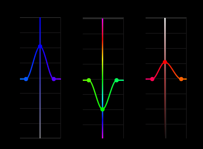
On the Premiere front, we’ve got a few updates I’m excited for as a colorist. Lumetri has plenty of punch, but it wasn’t necessarily intuitive for people who weren’t familiar with the entire Adobe ecosystem, namely Photoshop; things like the Hue/Sat “globe” aren’t traditionally present in film tools. With that in mind, Adobe updated Lumetri with five “vs. curves” (or as they call them, Selective Color Grading tools) and made them easier to work with by allowing you to move the color band from left to right (so Red, arguably one of the most adjusted colors, isn’t exactly on the boundaries of the work area. Resolve.) as well as by showing you what the adjustment actually does on the Y-axis. It almost teaches you how to use them as you use them. The five curves are, classically:
- Hue versus Saturation – Select a hue range and adjust its saturation level
- Hue versus Hue – Select a hue range and change it to another hue
- Hue versus Luma – Select a hue range and adjust the luma
- Luma versus Saturation – Select a luma range and adjust its saturation
- Saturation versus Saturation – Select a saturation range and increase or decrease its saturation
This update is deceptively simple but it totally changes the game with Lumetri, at least for me. Vs. Curves are present in most professional coloring suites and are vital to dialing in your look. If I’m honest, before this I wasn’t using Lumetri much. I’d do my edit, and then bounce it to Resolve for finishing. Lumetri just didn’t seem to do what I wanted it to when things got complicated, and I have to say it was partially due to the way it handled these curve adjustments. Plus I like the process of separating adjustments into nodes. Well, come to find out you can now stack Lumetri adjustments too.
Instead of adding instances of Lumetri in the effects pane, you just add another one in the Lumetri panel and the non-destructive adjustments remain separate and organized, as you can rename each “layer”. So somehow, without my input, Adobe handled both of my prior hang-ups with Lumetri. Imagine that. They’ve also added display color management within Premiere, as opposed to your OS, and some more audio tools (which have been awesome so far) in the form of Reduce Noise and Reduce Reverb sliders within the Essential Sound panel, which operate the DeNoise and DeReverb effects if you just want to drop those on your audio via the effects panel.
Another thing brought up during my conversation with Chief Adobe Evangelist and amazing-hair-haver Jason Levine was the new ability to modify Motion Graphics Templates (or MOGRT, pronounced like GoGurt) via spreadsheets. Data-driven effects always end up yielding creative results once people start playing with them but the obvious example here is if you’re, say, working in a corporate environment and post weekly updates or something like that. Instead of going in and editing the template every time, hoping your bleary eyes didn’t miss something, the department head or whoever can just keep the associated spreadsheet updated and it’ll update the template within Premiere. You can affect Text, Color, and Numbers in this way.
There’s a handful of other Premiere updates, such as to collaborative projects and Adobe Stock integration, that you can check out on the official site here. After Effects also got, aside from the color tools, some super nerdy JavaScript stuff that I don’t fully understand, as well as new puppeteering and time-scaling features (if you’re a big AE user, check out Rich Young’s updates here on PVC). Oh, and coming soon is content-aware fill for video. Levine straight-up deleted a running horse from a scene during his keynote by just using a simple circular mask. He then deleted the dusty hoof-prints by pre-comping that and painting out the offending area with a brush, re-running the content-aware effect. This is a harbinger of things to come.
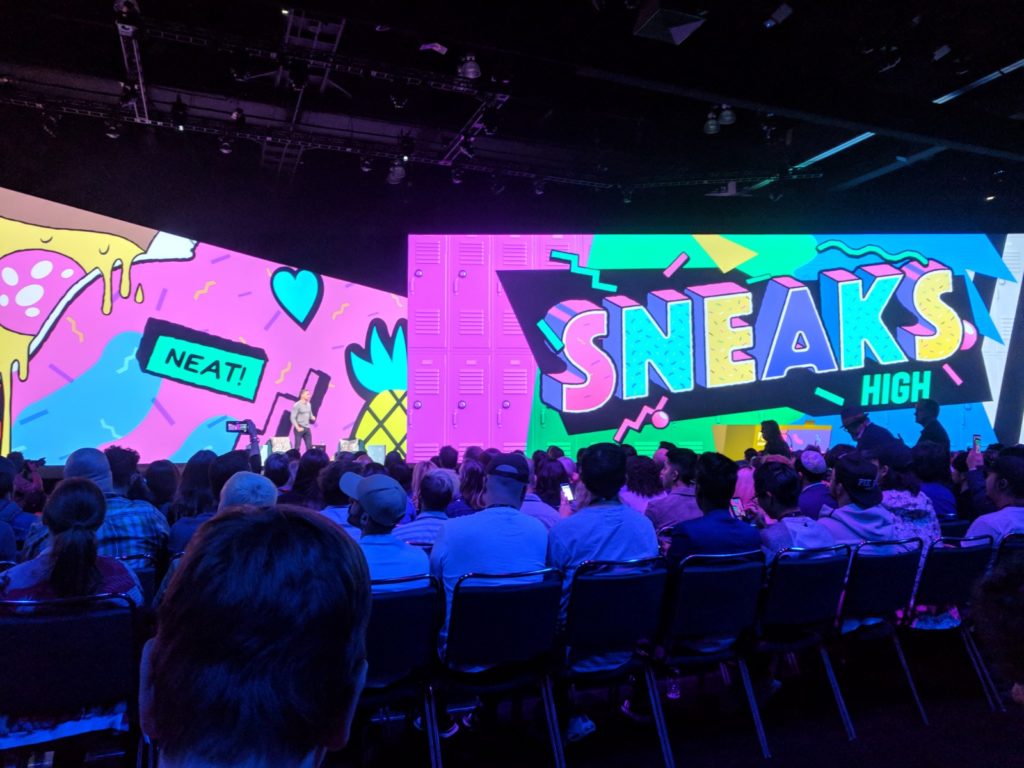
One thing that isn’t a release but I hope is on the way as soon as possible was something I saw in the “Sneaks” portion of the event: automatic masking. Project Fastmask is just raw technology right now, but using the machine learning algorithm they’ve developed as a way to auto-magically select and mask out objects using a few simple boundary clicks. Not only that, it animates that mask for you. I watched it work with my own eyes.
In one example the subject (a cat) walked behind a fence post and Fastmask picked it up on the other side, with only a few frames of adjustment needed. This, it would seem, is as simple as it sounds. The way it works behind the scenes is Adobe techs manually go through and teach Sensei “okay, this is a person, we mask them like this. This is a cat, we mask them like this.” a bunch of times until it figures it out reliably. Obviously, they can’t teach it every single object ever made, and I don’t know if maybe their AI starts to figure out stuff on its own at some point, or maybe makes educated guesses, but I’d even be happy if they released it right now where it only recognizes people. There are so many things I could use that for!
Usually making one big, animated mask in the shape of a person is inadvisable because adjustments are a nightmare and you can’t automate anything. Standard operating practice is to make multiple simple shape masks assigned to body parts (one for bicep, one for forearm, one for head, one for neck, etc) and animating those. If Project Fastmask is as accurate as demonstrated, that workflow will assuredly go out the window in favor of the automagic, where you only need to tidy up a few parts. Where foot meets ground and it masks the shadow a bit, or when someone does the “teapot” and it doesn’t pick up on the resulting arm hole initially, for instance. Very, very exciting stuff.
Another tool from the “raw tech” camp that I could see indie filmmakers using was a tool called Project Moving Stills. You’re probably aware of the “Ken Burns effect”, where an image is edited in such a way where it sort of mimics a depth effect, but it’s not necessarily realistic. Moving Stills somehow figures out how to properly separate the image’s contents and let you animate simple camera movements with realistic parallax. So booms, dollys, pushes, all doable with Moving Stills. While it seems like a novelty, my first thought was that you could probably use it to fake some quick b-roll or establishing shots by just going out and taking a picture, or using a stock photo. Or, if you’re shooting one location for another, have someone who lives in the real area go out and snag a photo for you; you don’t have to teach them anything about cinematography or pay for a local crew to get you the one thing. Obviously the subject of the image would have to be relatively motion-free (since you can’t fake granular movement like birds flying or cars driving by) but for the right job this would do well. Stills cameras have way more resolution than their video counterparts, so it stands to reason that with the right post-processing it’d blend in pretty easily. We shall see!
As I said at the top, as this was my first time at MAX and only my fourth time going to a large conference like this, I didn’t go in to this experience with much in terms of expectations. I mentioned SIGGRAPH, which was also at LACC, and I’ve been to CineGear twice now, so MAX would probably be somewhere in between, right?
No.
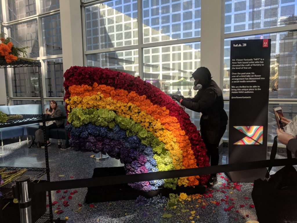
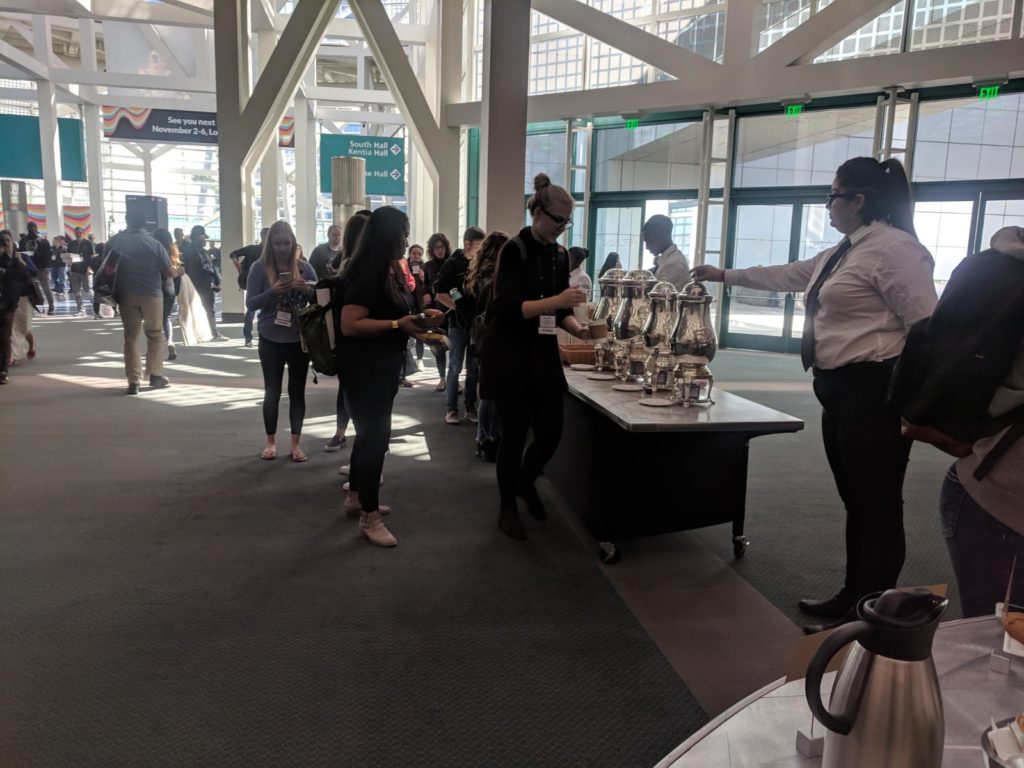
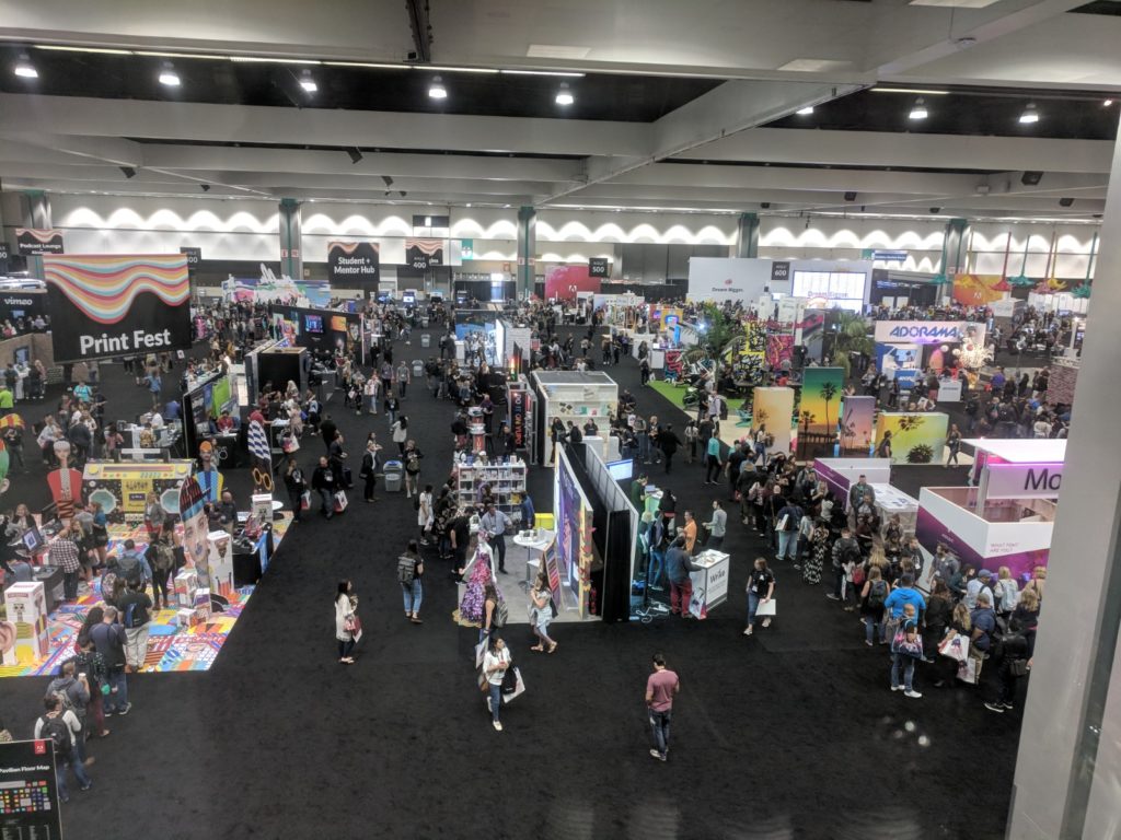
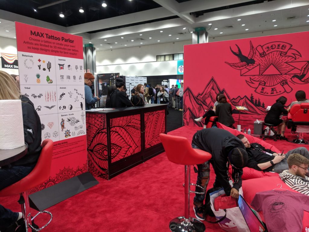
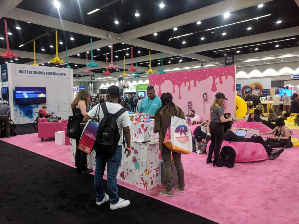
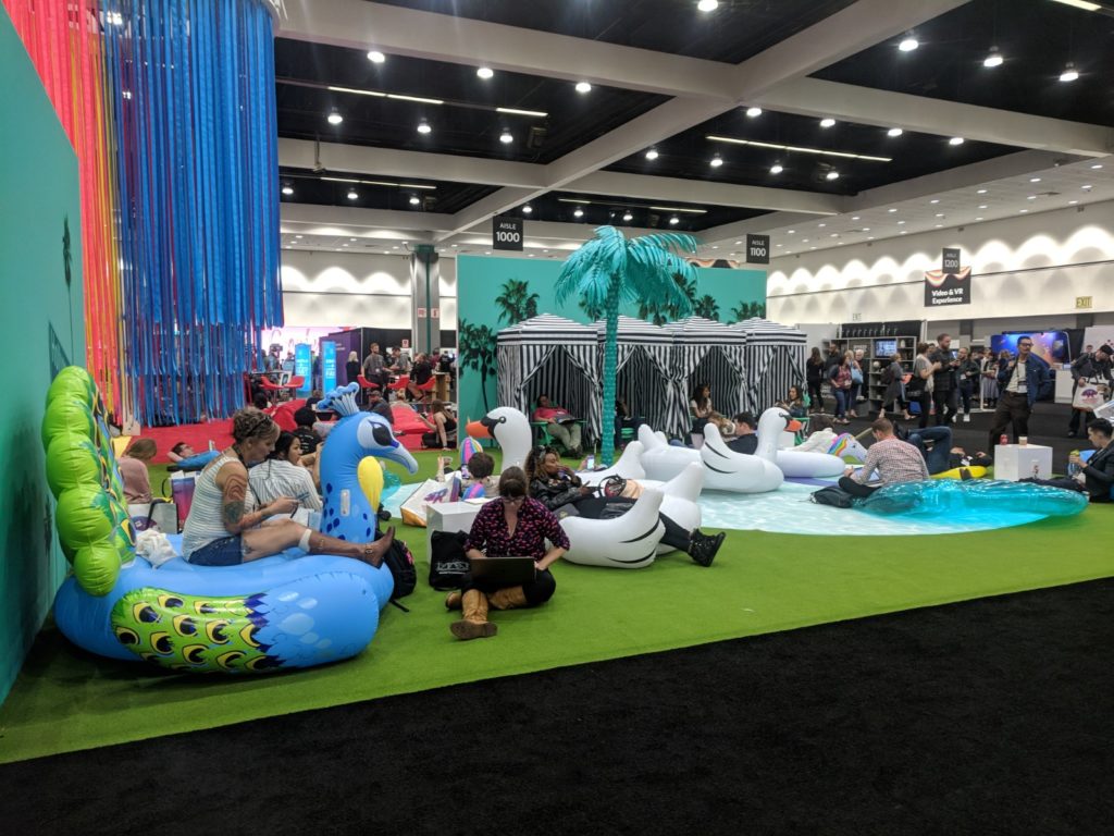
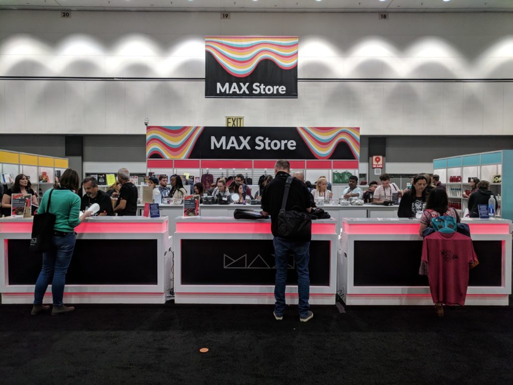
Adobe MAX felt like the first week of College. It’s the most expensive house party ever thrown, and since it’s a weekday you’ve gotta run to classes and lectures before you can come back to the festivities. The main hall was home to the party portion, half exhibition hall for vendors, half lounge for the attendees. A large portion of the companies involved had some high-end swag, premium raffles, or other free gifts for the attendees (nicer than traditional booth merch I mean) and peppered around the area were little open bars. At a certain point, carts full of food were wheeled out that everyone descended on before returning to one of the multiple themed seating areas, usually containing bean bag chairs or other loungey options.
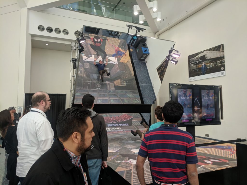
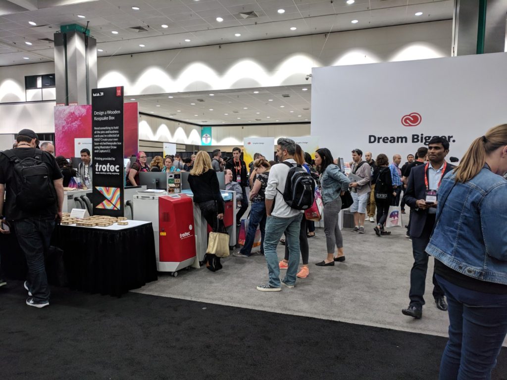
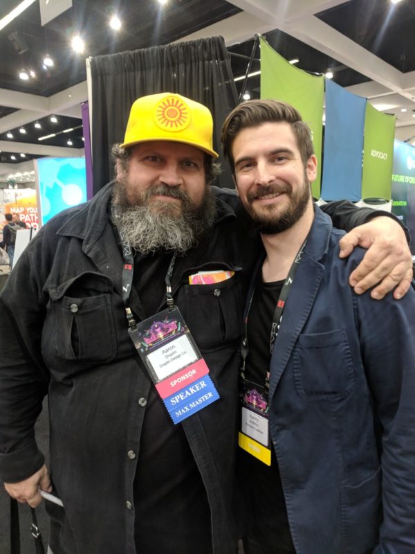
You could get custom items made with your images on them like wooden boxes and notebooks. There was a screen printing popup. Vimeo had some kinda walk-in infinity mirror setup and Airstream, the silver trailer company, had a big loungey “front yard” area dedicated to podcasting (for the record, they have some astonishingly nice trailers available). At one point I ran into the man who heavily influenced the design of my own company’s logo, Aaron Draplin. Needless to say, it felt more carnival than conference. And not in a bad way.
Throughout the Convention Center, if you’ve never been, are 64 smaller meeting rooms that were relegated to holding expert panels, seminars, and educational presentations aimed at bringing you up to speed or further enhancing your knowledge of the various Adobe offerings. There were also signings and the like scattered throughout, as well as additional food and beverage carts. To top it all off, visitors got a free hoodie.
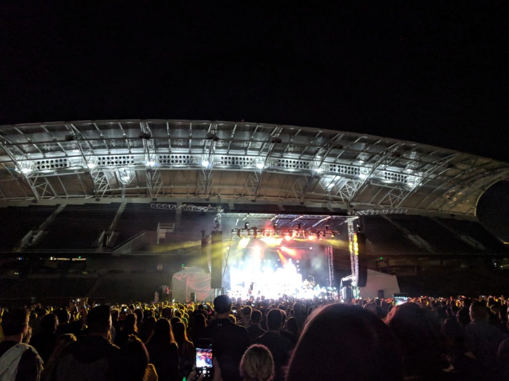
Actually, to top it all off visitors got to go to a private Beck concert at the Banc of California soccer stadium over at USC, which included more open bars and free food (all of which was genuinely delicious).
I was only able to attend 2 of the 3 main days, but even though I was there from morning ‘til night, I felt like I only saw less than half of what was available. There were a handful of vendors that caught my eye, such as BenQ, Samsung, Nvidia, and Puget Systems, and (if everything goes to plan) I’ll have some of those products up here in their own reviews. Obviously those will be post-centric, but as more and more of our work as filmmakers takes place on the computer that aspect of the job will require more and more close attention.
Samsung was touting their new ultrawide curved displays, like the 21:9 34” C34J79 model or the almost comically-huge 32:9 49” C49HG90, which every editor could potentially benefit from by giving you the room to view more of your timeline on. I’ll be interested to see how using a curved display feels, but I know for a fact everyone wishes they had a larger workspace, even if they’re on multi-monitor setups. These ultrawide displays could potentially merge what would traditionally be a two-monitor setup if the user was in to that, and they’re really pretty both from a display and aesthetic standpoint so you wouldn’t be missing much. With new QLED technology and Personally I dig having a full, separate display for organizational reasons, but using an ultrawide as my main workspace and something smaller as a secondary/grading monitor would be choice.
Something like one of the BenQ displays, for instance. Where the Samsung’s monitors are factory color calibrated and look great, they’re more aimed at the business side of things with their visual accuracy as a bonus. BenQ’s displays have specific tools and designs specifically for color workflows that really make the job easier. Some of them have a “HotKey Puck” which allows you to switch between color spaces on the fly, and one monitor I was shown, the PD2700U, is a 4K, 10-bit, 100% sRGB/Rec709 display that has a feature called DualView where it would split your monitor down the middle, with your color spaces of choice on either side. Instead of previewing your video on different devices, just use that splitview. It also had a little sensor under it that would constantly adjust the image to match your viewing environment for when you’re just doing normal work that doesn’t require color accuracy. Like a room-specific f.lux-type situation, but it’s called Eye Care and is built-in. Interestingly, both companies are starting to take nods from the e-sports community, resulting in more premium design features (144hz displays and 1ms refresh rates, for instance) in more modestly priced units. BenQ may have a head-start on the gaming aspect, having been part of that industry for a while, but a rising tide floats all boats!
AMD and Nvidia both were showing off their workstation GPUs, like the WX9100 and RTX5000 respectively, but Nvidia had a little toy on display that helped me understand what’s going on under the hood in regards to all of these new “AI” powers Adobe had been talking about. It was a small screen that you could doodle on, and with every stroke of the digital pen, the system would attempt to figure out what you were drawing. All you were doing was making simple lines, but the machine learning algorithm was hard at work trying to match those lines to known objects. At first, it would just be a mess of colors (attempting to fit your drawing into the style of famous painters), but once it got a hold of what you were doing *bang*, there’s an ocean, with a sailboat, and that’s the sun up there on the right. Having just left the Fastmask demonstration, which had sufficiently baked my noodle, it was all starting to make sense.
The AI used in these creative ways is like a buddy who’s really good at knowing what you’re referencing but can’t put your finger on when you tell a story; for me that friend is Trent Wilson. I’ve got a less-than-stellar memory, and more often than not I’ll be saying something only to go “that one dude’s in it, not-bubble boy” and Trent will go “Ryan Gossling”. That’s what Adobe’s Sensei is doing with all of these new Sensei-powered applications: it’s beating you to the punch by knowing what you intend to do after heading sufficiently along a given path. With enough training, these AI are almost indistinguishable from magic. Now, is it going to take your job? No. Not in the near future at least. But wouldn’t you like Fastmask to be a thing right now?
Events like these run the gamut of experiences, but as far as I’ve been exposed Adobe MAX is one of the more premium ones. Not only are the vendors and title sponsors really there to help and truly discuss every creative’s needs/path/etc, but being surrounded by fellow professionals involved enough in the industry to warrant ponying up the cash to attend, or bugging their superiors to lend a hand, is unique in that everyone’s on the same page. Everyone is looking to do the work, and has a unique perspective, unique workflows, and unique challenges that we can all learn from. With all the free booze and lounge areas, you’re 100% going to be chatting with these brothers and sisters in arms and, at least during my experience, every one of them is a rock star in their own right. Thankfully, I’ve been told MAX will be in LA again next year so hopefully I’ll be back for round two!
Did I mention I met Aaron Draplin?
Filmtools
Filmmakers go-to destination for pre-production, production & post production equipment!
Shop Now