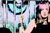
After Effects CS4 ships with a Cartoon effect, which can be used to give live-action footage more of a hand-inked look. Intended as a technology demonstration for what could be done with Adobe’s new Pixel Bender toolkit, it was pounced upon by many as example of how supposedly weak the AE CS4 upgrade was (with the benefit of experience, we beg to differ). The problem was that most of the early examples of Cartoon showed it at its default (or otherwise somewhat random) settings – and effects rarely look their best at their defaults.
To counter the perhaps mistaken conceptions about Cartoon, we wrote a tutorial for Artbeats.com that gives some hints on how to get more out of the Cartoon effect. Unfortunately, after the piece was published, we realized that it might be hard to tell the exact results by looking at the scaled-down and compressed images in the PDF. Therefore, after the “more” link below we’re including larger versions of the images with heavily truncated captions. (Be patient; they will take a few seconds to download.) We still suggest you download the file from Artbeats; if you subscribe to their newsletter, you got the main image (see on page 2 of this post) for free, and in a couple of days an AE CS4 project file should also be available to help you experiment with some of the results.
Overall Examples: Shot Selection Matters!
Artbeats clip KS132 from their Kids of Summer collection/
You can see where this image is not a good candidate for Cartoon, as it is too busy with similar-sized objects, and too many surfaces of the same color.
Artbeats clip PK106 from their Portraits: Kids collection.
This application of Cartoon uses the exact same settings as the first example, but the results are much better. The secret is selecting an original clip with more variety in size of objects (and therefore, amount of details) as well as color.
Artbeats clip FWR102 from their Faces of the World collection.
A more subtle application of Cartoon. The details (“edges”) in the beard can be controlled from being over-inked by reducing the Edge settings from their defaults.
Artbeats clip TE103 from their Teens on the Edge collection.
Obviously, stark colorful clips are great fodder for the Cartoon effect.
We almost always follow Cartoon with a color correction effect to alter the posterized colors Cartoon creates.
Tweaking Specific Parameters
Artbeats clip TEL130 from their Teen Life HD collection. It is the starting point for the remaining images. (If you subscribed to their newsletter, you got this clip free!)
Shading Steps
Shading Steps set to 2.1. (This is one of the most sensitive parameters, and is best at the lower end of its range.)
Shading Steps set to 2.5.
Shading Smoothness & Detail Threshold
Shading Smoothness set to 55. Lower settings give the Sunday Morning Funnies look.
Shading Smoothness set to 65. Settings between 60 and 70 are quite psychedelic.
Increasing Detail Threshold softens the result.
Edge Settings
The default edge settings are inelegant, in our opinion – especially when applied to standard definition footage (as we have here).
We prefer thinner, softer edge settings for standard definition footage. The result is more akin to a soft pencil.
Or, you could go to the other extreme, and increase the edge thickness (still with increased softness) to create a “magic marker” look.
Final Image
As mentioned earlier, we almost always follow Cartoon with color correction to get a more pleasing (or alien) result. We also tend to precede Cartoon with a Levels effect to alter the gray balance of the original clip before Cartoon processes it.
The Artbeats web site no longer contains the original PDF, so you can download a copy here.
The content contained in our books, videos, blogs, and articles for other sites are all copyright Crish Design, except where otherwise attributed.

