Recently I wrote of a wildly successful music video shoot I did with the HVX-200. Well, we did it again.
A few weeks ago I shot a music video project with director Jono Schaferkotter. The project turned out spectacularly well in spite of working with an eager, but inexperienced, crew and an HVX-200. Between picking shots that worked within the confines of what we could achieve with the gear we had, along with some basic color correction in Final Cut Studio using Magic Bullet Looks, the project looked much better than it had any right to, considering the budget was about $200.

Excited about the possibilities, Jono contacted me shortly thereafter about shooting a promo piece for a feature film script he was getting ready to pitch. Titled “Night Light,” the movie will feature an ensemble cast, a number of rich looks, and some complex visual effects shots. The idea behind the promo was to capture “real people” interviews with five characters who had read the script and were excited about it: an actress who had landed the lead; a musician who was going to write the soundtrack; a studio executive who was interested in green-lighting the project; the art director; and the visual effects supervisor. Jono’s instructions were clear: he didn’t want to see anyone’s face, and he wanted to accentuate the texture of the clothes. He wanted the shot to be mid-thigh to neck, with the idea that he would rotoscope animation onto the characters’ bodies in post. He wanted each shot to be a still that might have been pulled from a magazine. And we had the same budget and equipment as our last go-round.
Our kit consisted of (1) Panasonic HVX-200 camera; (1) Firestore; (1) Arri kit containing 2x300w fresnels and 2x650w fresnels; a couple of extra light stands; a small selection of bounce cards; and my bag of tricks, containing a 6×6 light grid and a 6×6 full grid. Oh, and I brought a lawn chair.
We had five setups to do in 14 hours and in two different locations. We finished two hours early. I’ve included screen shots from each of the setups, along with lighting diagrams and behind-the-scenes photos (by our two still photographers) where available. Go to page two to see how we did it…
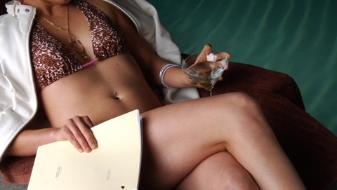
SHOT 1: The Actress


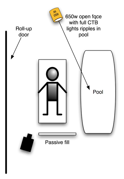
We’d shot parts of our previous music video project at the pool in the Boys and Girls Club of Santa Cruz, and that’s where we went back to for our first three setups. The first setup, the actress, took place next to the indoor pool and the bulk of the lighting came from opening up a roll-up door in the side of the building. Normally I prefer the shadows to fall toward the camera in any particular lighting setup but in this case that wasn’t possible without building a camera platform in the pool. The front light worked out well, and I was able to adjust the quality of the shadows by raising the rolling door up and down to make the “light source” bigger or smaller–which in turn made the shadows softer and lighter or harder and darker.
We really wanted to sell the pool in the background, and while cleaning the bottom of the pool we discovered that the ripples created by the pool sweep were perfect. I added an open-face 650w with full CTB to pop the ripples a bit. Originally I tried the light without CTB, and that made the pool an interesting greenish color when matched with the camera’s 5600k preset. I put the full CTB on the light when I realized that we were probably going to warm the shot in post–adding warmth to that color green would probably push it too far into bright green or yellow, so I made it more neutral by adding the gel.
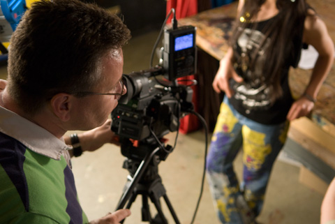
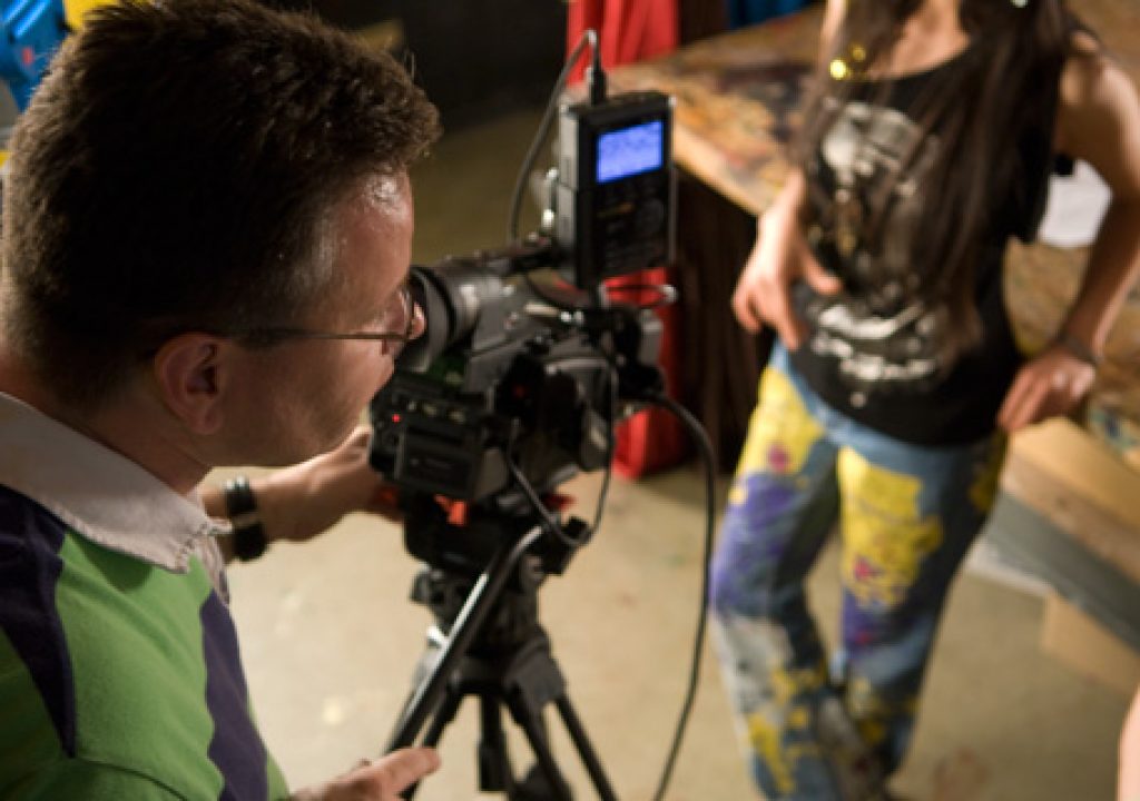
I watch excitedly as Jono checks the shot
Read on if you like music…
SHOT 2: The Musician
We shot this in a different room in the Boys and Girls club, a very small and very worn music room in the back of the building. It was maybe 8′ wide and 12′ deep, and we shot the musician in a corner of the room in front of some amps.
Watching the way the musician held the guitar told me a lot about how to approach this setup. I knew I wanted to pop the guitar and his hands, so I set up a 2×3 Reflectix bounce behind his left shoulder that raked across that area. His right arm disappeared into the shadows a bit so I added a 4×4 Reflectix bounce from the other direction, only using a small portion of that surface for the bounce. This added some shine to the dark side of the musician’s right hand as well as adding a kick to the guitar.
Last but not least I added a 4×4 bounce fill next to the camera. I kept it on the right side because I tend to like to fill from the key side, and as the 2×3 Reflectix was the brightest light in the shot I filled from that side to carry it around. Big soft sources from the direction of the camera feel very good to me: it’s a very smooth kind of light that feels ambient but not crazed, the way some ambient light can be. Sometimes the ambient light in a room can be too random and busy as fill light, and in those situations I use a big soft source near camera to exert some control.
Plus it makes people look great, and nobody complains about that.
Next page: the art director…
SHOT 3: The Art Director
Jono wanted to see the texture in the talents’ clothes, but in this case the actress wore a black shirt with silver shiny artwork on it. I raked her across the front with a 650w fresnel bounced off a 4×4 Reflectix card to her right side, and then carried the effect around front with an active 4×4 bounce card.
Objects on flat surfaces, such as tabletops, almost always benefit from soft backlight. I didn’t want that light to go everywhere, especially into the lens, so I built a “cove card” out of some artist showcard that was lying around. By bending the card into a “U”, and holding it in place with a couple of pieces of tape, I created a bounce source that wouldn’t fill to the sides. I aimed a 650w open-face light into it and got exactly what I’d hoped for: soft light that brought out the texture of the objects on the table surface and the clothes rack, along with a little shine in the table and the talent’s skin. I love soft back light for the incredible number of tones one can achieve, from subtle object shading to beautiful smooth reflected highlights.
Next page: A studio executive you don’t have to hate…
SHOT 4: The Studio Executive
Originally we thought we’d shoot this gentleman in a window at dusk, but the scheduling didn’t work out. We punted and put him at the top of this staircase in the building housing Compass Rose Media, Jono’s employer.
Most of the light came through some windows at the left of frame, through which came beautiful soft light from the sun hitting the building next door. I had to wrap the light around in front of the actor, though, so originally I tried putting a 4×4 active bounce near the camera. That flattened his shirt a bit too much, so I put the card on the ground instead, keeping it on the left side of camera to be consistent with the direction of the key light. It worked beautifully. The soft light from below felt real and ambient but really popped his clothing nicely. I gelled that light with full CTB, and then added an additional 650w Reflectix bounce at the bottom of the staircase, lighting up the landing below for a bit of depth. I kept that light at 3200k, keeping it nice and warm and feeling like bouncing afternoon sunlight. Any colored object livens up considerably if you hit it with light of the same color, and the warmth of the light really popped the warm wood nicely.
Read on to see the torso of the man behind the magic…
SHOT 5: The Visual Effects Supervisor
I love that T-shirt.
We shot this at Jono’s desk. I wanted this to be a little moodier, in keeping with the dark rooms that a lot of VFX supervisors work in, so I set up a 6×6 grid cloth as a big soft 3/4 back source. It wrapped around the talent very nicely but it didn’t bring out the texture of his clothing at all. I added a second light, a 300w hard fresnal with full CTB on it, to rake across his clothing and add a bit of color that would flicker across his clothing as he moved. Adding a hint of hard colored light to a softly lit scene can do wonders, especially if it really is only a hint: a half stop or so of additional color in the right circumstances can look wonderful and add a subtle bit of nuance to the shot, creating additional subtle shades and shadows.
I added one last 300w fresnel to pop the blue cloth-lined cabinets at the top of the desk behind the talent. And then we shot.
That was about it. We finished a couple of hours ahead of schedule by keeping the lighting very simple. The richness of the locations allowed us to get away with that. The more art direction a set has, the easier it is to light. There’s nothing worse than getting stuck in a bare white room. That takes more time to light than a small cluttered office.
Me, Jono and producer Laura Green. We had a lot more fun than it looks.
Jono’s currently working on the rotoscope portion of this project. I’m extremely excited to see what it turns into. I’ll post a version when it’s finished, hopefully in a week or two.
(Behind-the-scenes photos by Tosh Tanaka and Katie Hodges)


