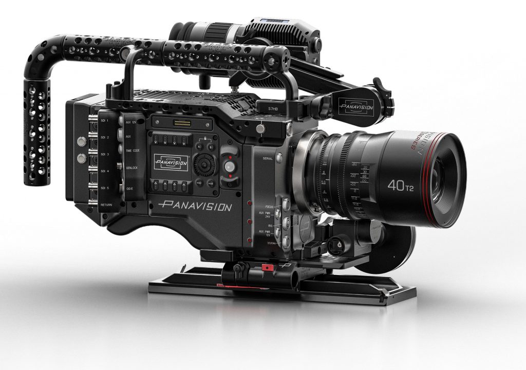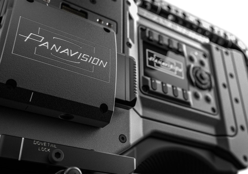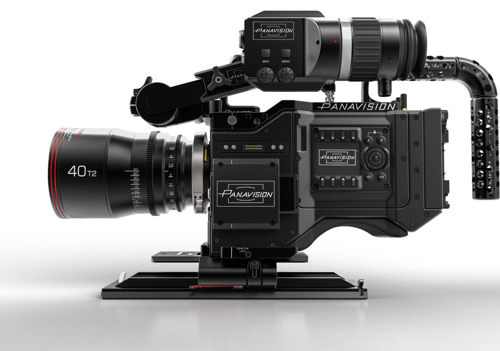
My invitation to a mysterious press event was nearly one of the biggest surprise announcements of the year. That morning Panavision showed their new camera, the Millennium DXL, to the ASC, and by early afternoon pictures of the camera flooded Twitter and Instagram. Panavision officially announced the camera by early afternoon as the cat was not only out of the bag but loudly playing bagpipes in the street outside the CineGear trade show, where Adam Wilt and I were setting up a booth for DSC Labs. The “surprise” press event that we’d signed up for the week before was no longer a surprise.
When I heard that this new 8K camera was a co-venture between RED and Panavision, my first thought was: “Of course, this makes perfect sense.” RED has an 8K sensor ready and waiting, they’ve given outside vendors unprecedented access to the internal workings of their cameras, and Panavision needed a response to the Arri Alexa 65. (It’s interesting to see RED pivot from being the “bad boy” of the industry to the most cooperative and open camera company on the planet. I like it.)
I’ll touch briefly on camera design, and skip the specs as those are easy to find. Then I’m going to focus on what I’m most interested in as a cinematographer: color, dynamic range and resolution. Along the way I’m going to teach you a bit about how cameras render color, and show why that’s important to you.
DESIGN


THE PHILOSOPHY OF THE “LOOK”
Camera specs are freely available and easily quantifiable. I’m more interested in intangibles, such as color. Over the years I’ve asked numerous camera companies for a brief summary of their color philosophy. The look of a camera is a highly subjective thing, and someone makes those aesthetic decisions. I’ve always wondered what they’re aiming for when they make those decisions.
His key concern was maintaining consistent flesh tone. It’s not unusual for digital skin tones to shift hue toward green or magenta in extreme highlights or shadows. Light Iron’s color science works aggressively to eliminate these shifts.
All stills are courtesy Light Iron and Michael Cioni, and were pulled as TIFFs from their 4K presentation. I created the JPEGs myself, using as little compression as possible, as TIFFs are not a supported web image format. Due to PVC’s 640px width restriction, and the inability to publish TIFFs as embedded images on the web, you are not seeing these images in their true glory.
Another example is front-lit trees in daylight: green leaves often look oversaturated and “electronic” under these conditions, so Vertovec sought to roll off the saturation in a pleasing way that preserved the color of the leaves without making them appear video-like.
As we spoke at the press conference it became clear that Vertovec was pursuing the holy grail of digital color: emulating the look of a subtractive color process (film) in an additive color medium (digital projection and TV displays). The most saturated hues that a TV can produce are also the brightest because TVs use additive color, where three strongly saturated light sources mix to create all possible hues. The most saturated hue comes about by turning one of those colored lights full on and the others full off: the most saturated red, for example, is also the brightest.
In short, TV highlights are where you can find the most highly saturated color. Most traditional video companies play to that “strength” because it seems like a natural fit: this is how TVs work, so why not take advantage?
The film look, however, is the opposite. The projector emits white light, and dyes in the film emulsion carve bits of it away to create the desired image on the screen. I like to compare this process to watercolor painting, as the two are very similar: the brightest portion of a watercolor painting is the white paper on which it resides, and the application of paint blocks portions of that paper’s reflected light spectrum and allows only light of the selected wavelengths to reach your eye. The application of paint creates a filter on top of the reflective white paper. Print film does the same thing: it filters light to create color images.
The darkest hues are the most saturated because watercolor paints, and film dyes, must be quite heavy to block enough of the spectrum to create a saturated hue, while the brightest hues are the least saturated because brightness requires passing more white light. This results in a natural roll of color saturation as brightness increases.
HUE DISCRIMINATION
Once I learned that the sensor came from RED, my next question became: does this camera look like a RED? During the intro, Light Iron CEO Michael Cioni spoke about how aggressively Light Iron sought to expand the sensor’s color palette so it was better able to discriminate between subtle hues. That’s what I love about the reigning hue discrimination champion, the Panasonic Varicam 35. While that camera has a broadcast camera “richness” to it, it also discriminates wonderfully between very fine hues.
Notice the subtle differences between jackets of similar hues. The man’s sweater is a very complex and sophisticated green that I’m not used to seeing in footage from any other camera. I see several similar but different hues of purple and blue, and several fabrics whose hues are close to neutral gray but have very slight casts to them… there’s a mix of subtle and strong hues here that I find dazzling. (Michael Cioni consulted on Varicam’s color as well.)
Mr. Cioni emphasized that this was one of Light Iron’s goals in devising the DXL’s color science. He spoke of starting work on the camera’s color as close to the sensor as possible and then manipulating it in a very large color space to push the various hues as far apart as possible.
Every camera has a native color gamut that is defined by the most saturated red, green and blue hues that it can detect. This color gamut doesn’t match any of the standard color spaces (Rec 709, Rec 2020, DCI-P3) because the dyes on the sensor aren’t that precise: none are completely pure, and their spectral overlap affects the size and shape of the color gamut. At some point in the process this color gamut is mapped into a standard color space for viewing, but that’s often the last step and is best handled by a LUT.
Integral to nearly every camera design is something called a color correction matrix. A color matrix is a brute force method of converting image color data from one color space to another, and the effect is linear: the data is basically remapped, but without any control over how saturated a hue is at a certain brightness level. A hue goes in and another hue comes out.
LUTs, on the other hand, can isolate specific hue ranges and brightness levels and manipulate them in very subtle ways. Rolling off color saturation in a highlight using a matrix is hard. Doing so with a LUT is easy.
Light Iron states that their look is based on color science that affects image data as close to the sensor as possible. This is not unusual as most cameras do this: there’s an order of operations when processing image data, and my guess is that most of their work is done in the RGB matrix that maps white-balanced and deBayered pixels into a working color space, where other operations are then performed. The trick, though, is that Panavision does not say that they are creating a look in camera: rather, they are ironing out the bugs that prevent them from having the maximum amount of grading flexibility so they can achieve the goals that DPs commonly pursue in a grade. They’ve not set out to create a look, but rather an easily-graded “digital negative.”
THE “LOOK”
Every sensor has underlying color characteristics based on the physical nature of how it sees light. The DXL is no different. I’ve certainly had my complaints about the look of RED cameras in the past, but the Dragon sensor, in conjunction with the skin tone filter, seems to be a mature combination. (It’s hard to argue otherwise when the majority of great looking Netflix and Amazon shows are shot on RED Dragon cameras.)
The Millennium DXL looks great. I can still see some of the underlying RED look, particularly in sequences with muted browns and greens that seem to mush together a bit, but the overall feel was very filmic. Flesh tones are very neutral: not green or magenta, or excessively warm, but solid and realistic. One shot, of Keanu Reeves sitting on a motorcycle overlooking a cloud-filled valley backlit by the setting sun, featured beautifully-rendered cyan skylight that nicely offset the warmth of the sunset. I didn’t see a wide range of blue hues, but they were very pleasing, and the dynamic range of the scene was impressive.
Let’s look at some images pulled directly from Light Iron’s 4K grade:
Part of what I’ve come to know as “the RED look” has to do with muted greens and browns blending together. I never understood why until I saw this article whose author did some backwards engineering to plot the primary colors that define the RED camera’s native color space. His results show that the green primary appears shifted a bit toward red, implying a lot of red/green overlap which then pushes some greens and reds toward yellow. This makes sense to me as it reflects what I’ve seen in RED footage in the past, where some greens and browns shift toward yellow or golden brown and merge together. Light Iron seems to be squeezing a lot more separation out of the sensor in this regard. Still, the brown tree feels a tiny bit mushy but the greens that surround it are quite vibrant.
MIXED LIGHT
This sensor does have a look, and it carries through th grade. In spite of this, it’s clear that its footage can be graded in a myriad of ways, with neutral flesh tones and beautifully rolled-off highlights. It appears to have a lot of dynamic range, and it’s very quiet at ISOs 800 and 1250. If it were a film negative, it would be a great all-around low-contrast medium saturation stock that offers a lot of flexibility in the DI suite.
Light Iron has done an impressive job fixing the image issues that most DPs complain about. The difference in subtle hues is not as dazzling as I expected based on the build up to the demo reel, but it’s by far the most filmic look I’ve seen out of a RED sensor to date. I don’t see the DXL taking the world by storm simply because of its look alone, but it’s likely going to be popular due to ease of grading, crazy high resolution, and the fact that it records 8K to a tiny RED SSD drive.
And now, a note on resolution. Mr. Cioni’s presentation contained a very interesting section where he stipulated that resolution is not the same as sharpness. He pointed to black and white prints by Ansel Adams, that were photographed on huge negatives, and showed us that they weren’t sharp, but rather smooth. The reason, he said, is that once a sensor achieves 30 megapixels the pixel density is high enough that pixelation effectively goes away. Here’s a bad photo of the presentation slide that illustrates this concept:
In HD, and even 4K, curves and diagonals are stair-stepped, and the additional edges result in an artificial sharpening of the image that’s not a good approximation of how our eyes see the world. Beyond 30 megapixels, resolution becomes so fine that, on a big screen, these extra edges disappear, and the image becomes smooth without losing detail. The contrast created by hard edges fades away, leaving softer edges around finer textures. We still see everything in the image, but the sense that it has been artificially sharpened—even at a low level—vanishes.
I think this is true. It makes sense both logically and intuitively. And… I’ve seen the 8K images, on a big screen and in 4K, and they looked super smooth.
In addition to the elimination of stair-stepping, I think 8K looks smooth because it captures a much more subtle range of tones than do lesser formats. Lower resolution images should contain higher local contrast because transitions between light and dark become more abrupt. The additional resolution afforded by an 8K sensor captures more shades of gray across smaller areas, which reduces contrast by adding tonal complexity.
Was I blown away by the look of the camera? From a resolution perspective, yes. From a color perspective, I was impressed but not stunned. That’s fine, though: there are a lot of great looking cameras on the market and they all fill their particular niches. Panavision now owns the highest resolution large format motion picture camera system on the market. It makes beautiful images and the design is very functional and smart. While it uses a RED sensor and electronics, they’ve pulled new characteristics out of a known sensor design. They’re also working on a new OLPF/IR cut filter package which will likely further change the look.
The footage I saw was shot with prototype cameras, and I’ll be very curious to see what kind of images these cameras produce when they are released late this year or early next.
Postscript: I asked Michael Cioni to look over this article for inaccuracies. In his emailed response he included the following information:
1) We are still in the very early stages of this system and developments are moving rapidly, which is to say the pictures you’ve seen thus far are the worst they’re going to ever be
2) We want to be transparent with the cinematography community and want feedback from users so we can improve the system based on user feedback
Panavision has enacted a “rapid response team” and it’s specifically designed to make changes fast so that we don’t have to unnecessarily extend our development timeline. What I’m hoping is that with each passing season, people will be impressed as to how much faster the DXL roadmap is as compared to other top flight cinema systems. Announcements will be made as upgrades and updates are ready.
And this, ladies and gentlemen, is how you run a camera company.


